 DayPilot
")
Overview
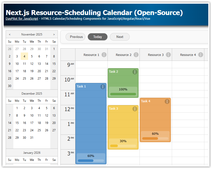
In this tutorial, you’ll build a Next.js scheduler with a horizontal timeline using the open-source DayPilot Scheduler component for React.
Features you will implement:
Resources as rows (vertical axis)
One-year timeline rendered as one day per cell
Date navigation using a left-side date picker (Navigator) to scroll the scheduler timeline
The current scheduler viewport is dynamically highlighted in the date picker
Timeline header action icon shown on hover (header “active area”)
Day column actions via a header context menu (bulk operations such as delete and postpone)
Highlight a selected time column (header + cells)
Add a Scheduler Component to a Next.js App
To start using the React package from the open-source DayPilot Lite for JavaScript scheduling library, install it from NPM:
npm install @daypilot/daypilot-lite-reactDayPilot UI components rely on browser APIs and event handlers, so in a Next.js project you need a client component.
'use client';

import {DayPilotScheduler} from "@daypilot/daypilot-lite-react";

export default function Scheduler() {

    return (
        <DayPilotScheduler />
    );
}
Without 'use client', Next.js will treat the component as a server component and you’ll run into runtime errors (no DOM, no event handlers).
Capture the Scheduler Instance
This Next.js scheduler timeline uses the DayPilot imperative API for scrolling and selection synchronization. To access it, you must capture control references using controlRef.
const [scheduler, setScheduler] = useState<DayPilot.Scheduler>();Bind it in JSX:
<DayPilotScheduler controlRef={setScheduler} /* ... */ />Now the DayPilot.Scheduler reference is stored in the scheduler state variable. You can use it to call the Scheduler methods.
Configure the Horizontal Timeline

Configure a One-Year Timeline (Day Scale)
For a horizontal timeline that shows one year at day resolution, configure:
scale="Day"(one cell = one day)timeHeaders(Month + Day header rows)startDate+days(the visible date range)
'use client';

import React, { useState } from "react";
import { DayPilot, DayPilotScheduler } from "@daypilot/daypilot-lite-react";

export default function Scheduler() {

  const [startDate] = useState<DayPilot.Date>(DayPilot.Date.today().firstDayOfYear());
  const [days] = useState<number>(DayPilot.Date.today().daysInYear());

  return (
    <DayPilotScheduler
      scale={"Day"}
      timeHeaders={[
        { groupBy: "Month" },
        { groupBy: "Day", format: "d" },
      ]}
      startDate={startDate}
      days={days}
      cellWidth={80}
    />
  );
}
In you app, you can also use a different scale (cell duration), such as "Minute", "Hour", "Week", or a custom number of minutes using "CellDuration".
The Scheduler can display a custom set of timeline header rows using grouping units such as "Year", "Month", "Week", "Day", etc.
The combination of startDate and days defines the date range displayed in the Scheduler grid. Later, you’ll use these values to display a different year when the user navigates outside the current range.
You can define multiple views with different cell durations and time headers, and let the user switch between them dynamically using the zoom feature.
Define Rows as Resources in the Scheduler

Define Resource Rows (Vertical Axis)
Resources define rows in the scheduler (the vertical axis). Each event references a resource by id.
'use client';

import React, {useEffect, useState} from "react";
import {DayPilot, DayPilotScheduler} from "@daypilot/daypilot-lite-react";

export default function Scheduler() {

    const [resources, setResources] = useState<DayPilot.ResourceData[]>([]);

    useEffect(() => {

        const resourceData: DayPilot.ResourceData[] = [
            { name: "Resource 1", id: "R1"},
            { name: "Resource 2", id: "R2"},
            { name: "Resource 3", id: "R3"},
            { name: "Resource 4", id: "R4"},
            { name: "Resource 5", id: "R5"},
            { name: "Resource 6", id: "R6"},
            { name: "Resource 7", id: "R7"},
            { name: "Resource 8", id: "R8"},
            { name: "Resource 9", id: "R9"},
        ];
        setResources(resourceData);


    }, []);


    return (
        <DayPilotScheduler
            ...
            resources={resources}
        />
    );
}
The Scheduler uses the resources array to generate rows. Events are placed in rows by matching event.resource with a resource id.
To improve performance, the Scheduler renders the row headers progressively during scrolling. This makes it possible to display a large number of rows without slowing down the UI.
Load and Customize Events in the Scheduler Timeline

In this section, you’ll load a set of events into the Next.js Scheduler timeline and customize how they look and behave. Events are provided as an array of DayPilot.EventData objects, and you can modify their appearance dynamically using render callbacks.
Define and load events
Create an events state variable and load initial data (static sample data in this tutorial). Each event specifies:
id(unique identifier)text(displayed label)start/end(date range)resource(row id)optional styling like
backColor
const [events, setEvents] = useState<DayPilot.EventData[]>([]);

useEffect(() => {
  const firstDayOfMonth = DayPilot.Date.today().firstDayOfMonth();

  const sample: DayPilot.EventData[] = [
    {
      id: "e1",
      text: "Client onboarding",
      start: firstDayOfMonth.addDays(2),
      end: firstDayOfMonth.addDays(4),
      resource: "R1",
      backColor: "#7DB5E8",
    },
    {
      id: "e2",
      text: "Preventive maintenance",
      start: firstDayOfMonth.addDays(6),
      end: firstDayOfMonth.addDays(8),
      resource: "R2",
      backColor: "#D6D6D6",
    },
    // ...
  ];

  setEvents(sample);
}, []);
Bind the events to the Scheduler:
<DayPilotScheduler
  /* ... */
  events={events}
/>
In a real Next.js app, you can replace the sample data with a fetch call to an API route and set the state with the returned events.
Customize event rendering (colors, borders, and icons)
To customize event UI, use onBeforeEventRender. This hook lets you adjust style properties and inject interactive elements (“active areas”) into events.
Example: add a subtle border and an inline edit icon that appears inside each event:
const onBeforeEventRender = (args: DayPilot.SchedulerBeforeEventRenderArgs) => {
  args.data.borderColor = "darker";

  args.data.areas = [
    {
      right: 5,
      top: "calc(50% - 15px)",
      width: 30,
      height: 30,
      symbol: "/icons/daypilot.svg#edit",
      borderRadius: "50%",
      backColor: "#ffffff99",
      fontColor: "#aaaaaa",
      padding: 5,
      onClick: async (areaArgs) => {
        await editEvent(areaArgs.source);
      },
    },
  ];
};
Bind it in JSX:
<DayPilotScheduler
  /* ... */
  onBeforeEventRender={onBeforeEventRender}
/>
To customize event content, you can set custom HTML (args.data.html), add interactive event active areas (args.data.areas), or render custom JSX.
Add Date Navigation

Add a Date Picker (Navigator) Next to the Timeline
To make it easy to jump across the year-long Scheduler timeline, add a DayPilotNavigator on the left.
The Navigator component is an inline date picker that displays one or more months as a mini-calendar. The selection mode (day, week, month) determines the date range that will be selected when the user clicks a date.
<div style={{ display: "flex", justifyContent: "space-between" }}>
  <div style={{ marginRight: "10px" }}>
    <DayPilotNavigator
      /* ... */
      onTimeRangeSelected={onDatePickerTimeRangeSelected}
      controlRef={setDatePicker}
    />
  </div>
  <div style={{ flexGrow: 1 }}>
    <DayPilotScheduler
      /* ... */
      onScroll={onScroll}
      controlRef={setScheduler}
    />
  </div>
</div>
Jump to a clicked date (Navigator > Scheduler)
The Navigator fires onTimeRangeSelected when the user clicks a date. In this handler:
If the clicked date is already inside the scheduler’s visible range, scroll immediately.
If it’s outside, update the year range first (
startDate/days), then scroll.
const onDatePickerTimeRangeSelected = (args: DayPilot.NavigatorTimeRangeSelectedArgs) => {
    const visibleStart = scheduler?.visibleStart();
    const visibleEnd = scheduler?.visibleEnd();
    const inRange = visibleStart && visibleEnd && args.start >= visibleStart && args.end <= visibleEnd;
    if (!inRange) {
        setStartDate(args.start.firstDayOfYear());
        setDays(args.start.daysInYear());
    }
    setTimeout(() =>  {
        scheduler?.scrollTo(args.start);
    });
}
Note that we defer the scroll using setTimeout(). Updating startDate/days triggers a React render; deferring scrollTo() ensures the Scheduler timeline has been re-rendered with the new date range before you attempt to scroll.
Highlight the current viewport in the date picker (Scheduler > Navigator)
When the user scrolls the scheduler timeline, update the Navigator selection to match the new viewport start:
const onScroll = (args: DayPilot.SchedulerScrollArgs) => {
    const viewport = args.viewport;
    datePicker?.select(viewport.start, {
        dontNotify: true
    });
};
The dontNotify: true option prevents a feedback loop where selecting in the Navigator triggers onTimeRangeSelected, which scrolls the Scheduler, which triggers onScroll, and so on.
Add a Context Menu Icon to the Scheduler Timeline Header

In this step, you will customize the Scheduler timeline header with a hover icon that opens a context menu when clicked. This is implemented using time header active areas - interactive objects that you insert into timeline header cells dynamically and assign built-in or custom behavior.
To place a hover icon in each day header cell, handle onBeforeTimeHeaderRender and define a header active area:
const onBeforeTimeHeaderRender = (args: DayPilot.SchedulerBeforeTimeHeaderRenderArgs) => {

    args.header.areas = [
        {
            right: 2,
            top: "calc(50% - 13px)",
            width: 26,
            height: 26,
            symbol: "/icons/daypilot.svg#hamburger-menu",
            borderRadius: 5,
            backColor: "#f8fafc",
            fontColor: "#475569",
            borderColor: "rgba(0,0,0,.18)",
            padding: 3,
            visibility: "Hover",
        }
    ];
};
Bind it in the Scheduler JSX:
<DayPilotScheduler
    onBeforeTimeHeaderRender={onBeforeTimeHeaderRender}
    ...
/>
Active areas support built-in and custom actions. To open a context menu on click, set action: "ContextMenu" and define menu:
args.header.areas = [
  {
    /* ...icon styling... */
    action: "ContextMenu",
    menu: new DayPilot.Menu({
      items: [
          {
              text: "List events",
              onClick: async () => {
                  const events = scheduler?.events.forRange(args.header.start, args.header.end);
                  await DayPilot.Modal.alert(events?.map(e => e.text()).join("<br>") || "No events");
              }
          },
          {
              text: "Delete events",
              onClick: async () => {
                  const dayEvents = scheduler?.events.forRange(args.header.start, args.header.end) || [];
                  if (dayEvents.length === 0) {
                      await DayPilot.Modal.alert("No events");
                      return;
                  }

                  const modal = await DayPilot.Modal.confirm(`Delete ${dayEvents.length} event(s) on ${args.header.start.toString("yyyy-MM-dd")}?`);
                  if (modal.canceled) {
                      return;
                  }

                  for (const e of dayEvents) {
                      scheduler?.events.remove(e);
                  }
              }
          },
          {
              text: "Move events to next day",
              onClick: async () => {
                  const dayStart = args.header.start;
                  const dayEnd = args.header.end;

                  const dayEvents = scheduler?.events.forRange(dayStart, dayEnd) || [];
                  if (dayEvents.length === 0) {
                      await DayPilot.Modal.alert("No events");
                      return;
                  }

                  const modal = await DayPilot.Modal.confirm(`Move ${dayEvents.length} event(s) to start on ${dayEnd.toString("yyyy-MM-dd")}?`);
                  if (modal.canceled) {
                      return;
                  }

                  for (const e of dayEvents) {
                      const s = new DayPilot.Date(e.data.start);
                      const en = new DayPilot.Date(e.data.end);
                      const durationMs = en.getTime() - s.getTime();

                      scheduler?.events.update({
                          ...e.data,
                          start: dayEnd,
                          end: dayEnd.addTime(durationMs),
                      });
                  }
              }
          },
        ]
    }),
  },
];
The context menu defines three items that demonstrate how to work with events in the selected day column. In all cases, the key method is events.forRange(start, end), which returns the events that intersect the selected time interval (between args.header.start and args.header.end):
List events
Retrieves all events in the selected day column and displays their text in a modal dialog. This is a quick way to confirm what is scheduled on that day.Delete events
Retrieves events in the selected day column, asks for confirmation, and then removes each event from the Scheduler. This shows how to implement a bulk delete for a specific day.Move events to next day
Retrieves events in the selected day column, asks for confirmation, and then shifts each event so it starts on the next day (dayEnd). The code preserves each event’s original duration by computing the event length in milliseconds and settingend = newStart + duration.
Note that moving events can result in overlaps with existing events. This implementation is intentionally simplified. To see how to prevent overlaps by pushing existing events back when moving an event, read the JavaScript Scheduler: Pushing Existing Events Back (Drag and Drop) tutorial.
Highlight a Selected Time Column

In this step, you’ll add a simple “day highlight” feature that visually marks a selected timeline column across the Scheduler:
the day header cell
all grid cells in that day
Store the highlighted day in React state
Keep the currently highlighted day in a state variable:
const [highlight, setHighlight] = useState<DayPilot.Date>();When highlight is set, we’ll compare it with the start time of each header/cell during rendering and apply a background color.
Set the highlight from the header menu
Add a menu item that stores the clicked day header start as the highlighted date:
{
  text: "Highlight",
  onClick: () => setHighlight(args.header.start),
}
Because this tutorial uses a Day scale, args.header.start (at the day header level) represents the start of the selected day column.
Apply highlighting to the day header row
Use onBeforeTimeHeaderRender to set the background color for the matching header cell. Apply it only to the day header row (level 1):
const onBeforeTimeHeaderRender = (args: DayPilot.SchedulerBeforeTimeHeaderRenderArgs) => {

    if (highlight && args.header.start.getTime() === highlight.getTime() && args.header.level === 1) {
        args.header.backColor = "#3b82f61a";
    }

};
The top header row groups by Month (level 0), and the second header row groups by Day (level 1). Highlighting only level 1 avoids coloring the entire month header.
Apply highlighting to grid cells in that day column
To highlight the entire day column, also apply the same background color to all grid cells whose start time matches the highlighted day:
const onBeforeCellRender = (args: DayPilot.SchedulerBeforeCellRenderArgs) => {
    if (highlight && args.cell.start.getTime() === highlight.getTime()) {
        args.cell.properties.backColor = "#3b82f61a";
    }
};
Bind both hooks in JSX
<DayPilotScheduler
    onBeforeCellRender={onBeforeCellRender}
    onBeforeTimeHeaderRender={onBeforeTimeHeaderRender}
    ...
/>
If you later want to support “toggle off” behavior, you can set highlight to undefined when the user clicks the same day again.
Full Source Code
Here is the full TypeScript source code of our Next.js Scheduler component that shows a horizontal timeline for multiple resources:
'use client';

import React, {useEffect, useState} from "react";
import {DayPilot, DayPilotScheduler, DayPilotNavigator} from "@daypilot/daypilot-lite-react";

export default function Scheduler() {

    const [scheduler, setScheduler] = useState<DayPilot.Scheduler>();
    const [datePicker, setDatePicker] = useState<DayPilot.Navigator>();

    const [events, setEvents] = useState<DayPilot.EventData[]>([]);
    const [resources, setResources] = useState<DayPilot.ResourceData[]>([]);

    const [highlight, setHighlight] = useState<DayPilot.Date>();

    const [startDate, setStartDate] = useState<DayPilot.Date>(DayPilot.Date.today().firstDayOfYear());
    const [days, setDays] = useState<number>(DayPilot.Date.today().daysInYear());

    const colors: DayPilot.ModalFormOption[] = [
        { name: "(default)", id: "" },
        { name: "Blue",   id: "#7DB5E8" },
        { name: "Green",  id: "#9ED58A" },
        { name: "Yellow", id: "#FFE08A" },
        { name: "Red",    id: "#FFBE8A" },
        { name: "Gray",   id: "#D6D6D6" },
    ];

    const eventEditForm: DayPilot.ModalFormItem[] =  [
        { name: "Text", id: "text" },
        { name: "Start", id: "start", type: "datetime", disabled: true },
        { name: "End", id: "end", type: "datetime", disabled: true },
        { name: "Resource", id: "resource", type: "select", options: resources as DayPilot.ModalFormOption[] },
        { name: "Color", id: "backColor", type: "select", options: colors }
    ];

    const editEvent = async (e: DayPilot.Event) => {
        const modal = await DayPilot.Modal.form(eventEditForm, e.data);
        if (modal.canceled) {
            return;
        }

        scheduler?.events.update(modal.result);
    };

    const onDatePickerTimeRangeSelected = (args: DayPilot.NavigatorTimeRangeSelectedArgs) => {
        const visibleStart = scheduler?.visibleStart();
        const visibleEnd = scheduler?.visibleEnd();
        const inRange = visibleStart && visibleEnd && args.start >= visibleStart && args.end <= visibleEnd;
        if (!inRange) {
            setStartDate(args.start.firstDayOfYear());
            setDays(args.start.daysInYear());
        }
        setTimeout(() =>  {
            scheduler?.scrollTo(args.start);
        });
    }

    const onSchedulerTimeRangeSelected = async (args: DayPilot.SchedulerTimeRangeSelectedArgs) => {

        const data = {
            start: args.start,
            end: args.end,
            resource: args.resource,
            id: DayPilot.guid(),
            text: "Event",
            backColor: "#999999"
        };

        const modal = await DayPilot.Modal.form(eventEditForm, data);

        scheduler?.clearSelection();

        if (modal.canceled) {
            return;
        }

        scheduler?.events.add(modal.result);
    };

    const onBeforeEventRender = (args: DayPilot.SchedulerBeforeEventRenderArgs) => {
        args.data.borderColor = "darker";
        args.data.areas = [
            {
                right: 5,
                top: "calc(50% - 15px)",
                width: 30,
                height: 30,
                symbol: "/icons/daypilot.svg#edit",
                borderRadius: "50%",
                backColor: "#ffffff99",
                fontColor: "#aaaaaa",
                padding: 5,
                onClick: async (args) => {
                    await editEvent(args.source);
                }
            }
        ];
    };

    const onBeforeCellRender = (args: DayPilot.SchedulerBeforeCellRenderArgs) => {
        if (highlight && args.cell.start.getTime() === highlight.getTime()) {
            args.cell.properties.backColor = "#3b82f61a";
        }
    };

    const onScroll = (args: DayPilot.SchedulerScrollArgs) => {
        const viewport = args.viewport;
        datePicker?.select(viewport.start, {
            dontNotify: true
        });
    };

    const onBeforeTimeHeaderRender = (args: DayPilot.SchedulerBeforeTimeHeaderRenderArgs) => {

        if (highlight && args.header.start.getTime() === highlight.getTime() && args.header.level === 1) {
            args.header.backColor = "#3b82f61a";
        }

        args.header.areas = [
            {
                right: 2,
                top: "calc(50% - 13px)",
                width: 26,
                height: 26,
                symbol: "/icons/daypilot.svg#hamburger-menu",
                borderRadius: 5,
                backColor: "#f8fafc",
                fontColor: "#475569",
                borderColor: "rgba(0,0,0,.18)",
                padding: 3,
                visibility: "Hover",
                style: "cursor: pointer",
                action: "ContextMenu",
                menu: new DayPilot.Menu({
                    items: [
                        {
                            text: "List events",
                            onClick: async () => {
                                const events = scheduler?.events.forRange(args.header.start, args.header.end);
                                await DayPilot.Modal.alert(events?.map(e => e.text()).join("<br>") || "No events");
                            }
                        },
                        {
                            text: "Delete events",
                            onClick: async () => {
                                const dayEvents = scheduler?.events.forRange(args.header.start, args.header.end) || [];
                                if (dayEvents.length === 0) {
                                    await DayPilot.Modal.alert("No events");
                                    return;
                                }

                                const modal = await DayPilot.Modal.confirm(`Delete ${dayEvents.length} event(s) on ${args.header.start.toString("yyyy-MM-dd")}?`);
                                if (modal.canceled) {
                                    return;
                                }

                                for (const e of dayEvents) {
                                    scheduler?.events.remove(e);
                                }
                            }
                        },
                        {
                            text: "Move events to next day",
                            onClick: async () => {
                                const dayStart = args.header.start;
                                const dayEnd = args.header.end;

                                const dayEvents = scheduler?.events.forRange(dayStart, dayEnd) || [];
                                if (dayEvents.length === 0) {
                                    await DayPilot.Modal.alert("No events");
                                    return;
                                }

                                const modal = await DayPilot.Modal.confirm(`Move ${dayEvents.length} event(s) to start on ${dayEnd.toString("yyyy-MM-dd")}?`);
                                if (modal.canceled) {
                                    return;
                                }

                                for (const e of dayEvents) {
                                    const s = new DayPilot.Date(e.data.start);
                                    const en = new DayPilot.Date(e.data.end);
                                    const durationMs = en.getTime() - s.getTime();

                                    scheduler?.events.update({
                                        ...e.data,
                                        start: dayEnd,
                                        end: dayEnd.addTime(durationMs),
                                    });
                                }
                            }
                        },
                        {
                            text: "-"
                        },
                        {
                            text: "Highlight",
                            onClick: async () => {
                                setHighlight(args.header.start);
                            }
                        }
                    ]
                }),
            }
        ];
    };

    useEffect(() => {

        const firstDayOfMonth = DayPilot.Date.today().firstDayOfMonth();

        const resourceData: DayPilot.ResourceData[] = [
            { name: "Resource 1", id: "R1"},
            { name: "Resource 2", id: "R2"},
            { name: "Resource 3", id: "R3"},
            { name: "Resource 4", id: "R4"},
            { name: "Resource 5", id: "R5"},
            { name: "Resource 6", id: "R6"},
            { name: "Resource 7", id: "R7"},
            { name: "Resource 8", id: "R8"},
            { name: "Resource 9", id: "R9"},
        ];
        setResources(resourceData);

        const eventData: DayPilot.EventData[] = [
            {
                id: "e1",
                text: "Client onboarding",
                start: firstDayOfMonth.addDays(2),
                end: firstDayOfMonth.addDays(4),
                resource: "R1",
                backColor: "#7DB5E8"
            },
            {
                id: "e2",
                text: "Preventive maintenance",
                start: firstDayOfMonth.addDays(6),
                end: firstDayOfMonth.addDays(8),
                resource: "R2",
                backColor: "#D6D6D6"
            },
            {
                id: "e3",
                text: "Release prep",
                start: firstDayOfMonth.addDays(1),
                end: firstDayOfMonth.addDays(3),
                resource: "R3",
                backColor: "#9ED58A"
            },
            {
                id: "e4",
                text: "Design review",
                start: firstDayOfMonth.addDays(5),
                end: firstDayOfMonth.addDays(7),
                resource: "R4",
                backColor: "#FFE08A"
            },
            {
                id: "e5",
                text: "Quality assurance",
                start: firstDayOfMonth.addDays(3),
                end: firstDayOfMonth.addDays(5),
                resource: "R5",
                backColor: "#FFBE8A"
            },
            {
                id: "e6",
                text: "Support rotation",
                start: firstDayOfMonth.addDays(4),
                end: firstDayOfMonth.addDays(7),
                resource: "R6",
                backColor: "#7DB5E8"
            },
            {
                id: "e7",
                text: "Stakeholder sync",
                start: firstDayOfMonth.addDays(7),
                end: firstDayOfMonth.addDays(9),
                resource: "R7",
                backColor: "#9ED58A"
            },
            {
                id: "e8",
                text: "Documentation update",
                start: firstDayOfMonth.addDays(2),
                end: firstDayOfMonth.addDays(4),
                resource: "R8",
                backColor: "#FFE08A"
            },
            {
                id: "e9",
                text: "Internal training",
                start: firstDayOfMonth.addDays(5),
                end: firstDayOfMonth.addDays(7),
                resource: "R9",
                backColor: "#D6D6D6"
            }
        ];

        setEvents(eventData);

        scheduler?.scrollTo(firstDayOfMonth);

    }, [scheduler]);

    return (
        <div style={{ display: "flex", justifyContent: "space-between" }}>
            <div style={{ marginRight: "10px" }}>
                <DayPilotNavigator
                    showMonths={3}
                    skipMonths={3}
                    onTimeRangeSelected={onDatePickerTimeRangeSelected}
                    controlRef={setDatePicker}
                />
            </div>
            <div style={{ flexGrow: 1 }}>
                <DayPilotScheduler
                    scale={"Day"}
                    timeHeaders={[
                        {groupBy: "Month"},
                        {groupBy: "Day", format: "d"}
                    ]}
                    startDate={startDate}
                    days={days}
                    cellWidth={80}
                    eventHeight={40}
                    rowMarginTop={2}
                    rowMarginBottom={2}
                    durationBarVisible={false}
                    events={events}
                    resources={resources}
                    onBeforeEventRender={onBeforeEventRender}
                    onBeforeCellRender={onBeforeCellRender}
                    onTimeRangeSelected={onSchedulerTimeRangeSelected}
                    onBeforeTimeHeaderRender={onBeforeTimeHeaderRender}
                    onScroll={onScroll}
                    controlRef={setScheduler}
                />
            </div>
        </div>
    );
}
You can dowload the complete Next.js app using the download link at the top of the article.