 DayPilot
Overview
Learn how to enable the zoom feature of the React Scheduler component.
Define your own zoom levels (e.g., from years to hours).
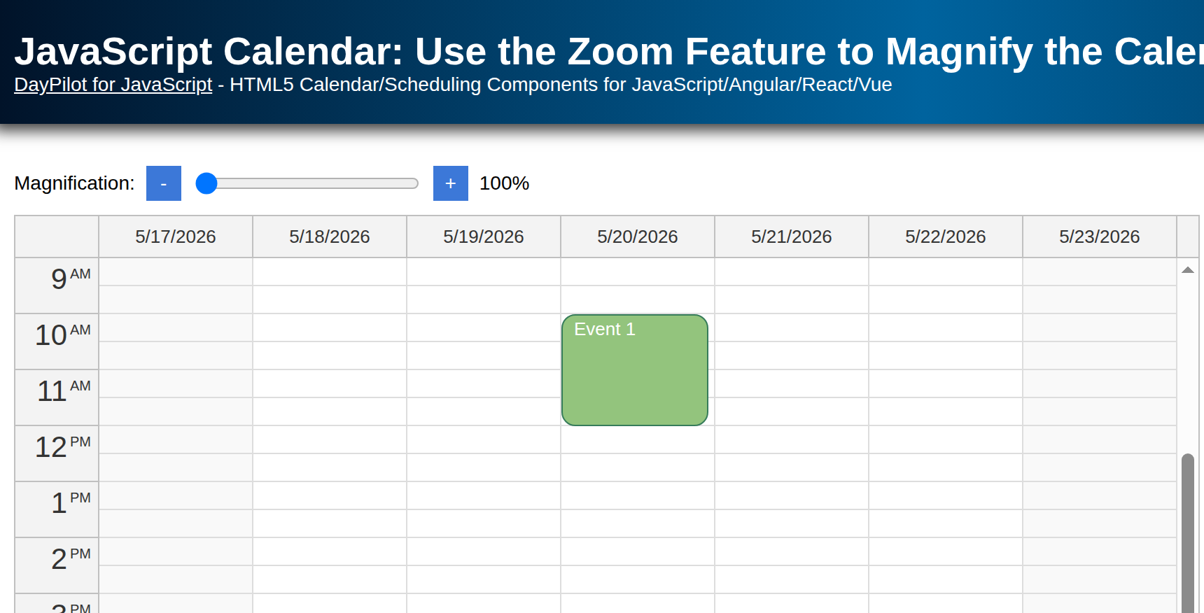
Zoom quickly using a slider (“range” HTML input element).
Add “Zoom In” and “Zoom Out” buttons to zoom incrementally.
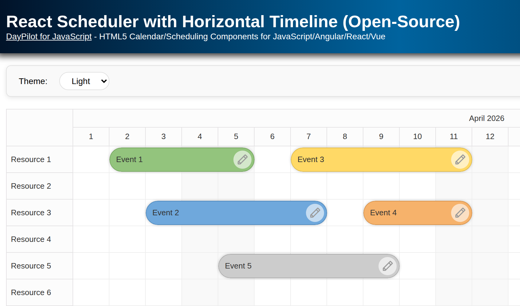
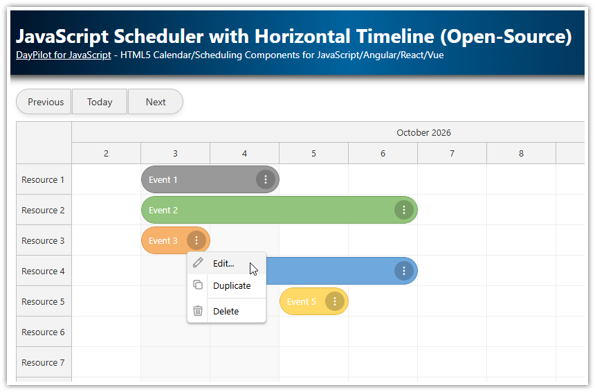
To see an introduction on using the React Scheduler component, please read the React Scheduler with Horizontal Timeline (Open-Source). It explains how to add the Scheduler to your React project and how to configure it to meet your requirements.
To learn how to implement a scheduling calendar with a timeline on the Y axis, please see the React Scheduler with a Vertical Timeline tutorial.
How to configure the timeline in the React Scheduler?

You can configure the timeline displayed by the React Scheduler component using the following properties:
The
scaleproperty sets the Scheduler grid resolution. The Scheduler will use cells with the selected duration. The following values are supported:"Minute","Hour","Day","Week","Month","Year". You can also use"CellDuration"scale and specify the cell duration in minutes using cellDuration property. It is also possible to use a manual timeline mode and define the timeline by specifying individual time cells.The
timeHeadersproperty defines the time groups displayed in the X axis header. There can be multiple rows and it lets you show the time for each of the time columns. The default values are derived from the date/time and you can use your own date/time format defined using theformatproperty. You can also customize the time header cells if needed. That way you get full control over the time header cell content (you can either specify text that will be HTML-escaped automatically or use raw HTML). You can also include additional elements (such as icons, buttons, etc.) using active areas. In React, you can also specify custom content as JSX (see the React Scheduler: Rendering JSX in Time Header and Upper-Left Corner tutorial).The timeline appearance is also affected by the cell size. You can set the cell width in pixels using the
cellWidthproperty.
Example React Scheduler configuration:
import React, { useEffect, useRef, useState } from 'react';
import { DayPilot, DayPilotScheduler } from '@daypilot/daypilot-lite-react';

const Scheduler = () => {
  const [scale, setScale] = useState("Day");
  const [cellWidth, setCellWidth] = useState(40);
  const [timeHeaders, setTimeHeaders] = useState([
    { groupBy: 'Year' },
    { groupBy: 'Month', format: 'MMMM' },
    { groupBy: 'Day', format: 'd' },
  ]);
  const [startDate, setStartDate] = useState(DayPilot.Date.today().firstDayOfYear());
  const [days, setDays] = useState(DayPilot.Date.today().daysInYear());

  return (
    <div>
      <DayPilotScheduler
        scale={scale}
        cellWidth={cellWidth}
        timeHeaders={timeHeaders}
        startDate={startDate}
        days={days}
        // ...
      />
    </div>
  );
};

export default Scheduler;
How to change the date range visible in the React Scheduler?
You can use startDate and days properties to change the visible date range. You need to apply the new values by changing the state variables or using the update() method.
It is also possible to use the infinite scrolling Scheduler mode that will shift the visible date range automatically as you approach the end of the current range.
const clickNextYear = () => {
  const next = startDate.addYears(1);
  setStartDate(next);
  setDays(next.daysInYear());
};
How to change the React Scheduler timeline dynamically?
You can change the Scheduler timeline by adjusting the configuration properties. The Scheduler will display the new timeline after update:
const switchToHourScale = () => {
setScale("Hour");
setCellWidth(40);
setTimeHeaders([
{ groupBy: "Month" },
{ groupBy: "Day", format: "dddd d" },
{ groupBy: "Hour" },
]);
setStartDate(DayPilot.Date.today().firstDayOfWeek());
setDays(7);
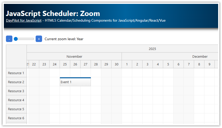
};How to configure zoom levels in the React Scheduler?
The React Scheduler component includes a built-in support for switching between different zoom levels.
It helps with switching the timeline to a new resolution:
You can set the zoom level number in order to switch to the new zoom level.
The Scheduler will apply the zoom level properties and calculate the required values from the current view.
The scrollbar position will be adjusted automatically to keep the current date at the specified anchor position (left, middle, right).
First, you need to define the zoom levels using zoomLevels property:
import React, {useEffect, useRef, useState} from 'react';
import {DayPilot, DayPilotScheduler} from "@daypilot/daypilot-lite-react";

const Scheduler = () => {
  const [events, setEvents] = useState([]);
  const [resources, setResources] = useState([]);

  const config= {
    zoomLevels: [
      {
        name: "Days",
        properties: {
          scale: "Day",
          cellWidth: 40,
          timeHeaders: [{groupBy: "Year"}, {groupBy: "Month", format: "MMMM"}, {groupBy: "Day", format: "d"}],
          startDate: args => args.date.firstDayOfYear(),
          days: args => args.date.daysInYear(),
        }
      },
      {
        name: "Half-Days",
        properties: {
          scale: "CellDuration",
          cellDuration: 720,
          cellWidth: 40,
          timeHeaders: [{groupBy: "Month"}, {groupBy: "Day", format: "ddd d"}, {groupBy: "Cell", format: "tt"}],
          startDate: args => args.date.firstDayOfMonth(),
          days: args => args.date.daysInMonth(),
        }
      },
      {
        name: "Hours",
        properties: {
          scale: "Hour",
          cellWidth: 40,
          timeHeaders: [{groupBy: "Month"}, {groupBy: "Day", format: "dddd d"}, {groupBy: "Hour"}],
          startDate: args => args.date.firstDayOfWeek(),
          days: args => 7,
        }
      },
      {
        name: "15-Minute Cells",
        properties: {
          scale: "CellDuration",
          cellDuration: 15,
          cellWidth: 40,
          timeHeaders: [{groupBy: "Day", format: "dddd MMMM d, yyyy"}, {groupBy: "Hour"}, {groupBy: "Cell"}],
          startDate: args => args.date.getDatePart(),
          days: args => 1,
        }
      },
    ],
  };

  return (
    <div>
      <DayPilotScheduler
        {...config}
        events={events}
        resources={resources}
      />
    </div>
  );
}
export default Scheduler;
The zoom level object has the following structure:
Each zoom level items can contain arbitrary properties at the top level (we use a
nameproperty to specify the zoom level name).The
propertiesproperty specifies the value that will be applied to the Scheduler when switching to this zoom level.
The properties can be either static (e.g. scale: "Hour") or calculated (startDate: args => args.date.firstDayOfWeek()). The calculated properties let you use dynamic values based on the Scheduler state and/or the date at the anchor position (args.date).
How to set the initial zoom level?
You can specify the initial zoom level using the zoom property:
import React, {useEffect, useRef, useState} from 'react';
import {DayPilot, DayPilotScheduler} from "@daypilot/daypilot-lite-react";

const Scheduler = () => {
  const [zoom, setZoom] = useState(0);

  const config = {
    // ...
  };

  return (
    <div>
      <DayPilotScheduler
        {...config}
        zoom={zoom}
      />
    </div>
  );
}
export default Scheduler;
How to set the zoom anchor?
You can specify the zoom anchor (the date/time reference position in the viewport that the will remain the same after switching the timeline to the new zoom level) using the zoomPosition property.
We are not going to change this value dynamically in our React application, so we can add it to the static config object.
import React, {useEffect, useRef, useState} from 'react';
import {DayPilot, DayPilotScheduler} from "@daypilot/daypilot-lite-react";

const Scheduler = () => {
  const config = {
    zoomPosition: "middle",
    // ...
  };

  return (
    <div>
      <DayPilotScheduler
        {...config}
      />
    </div>
  );
}
export default Scheduler;
How to zoom using a slider (“range” HTML input element)?

You can set the zoom level using a range HTML input control:
<input type="range" min="0" max="3" step="1" id="zoom-level" value={zoom} onChange={(ev) => changeZoomLevel(ev.currentTarget.value)} />We need to bind the range element value to the current zoom level (zoom state variable).
Changing the range element fires the onChange event. We will use this event to set the corresponding zoom level:
const changeZoomLevel = (value) => {
  const newZoom = parseInt(value);
  setZoom(newZoom);
};
This is how the range HTML input element can be integrated with the React Scheduler:
import React, {useEffect, useRef, useState} from 'react';
import {DayPilot, DayPilotScheduler} from "@daypilot/daypilot-lite-react";

const Scheduler = () => {
  const [zoom, setZoom] = useState(0);
  const [events, setEvents] = useState([]);
  const [resources, setResources] = useState([]);

  const config= {
    zoomPosition: "middle",
    startDate: "2027-01-01",
    zoomLevels: [
      // ...
    ],
  };

  const changeZoomLevel = (value) => {
    const newZoom = parseInt(value);
    setZoom(newZoom);
  };

  return (
    <div>
      <div className={"space"}>

        <input type="range" min="0" max="3" step="1" id="zoom-level" value={zoom}
               onChange={(ev) => changeZoomLevel(ev.currentTarget.value)} />

      </div>
      <DayPilotScheduler
        {...config}
        zoom={zoom}
        events={events}
        resources={resources}
      />
    </div>
  );
}
export default Scheduler;
How to zoom in?

The “plus” button JSX:
<button id="zoom-in" onClick={ev => timelineZoomIn()}>
  <svg style={{width: "16px", height: "16px"}}>
    <use href={"icons/daypilot.svg#plus-2"}/>
  </svg>
</button>
The timelineZoomIn() method updates the Scheduler zoom level to zoom in:
const timelineZoomIn = () => {
  const max = config.zoomLevels.length - 1;
  const newZoom = Math.min(max, zoom + 1);
  setZoom(newZoom);
};
In addition to changing the zoom value, we also need to check the range boundaries to make sure that the new zoom level does not exceed the maximum available zoom level.
How to zoom out?

The “minus” button JSX:
<button id="zoom-out" onClick={ev => timelineZoomOut()}>
  <svg style={{width: "16px", height: "16px"}}>
    <use href={"icons/daypilot.svg#minus-2"}/>
  </svg>
</button>
The timelineZoomOut() method updates the Scheduler zoom level to zoom out:
const timelineZoomOut = () => {
  const newZoom = Math.max(0, zoom - 1);
  setZoom(newZoom);
};
Full Source Code
Here is the full source code of our React application, which shows a Scheduler component with an adjustable zoom level (using “zoom in” and “zoom out'“ buttons and a slider).
import React, {useEffect, useState} from 'react';
import {DayPilot, DayPilotScheduler} from "@daypilot/daypilot-lite-react";

const Scheduler = () => {
  const [scheduler, setScheduler] = useState(null);
  const [zoom, setZoom] = useState(0);
  const [events, setEvents] = useState([]);
  const [resources, setResources] = useState([]);

  const config= {
    zoomPosition: "middle",
    startDate: new DayPilot.Date("2027-01-01"),
    rowMarginTop: 4,
    rowMarginBottom: 4,
    eventBorderRadius: 25,
    eventPadding: 5,
    zoomLevels: [
      {
        name: "Days",
        properties: {
          scale: "Day",
          cellWidth: 40,
          timeHeaders: [{groupBy: "Year"}, {groupBy: "Month", format: "MMMM"}, {groupBy: "Day", format: "d"}],
          startDate: args => args.date.firstDayOfYear(),
          days: args => args.date.daysInYear(),
        }
      },
      {
        name: "Half-Days",
        properties: {
          scale: "CellDuration",
          cellDuration: 720,
          cellWidth: 40,
          timeHeaders: [{groupBy: "Month"}, {groupBy: "Day", format: "ddd d"}, {groupBy: "Cell", format: "tt"}],
          startDate: args => args.date.firstDayOfMonth(),
          days: args => args.date.daysInMonth(),
        }
      },
      {
        name: "Hours",
        properties: {
          scale: "Hour",
          cellWidth: 40,
          timeHeaders: [{groupBy: "Month"}, {groupBy: "Day", format: "dddd d"}, {groupBy: "Hour"}],
          startDate: args => args.date.firstDayOfWeek(),
          days: args => 7,
        }
      },
      {
        name: "15-Minute Cells",
        properties: {
          scale: "CellDuration",
          cellDuration: 15,
          cellWidth: 40,
          timeHeaders: [{groupBy: "Day", format: "dddd MMMM d, yyyy"}, {groupBy: "Hour"}, {groupBy: "Cell"}],
          startDate: args => args.date.getDatePart(),
          days: args => 1,
        }
      },
    ],
    useEventBoxes: "Never",
    timeRangeSelectedHandling: "Enabled",
    onTimeRangeSelected: async (args) => {
      const scheduler = args.control;
      const modal = await DayPilot.Modal.prompt("Create a new event:", "Event 1");
      scheduler.clearSelection();
      if (modal.canceled) { return; }
      scheduler.events.add({
        start: args.start,
        end: args.end,
        id: DayPilot.guid(),
        resource: args.resource,
        text: modal.result
      });
    },
  };

  const changeZoomLevel = (value) => {
    const newZoom = parseInt(value);
    setZoom(newZoom);
  };

  const timelineZoomOut = () => {
    const newZoom = Math.max(0, zoom - 1);
    setZoom(newZoom);
  };

  const timelineZoomIn = () => {
    const max = config.zoomLevels.length - 1;
    const newZoom = Math.min(max, zoom + 1);
    setZoom(newZoom);
  };

  useEffect(() => {

    setResources([
      {name: "Resource A", id: "A"},
      {name: "Resource B", id: "B"},
      {name: "Resource C", id: "C"},
      {name: "Resource D", id: "D"},
      {name: "Resource E", id: "E"},
      {name: "Resource F", id: "F"},
      {name: "Resource G", id: "G"}
    ]);

    setEvents([
      {
        id: 1,
        text: "Event 1",
        start: "2027-08-02T00:00:00",
        end: "2027-08-05T00:00:00",
        resource: "A"
      },
      {
        id: 2,
        text: "Event 2",
        start: "2027-08-03T00:00:00",
        end: "2027-08-10T00:00:00",
        resource: "C",
        barColor: "#38761d",
        barBackColor: "#93c47d"
      },
      {
        id: 3,
        text: "Event 3",
        start: "2027-08-10T00:00:00",
        end: "2027-08-14T00:00:00",
        resource: "E",
        barColor: "#f1c232",
        barBackColor: "#f1c232"
      },
      {
        id: 4,
        text: "Event 3",
        start: "2027-08-02T00:00:00",
        end: "2027-08-08T00:00:00",
        resource: "E",
        barColor: "#cc0000",
        barBackColor: "#ea9999"
      }
    ]);

    scheduler?.scrollTo("2027-08-01");

  }, [scheduler]);

  return (
    <div>
      <div className={"space"}>
        <button id="zoom-out" onClick={ev => timelineZoomOut()}>
          <svg style={{width: "16px", height: "16px"}}>
            <use href={"icons/daypilot.svg#minus-2"}/>
          </svg>
        </button>

        <input type="range" min="0" max="3" step="1" id="zoom-level" value={zoom}
               onChange={(ev) => changeZoomLevel(ev.currentTarget.value)} />


        <button id="zoom-in" onClick={ev => timelineZoomIn()}>
          <svg style={{width: "16px", height: "16px"}}>
            <use href={"icons/daypilot.svg#plus-2"}/>
          </svg>
        </button>


        <span id="label">Zoom level: {config.zoomLevels[zoom].name}</span>
      </div>
      <DayPilotScheduler
        {...config}
        zoom={zoom}
        events={events}
        resources={resources}
        controlRef={setScheduler}
      />
    </div>
  );
}
export default Scheduler;