 DayPilot
Features
Display JSX components in the upper-left corner of the React Scheduler component
Customize the Scheduler time header using JSX (for example, to highlight weekends)
For an introduction to using the React Scheduler component, please see the React Scheduler Component Tutorial.
License
Licensed for testing and evaluation purposes. Please see the license agreement included in the sample project. You can use the source code of the tutorial if you are a licensed user of DayPilot Pro for JavaScript.
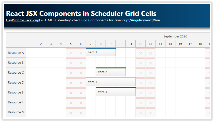
Rendering JSX in the Upper-Left Corner of the Scheduler
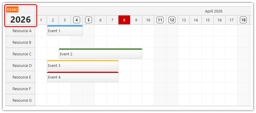
The React Scheduler can render custom JSX in the upper-left corner. You can use it to display the visible year of the current date range, or add action buttons or navigation elements.
Use onBeforeCornerDomAdd event handler to specify the JSX:
const cornerStyle = {
  fontSize: '30px',
  fontWeight: 'bold',
  height: '100%',
  display: 'flex',
  alignItems: 'flex-end',
  justifyContent: 'center',
}

onBeforeCornerDomAdd: (args) => {
  args.element = <div style={cornerStyle}>{args.control.startDate.toString('yyyy')}</div>
},
This event handler will be called whenever the Scheduler component is updated.
React JSX Components in the Time Header
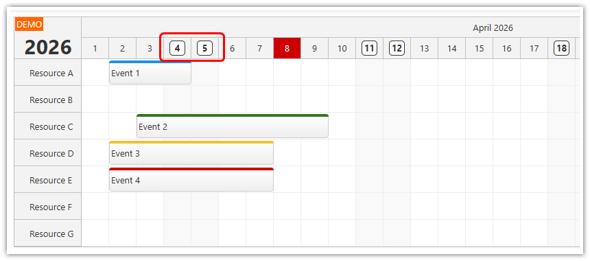
You can replace the default time header cell content with a custom JSX element or component using the onBeforeTimeHeaderDomAdd event handler:
const weekendHeaderStyle = {
  fontWeight: 'bold',
  border: '1px solid #333',
  backgroundColor: 'white',
  padding: '2px',
  width: '17px',
  textAlign: 'center',
  display: 'inline-block',
}

onBeforeTimeHeaderDomAdd: (args) => {
  if (args.header.level !== 1) {
    return
  }

  const dayOfWeek = args.header.start.getDayOfWeek()
  const weekend = dayOfWeek === 6 || dayOfWeek === 0
  if (weekend) {
    args.element = <span style={weekendHeaderStyle}>{args.header.start.toString('d')}</span>
  }
},
This example adds a highlighted date to weekend time header cells.
Changing the Time Header Cell Properties
In addition to inserting a custom JSX component, you can also adjust the time header cell properties using the onBeforeTimeHeaderRender event handler. This event handler lets you customize selected styles (such as background color) and specify the content using HTML. The HTML content would be replaced by the JSX if you set args.element in onBeforeTimeHeaderDomAdd.
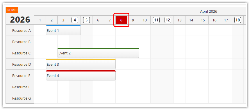
This sample shows the current month and highlights today by setting a custom foreground and background color. In DayPilot, direct comparison of equal DayPilot.Date values is valid, so the date check can stay simple:
const today = DayPilot.Date.today();
const startDate = today.firstDayOfMonth();
const highlightedDate = today;

onBeforeTimeHeaderRender: (args) => {
  if (args.header.level === 1 && args.header.start === highlightedDate) {
    args.header.backColor = '#cc0000';
    args.header.fontColor = '#ffffff';
  }
},
Using Active Areas to Customize the Time Header
The onBeforeTimeHeaderRender event handler can also be used to insert active areas into the time headers. In the Scheduler Time Header Customization tutorial, this method is used to create custom time header units:

Full Source Code
Here is the full source code of the customized React Scheduler component. The current sample project uses the builder-generated React 19/Vite structure, shows the current month, renders the visible year in the upper-left corner, highlights weekend headers using JSX elements, emphasizes today's header cell using onBeforeTimeHeaderRender, and passes Scheduler options as inline React props instead of a separate config object.
import { useState } from 'react';
import { DayPilot, DayPilotScheduler } from 'daypilot-pro-react';

const today = DayPilot.Date.today();
const startDate = today.firstDayOfMonth();
const highlightedDate = today;

const weekendHeaderStyle = {
  fontWeight: 'bold',
  border: '1px solid #333',
  backgroundColor: 'white',
  padding: '2px',
  width: '17px',
  textAlign: 'center',
  display: 'inline-block',
};

const cornerStyle = {
  fontSize: '30px',
  fontWeight: 'bold',
  height: '100%',
  display: 'flex',
  alignItems: 'flex-end',
  justifyContent: 'center',
};

const Scheduler = () => {
  const [resources] = useState(() => [
    { name: 'Resource A', id: 'A' },
    { name: 'Resource B', id: 'B' },
    { name: 'Resource C', id: 'C' },
    { name: 'Resource D', id: 'D' },
    { name: 'Resource E', id: 'E' },
    { name: 'Resource F', id: 'F' },
    { name: 'Resource G', id: 'G' },
  ]);

  const [events] = useState(() => [
    {
      id: 1,
      text: 'Event 1',
      start: startDate.addDays(1),
      end: startDate.addDays(4),
      resource: 'A',
    },
    {
      id: 2,
      text: 'Event 2',
      start: startDate.addDays(2),
      end: startDate.addDays(9),
      resource: 'C',
      barColor: '#38761d',
      barBackColor: '#93c47d',
    },
    {
      id: 3,
      text: 'Event 3',
      start: startDate.addDays(1),
      end: startDate.addDays(7),
      resource: 'D',
      barColor: '#f1c232',
      barBackColor: '#f1c232',
    },
    {
      id: 4,
      text: 'Event 4',
      start: startDate.addDays(1),
      end: startDate.addDays(7),
      resource: 'E',
      barColor: '#cc0000',
      barBackColor: '#ea9999',
    },
  ]);

  return (
    <div>
      <DayPilotScheduler
        timeHeaders={[{ groupBy: 'Month' }, { groupBy: 'Day', format: 'd' }]}
        scale="Day"
        days={startDate.daysInMonth()}
        startDate={startDate}
        timeRangeSelectedHandling="Enabled"
        onTimeRangeSelected={async (args) => {
          const scheduler = args.control;
          const modal = await DayPilot.Modal.prompt('Create a new event:', 'Event 1');
          scheduler.clearSelection();
          if (modal.canceled) {
            return;
          }
          scheduler.events.add({
            start: args.start,
            end: args.end,
            id: DayPilot.guid(),
            resource: args.resource,
            text: modal.result,
          });
        }}
        treeEnabled={true}
        onBeforeTimeHeaderRender={(args) => {
          if (args.header.level === 1 && args.header.start === highlightedDate) {
            args.header.backColor = '#cc0000';
            args.header.fontColor = '#ffffff';
          }
        }}
        onBeforeTimeHeaderDomAdd={(args) => {
          if (args.header.level !== 1) {
            return;
          }

          const dayOfWeek = args.header.start.getDayOfWeek();
          const weekend = dayOfWeek === 6 || dayOfWeek === 0;
          if (weekend) {
            args.element = <span style={weekendHeaderStyle}>{args.header.start.toString('d')}</span>;
          }
        }}
        onBeforeCornerDomAdd={(args) => {
          args.element = <div style={cornerStyle}>{args.control.startDate.toString('yyyy')}</div>;
        }}
        events={events}
        resources={resources}
      />
    </div>
  );
};

export default Scheduler;
History
April 8, 2026: Rebased the sample on the builder-generated React 19/Vite project structure, removed the old CRA-era scaffolding, and updated the demo to show the current month and highlight today.
August 3, 2021: Updated the sample to React 17 and DayPilot Pro 2021.3.
November 22, 2019: Initial release.