 DayPilot
Features
How to display custom JSX in React Scheduler events
Compare the JSX syntax and features with built-in active areas (another options for adding rich content)
Both approaches (JSX and active areas) can be used side-by-side
Uses the open-source DayPilot Lite for JavaScript library
Adding a React JSX Component to Scheduler Events

Let’s start with a simple React Scheduler configuration that displays a couple of rows and events. You can use the code below or you can generate a new React project using the DayPilot UI Builder application.
import React, {useEffect, useState} from "react";
import {DayPilot, DayPilotScheduler} from "@daypilot/daypilot-lite-react";

const Scheduler = () => {
  const [events, setEvents] = useState([]);
  const [resources, setResources] = useState([]);

  useEffect(() => {
    const initialEvents = [
      { id: 1, text: "Event 1", start: "2026-10-02T00:00:00", end: "2026-10-05T00:00:00", resource: "B" },
      // ...
    ];

    const initialResources = [
      { name: "Resource A", id: "A" },
      { name: "Resource B", id: "B" },
      // ...
    ];

    setEvents(initialEvents);
    setResources(initialResources);
  }, []);

  return (
    <div>
      <DayPilotScheduler
        timeHeaders={[{ groupBy: "Month" }, { groupBy: "Day", format: "d" }]}
        scale="Day"
        days={92}
        startDate="2026-10-01"
        events={events}
        resources={resources}
      />
    </div>
  );
};

export default Scheduler;
Normally, you would specify the event content is using the text or html property of the event data object:
const events = [
  {
    id: 1,
    text: "Event 1",
    start: "2026-10-02T00:00:00",
    end: "2026-10-05T00:00:00",
    resource: "B"
  },

  // ...

];
In React, you can use JSX to specify the event content. You can add a JSX element using args.element property in the onBeforeEventDomAdd event handler:
import React, {useEffect, useState} from "react";
import {DayPilot, DayPilotScheduler} from "@daypilot/daypilot-lite-react";
const Scheduler = () => {
const [scheduler, setScheduler] = useState(null);
const [events, setEvents] = useState([]);
const [resources, setResources] = useState([]);
const onBeforeEventDomAdd = (args) => {
args.element = <div>
{args.e.data.text}
<div style={{position: "absolute", right: "5px", top: "9px", width: "17px", height: "17px"}}
onClick={() => scheduler.events.remove(args.e)}><img src={"/icons/icon-delete.svg"} alt={"Delete icon"}/></div>
</div>;
};
useEffect(() => {
// ...
}, []);
return (
<div>
<DayPilotScheduler
controlRef={setScheduler}
...
floatingEvents={false}
onBeforeEventDomAdd={onBeforeEventDomAdd}
events={events}
resources={resources}
/>
</div>
);
};
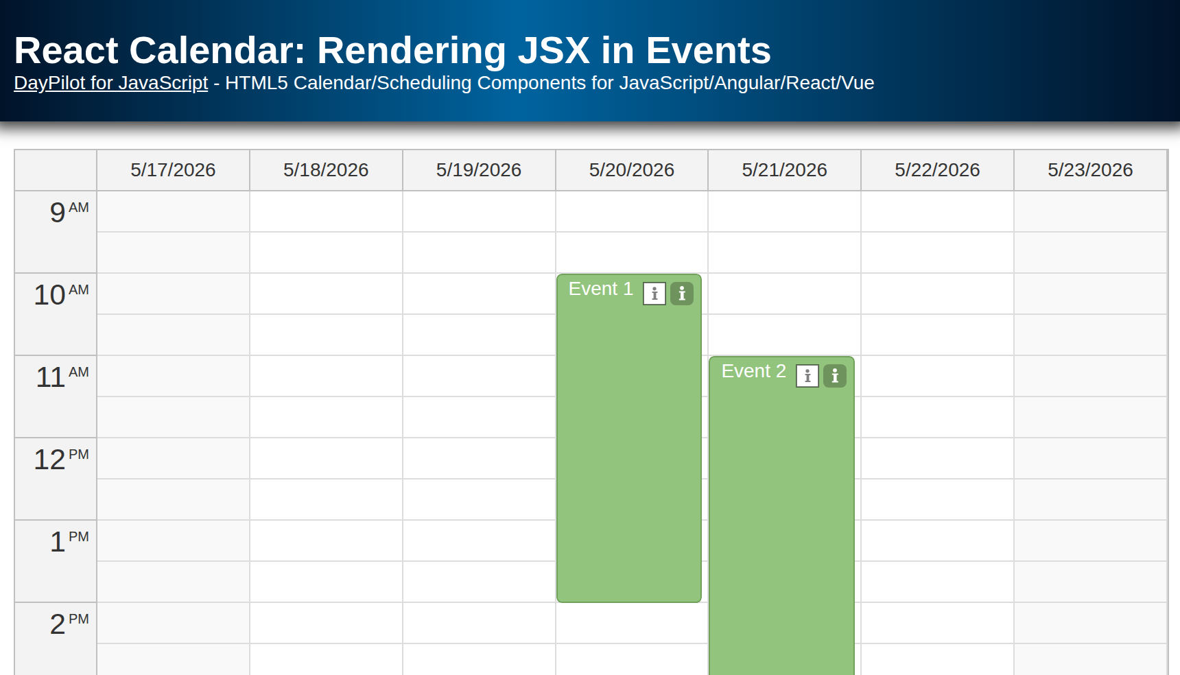
export default Scheduler;The example displays the default events text (args.e.data.text) and adds the icon-delete.svg image at the right side of the event. The onClick event handler deletes the event from the Scheduler.
The Scheduler unmounts the JSX content when the event is removed from DOM.
Using Active Areas to Add Rich Content to Scheduler Events

The Scheduler offers another way to add rich content to the Scheduler events, active areas. This is a programmatic way to add absolutely-positioned <div> elements at the specified location. The active areas can serve as simple styling tools but they will also let you add custom behavior.
In addition to custom event handler (onClick) the active areas can also trigger event moving, event resizing, or display a context menu or a bubble with event details.
Active area offers some advantages over JSX:
The horizontal position can be specified using date/time (start and end properties) - this can be used to display event phases (see also the Warm-Up and Cool-Down Time tutorial).
The areas can be permanently visible (visibility: "Visible"), visible on hover only (visibility: "Hover"), or permanently visible on touch devices but hover-only on desktop (visibility: "TouchVisible").
The areas can act as a drag and drop handle (moving, resizing).
The active area position is automatically adjusted in floating events.
They are supported in client-side image export (see also a related tutorial: JavaScript Scheduler: How to Export HTML to Image).
This example adds an icon with a similar functionality as the JSX element in the previous example:
import React, {useEffect, useState} from "react";
import {DayPilot, DayPilotScheduler} from "@daypilot/daypilot-lite-react";

const Scheduler = () => {
  const [scheduler, setScheduler] = useState(null);
  const [events, setEvents] = useState([]);
  const [resources, setResources] = useState([]);

  const editEvent = async (e) => {
    const form = [{ name: "Text", id: "text" }];
    const modal = await DayPilot.Modal.form(form, e.data);
    if (modal.canceled) return;
    e.data.text = modal.result.text;
    scheduler.events.update(e);
  };

  const onBeforeEventRender = (args) => {
    args.data.areas = [
      {
        right: 30,
        top: 10,
        width: 17,
        height: 17,
        image: "/icons/icon-edit.svg",
        onClick: (args) => {
          editEvent(args.source);
        },
      },
    ];
  };


  useEffect(() => {
    // ...
  }, []);

  return (
    <div>
      <DayPilotScheduler
        controlRef={setScheduler}
        timeHeaders={[{ groupBy: "Month" }, { groupBy: "Day", format: "d" }]}
        scale="Day"
        days={92}
        startDate="2026-10-01"
        onBeforeEventRender={onBeforeEventRender}
        events={events}
        resources={resources}
      />
    </div>
  );
};

export default Scheduler;
Full Source Code
Below is a full source code of the example. It displays the delete icon using both methods (JSX element and active areas) so you can compare the syntax.
Scheduler.js
import React, {useEffect, useState} from "react";
import {DayPilot, DayPilotScheduler} from "@daypilot/daypilot-lite-react";

const Scheduler = () => {
  const [scheduler, setScheduler] = useState(null);
  const [events, setEvents] = useState([]);
  const [resources, setResources] = useState([]);

  const editEvent = async (e) => {
    const form = [{ name: "Text", id: "text" }];
    const modal = await DayPilot.Modal.form(form, e.data);
    if (modal.canceled) return;
    e.data.text = modal.result.text;
    scheduler.events.update(e);
  };

  const onTimeRangeSelected = async (args) => {
    const modal = await DayPilot.Modal.prompt("Create a new event:", "Event 1");
    scheduler.clearSelection();
    if (modal.canceled) return;
    scheduler.events.add({
      start: args.start,
      end: args.end,
      id: DayPilot.guid(),
      resource: args.resource,
      text: modal.result,
    });
  };

  const onBeforeEventRender = (args) => {
    args.data.areas = [
      {
        right: 30,
        top: 10,
        width: 17,
        height: 17,
        image: "/icons/icon-edit.svg",
        onClick: (args) => {
          editEvent(args.source);
        },
      },
    ];
  };

  const onBeforeEventDomAdd = (args) => {
    args.element = <div>
      {args.e.data.text}
      <div style={{position: "absolute", right: "5px", top: "9px", width: "17px", height: "17px"}}
           onClick={() => scheduler.events.remove(args.e)}><img src={"/icons/icon-delete.svg"} alt={"Delete icon"}/></div>
    </div>;
  };

  useEffect(() => {
    const initialEvents = [
      { id: 1, text: "Event 1", start: "2026-10-02T00:00:00", end: "2026-10-05T00:00:00", resource: "B" },
      { id: 2, text: "Event 2", start: "2026-10-06T00:00:00", end: "2026-10-13T00:00:00", resource: "B", barColor: "#38761d", barBackColor: "#93c47d" },
      { id: 3, text: "Event 3", start: "2026-10-02T00:00:00", end: "2026-10-08T00:00:00", resource: "D", barColor: "#f1c232", barBackColor: "#f1c232" },
      { id: 4, text: "Event 3", start: "2026-10-05T00:00:00", end: "2026-10-11T00:00:00", resource: "F", barColor: "#cc0000", barBackColor: "#ea9999" },
    ];

    const initialResources = [
      { name: "Resource A", id: "A" },
      { name: "Resource B", id: "B" },
      { name: "Resource C", id: "C" },
      { name: "Resource D", id: "D" },
      { name: "Resource E", id: "E" },
      { name: "Resource F", id: "F" },
      { name: "Resource G", id: "G" },
    ];

    setEvents(initialEvents);
    setResources(initialResources);
  }, []);

  return (
    <div>
      <DayPilotScheduler
        controlRef={setScheduler}
        timeHeaders={[{ groupBy: "Month" }, { groupBy: "Day", format: "d" }]}
        scale="Day"
        days={92}
        startDate="2026-10-01"
        floatingEvents={false}
        onTimeRangeSelected={onTimeRangeSelected}
        onBeforeEventRender={onBeforeEventRender}
        onBeforeEventDomAdd={onBeforeEventDomAdd}
        events={events}
        resources={resources}
      />
    </div>
  );
};

export default Scheduler;