Overview
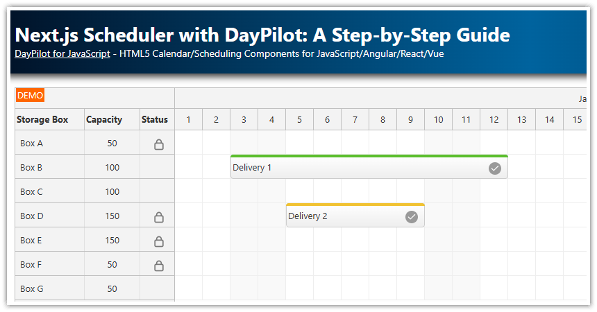
This tutorial provides instructions on using the React Scheduler component in a Next.js application. Key topics include:
Marking the component as client-only, which is essential for server-side rendering scenarios.
Configuring the Scheduler, including setting up time headers, scale, and resource columns.
Defining event handlers to respond to user interactions.
Loading resource (row) and event data within the
useEffect()hook.
Additionally, a sample project demonstrating how to build a scheduling UI using the React Scheduler in a Next.js 14 application is available for download. The project includes a trial version of DayPilot Pro for JavaScript (see License below).
License
Licensed for testing and evaluation purposes. Please see the license agreement included in the sample project. You can use the source code of the tutorial if you are a licensed user of DayPilot Pro for JavaScript. Buy a license.
How to Use a Client-Only React Scheduler in Next.js
The React Scheduler component can be used within Next.js. Since it is a client-side component, the parent component must be marked as client-only. This ensures that the Scheduler is rendered correctly in server-side rendering (SSR) scenarios.
To mark the component as client-only, add this directive at the top of the component source file:
'use client';How to Configure the Scheduler
The React Scheduler configuration will be stored in a state variable called config. The initial value will be an object (initialConfig) that specifies properties that will be used for the initial Scheduler view.
The initial configuration sets some basic properties, such as startDate, days, scale and timeHeaders.
const initialConfig: DayPilot.SchedulerConfig = {
    startDate: '2026-01-01',
    days: 365,
    scale: "Day",
    timeHeaders: [
        {groupBy: 'Month'},
        {groupBy: 'Day', format: 'd'}
    ],
    // ...
};
Now, we can create the config state variable using the useState() function.
const [config, setConfig] = useState(initialConfig);To apply the config properties to the React Scheduler component, we will use the spread syntax:
return (
    <div>
        <DayPilotScheduler
            {...config}
        />
    </div>
);
Using a state variable lets you change the Scheduler configuration on the fly. React will detect any changes and update the Scheduler automatically.
This example changes the visible year:
setConfig({
  ...config,
  startDate: DayPilot.Date.today().firstDayOfYear(),
  days: DayPilot.Date.today().daysInYear()
});
There are also additional methods to specify properties for the Scheduler component:
1. Using a Plain Object: This approach involves defining a static configuration object. The config object contains properties like startDate, days, scale, and timeHeaders. This method makes the Scheduler configuration static.
Example:
const config = {
    startDate: '2026-01-01',
    days: 365,
    scale: "Day",
    timeHeaders: [
        {groupBy: 'Month'},
        {groupBy: 'Day', format: 'd'}
    ],
    // ...
};
2. Inline Properties in <DayPilotScheduler>: Alternatively, you can specify these properties directly as attributes of the <DayPilotScheduler> component. This method offers a more straightforward, inline approach, potentially enhancing readability and making it easier to pass dynamic values.
Example:
return (
    <div>
        <DayPilotScheduler
            startDate={'2026-01-01'}
            days={365}
            scale={"Day"}
            timeHeaders={[
                {groupBy: 'Month'},
                {groupBy: 'Day', format: 'd'}
            ]}
        />
    </div>
);
How to Define React Scheduler Event Handlers in Next.js
Event handlers are special functions in the React Scheduler that enable you to process user actions. For example, the onTimeRangeSelected function is triggered when a user selects a time range using drag and drop:
const onTimeRangeSelected = async (args: DayPilot.SchedulerTimeRangeSelectedArgs) => {
    const modal = await DayPilot.Modal.prompt("Create a new event:", "Event 1");
    scheduler?.clearSelection();
    if (modal.canceled) {
        return;
    }
    scheduler?.events.add({
        start: args.start,
        end: args.end,
        id: DayPilot.guid(),
        text: modal.result,
        resource: args.resource
    });
};
In this function, a modal prompt is displayed to create a new event. If the action is not canceled, a new event is added to the scheduler.
You can link this event handler to the <DayPilotScheduler> component using its attributes:
return (
    <div>
        <DayPilotScheduler
            onTimeRangeSelected={onTimeRangeSelected}
        />
    </div>
)
The event handlers could be defined using the config object (the same way as the Scheduler properties). However, the scope of functions defined inside useEffect() is different and it may not be able to reach the correct value of the scheduler variable (see also below).
Access the Scheduler API in Next.js
To access the DayPilot.Scheduler API, we need to get a reference to the internal DayPilot.Scheduler object.
First, we will create a state variable:
const [scheduler, setScheduler] = useState<DayPilot.Scheduler>();In the React Scheduler tag, use the setScheduler as a callback in the the controlRef attribute.
return (
    <div>
        <DayPilotScheduler
            ...
            controlRef={setScheduler}
        />
    </div>
)
It's also possible to define event handlers using the config object, similar to setting Scheduler properties. However, be aware that the scope of functions defined inside useEffect() might differ, which can affect accessing the correct value of the scheduler variable.
Please note that the callback assigned via controlRef is invoked when the component mounts. Initially, this reference may be undefined, so it's essential to ensure that it has been set before using it. One way to handle this is by utilizing the useEffect() hook with [scheduler] as a dependency. This ensures that your code reacts to the scheduler being set up. We will explore this technique in the following chapter.
How to Load Event Data into the Scheduler in Next.js
There are two ways to load resources and events into the Scheduler:
1. Using the config object: React/Next.js automatically detects any changes to the config object, updating the Scheduler accordingly. To update the config object, you can use the setConfig() function. Utilize the spread syntax to maintain current values and add new properties at the end.
Example of setting the events property in config:
setConfig({
  ...config,
  events: [ ... ]
});
2. Using the direct API: If you have a reference to the DayPilot.Scheduler object (stored in the scheduler state property, as discussed in the previous chapter), you can use its methods for updating the Scheduler.
The update() method allows for loading resources and events data. This method is particularly beneficial for partial updates, like updating events as you change the visible date range. It's more efficient than reloading the entire dataset.
Example of updating Scheduler data using update():
useEffect(() => {
    if (!scheduler || scheduler?.disposed()) {
        return;
    }

    const resources = [
        {name: 'Room A', id: 'A'},
        {name: 'Room B', id: 'B'},
        {name: 'Room C', id: 'C'},
    ];
    const events = [
        {
            id: 1,
            text: 'Event 1',
            start: '2024-01-09T00:00:00',
            end: '2024-01-19T00:00:00',
            resource: 'A',
            bubbleHtml: 'Event 1<br>Room A'
        },
        {id: 2, text: 'Event 2', start: '2026-01-10T00:00:00', end: '2026-01-15T00:00:00', resource: 'B'},
    ];
    scheduler.update({resources, events});
}, [scheduler]);
The direct API is not only efficient for partial updates but also necessary for dynamic changes, such as displaying messages using the built-in message bar or clearing the current date range selection.
Full Source Code
Here is the full source code of our Scheduler component in a Next.js application:
'use client';

import React, {useEffect, useState} from "react";
import {DayPilot, DayPilotScheduler} from "daypilot-pro-react";

export default function Scheduler() {

    const [scheduler, setScheduler] = useState<DayPilot.Scheduler>();

    const initialConfig: DayPilot.SchedulerConfig = {
        startDate: '2026-01-01',
        days: 365,
        scale: "Day",
        timeHeaders: [
            {groupBy: 'Month'},
            {groupBy: 'Day', format: 'd'}
        ],
        rowHeaderColumns: [
            {text: 'Storage Box', width: 100},
            {text: 'Capacity', display: "capacity"},
            {text: 'Status', width: 50},
        ],
    };

    const [config, setConfig] = useState(initialConfig);

    useEffect(() => {
        if (!scheduler || scheduler?.disposed()) {
            return;
        }

        const resources = [
            {name: 'Box A', id: 'A', capacity: 50, status: "locked"},
            {name: 'Box B', id: 'B', capacity: 100},
            {name: 'Box C', id: 'C', capacity: 100},
            {name: 'Box D', id: 'D', capacity: 150, status: "locked"},
            {name: 'Box E', id: 'E', capacity: 150, status: "locked"},
            {name: 'Box F', id: 'F', capacity: 50, status: "locked"},
            {name: 'Box G', id: 'G', capacity: 50},
        ];
        const events = [
            {
                id: 1,
                text: 'Delivery 1',
                start: '2026-01-03T00:00:00',
                end: '2026-01-13T00:00:00',
                resource: 'B',
                barColor: "#5bbe2d"
            },
            {
                id: 2,
                text: 'Delivery 2',
                start: '2026-01-05T00:00:00',
                end: '2026-01-10T00:00:00',
                resource: 'D',
                barColor: "#f1c232"
            },
        ];
        scheduler.update({resources, events});
    }, [scheduler]);

    const onTimeRangeSelected = async (args: DayPilot.SchedulerTimeRangeSelectedArgs) => {
        const modal = await DayPilot.Modal.prompt("Create a new event:", "Event 1");
        scheduler?.clearSelection();
        if (modal.canceled) {
            return;
        }
        scheduler?.events.add({
            start: args.start,
            end: args.end,
            id: DayPilot.guid(),
            text: modal.result,
            resource: args.resource
        });
    };

    const onBeforeEventRender = (args: DayPilot.SchedulerBeforeEventRenderArgs) => {
        args.data.areas = [
            {right: 10, top: "calc(50% - 7px)", width: 18, height: 18, symbol: "/icons/daypilot.svg#checkmark-2", backColor: "#999999", fontColor: "#ffffff", padding: 2, style: "border-radius: 50%" }
        ];
    };

    const onBeforeRowHeaderRender = (args: DayPilot.SchedulerBeforeRowHeaderRenderArgs) => {
        args.row.columns[1].horizontalAlignment = "center";
        if (args.row.data.status === "locked") {
            args.row.columns[2].areas = [
                {left: "calc(50% - 8px)", top: 10, width: 20, height: 20, symbol: "/icons/daypilot.svg#padlock", fontColor: "#777777"}
            ];
        }
    };

    return (
        <div>
            <DayPilotScheduler
                {...config}
                onTimeRangeSelected={onTimeRangeSelected}
                onBeforeEventRender={onBeforeEventRender}
                onBeforeRowHeaderRender={onBeforeRowHeaderRender}
                controlRef={setScheduler}
            />
        </div>
    )
} DayPilot