 DayPilot
")
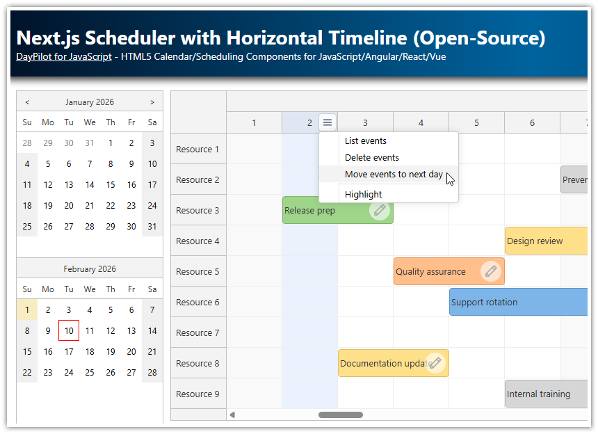
Overview
-
Horizontal timeline with support for hour, day, week, month, and year views
-
The React Scheduler component supports drag-and-drop event creation, resizing, and editing
-
Customizable time headers, cell duration, and timeline length
-
Support for thousands of rows and events with smooth, progressive rendering
-
Built-in modal dialogs for editing event details
-
Flexible event styling: colors, icons, tooltips, and custom CSS
-
Dynamic theme switching with built-in light/dark themes and custom theme support
-
API integration for loading resources and events asynchronously
-
Fully open-source with no external dependencies or license fees
License
Apache License 2.0
Installation
Start by installing the DayPilot Lite for React package:
npm install @daypilot/daypilot-lite-react
Once installed, you can use the <DayPilotScheduler> component to add the Scheduler to your React application:
import { DayPilotScheduler } from "@daypilot/daypilot-lite-react";

const ReactScheduler = () => {
  return (
    <div>
      <DayPilotScheduler />
    </div>
  );
};

export default ReactScheduler;
Generate a New React Scheduler Project with the Online Configurator

The Scheduler includes a rich API that lets you fully customize its appearance and behavior, including drag-and-drop support, time headers, and timeline units.
For a quick start, you can use the UI Builder online tool:
-
Set the most common properties using a visual interface.
-
Preview your changes instantly using a live Scheduler component.
-
View and copy the generated configuration object.
-
Download a ready-to-run React or Next.js project with the selected settings and all necessary boilerplate.
Here is the React Scheduler component with a basic configuration:
import { DayPilotScheduler } from "@daypilot/daypilot-lite-react";

const ReactScheduler = () => {
  const config = {
    timeHeaders: [
      { groupBy: "Month" },
      { groupBy: "Day", format: "d" }
    ],
    scale: "Day",
    days: DayPilot.Date.today().daysInMonth(),
    startDate: DayPilot.Date.today().firstDayOfMonth(),
  };

  return (
    <div>
      <DayPilotScheduler {...config} />
    </div>
  );
};

export default ReactScheduler;
The UI Builder outputs the configuration as a single object, which you can apply using spread syntax ({...config}).
This is functionally equivalent to writing the properties inline:
import { DayPilotScheduler } from "@daypilot/daypilot-lite-react";

const ReactScheduler = () => {

  return (
    <div>
      <DayPilotScheduler
        timeHeaders={[ { groupBy: "Month" }, { groupBy: "Day", format: "d" } ]}
        scale={"Day"}
        days={DayPilot.Date.today().daysInMonth()}
        startDate={DayPilot.Date.today().firstDayOfMonth()}
      />
    </div>
  );
}
export default ReactScheduler;
Customize the Scheduler Appearance: CSS Themes
You can style the React Scheduler component by applying a CSS theme. A few sample themes are included in the download package.
You can also design a custom theme using the Theme Designer, an online tool with a live preview:
-
Customize properties like background color, text color, font family and size, border radius, and border color.
-
Preview the changes in real time.
-
Download the generated CSS file and include it in your project.
This tutorial includes two themes created with the Theme Designer: Light and Dark. You can switch between them dynamically using a dropdown selector.
Light Theme:

Dark Theme:

Progressive Rendering: Ready for Big Data Sets
The React Scheduler is optimized to handle a large number of rows and events efficiently. It uses progressive rendering to keep the UI responsive and smooth, even with big data sets.
Key performance features:
-
Only the elements currently visible in the viewport are rendered.
-
Rows and events are rendered incrementally as the user scrolls.
-
A small delay is used to debounce rendering during scroll and resize operations.
These rendering delays are fully configurable. You can even set them to 0 to make rendering synchronous and disable debouncing. However, synchronous rendering may reduce performance on low-resource devices or when displaying large datasets.
Timeline Configuration

The timeline is the core of the Scheduler. You can fully control its range, granularity, and visual layout using a few key properties:
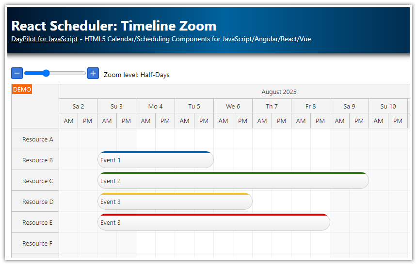
1. Set the Time Scale
The scale property defines the basic time unit of the timeline (e.g., hour, day, week):
<DayPilotScheduler
  scale={"Day"}
/>
Common values:
-
"Hour"– 1 cell = 1 hour -
"Day"– 1 cell = 1 day -
"Week"– 1 cell = 1 week
You can also use fine-grained units with cellDuration, e.g., 15 (for 15-minute slots), when scale is "Cell".
2. Define Time Headers
You can define multiple levels of headers using the timeHeaders array. This improves readability by showing both coarse and fine time units.
<DayPilotScheduler
  scale={"Day"}
  timeHeaders={[
    { groupBy: "Month" },
    { groupBy: "Day" }
  ]}
/>
You can use the format property to customize the display (e.g., "dddd" for full day names, "d" for numeric day). The format follows the rules described in the DayPilot.Date.toString() documentation.
3. Set the Timeline Start
The timeline's starting point is controlled by the startDate property. To allow dynamic updates, store it in state:
const [startDate, setStartDate] = useState(DayPilot.Date.today().firstDayOfMonth());

<DayPilotScheduler startDate={startDate} />
You can adjust the timeline programmatically by calling setStartDate(). This is useful for implementing custom navigation buttons.
4. Define the Timeline Length
The days property determines how many cells to display (typically aligned with the selected scale):
const [days, setDays] = useState(DayPilot.Date.today().daysInMonth());

<DayPilotScheduler days={days} />
For example:
-
To show one month:
days = 30(withscale: "Day") -
To show one work week:
days = 5(starting on Monday)
5. Set the Cell Width
The cellWidth property controls how wide each time cell is (in pixels). This directly affects horizontal scroll and layout density:
<DayPilotScheduler cellWidth={50} />-
Typical values: 30 - 100 pixels
-
For
"Hour"or"Cell"scales, smaller widths keep the timeline compact
Example: Full Timeline Setup
This renders a daily timeline for the current month, with 60px-wide cells and month/day headers.
const [startDate, setStartDate] = useState(DayPilot.Date.today().firstDayOfMonth());
const [days, setDays] = useState(DayPilot.Date.today().daysInMonth());

<DayPilotScheduler
  scale="Day"
  startDate={startDate}
  days={days}
  cellWidth={60}
  timeHeaders={[
    { groupBy: "Month" },
    { groupBy: "Day", format: "d" }
  ]}
/>
Scroll to the Current Month in the Year View
A year-wide timeline is easier to scan if the initial horizontal scroll position jumps directly to the current month.
First, capture a reference to the DayPilot.Scheduler instance:
const [scheduler, setScheduler] = useState(null);

<DayPilotScheduler controlRef={setScheduler} />
Then call scrollTo() when the control becomes available:
useEffect(() => {
  if (!scheduler) {
    return;
  }

  scheduler.scrollTo(DayPilot.Date.today().firstDayOfMonth());
}, [scheduler]);
This keeps the visible area focused on the current month while the full year remains available through horizontal scrolling.
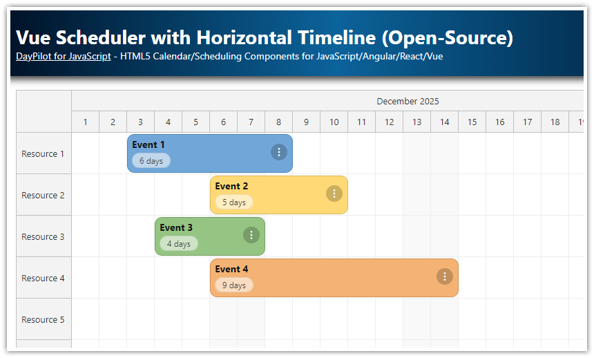
Load Rows (Resources)

In the Scheduler, each row represents a resource, such as a person, room, machine, or any item you want to schedule.
To define and display these rows, use the resources prop of the <DayPilotScheduler> component.
Basic Setup
Use React state to hold the resource list, and populate it in a useEffect() hook:
const [resources, setResources] = useState([]);

useEffect(() => {
  const resources = [
    { name: "Resource 1", id: "R1" },
    { name: "Resource 2", id: "R2" },
    { name: "Resource 3", id: "R3" },
    { name: "Resource 4", id: "R4" },
    { name: "Resource 5", id: "R5" },
    { name: "Resource 6", id: "R6" },
    { name: "Resource 7", id: "R7" },
  ];
  setResources(resources);
}, []);
Pass the resources to the Scheduler:
<DayPilotScheduler resources={resources} />Resource Object Format
Each resource should be an object with at least these two properties:
{
  id: "R1",        // Unique resource identifier (string or number)
  name: "Room A"   // Text displayed in the row header
}
You can include additional fields to support features like styling, tooltips, or custom context menus.
Loading from an API
You can also fetch resource data from a server or REST API:
useEffect(() => {
  const loadResources = async () => {
    const response = await DayPilot.Http.get("/api/resources");
    setResources(response.data);
  };

  loadResources();
}, []);
Load Events
To display scheduled items on the timeline, you need to provide them via the events prop of the <DayPilotScheduler> component.
1. Define Event State
First, define a React state variable to hold your event data:
const [events, setEvents] = useState([]);2. Load Events (Static Example)
You can load events directly in a useEffect() hook, or fetch them from a backend:
useEffect(() => {
  const events = [
    {
      id: 1,
      text: "Event 1",
      start: "2026-06-01T00:00:00",
      end: "2026-06-05T00:00:00",
      resource: "R2",
      barColor: "#38761d",
      barBackColor: "#93c47d"
    }
  ];
  setEvents(events);
}, []);
3. Bind Events to the Scheduler
Pass the loaded events to the Scheduler via the events prop:
<DayPilotScheduler events={events} />4. Event Data Format
Each event should include:
{
  id: "unique-id",       // required
  text: "Event title",   // required
  start: "2026-06-01T00:00:00",  // required (ISO 8601)
  end: "2026-06-05T00:00:00",    // required
  resource: "R1",         // required: matches row ID
  backColor: "#38761d",    // optional: background color
}
Use ISO 8601 format (YYYY-MM-DDTHH:mm:ss) for the date/time values.
For more about the item structure, see DayPilot.Event.data in the API docs.
5. Understanding Start and End Times
The start and end values define the exact time bounds of the event. For example, this event:
{
  start: "2026-06-01T00:00:00",
  end: "2026-06-06T00:00:00"
}
...will span five full days, because the end value is exclusive. This means it ends at the start of June 6 (00:00:00), not during that day.
6. Adjusting End Time Interpretation (Optional)
When using scale: "Day", you may want to treat the end date as inclusive so that an event ending on "2026-06-05" visually includes that full day.
To support this, use the eventEndSpec property:
<DayPilotScheduler eventEndSpec="Date" />
This setting tells the Scheduler to treat dates without a time portion (e.g., "2026-06-05") as the end of the day, not the beginning.
7. Loading Events from an API (Optional)
You can also load events from a backend using DayPilot.Http.get():
useEffect(() => {
  const loadEvents = async () => {
    const response = await DayPilot.Http.get("/api/events");
    setEvents(response.data);
  };

  loadEvents();
}, []);
Create New Events by Selecting a Time Range

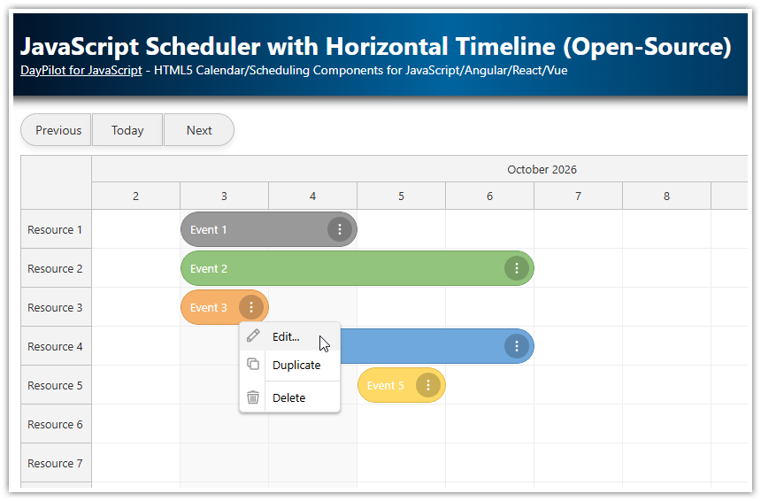
The Scheduler makes it easy to create new events by selecting a time range. This feature is enabled by default. All you need to do is handle the onTimeRangeSelected event.
This sample opens a modal form, pre-fills the selected dates and target row, and adds the new event directly using the Scheduler API:
  const onTimeRangeSelected = async (args) => {
    const data = {
      start: args.start,
      end: args.end,
      resource: args.resource,
      id: DayPilot.guid(),
      text: "Event"
    };

    const modal = await DayPilot.Modal.form(eventEditForm, data);

    scheduler.clearSelection();

    if (modal.canceled) {
      return;
    }

    scheduler.events.add(modal.result);
  };
The same eventEditForm definition is reused for both event creation and editing, which keeps the sample compact while still letting users choose the event text, resource, and color.
Custom Event Color and “Edit” Icon

You can customize the appearance and behavior of individual events using the onBeforeEventRender callback. This function is called just before each event is rendered, giving you full control over its style and interactive elements.
Example: Add a Custom Border and an Edit Icon
  const onBeforeEventRender = (args) => {
    if (!args.data.backColor) {
      args.data.backColor = "#93c47d";
      args.data.fontColor = "#ffffff";
    }

    args.data.borderColor = "darker";
    args.data.areas = [
      {
        right: 5,
        top: "calc(50% - 15px)",
        width: 30,
        height: 30,
        symbol: "/icons/daypilot.svg#edit",
        borderRadius: "50%",
        backColor: "#ffffff99",
        fontColor: "#999999",
        padding: 5,
        onClick: async (args) => {
          await editEvent(args.source);
        }
      }
    ];
  };
The areas array defines active areas within the event box. In this case:
-
right: 5places the icon 5px from the right edge -
top: calc(50% - 15px)centers it vertically -
The SVG edit icon is clickable and calls
editEvent()when clicked
Attach the Callback to the Scheduler
Pass the function via the onBeforeEventRender prop:
<DayPilotScheduler onBeforeEventRender={onBeforeEventRender} />
The editEvent() Handler
You can define your own modal dialog, or use the built-in DayPilot Modal:
  const eventEditForm = [
    { name: "Text", id: "text" },
    { name: "Start", id: "start", type: "datetime", disabled: true },
    { name: "End", id: "end", type: "datetime", disabled: true },
    { name: "Resource", id: "resource", type: "select", options: resources },
    { name: "Color", id: "backColor", type: "select", options: colors }
  ];

  const editEvent = async (e) => {
    const modal = await DayPilot.Modal.form(eventEditForm, e.data);
    if (modal.canceled) {
      return;
    }

    scheduler.events.update(modal.result);
  };
This lets users edit event details such as text, resource, or color directly from the timeline.
Additional Styling Options
Inside onBeforeEventRender, you can also customize:
-
borderColor,fontColor -
cssClassfor advanced styling via CSS -
htmlfor fully custom event content -
toolTipto show more details on hover
Example with Full Styling
args.data.barColor = "#38761d";
args.data.fontColor = "#ffffff";
args.data.cssClass = "event-high-priority";
args.data.toolTip = "Click the pencil icon to edit this event.";
You can define the CSS class in your stylesheet:
.event-high-priority {
  font-weight: bold;
  background: linear-gradient(to right, #38761d, #6aa84f);
}
Full Source Code
Here is the full source code of the React Scheduler with a horizontal timeline:
import { useEffect, useState } from 'react';
import { DayPilot, DayPilotScheduler } from "@daypilot/daypilot-lite-react";
import "../assets/themes/dark.css";
import "../assets/themes/light.css";
import "../assets/toolbar.css";

const themes = [
  { name: "light", text: "Light" },
  { name: "dark", text: "Dark" }
];

const colors = [
  { name: "(default)", id: null },
  { name: "Blue", id: "#6fa8dc" },
  { name: "Green", id: "#93c47d" },
  { name: "Yellow", id: "#ffd966" },
  { name: "Red", id: "#f6b26b" }
];

const ReactScheduler = () => {
  const [scheduler, setScheduler] = useState(null);
  const [events, setEvents] = useState([]);
  const [resources, setResources] = useState([]);
  const [startDate] = useState(DayPilot.Date.today().firstDayOfYear());
  const [days] = useState(DayPilot.Date.today().daysInYear());
  const [theme, setTheme] = useState("light");

  const eventEditForm = [
    { name: "Text", id: "text" },
    { name: "Start", id: "start", type: "datetime", disabled: true },
    { name: "End", id: "end", type: "datetime", disabled: true },
    { name: "Resource", id: "resource", type: "select", options: resources },
    { name: "Color", id: "backColor", type: "select", options: colors }
  ];

  const editEvent = async (e) => {
    const modal = await DayPilot.Modal.form(eventEditForm, e.data);
    if (modal.canceled) {
      return;
    }

    scheduler.events.update(modal.result);
  };

  const onTimeRangeSelected = async (args) => {
    const data = {
      start: args.start,
      end: args.end,
      resource: args.resource,
      id: DayPilot.guid(),
      text: "Event"
    };

    const modal = await DayPilot.Modal.form(eventEditForm, data);

    scheduler.clearSelection();

    if (modal.canceled) {
      return;
    }

    scheduler.events.add(modal.result);
  };

  const onBeforeEventRender = (args) => {
    if (!args.data.backColor) {
      args.data.backColor = "#93c47d";
      args.data.fontColor = "#ffffff";
    }

    args.data.borderColor = "darker";
    args.data.areas = [
      {
        right: 5,
        top: "calc(50% - 15px)",
        width: 30,
        height: 30,
        symbol: "/icons/daypilot.svg#edit",
        borderRadius: "50%",
        backColor: "#ffffff99",
        fontColor: "#999999",
        padding: 5,
        onClick: async (args) => {
          await editEvent(args.source);
        }
      }
    ];
  };

  useEffect(() => {
    const loadResources = async () => {
      const resources = [
        { name: "Resource 1", id: "R1" },
        { name: "Resource 2", id: "R2" },
        { name: "Resource 3", id: "R3" },
        { name: "Resource 4", id: "R4" },
        { name: "Resource 5", id: "R5" },
        { name: "Resource 6", id: "R6" },
        { name: "Resource 7", id: "R7" },
        { name: "Resource 8", id: "R8" },
        { name: "Resource 9", id: "R9" }
      ];
      setResources(resources);
    };

    loadResources();
  }, []);

  useEffect(() => {
    const firstDayOfMonth = DayPilot.Date.today().firstDayOfMonth();

    const loadEvents = async () => {
      const events = [
        {
          id: 1,
          text: "Event 1",
          start: firstDayOfMonth.addDays(1),
          end: firstDayOfMonth.addDays(5),
          resource: "R1",
          backColor: "#93c47d"
        },
        {
          id: 2,
          text: "Event 2",
          start: firstDayOfMonth.addDays(2),
          end: firstDayOfMonth.addDays(7),
          resource: "R3",
          backColor: "#6fa8dc"
        },
        {
          id: 3,
          text: "Event 3",
          start: firstDayOfMonth.addDays(6),
          end: firstDayOfMonth.addDays(11),
          resource: "R1",
          backColor: "#ffd966"
        },
        {
          id: 4,
          text: "Event 4",
          start: firstDayOfMonth.addDays(8),
          end: firstDayOfMonth.addDays(11),
          resource: "R3",
          backColor: "#f6b26b"
        },
        {
          id: 5,
          text: "Event 5",
          start: firstDayOfMonth.addDays(4),
          end: firstDayOfMonth.addDays(9),
          resource: "R5",
          backColor: "#cccccc"
        }
      ];
      setEvents(events);
    };

    loadEvents();
  }, []);

  useEffect(() => {
    if (!scheduler) {
      return;
    }

    scheduler.scrollTo(DayPilot.Date.today().firstDayOfMonth());
  }, [scheduler]);

  return (
    <div>
      <div className="toolbar">
        <label htmlFor="theme">Theme:</label>
        <select
          id="theme"
          value={theme}
          onChange={(e) => {
            setTheme(e.target.value);
          }}
        >
          {themes.map((t) => (
            <option key={t.name} value={t.name}>
              {t.text}
            </option>
          ))}
        </select>
      </div>

      <DayPilotScheduler
        scale={"Day"}
        timeHeaders={[
          { groupBy: "Month" },
          { groupBy: "Day", format: "d" }
        ]}
        startDate={startDate}
        days={days}
        cellWidth={60}
        rowHeaderWidth={110}
        rowMarginTop={2}
        rowMarginBottom={2}
        eventHeight={40}
        events={events}
        resources={resources}
        onBeforeEventRender={onBeforeEventRender}
        onTimeRangeSelected={onTimeRangeSelected}
        controlRef={setScheduler}
        theme={theme}
      />
    </div>
  );
};

export default ReactScheduler;