DayPilot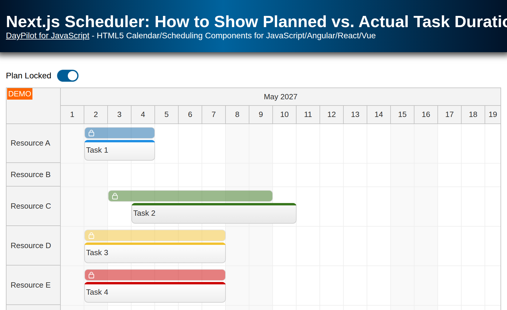
| Demo | |
|---|---|
| Downloads | |
| Languages | TypeScript |
| Technologies | React |
Overview
-
Dual Task Versions: Display both a planned and an actual version of each task on a single timeline.
-
Locked Planning View: Lock the planned tasks once finalized, preventing unintended changes and preserving a clear baseline.
-
Real-Time Comparison: Easily track deviations from the original plan by comparing task durations side by side.
-
Simple Mode Switching: Use a toggle switch to move between “planning” and “tracking” modes.
-
User-Friendly UI: Built with DayPilot React Scheduler component which lets you create an interactive timeline with drag-and-drop scheduling.
-
The Next.js project includes a trial version of DayPilot Pro for JavaScript (see License below).
License
Licensed for testing and evaluation purposes. Please see the license agreement included in the sample project. You can use the source code of the tutorial if you are a licensed user of DayPilot Pro for JavaScript. Buy a license.
Planning View: Next.js Scheduler with a Timeline for Multiple Resources
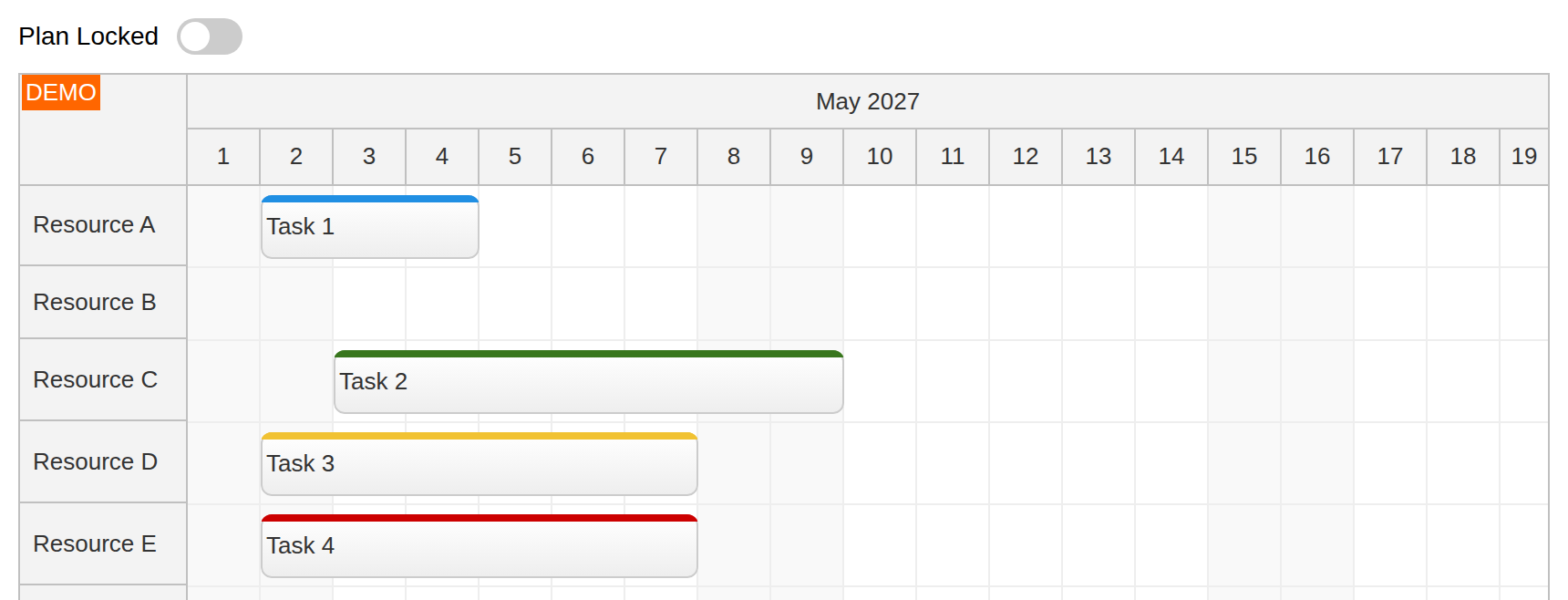
The planning view uses the React Scheduler UI component to define the task baseline (including the assigned resource, start, and duration).
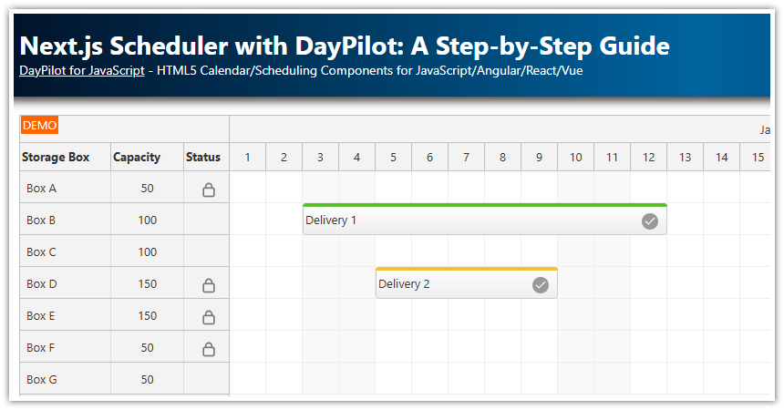
For an introduction to using the React Scheduler in Next.js, please see Next.js Scheduler with DayPilot: A Step-by-Step Guide. It explains how to install and configure the React Scheduler component in a Next.js application. In this tutorial, we will focus on configuring the Scheduler to display different versions of tasks side by side.
In the planning view, we will display the planned tasks in an edit mode that allows modification using drag and drop.
The planned tasks are initialized from a static array stored in the planned state variable. The sample displays May 2027:
const [planned, setPlanned] = useState<DayPilot.EventData[]>(() => [
    {
      id: 1,
      text: "Task 1",
      start: "2027-05-02T00:00:00",
      end: "2027-05-05T00:00:00",
      resource: "A",
    },
    // ...
]);
In the planning view, the <DayPilotScheduler> tag loads the task baseline directly from the planned state variable using the events prop:
<DayPilotScheduler
  ...
  events={planned}
  ...
/>
Tracking View: Use Event Versions to Display Planned Tasks
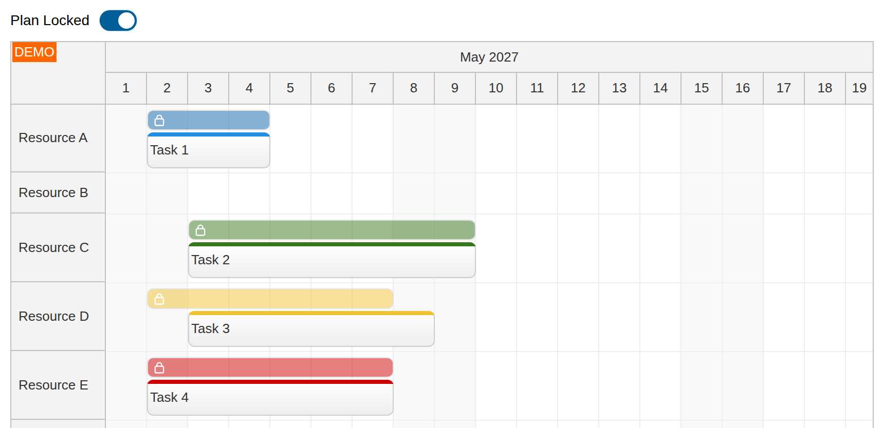
After switching to the tracking view which locks the plan, the Scheduler displays planned tasks as dedicated read-only bars with a lock icon. The actual task execution is displayed using the standard event boxes that allow drag-and-drop updates.
The tracking view can be activated by toggling the “Plan Locked” switch:
<ToggleSwitch label="Plan Locked" value={locked} onChange={setLocked} />When the tracking view is active, we use an array with the actual task details as the data source. We will extend the data source with information about the planned tasks. Each planned task will be displayed as a read-only version above the main event.
1. Enable Event Versions
The event versions need to be enabled in the Scheduler component using the eventVersionsEnabled property.
<DayPilotScheduler
  ...
  eventVersionsEnabled={true}
  ...
/>
2. Adjust the Version Size and Position
Now we can tune the version appearance: We will display the planned version above the main task (eventVersionPosition={"Above"}) and set the height to 20 pixels (eventVersionHeight={20}):
<DayPilotScheduler
  ...
  eventVersionsEnabled={true}
  eventVersionHeight={20}
  eventVersionPosition={"Above"}
  ...
/>
3. Define Event Versions
A version can be defined using the versions property of an event data object. It’s an array that allows defining multiple versions for each event. Our app defines just a single version. This event record uses literal dates to show the structure: the outer start and end describe the actual task, and the dates inside versions describe its planned baseline. Both initially run from May 2 to May 5, 2027:
const [actual, setActual] = useState<DayPilot.EventData[]>(() => [
    {
      id: 1,
      text: "Task 1",
      start: "2027-05-02T00:00:00",
      end: "2027-05-05T00:00:00",
      resource: "A",
      versions: [
        {
          start: "2027-05-02T00:00:00",
          end: "2027-05-05T00:00:00",
        }
      ],
    },
    // ...
]);
The only required properties of an event version are start and end. Versions are read-only and they are always displayed in the same row as the main event.
4. Load Event Versions
The versions can be sent from the server side as part of the event data. That would be the most common scenario.
In our example, we define two standalone data sets:
-
planned tasks (
planned) -
actual tasks (
actual)
When locking the plan using the switch, we map the actual data set to display objects and add the corresponding task from the planned data set as a version. Matching by ID keeps each actual task paired with its baseline. The mapping creates new objects so it does not mutate either state array. Here are both state arrays and the mapping in their component context. In tracking mode, trackingProps supplies the combined events; spreading it after events={planned} overrides the planning data. In planning mode it is empty, so the Scheduler continues to display planned:
const Scheduler = () => {
  const [locked, setLocked] = useState(false);
  const [planned, setPlanned] = useState<DayPilot.EventData[]>(() => [
      {
        id: 1,
        text: "Task 1",
        start: "2027-05-02T00:00:00",
        end: "2027-05-05T00:00:00",
        resource: "A",
      },
      // ...
  ]);

  const [actual, setActual] = useState<DayPilot.EventData[]>(() => [
      {
        id: 1,
        text: "Task 1",
        start: "2027-05-02T00:00:00",
        end: "2027-05-05T00:00:00",
        resource: "A",
        versions: [
          {
            start: "2027-05-02T00:00:00",
            end: "2027-05-05T00:00:00",
          }
        ],
      },
      // ...
  ]);

  // ...

  const events = locked ? actual.map(actualEvent => {
    const plannedEvent = planned.find(item => item.id === actualEvent.id);
    return {
      ...actualEvent,
      resource: plannedEvent?.resource ?? actualEvent.resource,
      moveVDisabled: true,
      versions: plannedEvent ? [{
        start: plannedEvent.start,
        end: plannedEvent.end,
        backColor: actualEvent.barColor || "#1066a8",
        barHidden: true,
        areas: [
          {top: 3, left: 5, width: 14, height: 14, fontColor: "#ffffff", symbol: "icons/daypilot.svg#padlock"}
        ]
      }] : []
    };
  }) : planned;

  const trackingProps: {events?: DayPilot.EventData[]} = locked ? {events} : {};

  // ...

  return (
    <div>
      <div className="toolbar">
        <ToggleSwitch label="Plan Locked" value={locked} onChange={setLocked} />
      </div>
      <DayPilotScheduler
        ...
        events={planned}
        {...trackingProps}
        ...
      />
    </div>
  );
};
To adjust the appearance of the planned tasks, we have specified additional properties (backColor, barHidden). We also add a padlock icon using an active area.
In the tracking view, it is only possible to change the event start and duration, but not the assigned resource. That’s why we limit the drag and drop moving to the horizontal direction (along the timeline) using moveVDisabled.
The displayed actual task uses the planned resource so both bars remain in the same row, even if the resource was changed during planning. Unlocking the plan lets you edit the baseline again; it does not reset the actual dates.
Move and resize handlers prevent the default update and save the new dates into the active React state array. In planning mode, edits change the baseline; in tracking mode, they change only the actual task. This keeps edits when you switch views:
const onEventMove = (args: DayPilot.SchedulerEventMoveArgs) => {
  args.preventDefault();
  const update = locked ? setActual : setPlanned;
  update(items => items.map(item => item.id === args.e.id()
    ? {...item, start: args.newStart, end: args.newEnd, resource: args.newResource}
    : item));
};

const onEventResize = (args: DayPilot.SchedulerEventResizeArgs) => {
  args.preventDefault();
  const update = locked ? setActual : setPlanned;
  update(items => items.map(item => item.id === args.e.id()
    ? {...item, start: args.newStart, end: args.newEnd}
    : item));
};
You can create tasks by selecting a time range in planning mode. New tasks are added to both arrays with the same ID and dates. Range selection is disabled while the plan is locked. All data stays in memory and resets when you reload the page; a production application should save both data sets on the server.
Full Source Code
Here is the full source code of our Next.js scheduling component that displays the task baseline in addition to the current state.
"use client";

import React, {useState} from "react";
import {DayPilot, DayPilotScheduler} from "daypilot-pro-react";
import ToggleSwitch from "./ToggleSwitch";
import "./Scheduler.css";

const Scheduler = () => {
  const [locked, setLocked] = useState(false);
  const [planned, setPlanned] = useState<DayPilot.EventData[]>(() => [
      {
        id: 1,
        text: "Task 1",
        start: "2027-05-02T00:00:00",
        end: "2027-05-05T00:00:00",
        resource: "A",
      },
      {
        id: 2,
        text: "Task 2",
        start: "2027-05-03T00:00:00",
        end: "2027-05-10T00:00:00",
        resource: "C",
        barColor: "#38761d",
        barBackColor: "#93c47d"
      },
      {
        id: 3,
        text: "Task 3",
        start: "2027-05-02T00:00:00",
        end: "2027-05-08T00:00:00",
        resource: "D",
        barColor: "#f1c232",
        barBackColor: "#f1c232"
      },
      {
        id: 4,
        text: "Task 4",
        start: "2027-05-02T00:00:00",
        end: "2027-05-08T00:00:00",
        resource: "E",
        barColor: "#cc0000",
        barBackColor: "#ea9999"
      }
  ]);

  const [actual, setActual] = useState<DayPilot.EventData[]>(() => [
      {
        id: 1,
        text: "Task 1",
        start: "2027-05-02T00:00:00",
        end: "2027-05-05T00:00:00",
        resource: "A",
        versions: [
          {
            start: "2027-05-02T00:00:00",
            end: "2027-05-05T00:00:00",
          }
        ],
      },
      {
        id: 2,
        text: "Task 2",
        start: "2027-05-03T00:00:00",
        end: "2027-05-10T00:00:00",
        resource: "C",
        barColor: "#38761d",
        barBackColor: "#93c47d"
      },
      {
        id: 3,
        text: "Task 3",
        start: "2027-05-02T00:00:00",
        end: "2027-05-08T00:00:00",
        resource: "D",
        barColor: "#f1c232",
        barBackColor: "#f1c232"
      },
      {
        id: 4,
        text: "Task 4",
        start: "2027-05-02T00:00:00",
        end: "2027-05-08T00:00:00",
        resource: "E",
        barColor: "#cc0000",
        barBackColor: "#ea9999"
      }
  ]);

  const [resources] = useState<DayPilot.ResourceData[]>(() => [
      {name: "Resource A", id: "A"},
      {name: "Resource B", id: "B"},
      {name: "Resource C", id: "C"},
      {name: "Resource D", id: "D"},
      {name: "Resource E", id: "E"},
      {name: "Resource F", id: "F"},
      {name: "Resource G", id: "G"}
  ]);

  const events = locked ? actual.map(actualEvent => {
    const plannedEvent = planned.find(item => item.id === actualEvent.id);
    return {
      ...actualEvent,
      resource: plannedEvent?.resource ?? actualEvent.resource,
      moveVDisabled: true,
      versions: plannedEvent ? [{
        start: plannedEvent.start,
        end: plannedEvent.end,
        backColor: actualEvent.barColor || "#1066a8",
        barHidden: true,
        areas: [
          {top: 3, left: 5, width: 14, height: 14, fontColor: "#ffffff", symbol: "icons/daypilot.svg#padlock"}
        ]
      }] : []
    };
  }) : planned;

  const trackingProps: {events?: DayPilot.EventData[]} = locked ? {events} : {};

  const onTimeRangeSelected = async (args: DayPilot.SchedulerTimeRangeSelectedArgs) => {
    const modal = await DayPilot.Modal.prompt("Create a new task:", "Task");
    args.control.clearSelection();
    if (modal.canceled || !modal.result) { return; }
    const task = {
      start: args.start,
      end: args.end,
      id: DayPilot.guid(),
      resource: args.resource,
      text: modal.result
    };
    setPlanned(items => [...items, task]);
    setActual(items => [...items, {...task}]);
  };

  const onEventMove = (args: DayPilot.SchedulerEventMoveArgs) => {
    args.preventDefault();
    const update = locked ? setActual : setPlanned;
    update(items => items.map(item => item.id === args.e.id()
      ? {...item, start: args.newStart, end: args.newEnd, resource: args.newResource}
      : item));
  };

  const onEventResize = (args: DayPilot.SchedulerEventResizeArgs) => {
    args.preventDefault();
    const update = locked ? setActual : setPlanned;
    update(items => items.map(item => item.id === args.e.id()
      ? {...item, start: args.newStart, end: args.newEnd}
      : item));
  };

  return (
    <div>
      <div className="toolbar">
        <ToggleSwitch label="Plan Locked" value={locked} onChange={setLocked} />
      </div>
      <DayPilotScheduler
        startDate={"2027-05-01"}
        days={31}
        scale={"Day"}
        timeHeaders={[
          {groupBy: "Month"},
          {groupBy: "Day", format: "d"}
        ]}
        timeRangeSelectedHandling={locked ? "Disabled" : "Enabled"}
        onTimeRangeSelected={onTimeRangeSelected}
        onEventMove={onEventMove}
        onEventResize={onEventResize}
        resources={resources}
        events={planned}
        {...trackingProps}
        linkArrowSize={"Auto"}
        linkHitAreaMinWidth={8}
        eventVersionsEnabled={true}
        eventVersionHeight={20}
        eventVersionPosition={"Above"}
        eventMarginBottom={5}
        rowMarginTop={5}
        eventBorderRadius={6}
      />
    </div>
  );
};
export default Scheduler;