 DayPilot
What You Will Learn in This Tutorial
-
How to add a React Scheduler component to your application.
-
How to define the visible date range (one year) and scroll to November 2026.
-
How to load reservation data.
-
How to change reservation color and active areas.
-
How to enable drag and drop operations (moving, resizing, creating).
-
How to show icons in the row headers.
-
How to filter rows by seat count and add a context menu to reservations.
License
Licensed for testing and evaluation purposes. Please see the license information included in the sample project. You can use the source code of the tutorial if you are a licensed user of DayPilot Pro for JavaScript.
Generate a React Scheduler Project using an Online UI Builder App

To get started more easily, you can use the online UI Builder app to configure the React Scheduler component and download a current React 19 + Vite starter project.
-
Configure the component using the available preset values.
-
Preview your changes immediately with a live Scheduler instance.
-
Download a complete React project that includes your selected configuration.
Create a React Scheduler Component using 6 Lines of Code

To integrate a visual scheduler into your React application, the minimal component can look like this:
import { DayPilotScheduler } from 'daypilot-pro-react';

const Scheduler = () => {
  return <DayPilotScheduler />;
};

export default Scheduler;
This renders an empty Scheduler component with the default configuration, without any resources or reservations.
This code requires the daypilot-pro-react library, which you can install using npm:
npm install https://npm.daypilot.org/daypilot-pro-react/trial/2026.2.6907.tar.gz
You can get the latest version of daypilot-pro-react at npm.daypilot.org.
How to Load Scheduler Rows

In order to display any useful data, we need to define rows using the resources property.
The live sample keeps the row data in React state and initializes it lazily using a helper function. That gives us static sample data for the tutorial while keeping the same state shape you would use with server-loaded data later.
const createResources = () => ([
  {
    name: 'Convertible',
    id: 'G2',
    expanded: true,
    children: [
      { name: 'MINI Cooper', seats: 4, doors: 2, transmission: 'Automatic', id: 'A', image: 'Mini_Cooper_Icon_24x24.png' },
      { name: 'BMW Z4', seats: 4, doors: 2, transmission: 'Automatic', id: 'B', image: 'BMW_Z4_icon_24x24.png' },
      { name: 'Ford Mustang', seats: 4, doors: 2, transmission: 'Automatic', id: 'C', image: 'Ford_Mustang_Icon_24x24.png' },
      { name: 'Mercedes-Benz SL', seats: 2, doors: 2, transmission: 'Automatic', id: 'D', image: 'Mercedes_Benz_SL_icon_24x24.png' },
    ],
  },
  {
    name: 'SUV',
    id: 'G1',
    expanded: true,
    children: [
      { name: 'BMW X1', seats: 5, doors: 4, transmission: 'Automatic', id: 'E', image: 'BMW_X1_Icon_24x24.png' },
      { name: 'Jeep Wrangler', seats: 5, doors: 4, transmission: 'Automatic', id: 'F', image: 'Jeep_Wrangler_Icon_24x24.png' },
      { name: 'Range Rover', seats: 5, doors: 4, transmission: 'Automatic', id: 'G', image: 'Range_Rover_Icon_24x24.png' },
    ],
  },
]);

const [resources] = useState(createResources);
Depending on the specific use case, these resources could represent rooms, machines, employees, or any other entity that requires task scheduling.
How to Define the Scheduler Timeline Scale and Time Headers

In the default configuration, the time header of the Scheduler displays today (one cell per hour). We will use startDate, days, scale and timeHeaders properties to customize the timeline:
<DayPilotScheduler
  startDate="2026-01-01"
  days={365}
  scale="Day"
  timeHeaders={[
    { groupBy: 'Month' },
    { groupBy: 'Day', format: 'd' },
  ]}
  treeEnabled
/>
This configuration shows the year 2026 using one cell per day.
We can also adjust the grid size using cellWidth and eventHeight properties of the React Scheduler component:
cellWidth={50}
eventHeight={35}
durationBarVisible={false}
rowMarginTop={3}
rowMarginBottom={3}
The cellWidth property defines the Scheduler grid cell width in pixels. The eventHeight property specifies the height of reservation boxes.

The React Scheduler component supports all properties from the JavaScript Scheduler API. In this tutorial, keeping the important values inline on <DayPilotScheduler> makes the code easier to follow than moving them into a separate config object.
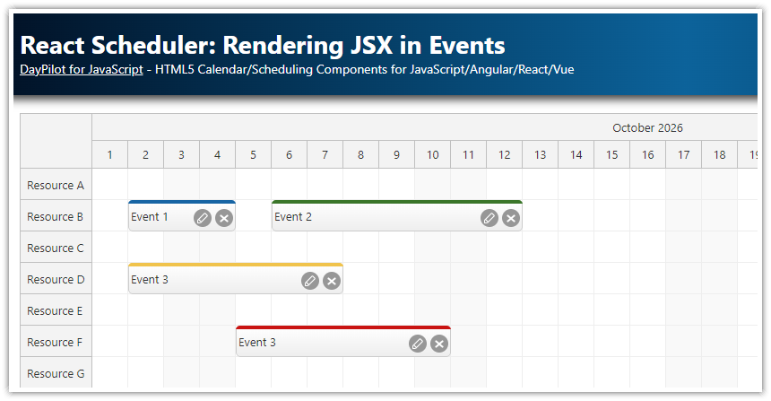
How to Load Reservation Data into the React Scheduler

In order to load events, the sample uses another lazy state initializer. The reservation data is fixed to November 2026, and the Scheduler scrolls to 2026-11-01 once the control is ready.
const createEvents = () => ([
  {
    id: 101,
    text: 'Reservation 101',
    start: '2026-11-02T00:00:00',
    end: '2026-11-05T00:00:00',
    resource: 'A',
  },
  {
    id: 102,
    text: 'Reservation 102',
    start: '2026-11-06T00:00:00',
    end: '2026-11-10T00:00:00',
    resource: 'A',
  },
  {
    id: 103,
    text: 'Reservation 103',
    start: '2026-11-03T00:00:00',
    end: '2026-11-10T00:00:00',
    resource: 'C',
    backColor: '#6fa8dc',
    locked: true,
  },
  {
    id: 104,
    text: 'Reservation 104',
    start: '2026-11-02T00:00:00',
    end: '2026-11-08T00:00:00',
    resource: 'E',
    backColor: '#f6b26b',
    plus: true,
  },
  {
    id: 105,
    text: 'Reservation 105',
    start: '2026-11-03T00:00:00',
    end: '2026-11-09T00:00:00',
    resource: 'G',
  },
  {
    id: 106,
    text: 'Reservation 106',
    start: '2026-11-02T00:00:00',
    end: '2026-11-07T00:00:00',
    resource: 'B',
  },
]);

const [events] = useState(createEvents);
The items of the events array need to follow the structure defined for DayPilot.Event.data.
In a real-world application, you can load the data from an API endpoint instead (use two parallel requests and wait for both of them to complete):
const loadData = async () => {
  try {
    const [resourcesResponse, eventsResponse] = await Promise.all([
      fetch('/api/resources'),
      fetch('/api/events'),
    ]);

    if (!resourcesResponse.ok || !eventsResponse.ok) {
      throw new Error('HTTP error, status = ' + resourcesResponse.status);
    }

    const resourceData = await resourcesResponse.json();
    const eventData = await eventsResponse.json();

    setResources(resourceData);
    setEvents(eventData);
  } catch (error) {
    console.error('Failed to fetch resources or events:', error);
  }
};
How to Show Additional Row Header Columns

In this step, we will extend the Scheduler component to display the following columns in the row header:
-
Car
-
Seats
-
Doors
-
Transmission
You can define the row header columns using the rowHeaderColumns property. Each item defines the displayed column title (name), the resource field that supplies the value (display), and the initial width (width).
rowHeaderColumns={[
  { name: 'Car' },
  { name: 'Seats', display: 'seats', width: 50 },
  { name: 'Doors', display: 'doors', width: 50 },
  { name: 'Transmission', display: 'transmission', width: 90 },
]}
We will customize the row header manually and display an icon for each resource:
onBeforeRowHeaderRender={(args) => {
  if (!args.row.data.image) {
    return;
  }

  args.row.columns[0].areas = [
    {
      left: 10,
      top: 8,
      width: 24,
      height: 24,
      image: `cars/${args.row.data.image}`,
      style: 'border-radius: 50%; overflow: hidden;',
    },
  ];
}}
The same sample also includes a small seat filter in the toolbar and a reservation context menu. The toolbar calls applyFilter(), which forwards the selected value to rows.filter(), and onRowFilter decides which rows stay visible. The context menu is created using DayPilot.Menu and opened from the three-dots active area that we add in onBeforeEventRender.
const applyFilter = (value) => {
const seats = parseInt(value, 10);
if (!seats) {
scheduler.rows.filter(null);
return;
}
scheduler.rows.filter({ seats });
};
<div className="toolbar">
Filter by seats:
<select onChange={(event) => applyFilter(event.currentTarget.value)}>
<option value="0">All</option>
<option value="2">2</option>
<option value="4">4</option>
<option value="5">5</option>
</select>
</div>const contextMenu = new DayPilot.Menu({
items: [
{
text: 'Delete',
onClick: async (args) => {
const modal = await DayPilot.Modal.confirm('Do you really want to delete this reservation?');
if (modal.canceled) {
return;
}
scheduler.events.remove(args.source);
},
},
{
text: 'Lock',
onClick: (args) => {
toggleEventLock(args.source);
},
},
],
onShow: (args) => {
const locked = !!args.source.data.locked;
args.menu.items[0].disabled = locked;
args.menu.items[1].text = locked ? 'Unlock' : 'Lock';
},
});
<DayPilotScheduler
contextMenu={contextMenu}
onRowFilter={(args) => {
if (!args.filter) {
return;
}
if (args.filterParam.seats) {
args.visible = args.row.data.seats === args.filterParam.seats;
}
}}
/>How to Handle User Events (Drag and Drop)

The Scheduler defines event handlers that you can use to get notifications of user changes. Here is the exact handler used for drag and drop event moving:
onEventMoved={(args) => {
  console.log('Event moved: ', args.e.data.id, args.newStart, args.newEnd, args.newResource);
  scheduler?.message(`Event moved: ${args.e.data.text}`);
}}
With eventMoveHandling="Update", the Scheduler updates the reservation automatically. The handler just receives the notification and calls message().
How to Resize Scheduler Events using Drag and Drop

You can handle drag and drop event resizing using the same mechanism. The resizing is enabled by default (eventResizeHandling is set to 'Update') and the sample only reacts to the notification in onEventResized:
onEventResized={(args) => {
  console.log('Event resized: ', args.e.data.id, args.newStart, args.newEnd);
  scheduler?.message(`Event resized: ${args.e.data.text}`);
}}
How to Add New Events/Reservations

To add support for creating new events, we need to handle onTimeRangeSelected:
onTimeRangeSelected={async (args) => {
  const modal = await DayPilot.Modal.prompt('New reservation name', 'Reservation');
  scheduler?.clearSelection();
  if (modal.canceled || !modal.result || !scheduler) {
    return;
  }

  scheduler.events.add({
    id: DayPilot.guid(),
    text: modal.result,
    start: args.start,
    end: args.end,
    resource: args.resource,
  });
}}
The event handler opens a prompt using the built-in DayPilot.Modal dialog and asks for the reservation name. The new item is added using events.add(), which applies the optimized Scheduler update directly.

How to Display a Message to the User using React Scheduler API

The Scheduler component offers a rich API that you can use in your application. The Scheduler methods let you use advanced features that cannot be controlled by properties alone.
The sample stores the DayPilot.Scheduler object in React state using controlRef and then uses that reference to call message() and scrollTo() directly:
const [scheduler, setScheduler] = useState(null);

useEffect(() => {
  scheduler?.scrollTo('2026-11-01');
}, [scheduler]);

<DayPilotScheduler
  // ...
  controlRef={setScheduler}
/>
This lets the sample scroll to the tutorial data once the control is ready and display small status messages after move and resize operations.
How to Customize the Color of Reservations

The React Scheduler component is very customizable and it lets you change the reservation color easily.
The sample hides the duration bar using durationBarVisible={false} and then customizes the rendered events in onBeforeEventRender. The same hook also adds the context-menu button and the padlock icon for locked reservations.
onBeforeEventRender={(args) => {
  if (!args.data.backColor) {
    args.data.backColor = '#93c47d';
  }

  args.data.borderColor = 'darker';
  args.data.fontColor = '#ffffff';
  args.data.areas = [
    {
      right: 4,
      top: 6,
      width: 24,
      height: 24,
      padding: 2,
      fontColor: '#ffffff',
      symbol: 'icons/daypilot.svg#threedots-v',
      action: 'ContextMenu',
      style: 'border-radius: 50%; cursor: pointer;',
    },
  ];

  if (!args.data.locked) {
    return;
  }

  args.data.areas.push({
    right: 26,
    top: 6,
    width: 24,
    height: 24,
    padding: 4,
    fontColor: '#ffffff',
    symbol: 'icons/daypilot.svg#padlock',
    style: 'border-radius: 50%; cursor: pointer;',
    onClick: async (areaArgs) => {
      const modal = await DayPilot.Modal.confirm('Do you really want to unlock this reservation?');
      if (modal.canceled) {
        return;
      }

      toggleEventLock(areaArgs.source);
    },
  });

  args.data.moveDisabled = true;
  args.data.resizeDisabled = true;
  args.data.clickDisabled = true;
  args.data.deleteDisabled = true;
}}
The special 'darker' value of the borderColor property calculates a darker border from the current backColor automatically.
Full Source Code of Scheduler.jsx
Here is the full source code of the customized React Scheduler component:
import { useEffect, useState } from 'react';
import { DayPilot, DayPilotScheduler } from 'daypilot-pro-react';
const createResources = () => [
{
name: 'Convertible',
id: 'G2',
expanded: true,
children: [
{ name: 'MINI Cooper', seats: 4, doors: 2, transmission: 'Automatic', id: 'A', image: 'Mini_Cooper_Icon_24x24.png' },
{ name: 'BMW Z4', seats: 4, doors: 2, transmission: 'Automatic', id: 'B', image: 'BMW_Z4_icon_24x24.png' },
{ name: 'Ford Mustang', seats: 4, doors: 2, transmission: 'Automatic', id: 'C', image: 'Ford_Mustang_Icon_24x24.png' },
{ name: 'Mercedes-Benz SL', seats: 2, doors: 2, transmission: 'Automatic', id: 'D', image: 'Mercedes_Benz_SL_icon_24x24.png' },
],
},
{
name: 'SUV',
id: 'G1',
expanded: true,
children: [
{ name: 'BMW X1', seats: 5, doors: 4, transmission: 'Automatic', id: 'E', image: 'BMW_X1_Icon_24x24.png' },
{ name: 'Jeep Wrangler', seats: 5, doors: 4, transmission: 'Automatic', id: 'F', image: 'Jeep_Wrangler_Icon_24x24.png' },
{ name: 'Range Rover', seats: 5, doors: 4, transmission: 'Automatic', id: 'G', image: 'Range_Rover_Icon_24x24.png' },
],
},
];
const createEvents = () => [
{
id: 101,
text: 'Reservation 101',
start: '2026-11-02T00:00:00',
end: '2026-11-05T00:00:00',
resource: 'A',
},
{
id: 102,
text: 'Reservation 102',
start: '2026-11-06T00:00:00',
end: '2026-11-10T00:00:00',
resource: 'A',
},
{
id: 103,
text: 'Reservation 103',
start: '2026-11-03T00:00:00',
end: '2026-11-10T00:00:00',
resource: 'C',
backColor: '#6fa8dc',
locked: true,
},
{
id: 104,
text: 'Reservation 104',
start: '2026-11-02T00:00:00',
end: '2026-11-08T00:00:00',
resource: 'E',
backColor: '#f6b26b',
plus: true,
},
{
id: 105,
text: 'Reservation 105',
start: '2026-11-03T00:00:00',
end: '2026-11-09T00:00:00',
resource: 'G',
},
{
id: 106,
text: 'Reservation 106',
start: '2026-11-02T00:00:00',
end: '2026-11-07T00:00:00',
resource: 'B',
},
];
function Scheduler() {
const [resources] = useState(createResources);
const [events] = useState(createEvents);
const [scheduler, setScheduler] = useState(null);
const toggleEventLock = (event) => {
if (!scheduler) {
return;
}
event.data.locked = !event.data.locked;
scheduler.events.update(event);
};
const applyFilter = (value) => {
if (!scheduler) {
return;
}
const seats = parseInt(value, 10);
if (!seats) {
scheduler.rows.filter(null);
return;
}
scheduler.rows.filter({ seats });
};
const contextMenu = new DayPilot.Menu({
items: [
{
text: 'Delete',
onClick: async (args) => {
if (!scheduler) {
return;
}
const modal = await DayPilot.Modal.confirm('Do you really want to delete this reservation?');
if (modal.canceled) {
return;
}
scheduler.events.remove(args.source);
},
},
{
text: 'Lock',
onClick: (args) => {
toggleEventLock(args.source);
},
},
],
onShow: (args) => {
const locked = !!args.source.data.locked;
args.menu.items[1].text = locked ? 'Unlock' : 'Lock';
args.menu.items[0].disabled = locked;
},
});
useEffect(() => {
scheduler?.scrollTo('2026-11-01');
}, [scheduler]);
return (
<div>
<div className="toolbar">
Filter by seats:
<select onChange={(event) => applyFilter(event.currentTarget.value)}>
<option value="0">All</option>
<option value="2">2</option>
<option value="4">4</option>
<option value="5">5</option>
</select>
</div>
<DayPilotScheduler
startDate="2026-01-01"
days={365}
scale="Day"
timeHeaders={[
{ groupBy: 'Month' },
{ groupBy: 'Day', format: 'd' },
]}
cellWidth={50}
eventHeight={35}
durationBarVisible={false}
rowMarginTop={3}
rowMarginBottom={3}
treeEnabled
timeRangeSelectedHandling="Enabled"
eventMoveHandling="Update"
eventResizeHandling="Update"
rowHeaderColumns={[
{ name: 'Car' },
{ name: 'Seats', display: 'seats', width: 50 },
{ name: 'Doors', display: 'doors', width: 50 },
{ name: 'Transmission', display: 'transmission', width: 90 },
]}
resources={resources}
events={events}
contextMenu={contextMenu}
onBeforeRowHeaderRender={(args) => {
if (!args.row.data.image) {
return;
}
args.row.columns[0].areas = [
{
left: 10,
top: 8,
width: 24,
height: 24,
image: `cars/${args.row.data.image}`,
style: 'border-radius: 50%; overflow: hidden;',
},
];
}}
onBeforeEventRender={(args) => {
if (!args.data.backColor) {
args.data.backColor = '#93c47d';
}
args.data.borderColor = 'darker';
args.data.fontColor = '#ffffff';
args.data.areas = [
{
right: 4,
top: 6,
width: 24,
height: 24,
padding: 2,
fontColor: '#ffffff',
symbol: 'icons/daypilot.svg#threedots-v',
action: 'ContextMenu',
style: 'border-radius: 50%; cursor: pointer;',
},
];
if (args.data.locked) {
args.data.areas.push({
right: 26,
top: 6,
width: 24,
height: 24,
padding: 4,
fontColor: '#ffffff',
symbol: 'icons/daypilot.svg#padlock',
style: 'border-radius: 50%;',
onClick: async (areaArgs) => {
const modal = await DayPilot.Modal.confirm('Do you really want to unlock this reservation?');
if (modal.canceled) {
return;
}
toggleEventLock(areaArgs.source);
},
});
args.data.moveDisabled = true;
args.data.resizeDisabled = true;
args.data.clickDisabled = true;
args.data.deleteDisabled = true;
}
}}
onRowFilter={(args) => {
if (!args.filter) {
return;
}
if (args.filterParam.seats) {
args.visible = args.row.data.seats === args.filterParam.seats;
}
}}
onEventMoved={(args) => {
console.log('Event moved: ', args.e.data.id, args.newStart, args.newEnd, args.newResource);
scheduler?.message(`Event moved: ${args.e.data.text}`);
}}
onEventResized={(args) => {
console.log('Event resized: ', args.e.data.id, args.newStart, args.newEnd);
scheduler?.message(`Event resized: ${args.e.data.text}`);
}}
onTimeRangeSelected={async (args) => {
const modal = await DayPilot.Modal.prompt('New reservation name', 'Reservation');
scheduler?.clearSelection();
if (modal.canceled || !modal.result || !scheduler) {
return;
}
scheduler.events.add({
id: DayPilot.guid(),
text: modal.result,
start: args.start,
end: args.end,
resource: args.resource,
});
}}
controlRef={setScheduler}
/>
</div>
);
}
export default Scheduler;
History
-
April 19, 2026: Rebuilt the sample on the current React 19 + Vite builder template, upgraded to
daypilot-pro-react2026.2.6907, restored the original direct Scheduler update semantics, refreshed the screenshots, and added the seat-filter/context-menu explanation. -
July 17, 2024: Upgraded to DayPilot Pro 2024.3.5973. Added: row header column icons, row filter, event context menu.
-
May 26, 2023: Converted to a functional React component (Hooks API), React 18, DayPilot Pro for JavaScript 2023.2.5582.
-
June 21, 2021: Row columns added, how to change event color.
-
May 20, 2021: Upgraded to React 17, DayPilot Pro for JavaScript 2021.2.4990.
-
November 22, 2020: Upgraded to DayPilot Pro for JavaScript 2020.4.4766.
-
September 11, 2019: Upgraded to DayPilot Pro for JavaScript 2019.3.4000, toolbar styling, event creating, event resizing.
-
May 21, 2018: Component interop (zoom component), custom event bar color.
-
May 18, 2018: Initial version released.