DayPilot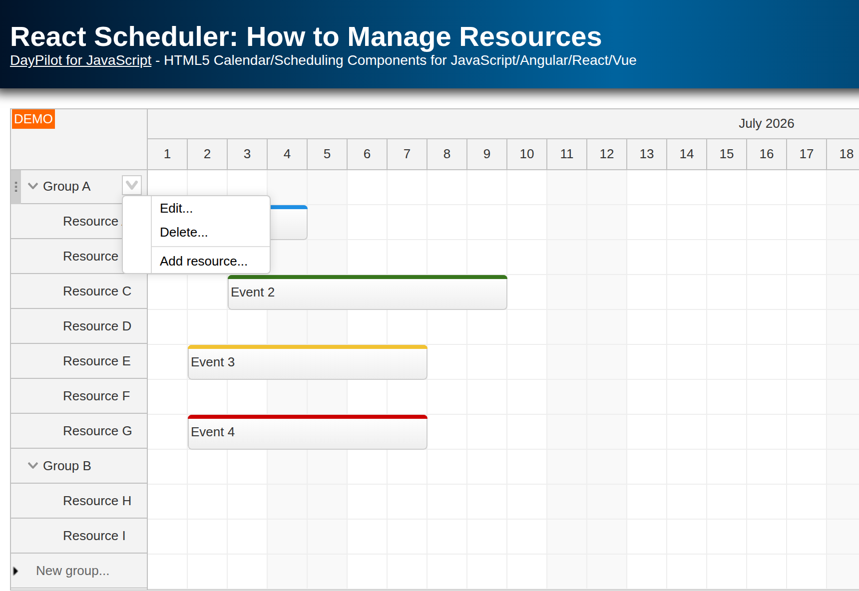
| Demo | |
|---|---|
| Downloads | |
| Languages | JavaScript |
| Technologies | React |
Overview
The React Scheduler component from DayPilot Pro for JavaScript displays a timeline for the specified resources. The resources are displayed as rows and the time slots are displayed as columns.
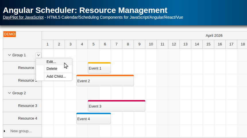
In this tutorial, we will add UI controls to the rows that represent resources (buildings, people, tools, cars, or machines). These controls let users of your React application add, move, delete, and edit resources.
License
Licensed for testing and evaluation purposes. Please see the licensing information included in the sample project. You can use the source code of the tutorial if you are a licensed user of DayPilot Pro for JavaScript.
How to load Scheduler resource data in React?
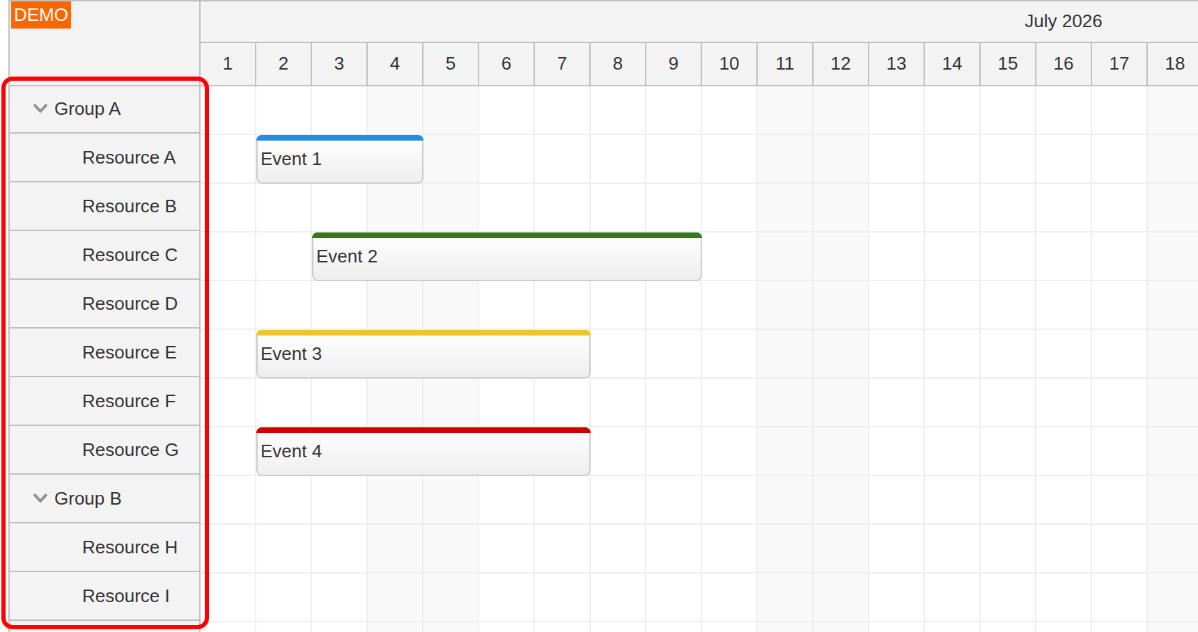
As soon as you have the React Scheduler installed and configured (see React Scheduler Component Tutorial for an introduction), you can load the Scheduler data.
The following example stores the resource tree in React state and passes it to the Scheduler using the resources prop:
const [resources] = useState([
  {
    name: "Group A",
    id: "GroupA",
    expanded: true,
    children: [
      { name: "Resource A", id: "A" },
      { name: "Resource B", id: "B" },
      { name: "Resource C", id: "C" },
      { name: "Resource D", id: "D" },
      { name: "Resource E", id: "E" },
      { name: "Resource F", id: "F" },
      { name: "Resource G", id: "G" }
    ]
  },
  {
    name: "Group B",
    id: "GroupB",
    expanded: true,
    children: [
      { name: "Resource H", id: "H" },
      { name: "Resource I", id: "I" }
    ]
  }
]);

// ...

return (
  <DayPilotScheduler
    resources={resources}
  />
);
Each top-level object represents a group. Its children array contains the individual resources, and expanded opens the group when the Scheduler loads.
How to add resource groups?
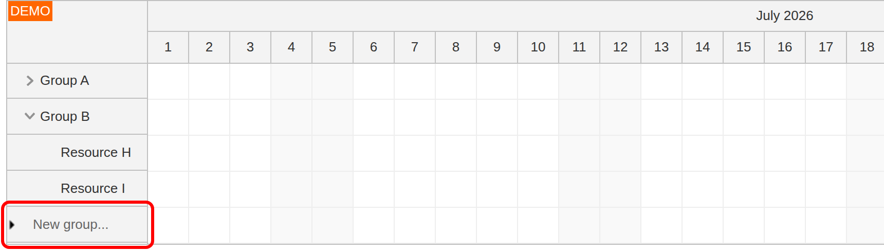
The Scheduler includes a built-in UI feature for adding new rows. We will use it to provide an interface for adding new groups (top-level rows).
The first step is to enable the feature using the rowCreateHandling property. This displays a special row at the bottom of the Scheduler. By default, it displays “New row…” text. We will change this to “New group…” using the rowCreateText property.
As soon as the user enters a new group name and confirms it using Enter, the Scheduler fires the onRowCreate event. We will use this event to add a new group using the Scheduler rows.add() method.
This new row will be displayed as the last item at the top level.
<DayPilotScheduler
  // ...
  rowCreateHandling="Enabled"
  rowCreateText="New group..."
  onRowCreate={(args) => {
    const row = {
      name: args.text,
      id: DayPilot.guid()
    };
    args.control.rows.add(row);
  }}
/>
How to add child resources?
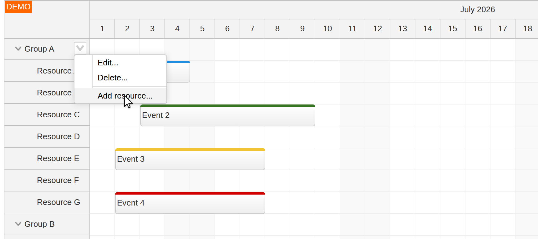
In order to let users add child resources to the groups, we will enable a row header context menu using the contextMenuResource property.
The “Add resource…” item opens a modal dialog where the user can enter the new resource name.
When the modal dialog closes, we add the new resource as the last child of the selected group using the Scheduler rows.addChild() method.
const contextMenu = new DayPilot.Menu({
  items: [
    { text: "Add resource...", onClick: (args) => addResource(args) }
  ]
});

const addResource = async (args) => {
  const parent = args.source;
  const form = [
    { name: "Name", id: "name" }
  ];
  const data = {
    name: "Resource"
  };
  const modal = await DayPilot.Modal.form(form, data);

  if (modal.canceled) {
    return;
  }

  const row = modal.result;
  row.id = DayPilot.guid();
  scheduler.rows.addChild(parent, row);
};
The controlRef prop stores the live Scheduler control in the scheduler state variable. The context-menu handlers use that control to update the displayed row collection directly.
How to edit Scheduler resources?
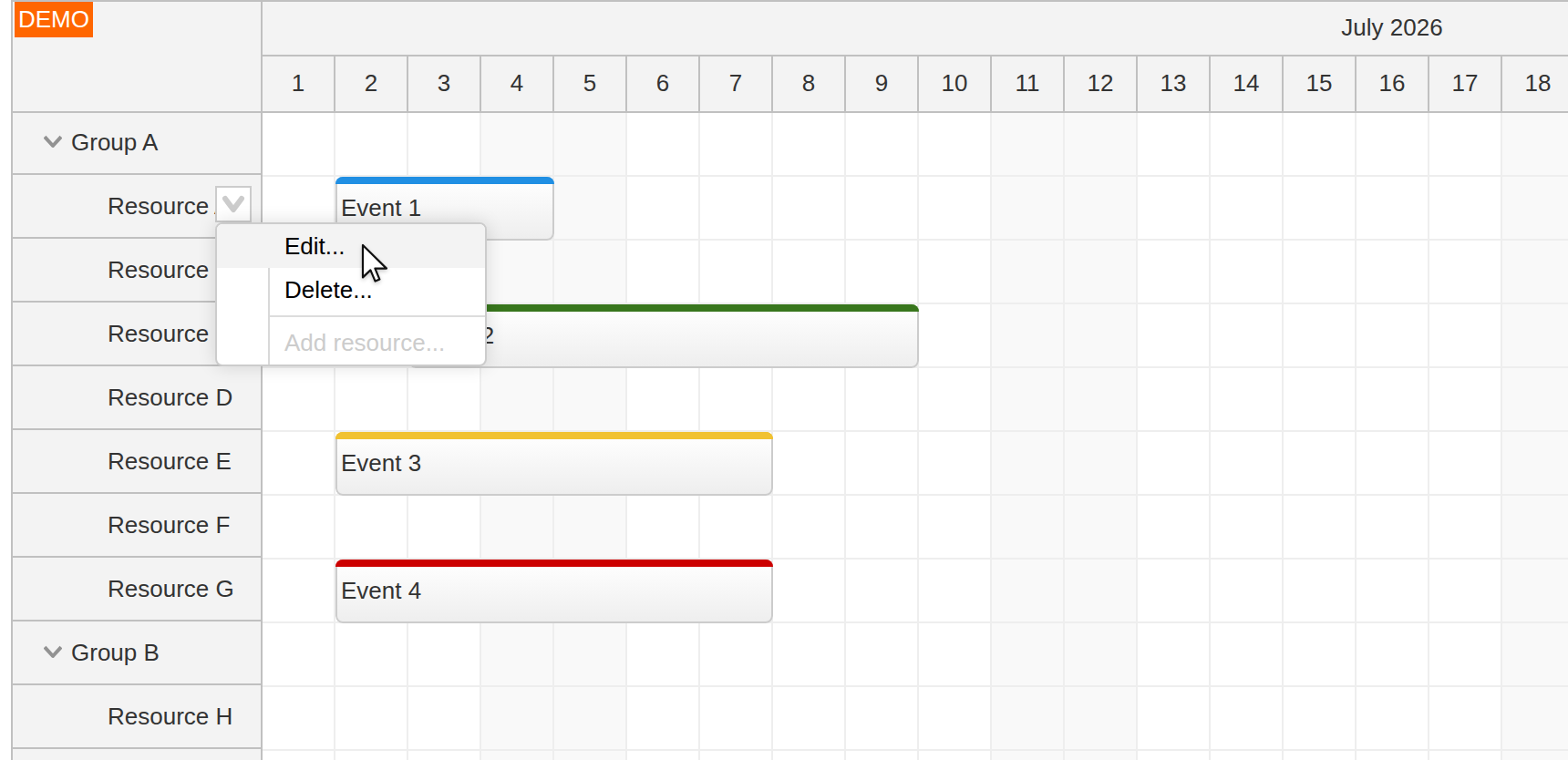
Now we can extend the context menu with additional items. The “Edit…” item lets users modify the resource name.
It opens a modal dialog for editing the resource name. The Scheduler updates the resource data using the rows.update() method.
const contextMenu = new DayPilot.Menu({
  items: [
    { text: "Edit...", onClick: (args) => editResource(args) }
  ]
});

const editResource = async (args) => {
  const form = [
    { name: "Name", id: "name" }
  ];
  const row = args.source;
  const modal = await DayPilot.Modal.form(form, row.data);

  if (modal.canceled) {
    return;
  }

  scheduler.rows.update(modal.result);
};
How to delete resources?
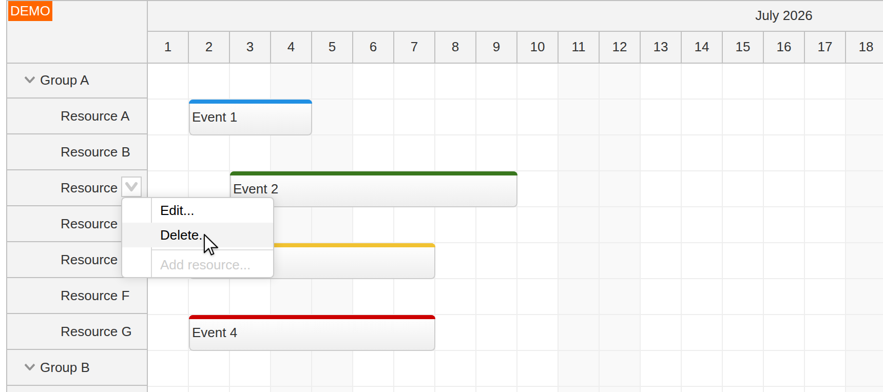
The “Delete…” menu item lets users delete a group or resource. Before the resource is deleted, we display a confirmation dialog using the DayPilot.Modal.confirm() method.
const contextMenu = new DayPilot.Menu({
  items: [
    { text: "Delete...", onClick: (args) => deleteResource(args) }
  ]
});

const deleteResource = async (args) => {
  const row = args.source;
  const modal = await DayPilot.Modal.confirm(
    `Do you really want to delete '${row.name}'?`
  );

  if (modal.canceled) {
    return;
  }

  scheduler.rows.remove(row);
};
How to add an icon to the row header?
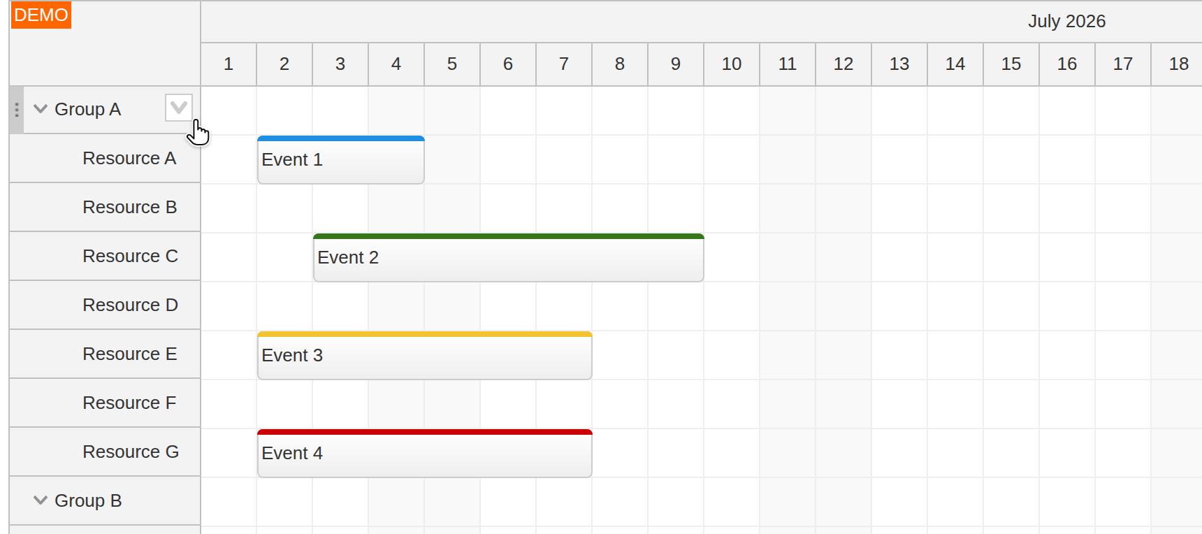
The resource context menu opens when the user right-clicks the row header. To make that option more prominent, we will add a special icon to the row header that appears on hover.
The icon can be added using a row-header active area.
You can specify the active area position and dimensions (right, top, width, and height properties), the SVG icon (symbol property), and hover visibility (visibility property).
The action is set to "ContextMenu". This command opens the default context menu associated with the row header.
<DayPilotScheduler
  // ...
  onBeforeRowHeaderRender={(args) => {
    args.row.areas = [
      {
        right: 6,
        top: 6,
        width: 18,
        height: 18,
        action: "ContextMenu",
        backColor: "#ffffff",
        symbol: "icons/daypilot.svg#minichevron-down-4",
        fontColor: "#cccccc",
        style: "border: 1px solid #ccc; cursor: pointer;",
        visibility: "Hover"
      }
    ];
  }}
/>
How to move resources using drag and drop?
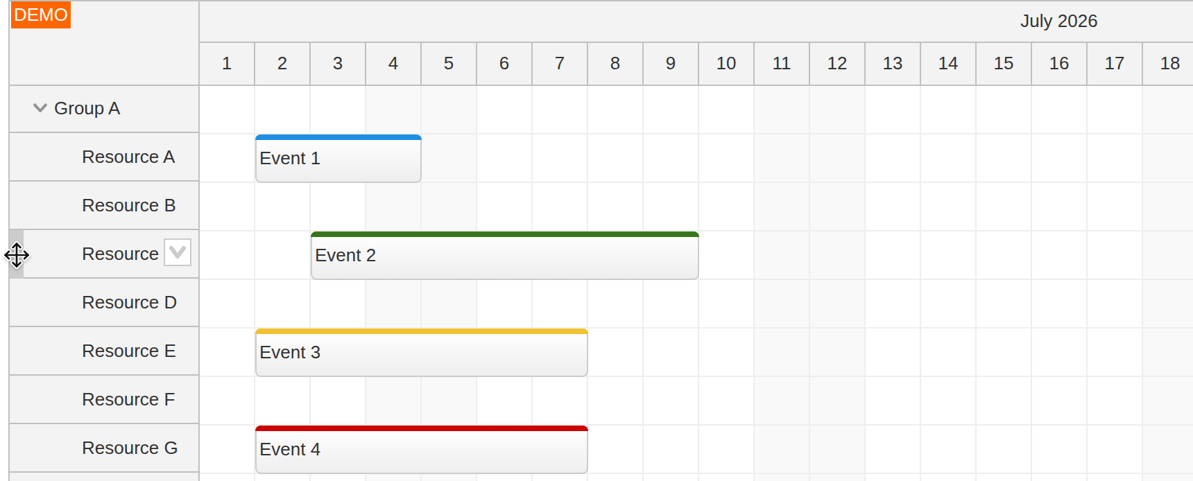
To enable drag-and-drop row moving, set the rowMoveHandling property to "Update".
When row moving is enabled, the React Scheduler displays a drag handle on hover. Users can drag the resource to a new location using this handle.
By default, the Scheduler lets users drag rows to an arbitrary position in the tree. We want resources and groups to stay at the same level: only groups are allowed at the top level, and groups can contain resources but not other groups. We enforce this rule using the rowMoveSameLevelOnly property.
<DayPilotScheduler
  // ...
  rowMoveSameLevelOnly={true}
  rowMoveHandling="Update"
  onRowMove={(args) => {
    console.log("Row moved:", args.source.data.name);
  }}
/>
Full Source Code
Here is the complete source code for the React Scheduler component with a UI for managing resources. You can also download the entire React project using the link at the top of this article.
import { useState } from "react";
import { DayPilot, DayPilotScheduler } from "daypilot-pro-react";

const Scheduler = () => {
  const [scheduler, setScheduler] = useState(null);
  const [resources] = useState([
    {
      name: "Group A",
      id: "GroupA",
      expanded: true,
      children: [
        { name: "Resource A", id: "A" },
        { name: "Resource B", id: "B" },
        { name: "Resource C", id: "C" },
        { name: "Resource D", id: "D" },
        { name: "Resource E", id: "E" },
        { name: "Resource F", id: "F" },
        { name: "Resource G", id: "G" }
      ]
    },
    {
      name: "Group B",
      id: "GroupB",
      expanded: true,
      children: [
        { name: "Resource H", id: "H" },
        { name: "Resource I", id: "I" }
      ]
    }
  ]);
  const [events] = useState(() => {
    const start = DayPilot.Date.today().firstDayOfMonth();

    return [
      {
        id: 1,
        text: "Event 1",
        start: start.addDays(1),
        end: start.addDays(4),
        resource: "A"
      },
      {
        id: 2,
        text: "Event 2",
        start: start.addDays(2),
        end: start.addDays(9),
        resource: "C",
        barColor: "#38761d",
        barBackColor: "#93c47d"
      },
      {
        id: 3,
        text: "Event 3",
        start: start.addDays(1),
        end: start.addDays(7),
        resource: "E",
        barColor: "#f1c232",
        barBackColor: "#f1c232"
      },
      {
        id: 4,
        text: "Event 4",
        start: start.addDays(1),
        end: start.addDays(7),
        resource: "G",
        barColor: "#cc0000",
        barBackColor: "#ea9999"
      }
    ];
  });

  const contextMenu = new DayPilot.Menu({
    onShow: (args) => {
      const row = args.source;
      const isParent = row.level === 0;
      args.menu.items[3].disabled = !isParent;
    },
    items: [
      { text: "Edit...", onClick: (args) => editResource(args) },
      { text: "Delete...", onClick: (args) => deleteResource(args) },
      { text: "-" },
      { text: "Add resource...", onClick: (args) => addResource(args) }
    ]
  });

  const editResource = async (args) => {
    const form = [
      { name: "Name", id: "name" }
    ];
    const row = args.source;
    const modal = await DayPilot.Modal.form(form, row.data);

    if (modal.canceled) {
      return;
    }

    scheduler.rows.update(modal.result);
  };

  const deleteResource = async (args) => {
    const row = args.source;
    const modal = await DayPilot.Modal.confirm(`Do you really want to delete '${row.name}'?`);

    if (modal.canceled) {
      return;
    }

    scheduler.rows.remove(row);
  };

  const addResource = async (args) => {
    const parent = args.source;
    const form = [
      { name: "Name", id: "name" }
    ];
    const data = {
      name: "Resource"
    };
    const modal = await DayPilot.Modal.form(form, data);

    if (modal.canceled) {
      return;
    }

    const row = modal.result;
    row.id = DayPilot.guid();
    scheduler.rows.addChild(parent, row);
  };

  return (
    <DayPilotScheduler
      timeHeaders={[
        { groupBy: "Month" },
        { groupBy: "Day", format: "d" }
      ]}
      scale="Day"
      days={DayPilot.Date.today().daysInMonth()}
      startDate={DayPilot.Date.today().firstDayOfMonth()}
      onTimeRangeSelected={async (args) => {
        const control = args.control;
        const modal = await DayPilot.Modal.prompt("Create a new event:", "Event 1");
        control.clearSelection();

        if (modal.canceled) {
          return;
        }

        control.events.add({
          start: args.start,
          end: args.end,
          id: DayPilot.guid(),
          resource: args.resource,
          text: modal.result
        });
      }}
      treeEnabled={true}
      rowCreateHandling="Enabled"
      rowCreateText="New group..."
      onRowCreate={(args) => {
        const row = {
          name: args.text,
          id: DayPilot.guid()
        };
        args.control.rows.add(row);
      }}
      rowMoveSameLevelOnly={true}
      rowMoveHandling="Update"
      onRowMove={(args) => {
        console.log("Row moved:", args.source.data.name);
      }}
      onBeforeRowHeaderRender={(args) => {
        args.row.areas = [
          {
            right: 6,
            top: 6,
            width: 18,
            height: 18,
            action: "ContextMenu",
            backColor: "#ffffff",
            symbol: "icons/daypilot.svg#minichevron-down-4",
            fontColor: "#cccccc",
            style: "border: 1px solid #ccc; cursor: pointer;",
            visibility: "Hover"
          }
        ];
      }}
      contextMenuResource={contextMenu}
      events={events}
      resources={resources}
      controlRef={setScheduler}
    />
  );
};

export default Scheduler;
History
- July 2026: Updated the sample to React 19 and a current-month Scheduler timeline.