 DayPilot
Overview
-
The Angular Scheduler component can display frozen rows at the top and/or bottom of the grid.
-
You can use the dynamic content generation events to calculate the resource utilization and display the percentage and a bar chart in the summary row cells.
-
The downloadable sample uses the current Angular 21 standalone application structure and signal-based Scheduler state.
-
This tutorial covers advanced configuration options and assumes you are already familiar with the component. For an introduction to using the Angular Scheduler component, please see the Angular Scheduler Tutorial.
License
Licensed for testing and evaluation purposes. Please see LICENSE.md in the sample project. You can use the source code of the tutorial if you are a licensed user of DayPilot Pro for JavaScript.
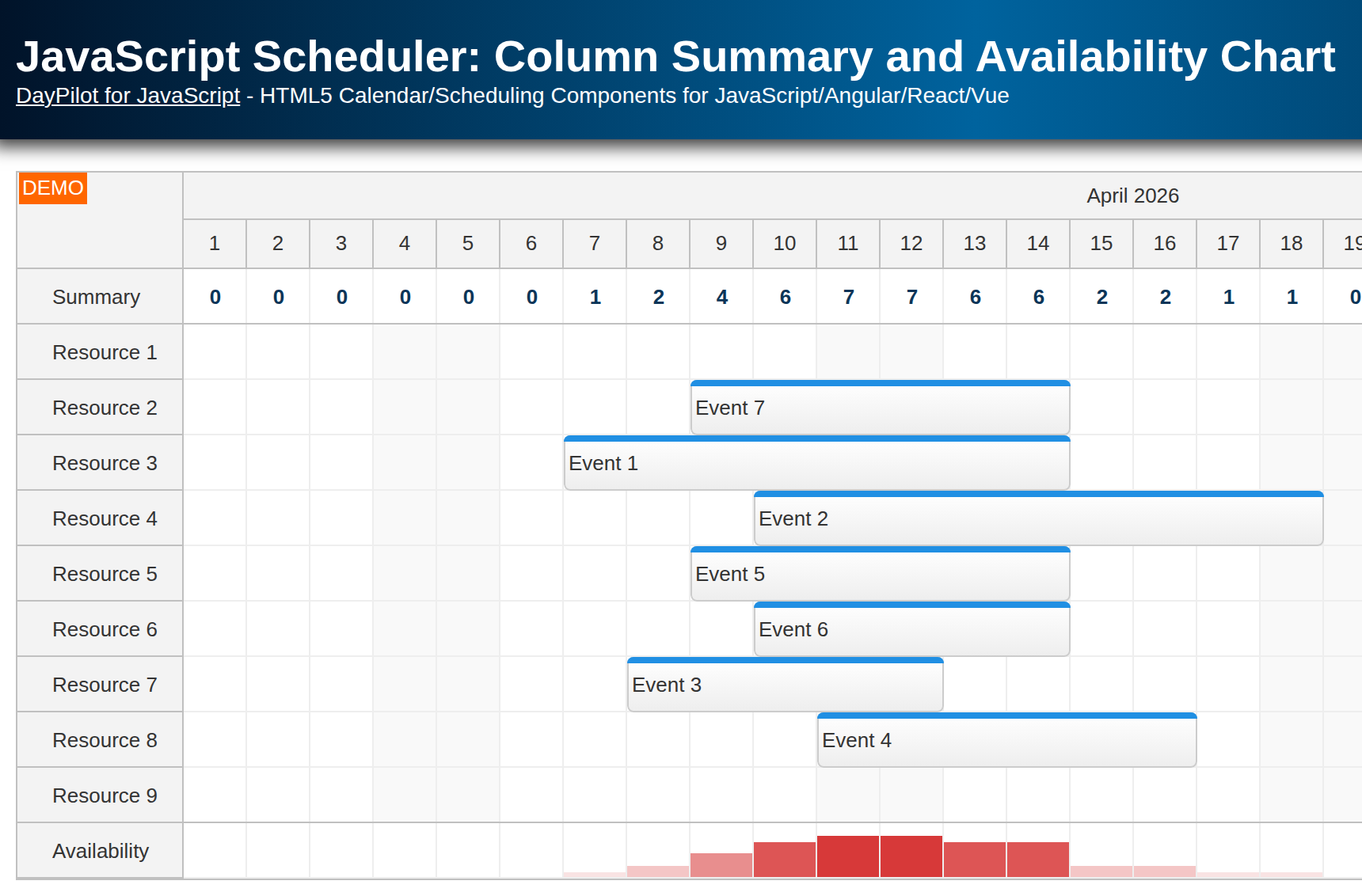
How to add fixed rows to the top of the Angular Scheduler?

We will use the frozen rows feature to display fixed rows at the top of the Angular Scheduler component. The frozen rows remain visible even when users scroll the Scheduler grid.
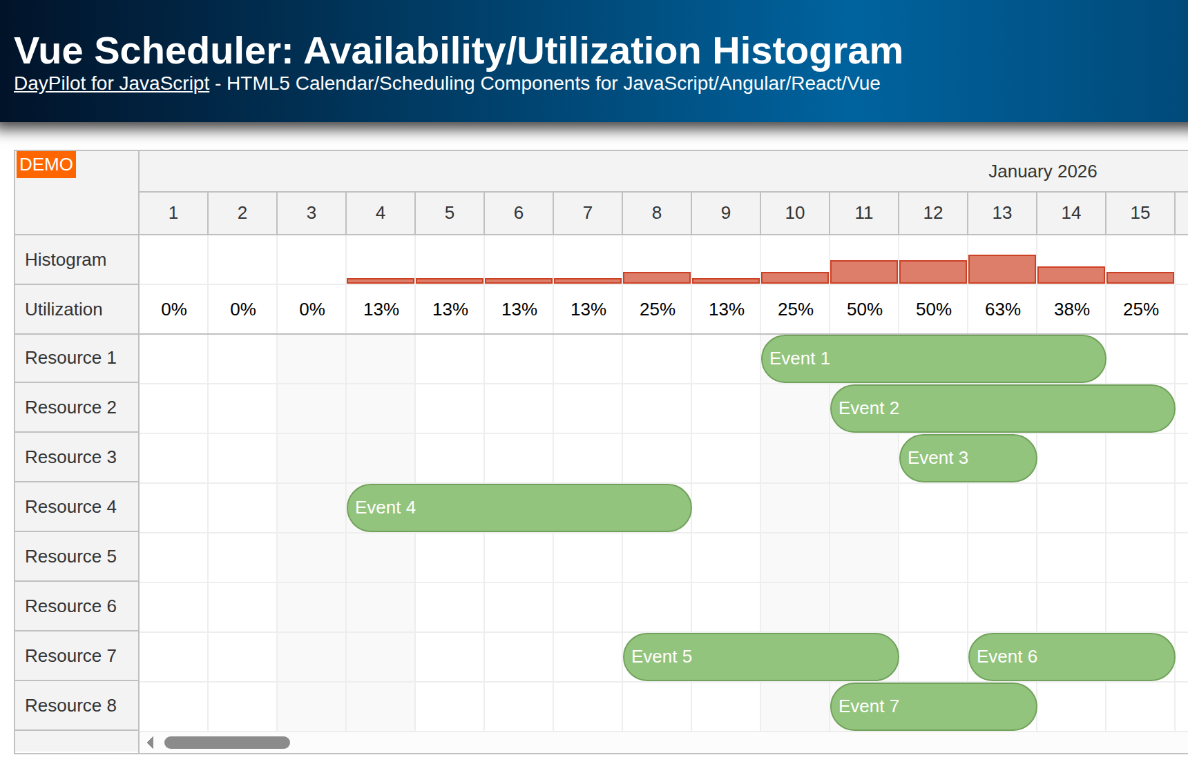
Our Angular Scheduler displays two frozen rows at the top:
-
The “Workload” row shows the utilization of the available resources as a percentage.
-
The “Chart” row shows the same utilization using bars.
In the Angular 21 sample, the Scheduler configuration is stored in a signal, so we update the resources array using this.config.update(). The sample also loads resources and events in parallel using firstValueFrom():
const [resources, events] = await Promise.all([
  firstValueFrom(this.ds.getResources()),
  firstValueFrom(this.ds.getEvents(from, to)),
]);

this.config.update((current) => ({
  ...current,
  resources: [
    { name: 'Workload', id: 'workload', frozen: 'top', cellsAutoUpdated: true, cellsDisabled: true },
    { name: 'Chart', id: 'chart', frozen: 'top', cellsAutoUpdated: true, cellsDisabled: true },
    ...resources,
  ],
}));

this.events.set(events);
Note that drag and drop is disabled for these rows using cellsDisabled: true. This ensures that users can’t create events in the summary rows.
How to display workload percentage for the time slots?

The “Workload” row displays the percentage of resources occupied by events, tasks, or reservations.
You can set the content of the frozen row cells using the onBeforeCellRender event handler. We use the handler to calculate the percentage value from the time slots below the summary cell.
The summary rows use automatic cell updates (cellsAutoUpdated) so the calculated values refresh after every data change. Without that flag, the result of onBeforeCellRender would be cached and reused.
First, we find the rows that are available for scheduling. The rows.all() method returns all Scheduler rows as an array of DayPilot.Row objects. We need to filter out rows that are not used for scheduling:
-
the frozen rows used for displaying the summary (
row.data.frozen) -
parent rows (
row.children().length > 0)
const resources = scheduler.rows.all().filter((row) => !row.data.frozen && !row.children().length);
const max = resources.length || 1;
Now we need the number of events for the specified time slot:
const events = scheduler.events.forRange(args.cell.start, args.cell.end).length;The workload percentage is calculated from the fraction of scheduled events and available resources, rounded to whole numbers for readability:
const utilization = events / max;
const percentage = Math.round(100 * utilization);
We can display the percentage in the header cell using a centered active area:
args.cell.properties.areas = [
  {
    left: 0,
    top: 0,
    right: 0,
    bottom: 0,
    style: 'display: flex; justify-content: center; align-items: center;',
    text: `${percentage}%`,
  },
];
Here is the full onBeforeCellRender code that displays the utilization percentage:
config = signal<DayPilot.SchedulerConfig>({
  // ...
  onBeforeCellRender: (args) => {
    const scheduler = this.scheduler.control;
    const resources = scheduler.rows.all().filter((row) => !row.data.frozen && !row.children().length);
    const max = resources.length || 1;
    const events = scheduler.events.forRange(args.cell.start, args.cell.end).length;
    const utilization = events / max;

    if (args.cell.resource === 'workload') {
      const percentage = Math.round(100 * utilization);

      args.cell.properties.backColor = '#ffffff';
      args.cell.properties.areas = [
        {
          left: 0,
          top: 0,
          right: 0,
          bottom: 0,
          style: 'display: flex; justify-content: center; align-items: center;',
          text: `${percentage}%`,
        },
      ];
    }
  },
  // ...
});
How to display resource utilization bar chart in the Angular Scheduler?

The “Chart” row displays the resource utilization graphically.
We already have the utilization value, so we can use it to size a custom active area:
-
The height of the active area is set according to the utilization percentage (
100%equals the row height). -
The opacity of the active area increases with the utilization percentage.
config = signal<DayPilot.SchedulerConfig>({
  // ...
  onBeforeCellRender: (args) => {
    const scheduler = this.scheduler.control;
    const resources = scheduler.rows.all().filter((row) => !row.data.frozen && !row.children().length);
    const max = resources.length || 1;
    const events = scheduler.events.forRange(args.cell.start, args.cell.end).length;
    const utilization = events / max;

    if (args.cell.resource === 'chart') {
      args.cell.properties.backColor = '#ffffff';

      if (events > 0) {
        const maxHeight = scheduler.eventHeight || 30;
        const percentage = Math.min(utilization, 1);
        const height = percentage * maxHeight;

        args.cell.properties.areas = [
          {
            bottom: 0,
            height,
            left: 0,
            right: 0,
            backColor: '#f6b26b',
            style: `box-sizing: border-box; border: 1px solid #e69138; opacity: ${percentage}`,
          },
        ];
      }
    }
  },
  // ...
});
History
-
April 14, 2026: Updated the sample to Angular 21 and refreshed the article code examples to the current standalone, signal-based project structure.