 DayPilot
")
Overview
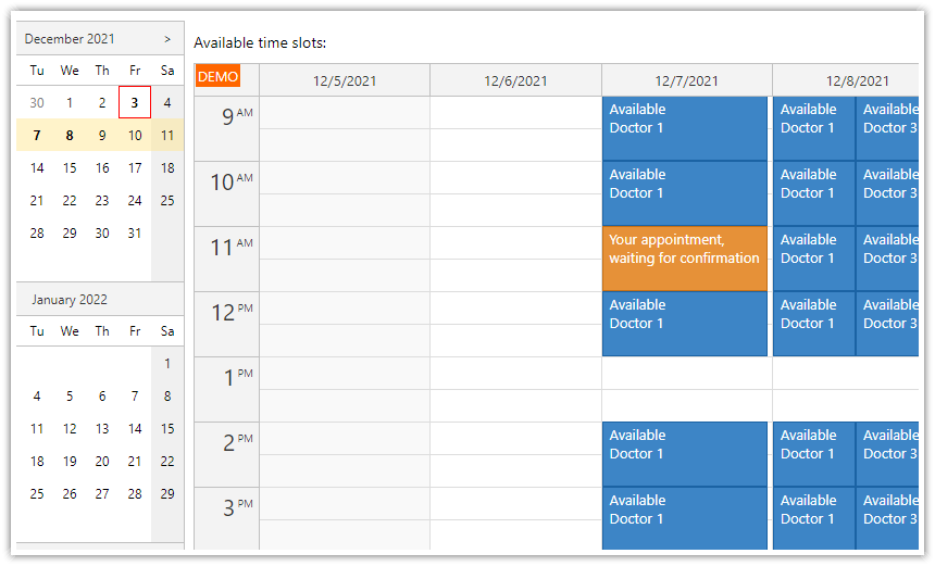
The ASP.NET Core Scheduler is a visual UI component that displays a timeline on the horizontal axis and resources (people, rooms, tools, machines) on the vertical axis (as rows).
The Scheduler communicates with the ASP.NET Core backend (API controllers) using HTTP requests that return JSON data.
Learn how to add the ASP.NET Core Scheduler component to your page, configure it, and load data from SQL Server using Entity Framework Core.
A Visual Studio solution with an ASP.NET Core .NET 10 project (C# source code) is available for download.
See how easily you can change the event appearance using CSS and event customization handlers.
The Scheduler component provides advanced features, such as sortable row headers and frozen rows that can display summary/utilization for individual time slots.
Includes a trial version of DayPilot Pro for JavaScript (see License below).
License
Licensed for testing and evaluation purposes. See the license agreement included in the sample project. You can use the source code from this tutorial if you are a licensed user of DayPilot Pro for JavaScript. Buy a license.
How to Add ASP.NET Core Scheduler to Your Application

Our Visual Studio project uses JavaScript to create the application UI on an ASP.NET Core page. In this application, we add the Scheduler to the page using the vanilla JavaScript API. The JavaScript Scheduler component can also be used with popular client-side frameworks such as Angular, React, and Vue.
To add the Scheduler to the ASP.NET Core page (Pages/Index.cshtml), follow these steps:
1. Include the DayPilot Pro library:
<script src="~/lib/daypilot/daypilot-all.min.js" asp-append-version="true"></script>We use the asp-append-version attribute to append a build-specific version string. This ensures that the current version of daypilot-all.min.js is loaded by the browser instead of any previously cached file.
2. Insert a placeholder <div> element in the page:
<div id="scheduler"></div>This is where the ASP.NET Core Scheduler will be rendered.
3. Configure and initialize the Scheduler component using JavaScript in a <script> section:
<script>
  const scheduler = new DayPilot.Scheduler("scheduler", {
    startDate: DayPilot.Date.today().firstDayOfMonth(),
    days: DayPilot.Date.today().daysInMonth(),
    scale: "Day",
    timeHeaders: [
      { groupBy: "Month" },
      { groupBy: "Day", format: "d" }
    ],
    resources: [
      { name: "Resource A", id: 1 },
      { name: "Resource B", id: 2 },
      { name: "Resource C", id: 3 },
    ]
  });
  scheduler.init();
</script>
This example sets the following Scheduler component properties:
startDate: the first visible daydays: number of days to be displayedscale: determines the cell size (see what other scale values are available in the Scheduler)timeHeaders: sets the Scheduler time headers on the X axis (see how to create your own time headers)resources: specifies the Scheduler rows on the Y axis (read more about loading resource data)
This Scheduler configuration displays a fixed timeline (the current month). To let users change the current month, you can add previous/next buttons, a date picker or enable infinite scrolling.
How to Load ASP.NET Core Scheduler Events

Next, we will load event data and display the events in the ASP.NET Core Scheduler.
You can define the events using the events property of the configuration object.
<script>
  const scheduler = new DayPilot.Scheduler("scheduler", {
    // ...
    events: [
      {
        id: 1,
        text: "Event 1",
        start: "2026-04-02T00:00:00",
        end: "2026-04-06T00:00:00",
        resource: 2
      },
      {
        id: 2,
        text: "Event 2",
        start: "2026-04-03T00:00:00",
        end: "2026-04-08T00:00:00",
        resource: 4
      },
    ]
  });
  scheduler.init();
</script>
This adds a static set of events that is displayed immediately when the Scheduler loads. However, it requires generating the event data directly in the view source. In most applications, you will want to separate the presentation from the data and load the events using an HTTP request.
Let's create a simple API endpoint that returns a JSON string with the event data:
GET /api/eventsHTTP response:
[{"id":1,"text":"Event 1","start":"2026-04-02T00:00:00","end":"2026-04-06T00:00:00","resource":2}]The /api/events endpoint is handled by an API controller on the server. It queries the database and returns events/tasks that fall within the date range specified using the start and end query string parameters (Controllers/EventsController.cs):
using System;
using System.Collections.Generic;
using System.Linq;
using System.Threading.Tasks;
using Microsoft.AspNetCore.Http;
using Microsoft.AspNetCore.Mvc;
using Microsoft.EntityFrameworkCore;
using Project.Models;

namespace Project.Controllers
{
    [Route("api/[controller]")]
    [ApiController]
    public class EventsController : ControllerBase
    {
        private readonly SchedulerDbContext _context;

        public EventsController(SchedulerDbContext context)
        {
            _context = context;
        }

        // GET: api/Events
        [HttpGet]
        public async Task<ActionResult<IEnumerable<SchedulerEvent>>> GetSchedulerEvents([FromQuery] DateTime start, [FromQuery] DateTime end)
        {
            if (_context.Events == null)
            {
                return NotFound();
            }
            return await _context.Events.Where(e => !((e.End <= start) || (e.Start >= end))).ToListAsync();
        }

        // ...

    }
}
As soon as the API endpoint is working, we can load the data using an HTTP call and update the Scheduler:
const start = scheduler.visibleStart().toString();
const end = scheduler.visibleEnd().toString();

const url = `/api/events?start=${start}&end=${end}`;
const { data } = await DayPilot.Http.get(url);

scheduler.update({ events: data });
If you don't need any extra processing, events.load() is available as a shortcut.
How to Load ASP.NET Core Scheduler Resources (Rows)

In the first example, we defined the resources statically during initialization:
<script>
    const scheduler = new DayPilot.Scheduler("scheduler", {
      // ...
      resources: [
        { name: "Resource A", id: 1 },
        { name: "Resource B", id: 2 },
        { name: "Resource C", id: 3 },
      ]
    });
    scheduler.init();
</script>
Now we will also load the resources using the API.
Let's create a similar backend endpoint for resource data:
GET /api/resourcesHTTP response:
[{"id":1,"name":"Resource A"},{"id":2,"name":"Resource B"},{"id":3,"name":"Resource C"},{"id":4,"name":"Resource D"}]The controller implementation in C# (Controllers/ResourcesController.cs):
using Microsoft.AspNetCore.Mvc;
using Microsoft.EntityFrameworkCore;
using Project.Models;

namespace Project.Controllers
{
    [ApiController]
    [Produces("application/json")]
    [Route("api/resources")]
    public class ResourcesController : ControllerBase
    {
        private readonly SchedulerDbContext _context;

        public ResourcesController(SchedulerDbContext context)
        {
            _context = context;
        }

        // GET: api/resources
        [HttpGet]
        public async Task<ActionResult<IEnumerable<SchedulerResource>>> GetResources()
        {
            return await _context.Resources.ToListAsync();
        }

    }
}
Now we can load the resources using an HTTP call and update the Scheduler:
<script>
const { data } = await DayPilot.Http.get("/api/resources");
scheduler.update({ resources: data });
</script>
This is the same approach used in the downloadable sample. If you just need the direct shortcut, rows.load() is available as well.
The ASP.NET Core Scheduler can display additional row data in row header columns.
You can define custom columns using the rowHeaderColumns property:
The
textproperty specifies the column title displayed in the header above the column.The
displayproperty specifies which property of the resource data item in theresourcesarray contains the cell value.
The additional columns are useful for displaying related values (capacity, ID, location), icons/images, and action buttons (for example, a context menu button). You can also enable the row sorting feature, which lets you reorder the rows based on the cell values.
const scheduler = new DayPilot.Scheduler("scheduler", {
    rowHeaderColumns: [
        { text: "Name" },
        { text: "ID", display: "id" }
    ],

    // ...

});
Styling the ASP.NET Core Scheduler Events

First, we make the events pill-shaped using eventBorderRadius and add extra left padding so there is room for the circular initials area.
const scheduler = new DayPilot.Scheduler("scheduler", {
    eventBorderRadius: 20,

    // ...
});

<style>
    .scheduler_default_event_inner {
        padding-left: 44px;
    }
</style>
Now we can customize the appearance of the ASP.NET Core Scheduler events.
You can do this either by modifying the CSS theme or by changing the event properties in onBeforeEventRender. The onBeforeEventRender handler can set the appearance dynamically for each event, which is useful when you want to style events based on their properties (status, custom rules).
The following onBeforeEventRender implementation makes these adjustments:
It hides the event duration bar using
args.data.barHidden = true.It sets the event background color using
args.data.backColor. The border color will be set automatically to a darker shade of the background (args.data.borderColor = "darker").It adds active areas that display event initials and action buttons.
onBeforeEventRender: (args) => {
    args.data.barHidden = true;
    args.data.fontColor = "#ffffff";
    args.data.borderColor = "darker";
    args.data.backColor = "#0089d0";

    const short = app.initials(args.data.text);

    args.data.areas = [];

    // dot
    args.data.areas.push({
        left: 0,
        top: 0,
        width: 40,
        height: 40,
        style: "border-radius: 36px; font-size: 20px; display: flex; align-items: center; justify-content: center;",
        backColor: DayPilot.ColorUtil.darker(args.data.backColor, 1),
        fontColor: "#ffffff",
        text: short
    });

    // menu
    args.data.areas.push({
        right: 30,
        top: 10,
        height: 20,
        width: 20,
        symbol: "icons/daypilot.svg#minichevron-down-2",
        style: "background-color: #fff; border: 1px solid #ccc; box-sizing: border-box; border-radius: 10px; padding: 0px;",
        action: "ContextMenu"
    });

    // delete
    args.data.areas.push({
        right: 6,
        top: 10,
        height: 20,
        width: 20,
        symbol: "icons/daypilot.svg#x-2",
        style: "background-color: #fff; border: 1px solid #ccc; box-sizing: border-box; border-radius: 10px; padding: 0px; padding: 2px;",
        action: "None",
        onClick: async (args) => {
            app.deleteEvent(args.source);
        }
    });

},
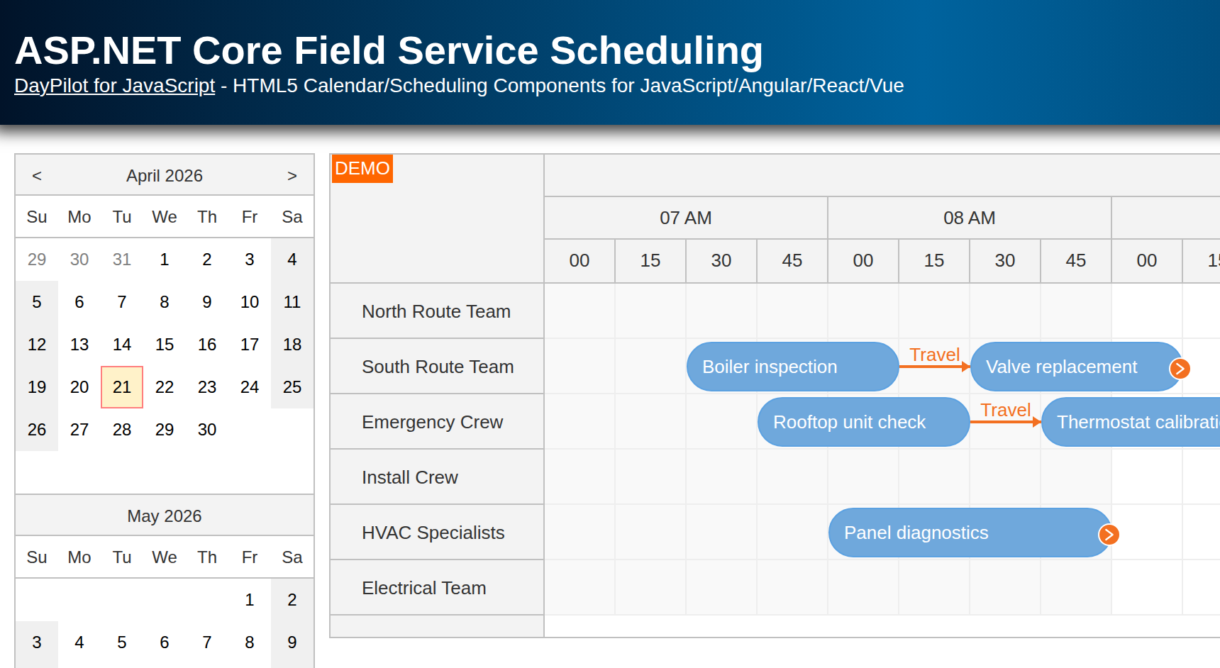
Add a Utilization Summary Row at the Top of the ASP.NET Core Scheduler

On the ASP.NET Core Scheduler page, we will display a special row with a utilization histogram. This utilization/availability chart will appear in a frozen row that stays visible even when you scroll down the Scheduler.
First, we need to add the frozen row to the resource data set. In the previous section, you learned how to load resources from the database.
The updated loadResources() method modifies the array of resources loaded from the /api/resources endpoint. It adds the frozen row ("Utilization") to the top of the list.
This special row is pinned to the top using the
frozen: "top"property.The row must be read-only, so it should not be possible to create or move events there. To disable drag-and-drop operations for this row, we add
cellsDisabled: trueto the row properties.Because the row contains calculated data that depend on the content of the ASP.NET Core Scheduler grid, we need to refresh its cells automatically after every change by adding
cellsAutoUpdated: true.
const app = {
    async loadResources() {
        const {data} = await DayPilot.Http.get("/api/resources");
        const resources = [
            { name: "Utilization", id: "UTILIZATION", frozen: "top", cellsAutoUpdated: true, cellsDisabled: true },
            ...data
        ];
        scheduler.update({resources});
    },

    // ...

};
You can then use an onBeforeCellRender event handler to generate the content of the summary row.
It looks up all events for the selected date/time range and calculates the utilization as a percentage of the total available slots.
For each time column, it displays a color bar with a height corresponding to the utilization percentage.
onBeforeCellRender: args => {
    if (args.cell.resource === "UTILIZATION") {

        const color = "#fcb711";
        const borderColor = DayPilot.ColorUtil.darker(color);

        const max = scheduler.rows.all().filter(r => r.data.frozen !== "top" && r.children().length === 0).length;

        const start = args.cell.start;
        const end = args.cell.end;
        const inUse = scheduler.events.all().filter(e => {
            return DayPilot.Util.overlaps(start, end, e.start(), e.end());
        }).length;

        const percentage = inUse / max;

        args.cell.properties.backColor = "#ffffff";
        if (inUse > 0) {

            const cellHeight = scheduler.eventHeight - 1;
            const barHeight = Math.min(percentage, 1) * cellHeight;

            args.cell.areas = [
                {
                    bottom: 1,
                    height: barHeight,
                    left: 3,
                    right: 3,
                    backColor: color,
                    style: `box-sizing: border-box; border: 1px solid ${borderColor}`,
                }
            ];
        }
    }
},
For a more detailed explanation of how to create a summary row with utilization data, see the JavaScript Scheduler: Column Summary and Availability Chart tutorial.
Entity Framework Model Classes
The SchedulerEvent class represents the ASP.NET Core Scheduler events/tasks/reservations (SchedulerEvent.cs):
public class SchedulerEvent
{
    public int Id { get; set; }
    public DateTime Start { get; set; }
    public DateTime End { get; set; }
    public string? Text { get; set; }
    public string? Color { get; set; }

    [JsonPropertyName("resource")]
    public int ResourceId { get; set; }
}
The SchedulerResource class represents resources that will be displayed as rows (SchedulerResource.cs):
public class SchedulerResource
{
    public int Id { get; set; }
    public required string Name { get; set; }
}
The sample creates the database automatically during startup using EnsureCreated(). By default, it uses SQL Server LocalDB together with the ConnectionStrings:SchedulerDbContext value from appsettings.json.
If you run the sample on a machine without LocalDB, switch Database:Provider to Sqlite and use ConnectionStrings:SchedulerDbContextSqlite instead. The startup code will create the SQLite database file automatically and seed a sample data set for the current month on the first run.
SQL Server Database Schema
If you keep the default SQL Server provider, EnsureCreated() will create the following schema.
[Events] table:
CREATE TABLE [dbo].[Events] (
    [Id]         INT            IDENTITY (1, 1) NOT NULL,
    [Start]      DATETIME2 (7)  NOT NULL,
    [End]        DATETIME2 (7)  NOT NULL,
    [Text]       NVARCHAR (MAX) NULL,
    [Color]      NVARCHAR (MAX) NULL,
    [ResourceId] INT            NOT NULL,
    CONSTRAINT [PK_Events] PRIMARY KEY CLUSTERED ([Id] ASC)
);
[Resources] table:
CREATE TABLE [dbo].[Resources] (
    [Id]   INT            IDENTITY (1, 1) NOT NULL,
    [Name] NVARCHAR (MAX) NOT NULL,
    CONSTRAINT [PK_Resources] PRIMARY KEY CLUSTERED ([Id] ASC)
);
History
April 9, 2026: Upgraded to .NET 10, DayPilot Pro for JavaScript 2026.2.6899, switched the solution to
.slnx, added an optional SQLite fallback for local testing, refreshed the screenshots, and aligned the sample with the current startup/database initialization flow.December 3, 2024: Upgraded to .NET 9, DayPilot 2024.4.6296. Automatic DB initialization. Using eventBorderRadius. Row with utilization chart fixed (correctly updating when events are moved).
January 30, 2024: Upgraded to .NET 8, DayPilot Pro 2024.1.
December 7, 2022: Upgraded to .NET 7, DayPilot Pro 2022.4. Updated styling.
December 17, 2020: Upgraded to .NET 5, DayPilot Pro 2020.4.
September 13, 2017: Initial release.