 DayPilot
Overview
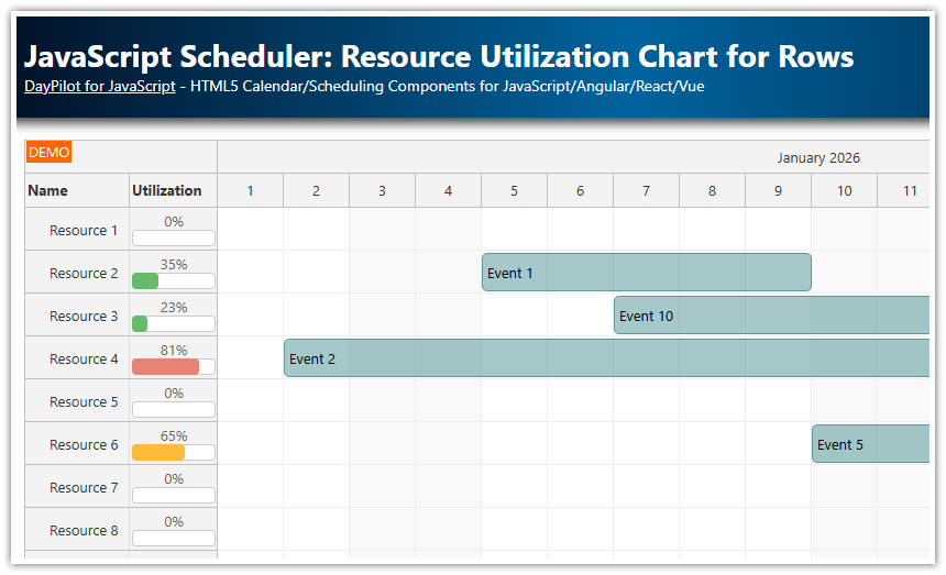
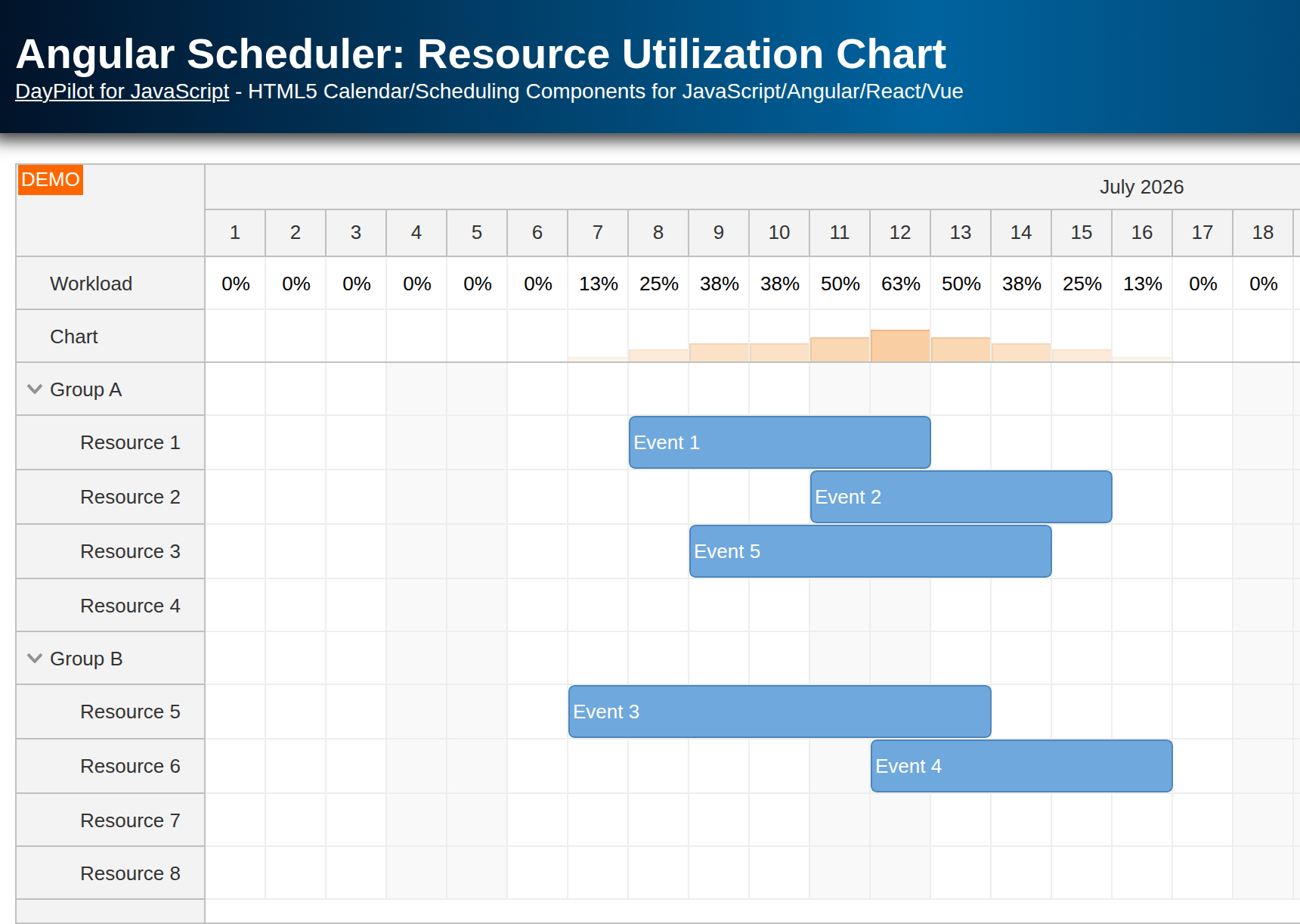
The histogram displayed at the top of the Vue Scheduler lets you quickly evaluate resource availability.
Another row shows resource utilization as a percentage.
The summary rows are fixed at the top of the Scheduler component, so they do not scroll with the resource rows and stay visible.
This tutorial assumes you already know how to install and configure the Vue Scheduler component. For an introduction, please see Vue Scheduler: Build a Reservation Application in 5 Minutes.
The Vue project includes a trial version of DayPilot Pro for JavaScript (see License below).
License
Licensed for testing and evaluation purposes. Please see the license agreement included in the sample project. You can use the source code of the tutorial if you are a licensed user of DayPilot Pro for JavaScript.
How to Add Rows with Availability Details to the Vue Scheduler

The rows displayed by the Vue Scheduler come from the resources array passed to the DayPilotScheduler component. Each item defines the row name, row id, and optional row behavior.
In this example, we use a static schedulerResources array. In a real application, you would usually load this data using an HTTP call from a database. To keep the sample focused on the Scheduler logic, the project uses a plain array.
Before assigning the row data, we add two special rows to the top of the list:
The “Histogram” row displays histogram bars, a graphical representation of utilization.
The “Utilization” row displays the percentage value.
Both summary rows are frozen at the top using the frozen: 'top' property. They also use cellsAutoUpdated so the Scheduler recalculates the custom cell content after event changes.
The three dots operator (spread syntax) appends the regular resource rows after the two summary rows.
const loadResources = () => {
  const schedulerResources = [
    { name: 'Resource 1', id: 'R1' },
    { name: 'Resource 2', id: 'R2' },
    { name: 'Resource 3', id: 'R3' },
    { name: 'Resource 4', id: 'R4' },
    { name: 'Resource 5', id: 'R5' },
    { name: 'Resource 6', id: 'R6' },
    { name: 'Resource 7', id: 'R7' },
    { name: 'Resource 8', id: 'R8' }
  ]

  resources.value = [
    { name: 'Histogram', id: 'histogram', frozen: 'top', cellsAutoUpdated: true, cellsDisabled: true },
    { name: 'Utilization', id: 'utilization', frozen: 'top', cellsAutoUpdated: true, cellsDisabled: true },
    ...schedulerResources
  ]
}
How to Calculate the Utilization Percentage

The Vue Scheduler component lets you write custom content to the grid cells. In the following example, we use this feature to add custom text to the “Utilization” row.
The cell customization runs in the onBeforeCellRender handler, which is connected using the @beforeCellRender event listener on DayPilotScheduler.
First, get the Scheduler control from args.control. The handler uses it to inspect the rows and events for the current cell.
const scheduler = args.controlNext, calculate the number of regular resource rows. The max value excludes the two frozen summary rows and any parent rows, so the percentage is based on real resource capacity.
  const max = scheduler.rows
    .all()
    .filter((row) => row.data.frozen !== 'top' && row.children().length === 0)
    .length
Then count the events that overlap the current time column:
const inUse = scheduler.events.forRange(args.cell.start, args.cell.end).lengthThe utilization ratio is the number of events divided by the number of regular resource rows. The zero-row guard keeps the calculation safe if the row list is empty.
const percentage = max > 0 ? inUse / max : 0When the current cell belongs to the utilization row, the handler converts the ratio to a percentage and adds a centered active area with the resulting text:
  if (args.cell.resource === 'utilization') {
    const text = Math.round(100 * percentage)

    args.cell.properties.backColor = '#ffffff'
    args.cell.properties.areas = [
      {
        left: 0,
        top: 0,
        right: 0,
        bottom: 0,
        style: 'display: flex; justify-content: center; align-items: center;',
        text: `${text}%`
      }
    ]
  }
How to Draw the Utilization Histogram

To display availability graphically, we add another fixed row at the top of the Vue Scheduler. It displays a histogram where each time cell contains a red bar with a height based on utilization. The higher the bar, the higher the utilization, so users can evaluate availability at a glance.
The histogram bars are displayed using active areas (args.cell.properties.areas). The handler only displays a bar if there is at least one event in the time column (inUse > 0).
  if (args.cell.resource === 'histogram') {
    args.cell.properties.backColor = '#ffffff'
    if (inUse > 0) {
      const cellHeight = scheduler.eventHeight - 1
      const barHeight = Math.min(percentage, 1) * cellHeight

      args.cell.properties.areas = [
        {
          bottom: 1,
          height: barHeight,
          left: 0,
          right: 1,
          backColor: '#dd7e6b',
          style: 'box-sizing: border-box; border: 1px solid #cc4125;'
        }
      ]
    }
  }
Full Source Code
Here is the full source code of the Vue Scheduler component that displays utilization as a percentage and as a histogram chart in frozen rows at the top of the Scheduler grid.
<template>
  <DayPilotScheduler
    ref="schedulerRef"
    :timeHeaders="timeHeaders"
    scale="Day"
    :days="days"
    :startDate="startDate"
    :cellWidth="50"
    timeRangeSelectedHandling="Enabled"
    eventClickHandling="Disabled"
    eventDeleteHandling="Update"
    eventHoverHandling="Bubble"
    eventMoveHandling="Update"
    eventResizeHandling="Update"
    :bubble="bubble"
    :rowMarginBottom="1"
    :allowEventOverlap="false"
    :resources="resources"
    :events="events"
    @timeRangeSelected="onTimeRangeSelected"
    @eventDeleted="onEventDeleted"
    @eventMoved="onEventMoved"
    @eventResized="onEventResized"
    @beforeEventRender="onBeforeEventRender"
    @beforeCellRender="onBeforeCellRender"
  />
</template>

<script setup>
import { DayPilot, DayPilotScheduler } from 'daypilot-pro-vue'
import { onMounted, ref } from 'vue'

const schedulerRef = ref(null)
const startDate = DayPilot.Date.today().firstDayOfYear()
const days = startDate.daysInYear()

const timeHeaders = [
  { groupBy: 'Month' },
  { groupBy: 'Day', format: 'd' }
]

const bubble = new DayPilot.Bubble({
  onLoad: (args) => {
    args.html = 'Event details'
  }
})

const resources = ref([])
const events = ref([])

const onTimeRangeSelected = async (args) => {
  const scheduler = args.control
  const modal = await DayPilot.Modal.prompt('Create a new event:', 'Event 1')
  scheduler.clearSelection()
  if (modal.canceled) {
    return
  }
  scheduler.events.add({
    start: args.start,
    end: args.end,
    id: DayPilot.guid(),
    resource: args.resource,
    text: modal.result
  })
}

const onEventDeleted = (args) => {
  console.log('Event deleted: ' + args.e.text())
}

const onEventMoved = (args) => {
  console.log('Event moved: ' + args.e.text())
}

const onEventResized = (args) => {
  console.log('Event resized: ' + args.e.text())
}

const onBeforeEventRender = (args) => {
  args.data.barHidden = true
  args.data.backColor = '#93c47d'
  args.data.fontColor = '#ffffff'
  args.data.borderColor = 'darker'
}

const onBeforeCellRender = (args) => {
  const scheduler = args.control
  const max = scheduler.rows
    .all()
    .filter((row) => row.data.frozen !== 'top' && row.children().length === 0)
    .length
  const inUse = scheduler.events.forRange(args.cell.start, args.cell.end).length
  const percentage = max > 0 ? inUse / max : 0

  if (args.cell.resource === 'histogram') {
    args.cell.properties.backColor = '#ffffff'
    if (inUse > 0) {
      const cellHeight = scheduler.eventHeight - 1
      const barHeight = Math.min(percentage, 1) * cellHeight

      args.cell.properties.areas = [
        {
          bottom: 1,
          height: barHeight,
          left: 0,
          right: 1,
          backColor: '#dd7e6b',
          style: 'box-sizing: border-box; border: 1px solid #cc4125;'
        }
      ]
    }
  }

  if (args.cell.resource === 'utilization') {
    const text = Math.round(100 * percentage)

    args.cell.properties.backColor = '#ffffff'
    args.cell.properties.areas = [
      {
        left: 0,
        top: 0,
        right: 0,
        bottom: 0,
        style: 'display: flex; justify-content: center; align-items: center;',
        text: `${text}%`
      }
    ]
  }
}

const loadEvents = () => {
  events.value = [
    { id: 1, start: startDate.addDays(9), end: startDate.addDays(14), text: 'Event 1', resource: 'R1' },
    { id: 2, start: startDate.addDays(10), end: startDate.addDays(15), text: 'Event 2', resource: 'R2' },
    { id: 3, start: startDate.addDays(11), end: startDate.addDays(13), text: 'Event 3', resource: 'R3' },
    { id: 4, start: startDate.addDays(3), end: startDate.addDays(8), text: 'Event 4', resource: 'R4' },
    { id: 5, start: startDate.addDays(7), end: startDate.addDays(11), text: 'Event 5', resource: 'R7' },
    { id: 6, start: startDate.addDays(12), end: startDate.addDays(15), text: 'Event 6', resource: 'R7' },
    { id: 7, start: startDate.addDays(10), end: startDate.addDays(13), text: 'Event 7', resource: 'R8' }
  ]
}

const loadResources = () => {
  const schedulerResources = [
    { name: 'Resource 1', id: 'R1' },
    { name: 'Resource 2', id: 'R2' },
    { name: 'Resource 3', id: 'R3' },
    { name: 'Resource 4', id: 'R4' },
    { name: 'Resource 5', id: 'R5' },
    { name: 'Resource 6', id: 'R6' },
    { name: 'Resource 7', id: 'R7' },
    { name: 'Resource 8', id: 'R8' }
  ]

  resources.value = [
    { name: 'Histogram', id: 'histogram', frozen: 'top', cellsAutoUpdated: true, cellsDisabled: true },
    { name: 'Utilization', id: 'utilization', frozen: 'top', cellsAutoUpdated: true, cellsDisabled: true },
    ...schedulerResources
  ]
}

onMounted(() => {
  loadResources()
  loadEvents()
  schedulerRef.value?.control.message('Welcome!')
})
</script>

<style>
.scheduler_default_event_inner {
  border-radius: 25px;
  padding: 5px;
}
</style>
History
June 22, 2026: Updated for current Vue 3 and DayPilot Pro. The sample now uses direct Scheduler props and event listeners.
June 25, 2024: Composition API, DayPilot Pro for JavaScript 2024.2.5951, styling updates.
August 26, 2021: Initial release (Vue 3, Options API).