 DayPilot
")
Overview
Vue.js appointment calendar created using DayPilot JavaScript calendar component from the free and open-source DayPilot Lite scheduling library (Apache License 2.0).
How to create and configure the Vue.js calendar
How to load event/appointment data
How to add support for adding new appointment using drag and drop
How to style calendar appointments using CSS
Vue.js Calendar Component

Let's start with a blank Vue project. We will create a new component that displays an appointment calendar using DayPilot Vue.js Calendar.
The Vue.js Calendar component is included in the Vue.js package of DayPilot Lite for JavaScript. You can install it using using npm:
npm install @daypilot/daypilot-lite-vueFirst, we create a new Calendar component using <DayPilotCalendar> tag. Our calendar component will define the scheduler appearance and behavior:
components/Calendar.vue
<template>
  <DayPilotCalendar />
</template>

<script setup>
import {DayPilotCalendar} from '@daypilot/daypilot-lite-vue';
</script>
Now we can add the calendar to our Vue application:
App.vue
<template>
<Calendar />
</template>
<script setup>
import Calendar from './components/Calendar.vue'
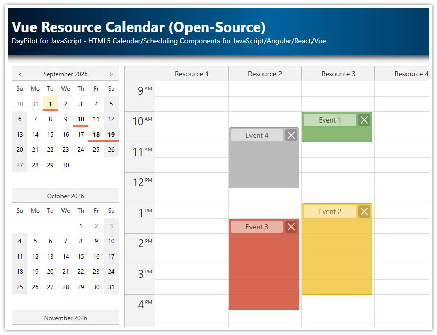
</script>Tip: If you want to display a calendar for multiple resources (displayed as columns), take a look at the Vue Resource Calendar (Open-Source) tutorial.
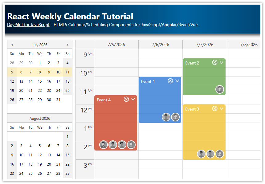
Vue.js Weekly Calendar Configuration

By default, the Vue calendar displays a day view. We want to switch it to a week view. This can be done by setting the viewType property to "Week".
The calendar properties can be specified using the :config attribute of the component. We have set the value to "calendarConfig" which tells the calendar to look for calendarConfig object in the application data.
<template>
  <DayPilotCalendar viewType="Week" />
</template>

<script setup>

import {DayPilotCalendar} from '@daypilot/daypilot-lite-vue';

</script>
You can use the config object to set additional calendar properties and event handlers. Changes made to the config object using Vue.set() method will be detected by Vue and the Calendar component will be updated automatically.
Loading Appointments

To load events, we use the the :events prop that points to a special state variabl (events).
<template>
  <DayPilotCalendar viewType="Week" :events="events" />
</template>

<script setup>

import {DayPilotCalendar} from '@daypilot/daypilot-lite-vue'

const events = ref([])

</script>
The appointment data can be displayed by updating the value of the events state variable.
<template>
  <DayPilotCalendar viewType="Week" :events="events" />
</template>

<script setup>
import {DayPilot, DayPilotCalendar, DayPilotNavigator} from '@daypilot/daypilot-lite-vue'

const events = ref([])

function loadEvents() {
  events.value = [
    {
      id: 1,
      start: '2026-08-24T10:00:00',
      end: '2026-08-24T11:00:00',
      text: 'Event 1',
    },
    {
      id: 2,
      start: '2026-08-24T13:00:00',
      end: '2026-08-24T16:00:00',
      text: 'Event 2',
    },
    // ...
  ]
}

onMounted(() => {
  loadEvents()
})

</script>
Creating New Appointments

The JavaScript calendar lets users create new appointments using drag and drop time range selection.
To handle the user action, we'll add onTimeRangeSelected event handler to the calendarConfig object.
<template>
  <DayPilotCalendar
    viewType="Week"
    :events="events"
    @timeRangeSelected="onCalTimeRangeSelected"
  />
</template>

<script setup>
import {DayPilotCalendar} from '@daypilot/daypilot-lite-vue'

const onCalTimeRangeSelected = async (args) => {
  const modal = await DayPilot.Modal.prompt('Create a new event:', 'Event 1')
  const dp = args.control
  dp.clearSelection()
  if (modal.canceled) return
  dp.events.add({
    start: args.start,
    end: args.end,
    id: DayPilot.guid(),
    text: modal.result,
  })
}

// ...

</script>
Calendar Appointment CSS Styling

You can change the appointment appearance using CSS:
You can generate a custom CSS theme using the online theme designer. The theme designer lets you customize the appearance of the calendar component and also the styling of the appointments.
You can simply override selected styles of the built-in theme.
First, we turn off the duration bar using the durationBarVisible prop:
<template>
  <DayPilotCalendar
    :durationBarVisible="false"
    ....
  />
</template>
Now we can add custom CSS styles. This CSS class will change the appointment background color to blue, text color to white, add a bit of transparency and apply rounded corners:
<style>
.calendar_default_event_inner {
  background: #2e78d6;
  color: white;
  border-radius: 5px;
  opacity: 0.9;
}
</style>
In addition to the global CSS settings, you can also set selected properties directly in the event properties or you can customize the appointments dynamically using onBeforeEventRender event handler.
function loadEvents() {
  events.value = [
    {
      id: 1,
      start: '2026-08-24T10:00:00',
      end: '2026-08-24T11:00:00',
      text: 'Event 1',
      backColor: '#6aa84f',
      borderColor: '#569838',
    },
    {
      id: 2,
      start: '2026-08-24T13:00:00',
      end: '2026-08-24T16:00:00',
      text: 'Event 2',
      backColor: '#f1c232',
      borderColor: '#d5a715',
    },
    {
      id: 3,
      start: '2026-08-25T13:30:00',
      end: '2026-08-25T16:30:00',
      text: 'Event 3',
      backColor: '#da5c41',
      borderColor: '#cc4125',
    },
    {
      id: 4,
      start: '2026-08-25T10:30:00',
      end: '2026-08-25T12:30:00',
      text: 'Event 4',
    },
  ]
}
Complete Source Code of the Vue.js Calendar Component
components/Calendar.vue
<template>
  <div class="wrap">
    <div class="left">
      <DayPilotNavigator
          selectMode="Week"
          :showMonths="3"
          :skipMonths="3"
          :selectionDay="selectionDay"
          @timeRangeSelected="onNavTimeRangeSelected"
      />
    </div>
    <div class="content">
      <DayPilotCalendar
          ref="calendarRef"
          viewType="Week"
          :startDate="startDate"
          :events="events"
          :durationBarVisible="false"
          timeRangeSelectedHandling="Enabled"
          eventDeleteHandling="Disabled"
          :contextMenu="contextMenu"
          @timeRangeSelected="onCalTimeRangeSelected"
          @beforeEventRender="onBeforeEventRender"
          @eventMoved="onEventMoved"
          @eventResized="onEventResized"
      />
    </div>
  </div>
</template>

<script setup>
import { DayPilot, DayPilotCalendar, DayPilotNavigator } from '@daypilot/daypilot-lite-vue'
import { ref, onMounted } from 'vue'

const calendarRef = ref(null)

const selectionDay = ref('2026-08-23')

const startDate = ref('2026-08-23')
const events = ref([])

const onNavTimeRangeSelected = (args) => {
  startDate.value = args.day
}

const onCalTimeRangeSelected = async (args) => {
  const modal = await DayPilot.Modal.prompt('Create a new event:', 'Event 1')
  const dp = args.control
  dp.clearSelection()
  if (modal.canceled) return
  dp.events.add({
    start: args.start,
    end: args.end,
    id: DayPilot.guid(),
    text: modal.result,
  })
}

const onBeforeEventRender = (args) => {
  if (!args.data.backColor) {
    args.data.backColor = '#2e78d6' // default color
    args.data.borderColor = '#0a5cd2'
  }
  args.data.fontColor = '#ffffff'
  args.data.backColor += 'cc' // make events semi-transparent
  args.data.areas = [
    {
      right: 5,
      top: 7,
      width: 25,
      height: 25,
      backColor: '#ffffff',
      fontColor: '#666666',
      padding: 4,
      symbol: '/icons/daypilot.svg#threedots-v',
      style: 'border-radius: 50%;',
      action: 'ContextMenu',
    },
  ]
}

const onEventMoved = () => {
  console.log('Event moved')
}

const onEventResized = () => {
  console.log('Event resized')
}

const contextMenu = new DayPilot.Menu({
  items: [
    {
      text: 'Delete',
      onClick: (args) => {
        const dp = calendarRef.value.control
        dp.events.remove(args.source)
      },
    },
  ],
})

function loadEvents() {
  events.value = [
    {
      id: 1,
      start: '2026-08-24T10:00:00',
      end: '2026-08-24T11:00:00',
      text: 'Event 1',
      backColor: '#6aa84f',
      borderColor: '#569838',
    },
    {
      id: 2,
      start: '2026-08-24T13:00:00',
      end: '2026-08-24T16:00:00',
      text: 'Event 2',
      backColor: '#f1c232',
      borderColor: '#d5a715',
    },
    {
      id: 3,
      start: '2026-08-25T13:30:00',
      end: '2026-08-25T16:30:00',
      text: 'Event 3',
      backColor: '#da5c41',
      borderColor: '#cc4125',
    },
    {
      id: 4,
      start: '2026-08-25T10:30:00',
      end: '2026-08-25T12:30:00',
      text: 'Event 4',
    },
  ]
}

onMounted(() => {
  loadEvents()
})
</script>

<style>
.wrap { display: flex; }
.left { margin-right: 10px; }
.content { flex-grow: 1; }
</style>
History
January 9, 2026: Upgraded to DayPilot Lite for JavaScript 2026.1.790. Default event look set using
onBeforeEventRender.September 13, 2025: Upgraded to DayPilot Lite for JavaScript 2025.3.703. Config object replaced by inline props.
June 22, 2024: Upgraded to DayPilot Lite for JavaScript 2024.2.532, Vue composition API. Context menu and event icons added.
January 4, 2022: Switched to the Vue Calendar component from the open-source DayPilot Lite library (version 2021.4.341). Date picker for changing dates integrated. Upgraded to Vue 3.
December 16, 2020: Upgraded to DayPilot Pro for JavaScript 2020.4.4807. Using NPM package (daypilot-pro-vue).
September 18, 2019: Upgraded to DayPilot Pro for JavaScript 2019.3.4012. Context menu added.
April 11, 2018: Initial release