 DayPilot
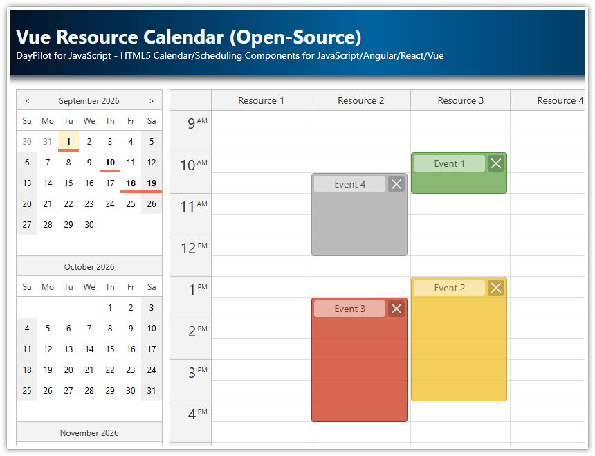
Overview
How to add Previous/Next buttons that change the month displayed by the Vue.js Scheduler component.
There are two ways to change the Scheduler properties: reactive Vue props and direct access to the Scheduler instance.
This Vue.js project was generated using the online UI Builder application.
Changing the Scheduler Properties in Vue
The visible date range of the DayPilot Vue.js Scheduler component is defined using two properties:
const startDate = ref(new DayPilot.Date('2026-04-01'))
const days = computed(() => startDate.value.daysInMonth())
const currentMonthLabel = computed(() => startDate.value.toString('MMMM yyyy'))
In this sample, the initial view is pinned to April 2026 so the example stays predictable. The same startDate value also drives the centered month label in the toolbar.
Change Vue Scheduler Date Range using "Next" Button

Any change to the startDate or days props is detected and applied automatically. To switch to the next month, we add one month to the current startDate value.
  <div class="toolbar">
    <div class="nav">
      <button id="previous" type="button" @click="previous">Previous</button>
      <div class="current-month">{{ currentMonthLabel }}</div>
      <button id="next" type="button" @click="next">Next</button>
    </div>
const next = () => {
startDate.value = startDate.value.addMonths(1)
}If you prefer direct access to the underlying DayPilot.Scheduler instance, you can use the update() method instead. This alternative snippet explains the API call, but it is not copied from the downloadable project.
const next = () => {
const scheduler = schedulerRef.value?.control
const startDate = scheduler.startDate.addMonths(1)
const days = startDate.daysInMonth()
scheduler.update({ startDate, days })
}Change Vue Scheduler Date Range using "Previous" Button

The “Previous” button logic is similar. We subtract one month from the current startDate value.
const previous = () => {
startDate.value = startDate.value.addMonths(-1)
}The same direct-access alternative is available here as well:
const previous = () => {
const scheduler = schedulerRef.value?.control
const startDate = scheduler.startDate.addMonths(-1)
const days = startDate.daysInMonth()
scheduler.update({ startDate, days })
}Full Source Code
Here is the source code of our Vue Scheduler example that shows how to change the visible date range using Previous and Next buttons.
It also includes some other basic config options, such as event styling using onBeforeEventRender and drag-and-drop event creation using onTimeRangeSelected.
<template>
<div class="toolbar">
<div class="nav">
<button id="previous" type="button" @click="previous">Previous</button>
<div class="current-month">{{ currentMonthLabel }}</div>
<button id="next" type="button" @click="next">Next</button>
</div>
</div>
<DayPilotScheduler
ref="schedulerRef"
:timeHeaders="timeHeaders"
scale="Day"
:days="days"
:startDate="startDate"
timeRangeSelectedHandling="Enabled"
:durationBarVisible="false"
:eventBorderRadius="16"
:eventHeight="36"
:rowHeaderWidth="120"
:treeEnabled="true"
:events="events"
:resources="resources"
@timeRangeSelected="onTimeRangeSelected"
@beforeEventRender="onBeforeEventRender"
/>
</template>
<script setup>
import { DayPilot, DayPilotScheduler } from '@daypilot/daypilot-lite-vue'
import { computed, onMounted, ref } from 'vue'
const schedulerRef = ref(null)
const timeHeaders = [
{ groupBy: 'Month' },
{ groupBy: 'Day', format: 'd' },
]
const startDate = ref(new DayPilot.Date('2026-04-01'))
const days = computed(() => startDate.value.daysInMonth())
const currentMonthLabel = computed(() => startDate.value.toString('MMMM yyyy'))
const events = ref([])
const resources = ref([])
const onTimeRangeSelected = async (args) => {
const modal = await DayPilot.Modal.prompt('Create a new event:', 'New event')
args.control.clearSelection()
if (modal.canceled) return
args.control.events.add({
start: args.start,
end: args.end,
id: DayPilot.guid(),
resource: args.resource,
text: modal.result,
backColor: 'var(--event-bg-soft)',
borderColor: 'var(--event-border-soft)',
fontColor: 'var(--event-text)',
})
}
const onBeforeEventRender = (args) => {
const accent = args.data.borderColor || 'var(--event-border)'
args.data.borderRadius = 16
args.data.areas = [
{
top: 6,
right: 8,
width: 22,
height: 22,
padding: 4,
borderRadius: '50%',
symbol: 'icons/daypilot.svg#x-2',
backColor: '#ffffff',
borderColor: accent,
fontColor: accent,
style: 'cursor: pointer;',
toolTip: 'Delete',
onClick: (clickArgs) => {
schedulerRef.value?.control.events.remove(clickArgs.source)
},
},
]
}
const previous = () => {
startDate.value = startDate.value.addMonths(-1)
}
const next = () => {
  startDate.value = startDate.value.addMonths(1)
}
const loadEvents = () => {
events.value = [
{
id: 1,
start: '2026-03-10',
end: '2026-03-14',
text: 'Preliminary Review',
resource: 'R1',
backColor: 'var(--event-bg-soft)',
borderColor: 'var(--event-border-soft)',
fontColor: 'var(--event-text)',
},
{
id: 2,
start: '2026-04-03',
end: '2026-04-07',
text: 'Planning',
resource: 'R2',
backColor: 'var(--event-bg)',
borderColor: 'var(--event-border)',
fontColor: 'var(--event-text)',
},
{
id: 3,
start: '2026-04-10',
end: '2026-04-14',
text: 'Site Visit',
resource: 'R4',
backColor: 'var(--event-bg-soft)',
borderColor: 'var(--event-border-soft)',
fontColor: 'var(--event-text)',
},
{
id: 4,
start: '2026-04-16',
end: '2026-04-21',
text: 'Follow-up',
resource: 'R6',
backColor: 'var(--event-bg-strong)',
borderColor: 'var(--event-border-strong)',
fontColor: 'var(--event-text)',
},
{
id: 5,
start: '2026-05-05',
end: '2026-05-09',
text: 'Final Approval',
resource: 'R5',
backColor: 'var(--event-bg)',
borderColor: 'var(--event-border)',
fontColor: 'var(--event-text)',
},
]
}
const loadResources = () => {
resources.value = [
{ name: 'Resource 1', id: 'R1' },
{ name: 'Resource 2', id: 'R2' },
{ name: 'Resource 3', id: 'R3' },
{ name: 'Resource 4', id: 'R4' },
{ name: 'Resource 5', id: 'R5' },
{ name: 'Resource 6', id: 'R6' },
{ name: 'Resource 7', id: 'R7' },
]
}
onMounted(() => {
loadResources()
loadEvents()
})
</script>
<style>
:root {
--toolbar-bg: #eef6f1;
--toolbar-border: #b8d4c5;
--toolbar-hover: #e2efe8;
--toolbar-text: #1f4d39;
--nav-button-bg: #dceee3;
--nav-button-border: #8fb79f;
--nav-button-hover: #d1e6d8;
--event-bg: #e3f2ea;
--event-border: #2f7d57;
--event-bg-soft: #edf7f1;
--event-border-soft: #5f8f77;
--event-bg-strong: #d9ede3;
--event-border-strong: #206949;
--event-text: #1b3c30;
}
body .scheduler_default_event {
box-shadow: none;
}
body .scheduler_default_event_inner {
padding: 8px 38px 8px 12px;
display: flex;
align-items: center;
box-sizing: border-box;
}
</style>
<style scoped>
.toolbar {
margin-bottom: 12px;
}
.nav {
display: inline-flex;
align-items: stretch;
}
.nav button,
.current-month {
color: var(--toolbar-text);
border: 1px solid var(--toolbar-border);
padding: 0.55rem 1rem;
font: inherit;
box-sizing: border-box;
line-height: 1.2;
}
.nav button {
min-width: 100px;
background-color: var(--nav-button-bg);
border-color: var(--nav-button-border);
cursor: pointer;
transition: background-color 0.18s ease, color 0.18s ease, border-color 0.18s ease;
}
.nav button + .current-month,
.current-month + .nav button,
.current-month + button,
.nav button + button {
margin-left: -1px;
}
.nav button:first-child {
border-top-left-radius: 30px;
border-bottom-left-radius: 30px;
}
.nav button:last-child {
border-top-right-radius: 30px;
border-bottom-right-radius: 30px;
}
.current-month {
display: inline-flex;
align-items: center;
justify-content: center;
min-width: 150px;
background-color: var(--toolbar-bg);
font-weight: 600;
white-space: nowrap;
}
.nav button:hover {
background-color: var(--nav-button-hover);
}
.nav button:focus-visible {
position: relative;
outline: none;
border-color: var(--event-border);
z-index: 1;
}
.nav button:active {
background-color: #d8e8df;
}
</style>History
April 17, 2026: Updated the sample to
@daypilot/daypilot-lite-vue5.6.0, refreshed the toolbar and event styling, switched the sample to a multi-month dataset, set an explicit row header width.