 DayPilot
")
Features
This React application builds an event calendar/scheduler UI using React Event Calendar component from the free DayPilot Lite open-source calendar library.
The React calendar appearance is customized using CSS.
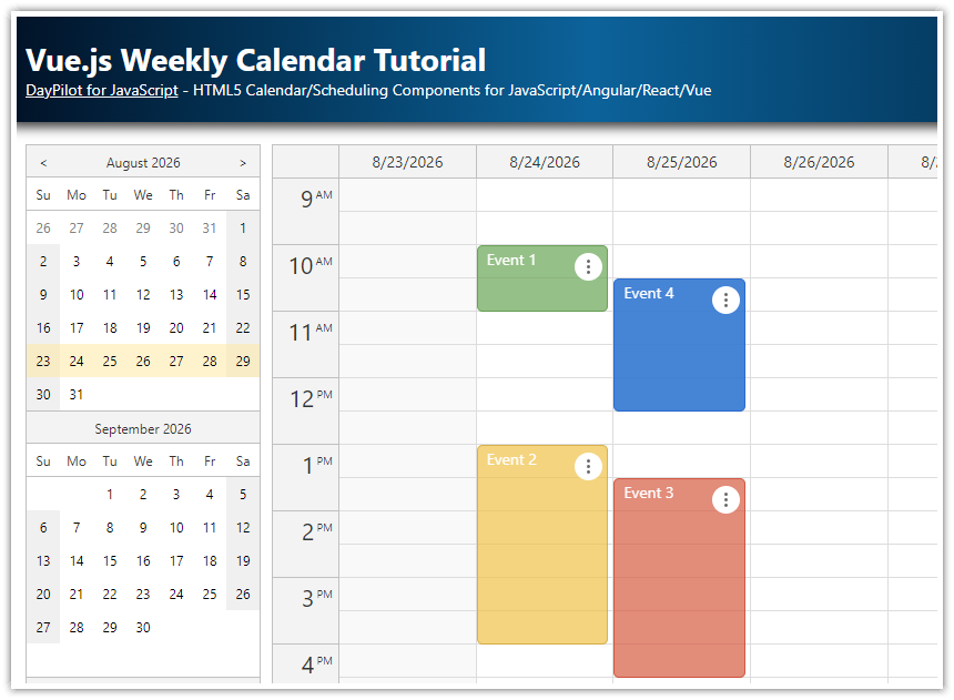
The built-in date picker can be used for switching the visible week.
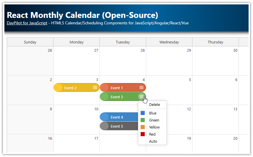
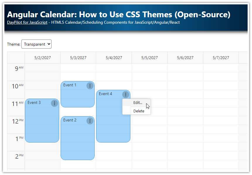
The events display action icons (delete, open context menu) and icons/avatars of the event participants.
A React project with a complete source code is available for download.
License
Apache License 2.0
React Calendar UI Configurator
You can configure the React weekly calendar component using the visual UI Builder application. Preview the configuration using a live calendar instance and download a ready-to-run React project.
How to install the React calendar component?

You can add the React calendar component to your JSX using <DayPilotCalendar> tag.
This example creates a new functional React component called Calendar and adds the <DayPilotCalendar> component with the default configuration.
import React from 'react';
import { DayPilotCalendar } from "@daypilot/daypilot-lite-react";

const Calendar = () => {
    return (
        <div>
            <DayPilotCalendar />
        </div>
    );
}

export default Calendar;
Out of the box, the React calendar component displays the current day. Later in this tutorial, we will see how to enable a week view and set a custom start date.
The DayPilotCalendar React component is available as part of the open-source DayPilot Lite calendar/scheduling library. The React package is available at NPM (@daypilot/daypilot-lite-react).
You can add it to your React application using npm :
npm install @daypilot/daypilot-lite-reactHow to add a weekly calendar to your React application?

You can add a weekly calendar by changing the React calendar component configuration object. By default, the calendar displays one day (day view). There are several modes available:
Day
Week
WorkWeek
Days (custom number of days)
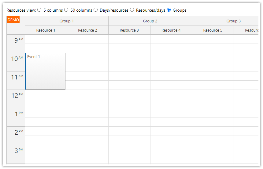
Resources
The “Resources” calendar mode lets you add a resource calendar to your React application. This mode displays custom resources (people, rooms, locations, tools) as columns in the scheduling calendar. To learn more about using the resource calendar in React, see the React Resource Calendar with Editable Columns (Open-Source) tutorial:

We will switch the calendar to the week view using viewType property:
import React, { useState } from 'react';
import { DayPilotCalendar } from "@daypilot/daypilot-lite-react";

const Calendar = () => {
    const config = {
        viewType: "Week"
    };

    return (
        <div>
            <DayPilotCalendar {...config} />
        </div>
    );
}

export default Calendar;
Note that we have added a config object to our Calendar component. It holds the static calendar configuration properties (and event handlers). The {...config} spread syntax is used to pass all properties of the config object as props to the DayPilotCalendar component.
In the next steps, we will use the config object to add more properties that will customize the calendar view.
How to customize the appearance of the React calendar?
We will make a couple of changes to the calendar appearance using the configuration object and CSS.
By default, a duration bar is displayed on the left side of calendar events, representing the actual event duration. Also, the color of the duration bar can be customized based on the event type or status.

In our React application, we will hide the duration bar using the durationBarVisible property:

import React, { useState } from 'react';
import { DayPilotCalendar } from "@daypilot/daypilot-lite-react";
import "./Calendar.css";

const Calendar = () => {
    const config = {
      // ...
      durationBarVisible: false,
      // ...
    };

    return (
        <div>
            <DayPilotCalendar {...config} />
        </div>
    );
}

export default Calendar;
In the next step, we will customize the appearance of the calendar events using CSS.
The calendar styles are set by a CSS theme. The calendar component includes a built-in theme which defines the default appearance ("calendar_default").
You can create your own theme using the online theme designer or you can simply override selected styles of the built-in theme. That's what we are going to do in this example:
Calendar.css
/* adjusting the built-in theme */


/* calendar event */
.calendar_default_main:not(.default) {
    --dp-calendar-event-background: #2e78d6cc;
    --dp-calendar-event-color: #ffffff;
    --dp-calendar-event-border-radius: 5px;
    --dp-calendar-event-border: none;
    --dp-calendar-event-padding: 5px;
}
This CSS overrides the default calendar event appearance, using white text on a semi-transparent light blue background:

How to add a React date picker to the calendar?

In order to let users change the visible week, we will use a React date picker component called Navigator. You can add the navigator to the React JSX page using <DayPilotNavigator> tag:
import React, { useState } from 'react';
import { DayPilotCalendar, DayPilotNavigator } from "@daypilot/daypilot-lite-react";
import "./Calendar.css";

const Calendar = () => {

    // ...

    return (
        <div>
            <DayPilotNavigator />
            <DayPilotCalendar {...config} />
        </div>
    );
}

export default Calendar;
The navigator fires the onTimeRangeSelected event whenever a user clicks a date:
import React, { useState } from 'react';
import { DayPilotCalendar, DayPilotNavigator } from "@daypilot/daypilot-lite-react";
import "./CalendarStyles.css";

const Calendar = () => {

    // ...

    return (
        <div>
            <DayPilotNavigator
                onTimeRangeSelected={ args => {
                    console.log("You clicked: " + args.day);
                }}
            />
            <DayPilotCalendar {...config} />
        </div>
    );
}

export default Calendar;
We will use the date picker onTimeRangeSelected event to change the startDate property of the Calendar component:
First, it is necessary to create a startDate state variable that will store the date displayed by the React calendar component.
We will point the startDate attribute of the <DayPilotCalendar> tag to this state variable. This way, the React will detect any change of the startDate variable and update the weekly calendar automatically.
import React, { useState } from 'react';
import { DayPilotCalendar, DayPilotNavigator } from "@daypilot/daypilot-lite-react";
import "./Calendar.css";

const Calendar = () => {

    // ...

    const [startDate, setStartDate] = useState("2025-10-04");

    return (
        <div>
            <DayPilotNavigator
                onTimeRangeSelected={ args => {
                    setStartDate(args.day);
                }}
            />
            <DayPilotCalendar
               {...config}
               startDate={startDate}
            />
        </div>
    );
}

export default Calendar;
The onTimeRangeSelected event handler of the Navigator (date picker) uses the clicked date (args.day) to update the value of the startDate state variable.
We can also use the startDate variable to set the initial date picker selection (by default it uses today).
This is how the date-changing logic looks now in our application:
import React, { useState } from 'react';
import { DayPilotCalendar, DayPilotNavigator } from "@daypilot/daypilot-lite-react";
import "./Calendar.css";

const styles = {
  wrap: {
    display: "flex"
  },
  left: {
    marginRight: "10px"
  },
  main: {
    flexGrow: "1"
  }
};

const Calendar = () => {
    const config = {
      viewType: "Week",
      durationBarVisible: false
    };

    const [startDate, setStartDate] = useState("2026-07-06");

    const handleTimeRangeSelected = args => {
      setStartDate(args.day);
    };

    return (
        <div style={styles.wrap}>
            <div style={styles.left}>
                <DayPilotNavigator
                    selectMode={"Week"}
                    showMonths={3}
                    skipMonths={3}
                    selectionDay={startDate}
                    onTimeRangeSelected={handleTimeRangeSelected}
                />
            </div>
            <div style={styles.main}>
                <DayPilotCalendar {...config} startDate={startDate} />
            </div>
        </div>
    );
}

export default Calendar;
How to load calendar events in React?

The calendar event data can be loaded using the events attribute.
We will create a special events state variable:that will store the initial calendar data set:
const [events, setEvents] = useState([]);And use it as a value of the events attribute of the calendar:
<DayPilotCalendar
  events={events}
  ...
/>
Now we can load the events in a useEffect() block that runs when the weekly calendar component is initialized:
useEffect(() => {
  const events = [
    {
      id: 1,
      text: "Event 1",
      start: "2026-07-06T10:30:00",
      end: "2026-07-06T13:00:00",
      participants: 2,
    },
    {
      id: 2,
      text: "Event 2",
      start: "2026-07-07T09:30:00",
      end: "2026-07-07T11:30:00",
      backColor: "#6aa84fcc",
      participants: 1,
    },
    {
      id: 3,
      text: "Event 3",
      start: "2026-07-07T12:00:00",
      end: "2026-07-07T15:00:00",
      backColor: "#f1c232cc",
      participants: 3,
    },
    {
      id: 4,
      text: "Event 4",
      start: "2026-07-05T11:30:00",
      end: "2026-07-05T14:30:00",
      backColor: "#cc4125cc",
      participants: 4,
    },
  ];
  setEvents(events);
}, []);
Full Source Code
And here is the full source code of our React calendar/scheduler component that displays events customized using CSS:
Calendar.jsx
import React, {useEffect, useState} from 'react';
import {DayPilot, DayPilotCalendar, DayPilotNavigator} from "@daypilot/daypilot-lite-react";
import "./Calendar.css";

const styles = {
  wrap: {
    display: "flex"
  },
  left: {
    marginRight: "10px"
  },
  main: {
    flexGrow: "1"
  }
};

const Calendar = () => {
  const [calendar, setCalendar] = useState(null);
  const [events, setEvents] = useState([]);
  const [startDate, setStartDate] = useState("2026-07-05");

  const config = {
    viewType: "Week",
    durationBarVisible: false,
    timeRangeSelectedHandling: "Enabled",
    onTimeRangeSelected: async args => {
      const modal = await DayPilot.Modal.prompt("Create a new event:", "Event 1");
      calendar.clearSelection();
      if (!modal.result) { return; }
      calendar.events.add({
        start: args.start,
        end: args.end,
        id: DayPilot.guid(),
        text: modal.result
      });
    },
    onEventClick: async args => {
      await editEvent(args.e);
    },
    contextMenu: new DayPilot.Menu({
      items: [
        {
          text: "Delete",
          onClick: async args => {
            calendar.events.remove(args.source);
          },
        },
        {
          text: "-"
        },
        {
          text: "Edit...",
          onClick: async args => {
            await editEvent(args.source);
          }
        }
      ]
    }),
    onBeforeEventRender: args => {
      args.data.areas = [
        {
          top: 3,
          right: 3,
          width: 20,
          height: 20,
          symbol: "icons/daypilot.svg#minichevron-down-2",
          fontColor: "#fff",
          toolTip: "Show context menu",
          action: "ContextMenu",
        },
        {
          top: 3,
          right: 25,
          width: 20,
          height: 20,
          symbol: "icons/daypilot.svg#x-circle",
          fontColor: "#fff",
          action: "None",
          toolTip: "Delete event",
          onClick: async args => {
            calendar.events.remove(args.source);
          }
        }
      ];


      const participants = args.data.participants;
      if (participants > 0) {
        // show one icon for each participant
        for (let i = 0; i < participants; i++) {
          args.data.areas.push({
            bottom: 5,
            right: 5 + i * 30,
            width: 24,
            height: 24,
            action: "None",
            image: `/avatars/avatar${i+1}.png`,
            style: "border-radius: 50%; border: 2px solid #fff; overflow: hidden;",
            onClick: async args => {
              const form = [
                {name: `Participant ${i+1}`},
                {image: `/avatars/avatar${i+1}.png`}
              ];
              await DayPilot.Modal.form(form);
            }
          });
        }
      }
    }
  };

  const editEvent = async (e) => {
    const modal = await DayPilot.Modal.prompt("Update event text:", e.text());
    if (!modal.result) { return; }
    e.data.text = modal.result;
    calendar.events.update(e);
  };

  useEffect(() => {
    const events = [
      {
        id: 1,
        text: "Event 1",
        start: "2026-07-06T10:30:00",
        end: "2026-07-06T13:00:00",
        participants: 2,
      },
      {
        id: 2,
        text: "Event 2",
        start: "2026-07-07T09:30:00",
        end: "2026-07-07T11:30:00",
        backColor: "#6aa84fcc",
        participants: 1,
      },
      {
        id: 3,
        text: "Event 3",
        start: "2026-07-07T12:00:00",
        end: "2026-07-07T15:00:00",
        backColor: "#f1c232cc",
        participants: 3,
      },
      {
        id: 4,
        text: "Event 4",
        start: "2026-07-05T11:30:00",
        end: "2026-07-05T14:30:00",
        backColor: "#cc4125cc",
        participants: 4,
      },
    ];
    setEvents(events);
  }, []);

  return (
    <div style={styles.wrap}>
      <div style={styles.left}>
        <DayPilotNavigator
          selectMode={"Week"}
          showMonths={3}
          skipMonths={3}
          selectionDay={startDate}
          onTimeRangeSelected={ args => {
            setStartDate(args.day);
          }}
        />
      </div>
      <div style={styles.main}>
        <DayPilotCalendar
          {...config}
          events={events}
          startDate={startDate}
          controlRef={setCalendar}
        />
      </div>
    </div>
  );
}

export default Calendar;
History
September 3, 2025: Upgraded to DayPilot Lite for JavaScript 2025.3.703 (4.4.0). Upgraded to React 19 (and Vite).
July 31, 2024: Upgraded to DayPilot Lite for JavaScript 2024.3.543. Using the
controlRefproperty to get a DayPilot.Calendar reference directly. Loading events and changing the date using state variables.August 15, 2023: Added action icons (delete, context menu) and participant avatars. Upgraded to DayPilot Lite for JavaScript 2023.3.484.
May 25, 2023: Switched to React Hooks API. Upgraded to DayPilot Lite for JavaScript 2023.2.470.
July 18, 2022: Upgraded to React 18. Upgraded to DayPilot Lite for JavaScript 2022.3.393.
December 31, 2021: Switched to the open-source DayPilot Lite library (2021.4.341)
June 13, 2021: Upgraded to DayPilot Pro for JavaScript 2021.2.5000
November 27, 2020: Upgraded to React 17, DayPilot Pro for JavaScript 2020.4.4784
September 20, 2019: Upgraded to React 16.9, DayPilot Pro for JavaScript 2019.3.4012
June 9, 2018: Initial release