 DayPilot
")
Overview
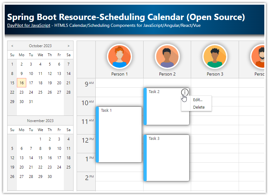
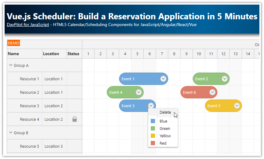
The Vue resource calendar component displays resources (people, rooms, cars, tools) as columns.
It is built using the open-source Vue calendar from DayPilot Lite for JavaScript package.
You can switch the current day using a date picker that shows a calendar preview for three months.
Days with scheduled events are highlighted in the date picker.
The resource calendar lets you schedule tasks, make reservations, and show resource utilization.
Vue calendar project is available for download.
The attached project uses Vue 3 and the Composition API to build the calendar.
Resource Calendar in Vue.js
To use the DayPilot resource calendar component in your Vue application, start by installing the @daypilot/daypilot-lite-vue NPM package:
npm install @daypilot/daypilot-lite-vueNow you can add the resource calendar to your Vue application:
Create a new
ResourceCalendarVue component.Add
<DayPilotCalendar>to the component template.To enable the resource calendar mode, add a
viewType="Resources"prop.
<template>
  <DayPilotCalendar viewType="Resources" />
</template>
<script setup>
import { DayPilotCalendar } from "@daypilot/daypilot-lite-vue"
</script>
Show Resources as Columns in the Vue Calendar

The columns can be defined using the :columns prop. First, we need to add it to the template:
<template>
  <DayPilotCalendar viewType="Resources" :columns="columns" />
</template>
Now we create a new columns variable that will hold the column data.
const columns = ref([])The loadResources() JavaScript function defines a set of resources statically to make things easier:
const loadResources = () => {
  columns.value = [
    { name: "Resource 1", id: "R1" },
    { name: "Resource 2", id: "R2" },
    { name: "Resource 3", id: "R3" },
    { name: "Resource 4", id: "R4" },
    { name: "Resource 5", id: "R5" },
    { name: "Resource 6", id: "R6" },
  ]
}
When the value of the columns variable changes, the Calendar automatically updates the view to show the resources.
<template>
  <DayPilotCalendar viewType="Resources" :columns="columns" />
</template>
<script setup>
import { ref, onMounted } from "vue"
import { DayPilot, DayPilotCalendar } from "@daypilot/daypilot-lite-vue"

const columns = ref([])

const loadResources = () => {
  columns.value = [
    { name: "Resource 1", id: "R1" },
    { name: "Resource 2", id: "R2" },
    { name: "Resource 3", id: "R3" },
    { name: "Resource 4", id: "R4" },
    { name: "Resource 5", id: "R5" },
    { name: "Resource 6", id: "R6" },
  ]
}

onMounted(() => {
  loadResources()
})
</script>
Load and Display Resource Calendar Events/Tasks
 - Loading Events")
In this setp, we load the event data (tasks, reservations) that will be displayed in the main calendar grid.
We bind the :events prop to a new events variable:
<template>
  <DayPilotCalendar viewType="Resources" :columns="columns" :events="events" />
</template>
<script setup>
import { ref, onMounted } from "vue"
import { DayPilot, DayPilotCalendar } from "@daypilot/daypilot-lite-vue"

const columns = ref([])
const events = ref([])

// ...

</script>
The loadEvents() function is also very simple. We set the event data using events.value:
const loadEvents = () => {
  events.value = [
    { id: 1, start: "2026-09-01T10:00:00", end: "2026-09-01T11:00:00", resource: "R3", text: "Event 1", backColor: "#6aa84fcc" },
    { id: 2, start: "2026-09-01T13:00:00", end: "2026-09-01T16:00:00", resource: "R3", text: "Event 2", backColor: "#f1c232cc" },
    { id: 3, start: "2026-09-01T13:30:00", end: "2026-09-01T16:30:00", resource: "R2", text: "Event 3", backColor: "#cc4125cc" },
    // ...
  ]
}
Add New Events using Drag and Drop
 - Add New Events")
The resource calendar supports adding new events using drag and drop. Users can select a time range for the selected resource (column) and enter details of the new event.
To enable this feature, add an onTimeRangeSelected event handler to the resource calendar:
<template>
  <DayPilotCalendar
    viewType="Resources"
    :columns="columns"
    :events="events"
    ref="calendar"
    timeRangeSelectedHandling="Enabled"
    @timeRangeSelected="onCalTimeRangeSelected"
 />
</template>
<script setup>
import { ref, onMounted } from "vue"
import { DayPilot, DayPilotCalendar } from "@daypilot/daypilot-lite-vue"

const calendar = ref(null)

// ...

const onCalTimeRangeSelected = async (args) => {
  await createEvent(args.start, args.end, args.resource)
  calendar.value.control.clearSelection()
}

</script>
Our onTimeRangeSelected event handler opens a modal dialog for entering details of the new event and then clears the current selection.
Displaying a Modal Dialog
The createEvent() function opens a modal dialog that shows the selected resource, start and end time and lets you enter the event text.
The modal dialog is created using DayPilot.Modal.form() method that lets you create a JavaScript modal dialog with custom form fields programmatically (see also some modal dialog examples).

Our “new event” form displays four fields:
Text
Start
End
Resources
The DayPilot.Modal.form() method can pre-fill the form fields from the supplied data object. The data object uses data from the current calendar selection (start, end, resource).
As soon as the modal dialog closes, you can access the form result using modal.result property. It’s a copy of the original data object - the properties are updated using the supplied form field values.
const createEvent = async (start, end, resource) => {
  const form = [
    {name: "Text", id: "text"},
    {name: "Start", id: "start", type: "datetime", disabled: true},
    {name: "End", id: "end", type: "datetime", disabled: true},
    {name: "Resource", id: "resource", type: "select", options: calendar.value.control.columns.list}
  ]
  const data = {
    start,
    end,
    resource,
    id: DayPilot.guid()
  }
  const modal = await DayPilot.Modal.form(form, data)
  if (modal.canceled) {
    return
  }

  const e = modal.result
  calendar.value.control.events.add(e)
}
The events.add() method then adds the new event to the resource calendar.
Clearing the Selection
To access the clearSelection() method, we need a reference to the DayPilot.Calendar object:
1. Add ref="calendar" to the <DayPilotCalendar> tag.
2. Define a new calendar variable: const calendar = ref(null)
3. The DayPilot.Calendar object is now accessible as calendar.value.control.
Edit Resource Calendar Events
You can use the same approach to create the “edit” modal dialog.
To open the modal dialog on event click, it is necessary to add an onEventClick event handler to the resource calendar.
<template>
  <DayPilotCalendar
    viewType="Resources"
    :columns="columns"
    :events="events"
    ref="calendar"
    ...
    @eventClick="onEventClick"
 />
</template>
<script setup>
import { ref, onMounted } from "vue"
import { DayPilot, DayPilotCalendar } from "@daypilot/daypilot-lite-vue"

const calendar = ref(null)

// ...

const onEventClick = (args) {
  editEvent(args.e)
}

</script>
The editEvent() JavaScript function opens a modal dialog similar to the “new event” dialog from the previous chapter and updates the event using an events.update() call.
const editEvent = async (e) => {
  const form = [
    {name: "Text", id: "text"},
    {name: "Start", id: "start", type: "datetime", disabled: true},
    {name: "End", id: "end", type: "datetime", disabled: true},
    {name: "Resource", id: "resource", type: "select", options: calendar.value.control.columns.list}
  ]
  const data = e.data
  const modal = await DayPilot.Modal.form(form, data)
  if (modal.canceled) {
    return
  }

  calendar.value.control.events.update(modal.result)
}
Vue Date Picker with Free/Busy Highlighting

To make the date switching easier, we will add a date picker component that will display an overview of three months and let users change the current date easily. To learn more about the Vue date picker, please see the Vue Date Picker with Free/Busy Highlighting (Open-Source) tutorial. Here is a quick summary of the necessary steps:
The date picker can be added using <DayPilotNavigator> component.
First, it’s necessary to update the layout so there are two independent columns. The left column will display the date picker component and the right column will display the resource calendar:
<template>
  <div class="wrap">
    <div class="left">
      <DayPilotNavigator ... />
    </div>
    <div class="content">
      <DayPilotCalendar ... />
    </div>
  </div>
</template>
The parent <div> that is marked with wrap CSS class uses display: flex to show the child elements as columns:
<style>
.wrap {
  display: flex;
}

.left {
  margin-right: 10px;
}

.content {
  flex-grow: 1;
}

</style>
Now we can configure the date picker:
<DayPilotNavigator
    ref="navigator"
    :showMonths="3"
    :skipMonths="3"
    selectMode="Day"
    :startDate="initialNavigatorDate"
    :selectionDay="initialNavigatorDate"
    :events="events"
    @timeRangeSelected="onNavTimeRangeSelected"
/>
The onTimeRangeSelected event handler is fired when a user selects a date in the date picker. We will use this event handler to update the startDate property that is used to define the date displayed by the Calendar:
<template>
  <DayPilotNavigator ... />
  <DayPilotCalendar
    :startDate="startDate"
    ...
  />
</template>
<script setup>

// ...

const startDate = ref("2026-09-01")

const onNavTimeRangeSelected = (args) => {
  startDate.value = args.day
}
</script>
To highlight busy days, you can load the event data in the Navigator. Since the data is already available in the events property, we can just bind it to the Navigator :events prop:
<DayPilotNavigator
    ...
    :events="events"
/>