 DayPilot
")
Overview
Vue monthly calendar/scheduler component from the open-source DayPilot Lite for JavaScript library.
It’s free and open-source (Apache License 2.0).
You can use the monthly calendar component for scheduling tasks, reminders, reservations, and milestones.
The calendar uses a context menu for easy access to event actions (delete, edit, postpone, duplicate, lock).
Each calendar event type uses a custom color.
You can move and resize events using drag and drop.
Edit the event text using a built-in or custom modal dialog.
Download the source code of this Vue 3 application and use it for your own project.
How to Install the Vue Monthly Calendar Component

The Vue version of the open-source DayPilot Lite calendar/scheduler library is available at NPM (@daypilot/daypilot-lite-vue package).
You can add it to your Vue project using npm:
npm install @daypilot/daypilot-lite-vueThe Vue monthly calendar component is now available and you can add it to the Vue template as <DayPilotMonth> tag:
<template>
  <DayPilotMonth :config="config" />
</template>
To configure the monthly calendar, add props to the <DayPilotMonth> tag in the Vue template:
<template>
  <DayPilotMonth :startDate="startDate" />
</template>

<script setup>

import { DayPilotMonth } from '@daypilot/daypilot-lite-vue'

const startDate = ref("2026-10-01")

</script>
You can use the props to specify the monthly scheduler properties and event handlers.
Our config is very simple (it relies on the default values) and it only specifies the :startDate prop which determines the month that will be displayed after initialization. Whenever you change the value of the startDate state variable, the calendar updates automatically.
Later, we will extend the tag with additional properties to add more functionality to the Vue monthly calendar (context menu, click handler, delete handler, etc.).
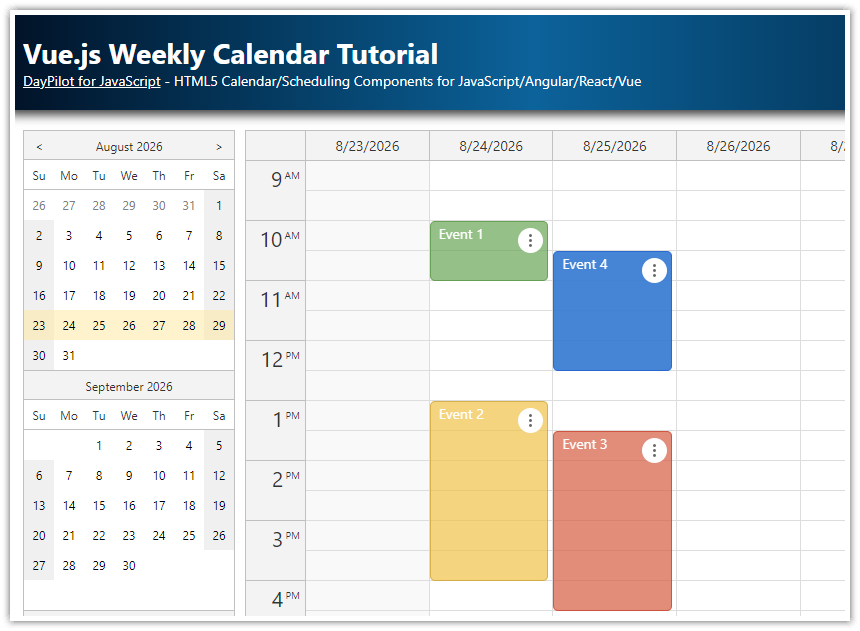
Vue Daily/Weekly Calendar
")
DayPilot Lite also supports a traditional day and week calendar views. See the following tutorial:
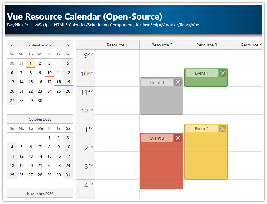
Vue Resource Calendar
")
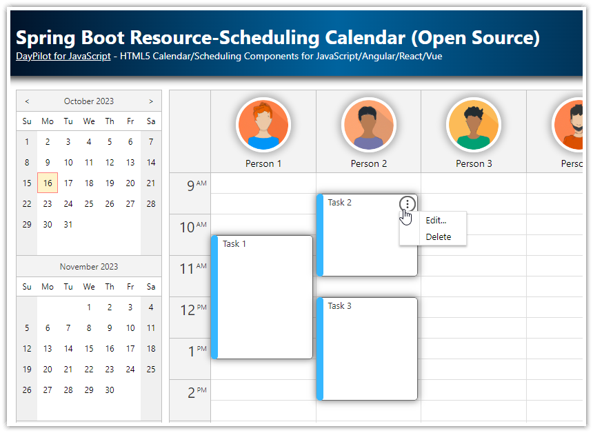
To schedule events, tasks, appointments and assignments for multiple resources, you can use the resource calendar view.
Download a Vue project that shows how to display a resource calendar with people, rooms, or tools as columns:
Vue Monthly Calendar/Scheduler with Event Types
The Vue Monthly Calendar component can display multiple types of events. In our example, we will use “Event”, “Task”, “Reminder” and “Holiday”. You can use your own types of scheduler events (e.g., goals, milestones, or reservations).
The event type is stored in the type property of the calendar event data object. It’s a custom property that is not part of the event object schema.
For simplicity, we add the property at the top level but it’s better to use the tags property of the event object to store custom data types. This will prevent collisions with possible future extensions. Read more about loading events and the event data object structure.
const events = [
  {
    id: 1,
    start: "2026-10-04T00:00:00",
    end: "2026-10-05T00:00:00",
    text: "Event 1",
    type: "event"
  },
  {
    id: 2,
    start: "2026-10-05T00:00:00",
    end: "2026-10-06T00:00:00",
    text: "Reminder",
    type: "reminder"
  },
  {
    id: 3,
    start: "2026-10-05T00:00:00",
    end: "2026-10-06T00:00:00",
    text: "Task 1",
    type: "task"
  },
  {
    id: 4,
    start: "2026-10-10T00:00:00",
    end: "2026-10-11T00:00:00",
    text: "Holiday",
    type: "holiday",
    locked: true
  },
];
Now that we have defined the event type, we can associate a custom color with each event type.
Let’s create a list of types, and their color mappings:
const colors = {
  "event": "#3c78d8",
  "task": "#6aa84f",
  "reminder": "#f1c232",
  "holiday": "#cc0000",
};
Now we can set the bar color when rendering events:
const onBeforeEventRender = args => {
  args.data.barColor = colors[args.data.type];
}
You can also use a different visual hint to distinguish between event types. For example, you can add a custom CSS class to events and define the event type appearance using CSS.
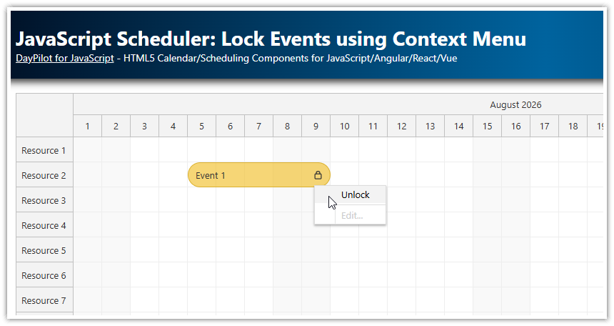
Context Menu for Calendar Events

Since version 2022.3.415, the open-source DayPilot Lite library supports a context menu. We will use it to enable additional user actions for the calendar/scheduler events.
“Edit” - opens a modal dialog with event details and lets users change the event name
“Delete” - removes the event from the calendar view; first, it asks for a confirmation
“Postpone” - moves the event to the following day
“Duplicate” - creates a copy of the calendar event (with the same text, type, and date)
“Lock” - locks the event; a locked event can’t be moved using drag and drop or edited; you can still unlock it or make a duplicate
“Type” - changes the event type to a different one - all event types are listed as sub-menu items
How to Duplicate a Calendar Event in Vue

The “Duplicate” context menu item is defined as follows:
const contextMenu = new DayPilot.Menu({
  items: [
    // ...
    {text: "Duplicate", onClick: args => duplicateEvent(args.source) },
    // ....
  ],
})
This menu item fires duplicateEvents() on click:
const duplicateEvent = (e) => {
  const newEvent = {
    ...e.data,
    id: DayPilot.guid()
  };
  monthRef.value.control.events.add(newEvent);
};
How to Postpone a Task in the Vue Scheduler

The “Postpone” menu item uses the minichevron-right-4 icon (SVG symbol) from the daypilot.svg file in addition to the text. You can use menu icons to highlight selected items and provide a visual hint for quick navigation.
To explore all available icons, see DayPilot Icons.
const contextMenu = new DayPilot.Menu({
  items: [
    // ...
    {text: "Postpone", symbol: "daypilot.svg#minichevron-right-4", onClick: args => postponeEvent(args.source) },
    // ...
  ],
})
The postponeEvent() function updates the event:
const postponeEvent = (e) => {
  e.data.start = e.start().addDays(1);
  e.data.end = e.end().addDays(1);
  monthRef.value.control.events.update(e);
}
To read the start and end, we use start() and end() methods of the DayPilot.Event object which return a DayPilot.Date object. This is helpful when the source data object defines the dates as an ISO string. These methods convert the date to a DayPilot.Date object which makes the date changes easier.
The source data object is available as data property of the DayPilot.Event class. We update the start and end properties with new values (increased by one day).
After changing the dates, we need to update the event in the calendar using events.update() method.
How to Delete a Reminder in the Vue Monthly Calendar

The “Delete” context menu items lets users remove an event (reminder, or task) from the monthly calendar.
const contextMenu = new DayPilot.Menu({
  items: [
    // ...
    {text: "Delete", symbol: "daypilot.svg#x-4", onClick: args => deleteEvent(args.source) },
    // ...
  ],
})
The deleteEvent() function displays a modal dialog and asks for a confirmation:

If you click “OK”, it calls events.remove() which actually deletes the event from the Vue calendar:
const deleteEvent = async (e) => {
  const modal = await DayPilot.Modal.confirm("Do you really want to delete this event?")
  if (modal.canceled) return
  monthRef.value.control.events.remove(e)
}
How to Lock an Event

Using a context menu, it is also possible to update the event status. In this example, you will see how to implement event locking.
The “Lock” item fires toggleEventLock() function on click:
const contextMenu = new DayPilot.Menu({
  items: [
    // ...
    {text: "Lock", symbol: "daypilot.svg#padlock", onClick: args => toggleEventLock(args.source) },
    // ...
  ],
})
The toggleEventLock() function is very simple. It toggles the locked property of the event object:
const toggleEventLock = (e) => {
  e.data.locked = !e.data.locked;
  monthRef.value.control.events.update(e);
};
To give the locked event a special look, we apply a custom CSS class to events that are marked as locked.
We also disable the drag and drop actions (moving, resizing) and other interactions (click, delete):
const onBeforeEventRender = args => {

  // ...

  if (args.data.locked) {
    args.data.text += " (locked)";
    args.data.areas.push({
      right: 30,
      top: 3,
      width: 24,
      height: 24,
      padding: 4,
      fontColor: "#ffffff",
      backColor: color + "55",
      symbol: "icons/daypilot.svg#padlock",
      style: "border-radius: 50%",
      onClick: async args => {
        const modal = await DayPilot.Modal.confirm("Do you really want to unlock this event?");
        if (modal.canceled) {
          return;
        }
        toggleEventLock(args.source);
      }
    });

    args.data.moveDisabled = true;
    args.data.resizeDisabled = true;
    args.data.clickDisabled = true;
    args.data.deleteDisabled = true;
  }

}
As we want to forbid changes of the locked events, we also need to adjust the context menu itemsdynamically depending on the event locked status.
The onShow event of the DayPilot.Menu object is fired whenever the context menu is activated. We can use it to disable selected menu items and update the “Lock” item text.
const contextMenu = new DayPilot.Menu({
  items: [
    // ...
  ],
  onShow: args => {
    const e = args.source;
    const locked = e.data.locked;

    // update the lock/unlock text
    args.menu.items[2].text = locked ? "Unlock" : "Lock";

    // disable actions for locked
    args.menu.items[0].disabled = locked;
    args.menu.items[1].disabled = locked;
    args.menu.items[5].disabled = locked;
    args.menu.items[7].disabled = locked;
  }
})
This is how the context menu looks for locked events:

Full Source Code
Here is the full source code of the open-source Vue Monthly Calendar app:
<template>
  <DayPilotMonth
      ref="monthRef"
      :startDate="startDate"
      :eventHeight="30"
      :headerHeight="40"
      :events="events"
      :contextMenu="contextMenu"
      @eventMoved="onEventMoved"
      @eventResized="onEventResized"
      @eventClicked="onEventClicked"
      @timeRangeSelected="onTimeRangeSelected"
      @beforeEventRender="onBeforeEventRender"
  />
</template>

<script setup>
import { DayPilot, DayPilotMonth } from '@daypilot/daypilot-lite-vue'
import { ref, onMounted } from 'vue'

const monthRef = ref(null)
const startDate = ref("2026-10-01")
const events = ref([])

const colors = {
  event: "#3c78d8",
  task: "#6aa84f",
  reminder: "#f1c232",
  holiday: "#cc0000",
}

const onEventMoved = (args) => {
  console.log("Event moved: " + args.e.text())
}

const onEventResized = (args) => {
  console.log("Event resized: " + args.e.text())
}

const onEventClicked = async (args) => {
  const form = [{ name: "Text", id: "text" }]
  const modal = await DayPilot.Modal.form(form, args.e.data)
  if (modal.canceled) return
  monthRef.value.control.events.update(modal.result)
}

const onTimeRangeSelected = async (args) => {
  const modal = await DayPilot.Modal.prompt("Create a new event:", "Event 1")
  const dp = args.control
  dp.clearSelection()
  if (modal.canceled) {
    return
  }
  dp.events.add({
    start: args.start,
    end: args.end,
    id: DayPilot.guid(),
    text: modal.result,
  })
}

const onBeforeEventRender = (args) => {
  const color = colors[args.data.type] || "#3c78d8"
  args.data.backColor = color + "55"
  args.data.borderColor = color + "44"
  args.data.barColor = color + "66"

  args.data.areas = [
    {
      right: 4,
      top: 3,
      width: 24,
      height: 24,
      padding: 2,
      fontColor: "#ffffff",
      backColor: color + "55",
      symbol: "icons/daypilot.svg#threedots-v",
      action: "ContextMenu",
      style: "border-radius: 50%",
    },
  ]

  if (args.data.locked) {
    args.data.text += " (locked)"
    args.data.areas.push({
      right: 30,
      top: 3,
      width: 24,
      height: 24,
      padding: 4,
      fontColor: "#ffffff",
      backColor: color + "55",
      symbol: "icons/daypilot.svg#padlock",
      style: "border-radius: 50%",
      onClick: async (a) => {
        const modal = await DayPilot.Modal.confirm("Do you really want to unlock this event?")
        if (modal.canceled) return
        toggleEventLock(a.source)
      },
    })

    args.data.moveDisabled = true
    args.data.resizeDisabled = true
    args.data.clickDisabled = true
    args.data.deleteDisabled = true
  }
}

const contextMenu = new DayPilot.Menu({
  items: [
    { text: "Edit...", onClick: (args) => editEvent(args.source) },
    { text: "Delete", symbol: "icons/daypilot.svg#x-4", onClick: (args) => deleteEvent(args.source) },
    { text: "Lock", symbol: "icons/daypilot.svg#padlock", onClick: (args) => toggleEventLock(args.source) },
    { text: "-" },
    { text: "Duplicate", onClick: (args) => duplicateEvent(args.source) },
    { text: "Postpone", symbol: "icons/daypilot.svg#minichevron-right-4", onClick: (args) => postponeEvent(args.source) },
    { text: "-" },
    {
      text: "Type",
      items: [
        { text: "Event", icon: "icon icon-blue", onClick: (args) => updateEventType(args.source, "event") },
        { text: "Task", icon: "icon icon-green", onClick: (args) => updateEventType(args.source, "task") },
        { text: "Reminder", icon: "icon icon-yellow", onClick: (args) => updateEventType(args.source, "reminder") },
        { text: "Holiday", icon: "icon icon-red", onClick: (args) => updateEventType(args.source, "holiday") },
      ],
    },
  ],
  onShow: (args) => {
    const e = args.source
    const locked = e.data.locked
    args.menu.items[2].text = locked ? "Unlock" : "Lock"
    args.menu.items[0].disabled = locked
    args.menu.items[1].disabled = locked
    args.menu.items[5].disabled = locked
    args.menu.items[7].disabled = locked
  },
})

// --- helpers used by menu/areas ---
const editEvent = async (e) => {
  const form = [{ name: "Text", id: "text" }]
  const modal = await DayPilot.Modal.form(form, e.data)
  if (modal.canceled) {
    return
  }
  monthRef.value.control.events.update(modal.result)
}

const deleteEvent = async (e) => {
  const modal = await DayPilot.Modal.confirm("Do you really want to delete this event?")
  if (modal.canceled) {
    return
  }
  monthRef.value.control.events.remove(e)
}

const duplicateEvent = (e) => {
  const newEvent = { ...e.data, id: DayPilot.guid() }
  monthRef.value.control.events.add(newEvent)
}

const postponeEvent = (e) => {
  e.data.start = e.start().addDays(1)
  e.data.end = e.end().addDays(1)
  monthRef.value.control.events.update(e)
}

const updateEventType = (e, type) => {
  e.data.type = type
  monthRef.value.control.events.update(e)
}

const toggleEventLock = (e) => {
  e.data.locked = !e.data.locked
  monthRef.value.control.events.update(e)
}

const loadEvents = () => {
  events.value = [
    { id: 1, start: "2026-10-06T00:00:00", end: "2026-10-07T00:00:00", text: "Event 1", type: "event" },
    { id: 2, start: "2026-10-07T00:00:00", end: "2026-10-08T00:00:00", text: "Reminder", type: "reminder" },
    { id: 3, start: "2026-10-07T00:00:00", end: "2026-10-08T00:00:00", text: "Task 1", type: "task" },
    { id: 4, start: "2026-10-13T00:00:00", end: "2026-10-14T00:00:00", text: "Holiday", type: "holiday", locked: true },
  ]
}

onMounted(() => {
  loadEvents()
})
</script>

<style>
.month_default_event_inner {
  border-radius: 20px;
  padding-left: 35px;
  white-space: nowrap;
}

.month_default_event_bar_inner {
  width: 30px;
  border-radius: 20px;
}

.month_default_event svg:hover {
  color: #00000044;
  cursor: pointer;
}

/* context menu icons */
.icon:before {
  position: absolute;
  left: 0px;
  margin-left: 8px;
  margin-top: 3px;
  width: 14px;
  height: 14px;
  content: '';
}

.icon-blue:before { background-color: #3c78d8; }
.icon-green:before { background-color: #6aa84f; }
.icon-yellow:before { background-color: #f1c232; }
.icon-red:before { background-color: #cc0000; }
</style>