 DayPilot
")
Overview
How to highlight free and busy days in the Vue date picker component.
The free/busy data source uses the same format as the Vue Calendar component.
You can use the same data source and update the free/busy highlighting automatically on every change.
The date picker marks the free and busy days are using special CSS classes. You can use CSS to customize the appearance.
The attached Vue project includes DayPilot Lite for JavaScript (open-source).
License
Apache License 2.0
Vue Date Picker Component
DayPilot Lite, an open-source scheduling library, includes a date picker component that lets you choose a date (or a date range) and display the range using the Vue Calendar component.
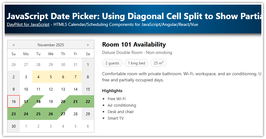
The date picker component (called Navigator) displays one or more months in a small calendar view:

In order to add the date picker to your Vue application you need to follow these steps:
Install @daypilot/daypilot-lite-vue package from NPM.
Add a
<DayPilotNavigator>tag to your template.Use a
:configattribute to specify an object with the date picker configuration.
Vue template:
<template>
  <DayPilotNavigator :config="datePickerConfig" />
</template>
Configuration:
<script setup>
import { reactive } from 'vue'
import { DayPilotNavigator } from '@daypilot/daypilot-lite-vue'

const datePickerConfig = reactive({
  showMonths: 3,
  skipMonths: 3,
  selectMode: 'Week',
})
</script>
This simple configuration displays a date picker for three months, with a weekly selection mode.
Instead of using a single config object, you can also use inline props:
<template>
  <DayPilotNavigator
    :showMonths="3"
    :skipMonths="3"
    selectMode="Week"
  />
</template>
How to Mark Busy Days in the Vue Date Picker

The Navigator component uses the same data format as the Calendar component. This is convenient because you don’t have to modify the data or load a special data source in order to display the free/busy data in the date picker.
The :events attribute lets you point the date picker to the data source already used by the Calendar. Whenever the Calendar data is modified Vue detects the change and updates the free/busy data.
Vue template (note the same value of the :events attribute in both components):
<template>
  <DayPilotNavigator
      :showMonths="3"
      :skipMonths="3"
      selectMode="Week"
      ...
      :events="events"
  />

  <!-- ... -->

  <DayPilotCalendar
      viewType="Week"
      :startDate="startDate"
      ...
      :events="events"
  />

</template>
Now we can load the calendar data and save it as events property. This property is shared by both components.
In this example, we simply generate static event data when the application starts. In a standard application, you would load the data from the server side in JSON format.
<script setup>
import { ref, reactive, onMounted } from 'vue'
import { DayPilot, DayPilotCalendar, DayPilotNavigator } from '@daypilot/daypilot-lite-vue'

const events = ref([])

// ...

onMounted(() => {
  events.value = [
    {
      id: 1,
      start: '2026-06-05T10:00:00',
      end: '2026-06-05T11:00:00',
      text: 'Event 1',
      barColor: '#6aa84f',
    },
    // ...
  ]
})
</script>
Styling the Busy Days using CSS
The busy days are marked with navigator_default_busy CSS class. By default, it uses a bold font to highlight the busy days.

You can customize the appearance as needed. The attached project uses a red circle for the busy days.

CSS:
<style>

.navigator_default_busy.navigator_default_cell {
  background-color: #ee4f2e;
  border-radius: 15px;
  color: white;
}

</style>
You can also style the free days - these are marked with navigator_default_free CSS class.