Overview
-
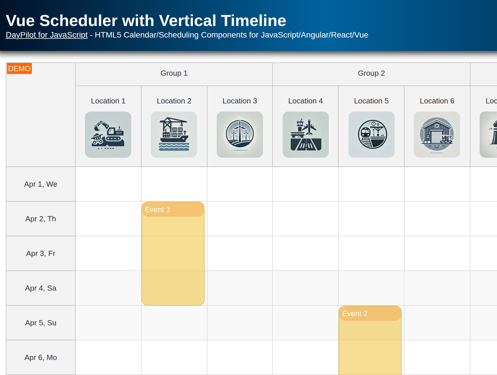
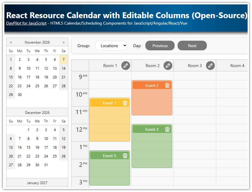
Interactive scheduling UI that displays resources as columns.
-
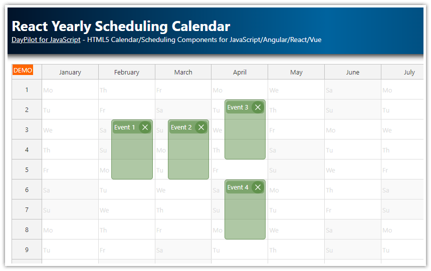
Vertical timeline that displays the specified number of days (one month in this example).
-
Customize the scale of the timeline (use minutes, hours, days, weeks as time cell units) and switch the scale dynamically as needed.
-
Add resource icons to the column headers using Vue templates.
-
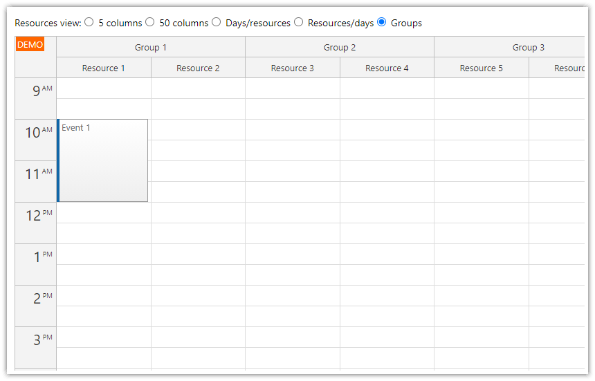
Group columns by category, location, or other properties.
-
Make the scheduler UI responsive by configuring the automatic column width.
-
The Vue project includes a trial version of DayPilot Pro for JavaScript (see License below).
License
Licensed for testing and evaluation purposes. Please see the license agreement included in the sample project. You can use the source code of the tutorial if you are a licensed user of DayPilot Pro for JavaScript. Buy a license.
Defining Custom Columns for Resources in Vue Scheduler
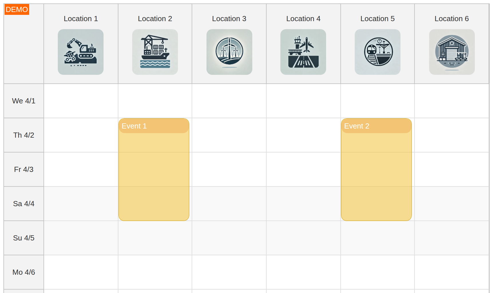
Each column in the scheduling calendar component represents a resource. In our example, these resources are locations, but they can be anything like machines, tools, cars, or people.
To define the resources, use the columns prop of the Vue Calendar component:
<template>
  <DayPilotCalendar
      :viewType="'Resources'"
      :columns="columns"
    />
</template>
In our Vue app, the columns ref variable is initialized with an empty array:
const columns = ref([])The flat resource list is stored in a separate array:
const resourceColumns = [
  { name: 'Location 1', id: 1, image: '/images/location1.jpg' },
  { name: 'Location 2', id: 2, image: '/images/location2.jpg' },
  { name: 'Location 3', id: 3, image: '/images/location3.jpg' },
  // ...
]
The name and id properties are required for the resource-scheduling calendar view. We also define a custom image property that stores an icon representing the resource. We will use it later to add the icons to the column header.
Setting Up Column Groups in Vue Scheduler
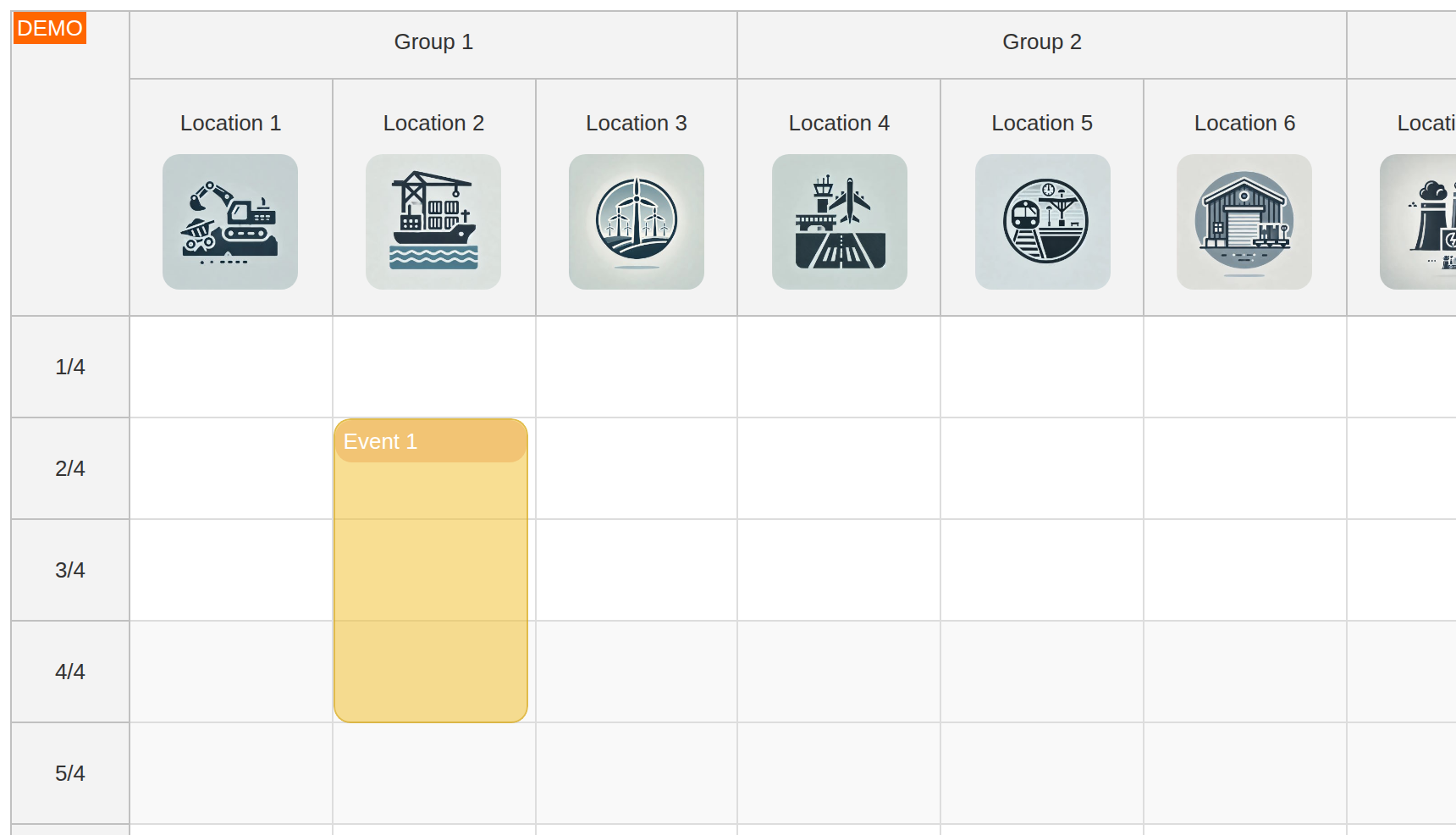
Instead of a flat list of columns, it is possible to define a column hierarchy and group resources by type or location:
const groupedColumns = [
  { name: 'Group 1', children: resourceColumns.slice(0, 3) },
  { name: 'Group 2', children: resourceColumns.slice(3, 6) },
  { name: 'Group 3', children: resourceColumns.slice(6) }
]

columns.value = groupedColumns
Set the header heights:
<DayPilotCalendar
    :viewType="'Resources'"
    :columns="columns"
    :headerLevelHeights="[40, 140]"
    ...
/>
Customizing Column Headers with Vue Templates
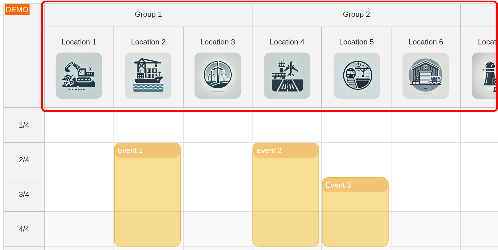
In this step, we will extend our Vue app to display resource icons in the column headers. First, we need to make space for the icons by defining the height for each column header:
<template>
  <DayPilotCalendar
      :viewType="'Resources'"
      :columns="columns"
      :headerLevelHeights="[40, 140]"
  />
</template>
The height of the first row (which displays the resource groups) will be 40 pixels, the height of the second row (which displays resources and icons) will be 140 pixels.
Now we can use a Vue template to define custom column header content. The column header slot is identified using the #columnHeader slot:
<template #columnHeader="{column}">
  <div class="column-header">
    <div class="column-header-label">{{ column.name }}</div>
    <div class="column-header-icon" v-if="column.data.image">
      <img
        :src="column.data.image"
        :alt="column.name"
      />
    </div>
  </div>
</template>
The slot receives a props object. Here, we destructure the column property using {column} and use it to get the column name (column.name) and image URL (column.data.image).
The styling is defined using the column-header, column-header-label, and column-header-icon CSS classes:
<style scoped>
.column-header {
  display: flex;
  flex-direction: column;
  align-items: center;
  padding: 10px;
}

.column-header-label {
  display: inline-block;
  padding: 6px 12px;
  font-size: 1em;
  margin-bottom: 5px;
}

.column-header-icon img {
  width: 80px;
  height: 80px;
  object-fit: cover;
  border-radius: 10px;
}
</style>
Vue Resource Scheduler Usage Scenarios
The resource scheduler UI created using Vue Calendar with resources as columns and timeline on the vertical axis can be used in many scheduling scenarios:
1. Facility Management:
-
Use Case: Scheduling conference rooms, auditoriums, or other facilities.
-
Configuration: Each room is a resource with properties like capacity and location. Grouping can separate rooms by floor or building.
2. Equipment Scheduling:
-
Use Case: Managing projectors, vehicles, or machinery.
-
Configuration: Resources represent equipment with properties such as maintenance schedules (capacity) and operational status.
3. Personnel Planning:
-
Use Case: Organizing staff shifts, assignments, or availability.
-
Configuration: Each employee is a resource, with groups representing departments or teams.
4. Vehicle Fleet Management:
-
Use Case: Scheduling cars or other vehicles for use.
-
Configuration: Vehicles are resources, grouped by type (e.g., sedans, SUVs, trucks) or location.
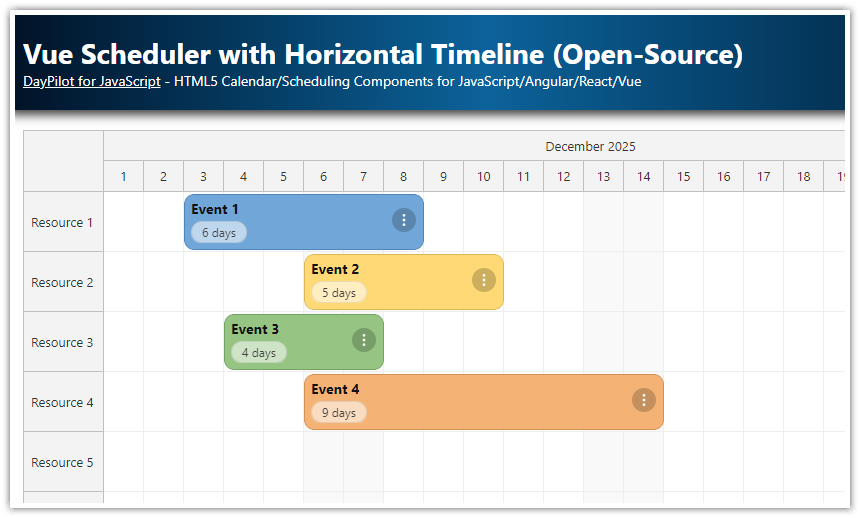
For a scheduler view with a horizontal timeline and resources displayed as rows, please see the Vue Scheduler component:
Defining Vertical Timeline for Vue Scheduler
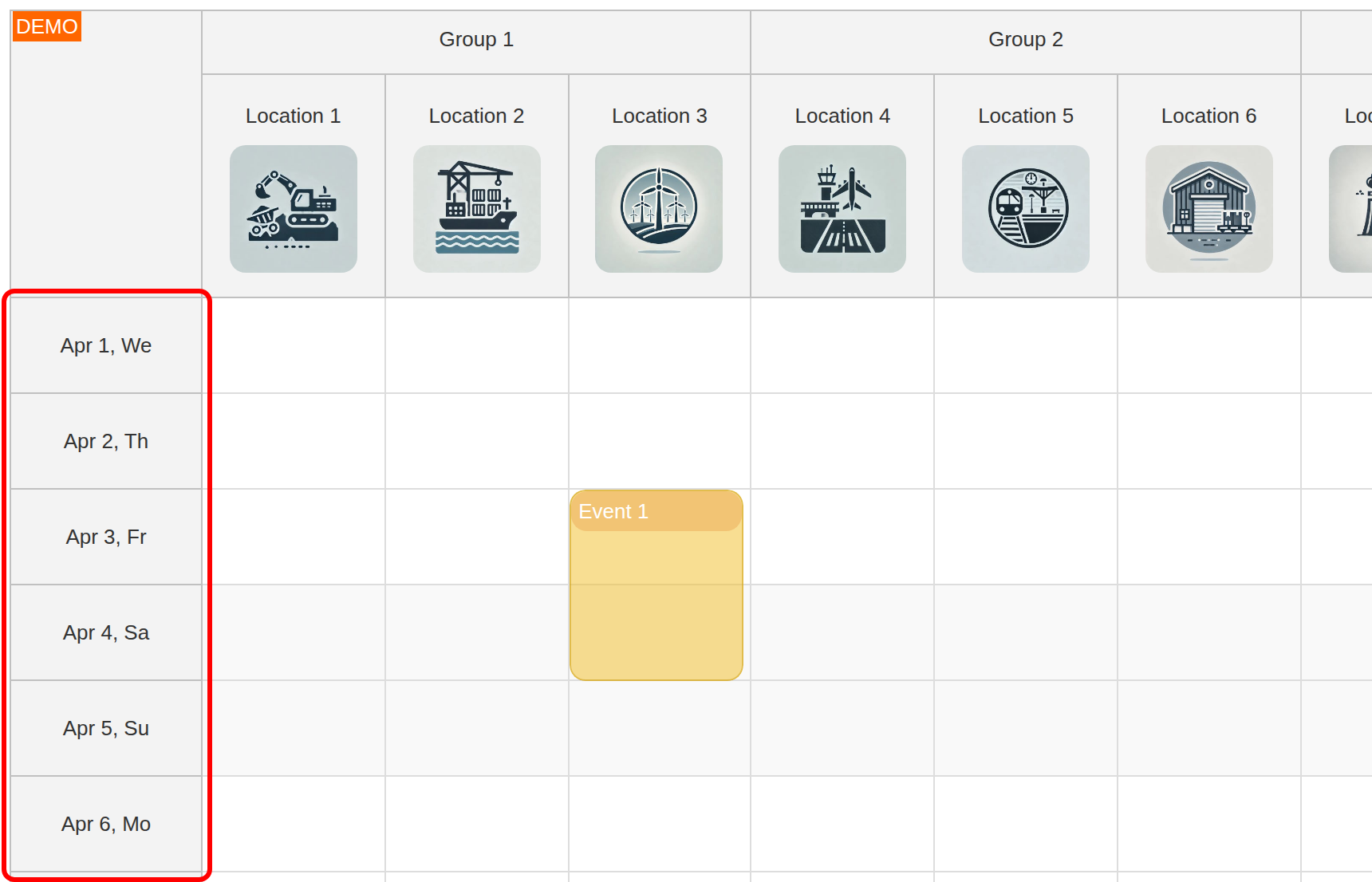
Our scheduling app will display the timeline on the vertical axis:
-
Each column represents one resource from the
columnsarray. -
Each cell of the calendar grid represents one day. This is set using the
scaleprop. -
The vertical timeline starts with the date set using the
startDatevariable. -
The number of visible days (rows) is set using the
daysvariable. -
The row header displayed on the left side shows the corresponding date.
We configure the scheduling calendar component to display one day per cell, allowing a detailed day-by-day view.
<DayPilotCalendar
  :scale="'Day'"
  :days="days"
  :startDate="startDate"
  <!-- ... -->
/>
The startDate and days ref variables are set to show the current month:
const startDate = ref(DayPilot.Date.today().firstDayOfMonth())
const days = ref(DayPilot.Date.today().daysInMonth())
In addition to using the Day scale, you can configure the Calendar to use a different resolution (cell duration):
-
"Minute" -
"Hour" -
"Day" -
"Week" -
"CellDuration"
The CellDuration mode lets you set a custom cell duration using any number of minutes.
The scale and cell dimensions can be changed dynamically. You can use this to implement a zoom feature that magnifies the calendar cells or changes the scale using custom buttons or a slider.
To customize the content of the time slot headers on the left side of the Calendar (vertical axis), you can use a named Vue template identified using the #timeHeader slot:
<template>
  <DayPilotCalendar
      :viewType="'Resources'"
      :columns="columns"
      :events="events"
      :scale="'Day'"
      :hourWidth="100"
      :startDate="startDate"
      :days="days"
      ...
      >

    <template #timeHeader="{header}">
      {{ header.date.toString("MMM d, ddd") }}
    </template>

    <!-- ... -->

  </DayPilotCalendar>
</template>
Responsive Layout: Automatic Column Width with Defined Minimum
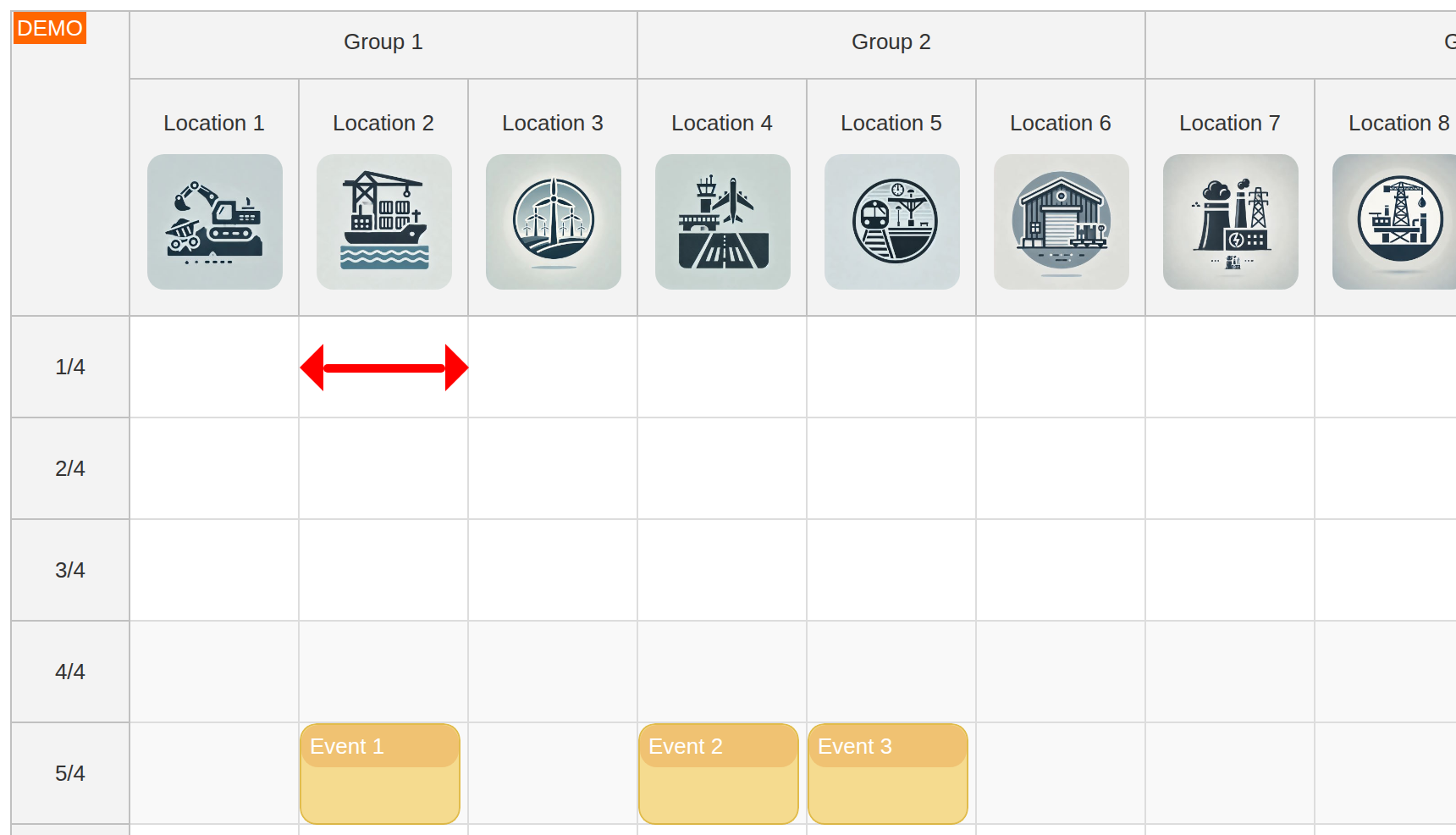
By default, the calendar column width is calculated automatically so the calendar grid fills the available width.
On narrow screens (like mobile devices), or with a large number of resources, this can be limiting. Too-narrow columns can affect readability of the event data. The calendar component allows enforcing a minimum column width using the columnWidthMin property. When defined, it sets the minimum width and the calendar adds a horizontal scrollbar automatically when needed so you can access the whole grid easily.
<DayPilotCalendar
  :columnWidthSpec="'Auto'"
  :columnWidthMin="100"
  <!-- ... -->
/>
Fixed Height vs. Flexible Height
The calendar's height can be fixed or flexible based on the layout requirements.
Our Vue app uses a fixed height of the Calendar, set to 600 pixels:
<DayPilotCalendar
  :heightSpec="'Fixed'"
  :height="600"
  <!-- ... -->
 />
You can also switch the calendar to a flexible height mode which adjusts the height based on the parent container or the viewport, making it ideal for responsive and full-screen layouts.
<DayPilotCalendar
  :heightSpec="'Parent100Pct'"
  <!-- ... -->
/>
When using heightSpec="Parent100Pct", the Calendar fills the available vertical space.
Customizing Event Content with Vue Templates
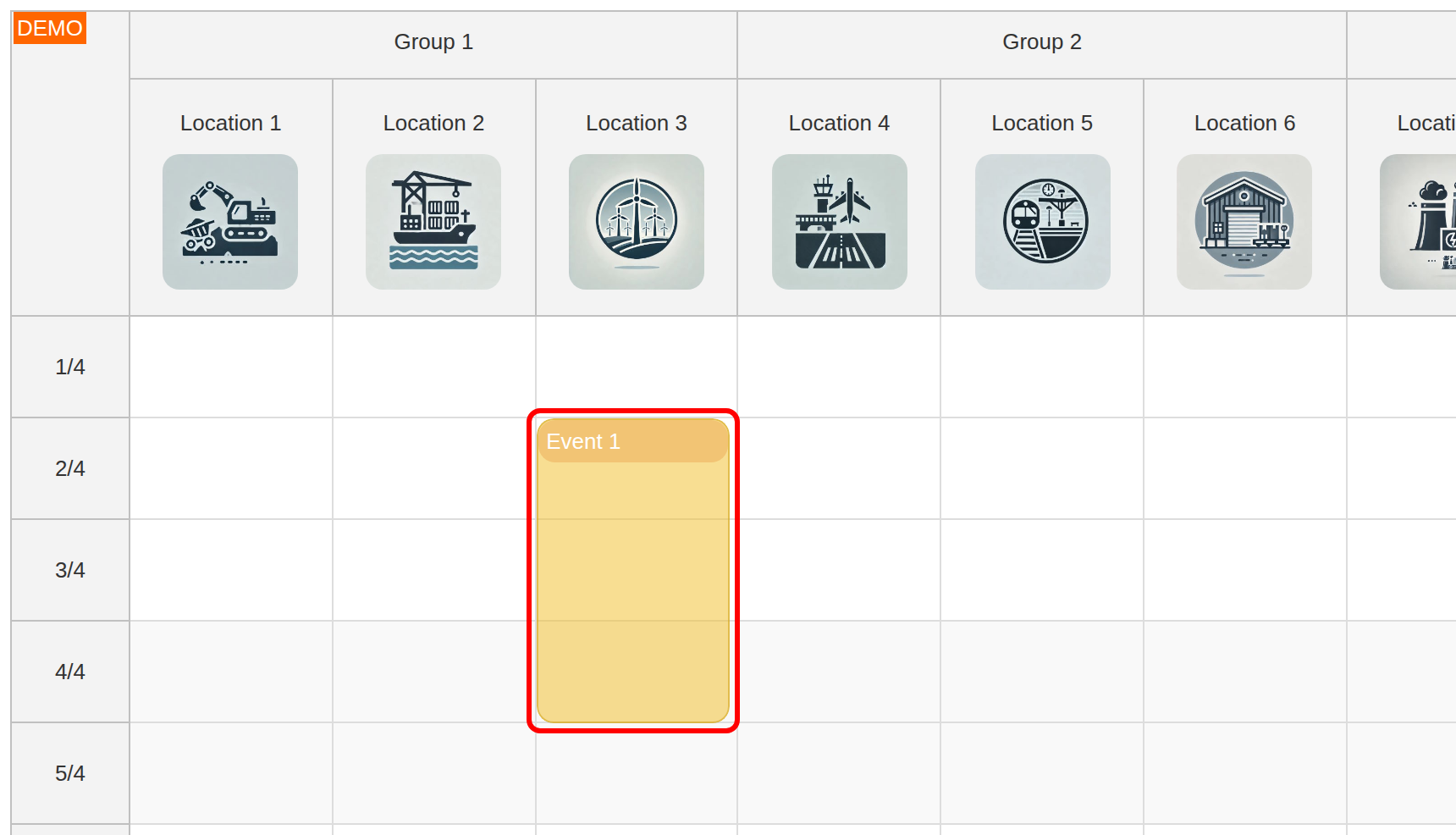
Events are the core elements representing scheduled tasks, bookings, or activities within the calendar.
In our resource-scheduling Vue app, we use a simple event template that defines a header for each event:
<template #event="{event}">
  <div class="event-body">
    <div class="event-header">
      {{ event.text() }}
    </div>
  </div>
</template>
Using Vue templates in the Calendar component is a flexible way of customizing the event content with additional details, status icons, and interactive content.
Including Additional Event Details
You can use Vue templates to display more information in each event, such as description, assigned employees, or priority levels.
<template #event="{event}">
  <div class="event-body">
    <div class="event-header">
      {{ event.text() }}
    </div>
    <div class="event-details">
      Assigned to: {{ event.data.assignedTo }}
    </div>
  </div>
</template>
Icons and Badges
Using Vue templates, you can also add icons or badges to represent event types, statuses, or other categorizations.
<template #event="{event}">
  <div class="event-body">
    <div class="event-header">
      <i :class="getEventIcon(event.data.type)"></i>
      {{ event.text() }}
    </div>
    <!-- ... -->
  </div>
</template>

<script setup>
const getEventIcon = (type) => {
  switch (type) {
    case 'Meeting':
      return 'fas fa-handshake'
    case 'Maintenance':
      return 'fas fa-tools'
    case 'Delivery':
      return 'fas fa-truck'
    default:
      return 'fas fa-calendar'
  }
}
</script>

<style scoped>
.event-header i {
  margin-right: 5px
}
</style>
Interactive Elements
The templates can be used to add interactive elements (such as view/edit buttons or drop-downs) with custom event handlers.
<template #event="{event}">
  <div class="event-body" @click="viewEventDetails(event)">
    <div class="event-header">
      {{ event.text() }}
    </div>
    <div class="event-details">
      Assigned to: {{ event.data.assignedTo }}
    </div>
  </div>
</template>

<script setup>
const viewEventDetails = (event) => {
  // Logic to display event details
  alert(`Event Details:\n${event.text()}\nAssigned to: ${event.data.assignedTo}`)
}
</script>
Full Source Code
Here is the full source code of our Vue scheduling calendar with vertical timeline that shows resources as columns:
<template>
  <DayPilotCalendar
    :viewType="'Resources'"
    :columns="columns"
    :events="events"
    :scale="'Day'"
    :columnWidthSpec="'Auto'"
    :columnWidthMin="100"
    :cellHeight="60"
    :heightSpec="'Fixed'"
    :height="600"
    :hourWidth="100"
    :startDate="startDate"
    :days="days"
    :eventBorderRadius="10"
    :durationBarVisible="false"
    :headerLevelHeights="[40, 140]"
    @timeRangeSelected="onTimeRangeSelected"
    @eventMoved="onEventMoved"
    @beforeEventRender="onBeforeEventRender"
  >
    <template #columnHeader="{column}">
      <div class="column-header">
        <div class="column-header-label">{{ column.name }}</div>
        <div class="column-header-icon" v-if="column.data.image">
          <img
            :src="column.data.image"
            :alt="column.name"
          />
        </div>
      </div>
    </template>
    <template #event="{event}">
      <div class="event-body">
        <div class="event-header">
         {{ event.text() }}
        </div>
      </div>
    </template>
    <template #timeHeader="{header}">
      {{ header.date.toString("MMM d, ddd") }}
    </template>
  </DayPilotCalendar>
</template>

<script setup>
import { DayPilot, DayPilotCalendar } from 'daypilot-pro-vue'
import { onMounted, ref } from 'vue'

const columns = ref([])
const events = ref([])
const startDate = ref(DayPilot.Date.today().firstDayOfMonth())
const days = ref(DayPilot.Date.today().daysInMonth())

const onTimeRangeSelected = async (args) => {
  const modal = await DayPilot.Modal.prompt('Create a new event:', 'Event 1')
  const calendar = args.control
  calendar.clearSelection()
  if (modal.canceled) {
    return
  }
  calendar.events.add({
    start: args.start,
    end: args.end,
    id: DayPilot.guid(),
    text: modal.result,
    resource: args.resource
  })
}

const onEventMoved = (args) => {
  const text = args.e.data.text
  const start = args.newStart
  const resource = args.newResource

  console.log(`Event ${text} moved to ${start}, ${resource}.`)
}

const onBeforeEventRender = (args) => {
  args.data.borderColor = 'darker'
  args.data.backColor = '#f1c23288'
}

const resourceColumns = [
  { name: 'Location 1', id: 1, image: '/images/location1.jpg' },
  { name: 'Location 2', id: 2, image: '/images/location2.jpg' },
  { name: 'Location 3', id: 3, image: '/images/location3.jpg' },
  { name: 'Location 4', id: 4, image: '/images/location4.jpg' },
  { name: 'Location 5', id: 5, image: '/images/location5.jpg' },
  { name: 'Location 6', id: 6, image: '/images/location6.jpg' },
  { name: 'Location 7', id: 7, image: '/images/location7.jpg' },
  { name: 'Location 8', id: 8, image: '/images/location8.jpg' },
  { name: 'Location 9', id: 9, image: '/images/location9.jpg' },
  { name: 'Location 10', id: 10, image: '/images/location10.jpg' }
]

const groupedColumns = [
  { name: 'Group 1', children: resourceColumns.slice(0, 3) },
  { name: 'Group 2', children: resourceColumns.slice(3, 6) },
  { name: 'Group 3', children: resourceColumns.slice(6) }
]

const loadData = () => {
  events.value = [
    { id: 1, start: startDate.value.addDays(1), end: startDate.value.addDays(4), text: 'Event 1', resource: 2 },
    { id: 2, start: startDate.value.addDays(4), end: startDate.value.addDays(8), text: 'Event 2', resource: 5 },
    { id: 3, start: startDate.value.addDays(10), end: startDate.value.addDays(13), text: 'Event 3', resource: 7 },
    { id: 4, start: startDate.value.addDays(16), end: startDate.value.addDays(21), text: 'Event 4', resource: 9 }
  ]
  columns.value = groupedColumns
}

onMounted(loadData)
</script>


<style scoped>
.column-header {
  display: flex;
  flex-direction: column;
  align-items: center;
  padding: 10px;
}

.column-header-label {
  display: inline-block;
  padding: 6px 12px;
  font-size: 1em;
  margin-bottom: 5px;
}

.column-header-icon img {
  width: 80px;
  height: 80px;
  object-fit: cover;
  border-radius: 10px;
}

.event-body {
  position: absolute;
  inset: 0;
}

.event-header {
  padding: 5px;
  background-color: #e6913855;
  border-radius: 10px;
  color: #ffffff
}
</style>
History
-
April 10, 2026: Updated the sample to the current Vue 3/Vite builder structure, refreshed the DayPilot Pro dependency, switched the timeline data to the current month, and synced the code listings with the updated project.
You can download the Vue project using the Download link at the top of the tutorial.
 DayPilot