DayPilot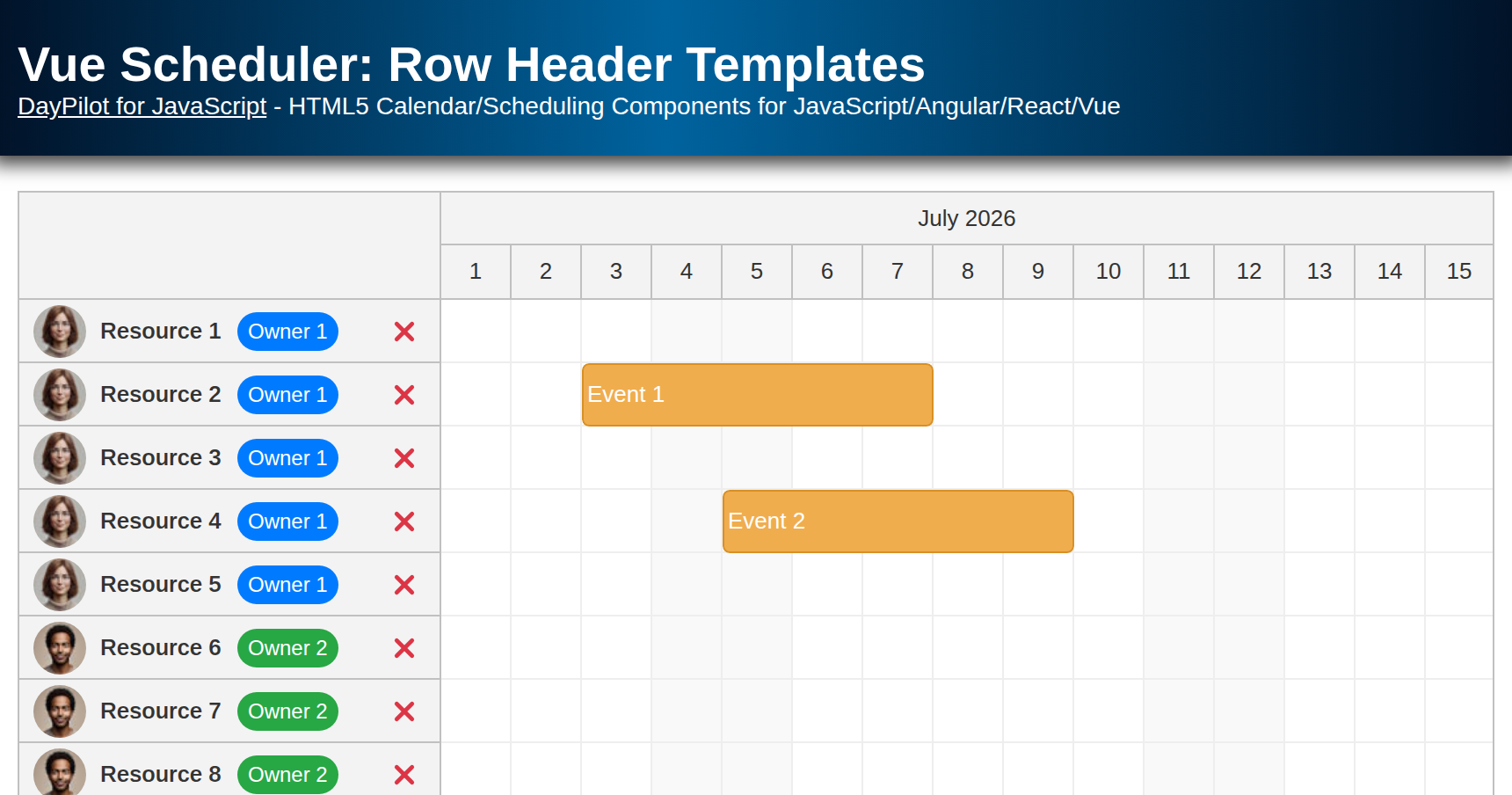
| Demo | |
|---|---|
| Downloads | |
| Repository | |
| Languages | JavaScript |
| Technologies | Vue.js |
| Code License | Apache License 2.0 (Open-Source) |
Overview
In this tutorial, we'll customize the row header of the Vue Scheduler component using Vue templates. The sample uses DayPilot Lite for JavaScript, so the row header is a single column that combines the resource name, owner avatar, owner badge, and a delete button.
The downloadable Vue project uses DayPilot for JavaScript and the current Vue 3/Vite project structure generated by the DayPilot UI Builder.
Vue Scheduler Component Config and Data
Let's start by setting up the Scheduler with predefined events and resources. The Scheduler receives the timeline settings, resources, and events directly as Vue component props.
<template>
  <DayPilotScheduler
    :events="events"
    :resources="resources"
    scale="Day"
    :timeHeaders="timeHeaders"
    :days="DayPilot.Date.today().daysInMonth()"
    :startDate="DayPilot.Date.today().firstDayOfMonth()"
    :rowHeaderWidth="240"
    :eventHeight="36"
    :durationBarVisible="false"
    @timeRangeSelected="onTimeRangeSelected"
    @beforeEventRender="onBeforeEventRender"
  >
    ...
  </DayPilotScheduler>
</template>
The data source contains a custom owner property on each resource. The row header template will use this value to pick the avatar image and badge color.
import { DayPilot, DayPilotScheduler } from '@daypilot/daypilot-lite-vue'
import { ref, onMounted } from 'vue'

const timeHeaders = [
  { groupBy: 'Month' },
  { groupBy: 'Day', format: 'd' }
]

const events = ref([])
const resources = ref([])

const owners = {
  'Owner 1': {
    avatar: '/images/owner_1.jpg',
    color: 'badge-blue'
  },
  'Owner 2': {
    avatar: '/images/owner_2.jpg',
    color: 'badge-green'
  }
}
The initial event is placed near the start of the current month so it is visible when the Scheduler first opens.
In this setup:
events: An array of event objects that the scheduler will display.
resources: An array of resources representing different entities, such as people or rooms, associated with the events.
scale: Defines the time scale of the scheduler.
timeHeaders: Configures the headers that display the time intervals.
days and startDate: Set the date range displayed in the Vue Scheduler.
DayPilot Lite supports one row header column in the Scheduler. This sample customizes that single column instead of using rowHeaderColumns, which is a Pro-only feature. The rowHeaderWidth value leaves room for the resource name, avatar, badge, and delete button so the resource names stay readable.
Customizing Scheduler Row Headers with Vue Templates
To customize the row header, define a Vue template and assign it to the #rowHeader slot. The template receives the row object representing the current DayPilot.Row.
You can read the displayed row name using row.name. The original resource object is available as row.data, including any custom fields that you add to the resources array.
Getting the Default Row Header Column Text
Sometimes, you might want to start with the default text provided by the Scheduler row. In a single-column Lite row header, use the row name:
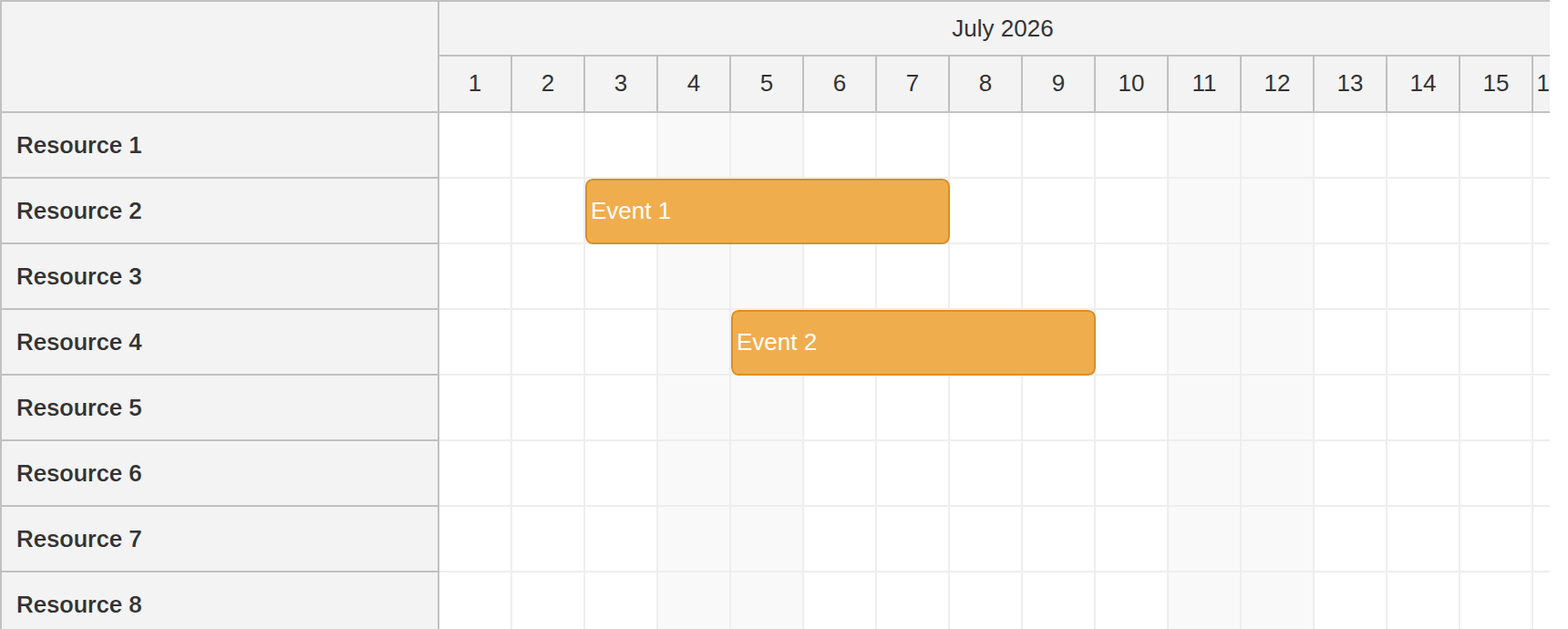
The row.name value comes from the name field of the resource object. Inside the row header slot, it is rendered by <span class="resource-name">{{ row.name }}</span>.
<template #rowHeader="{ row }">
  <div class="scheduler-row-header">
    ...
    <span class="resource-name">{{ row.name }}</span>
    ...
  </div>
</template>
Additional Content in the Row Header
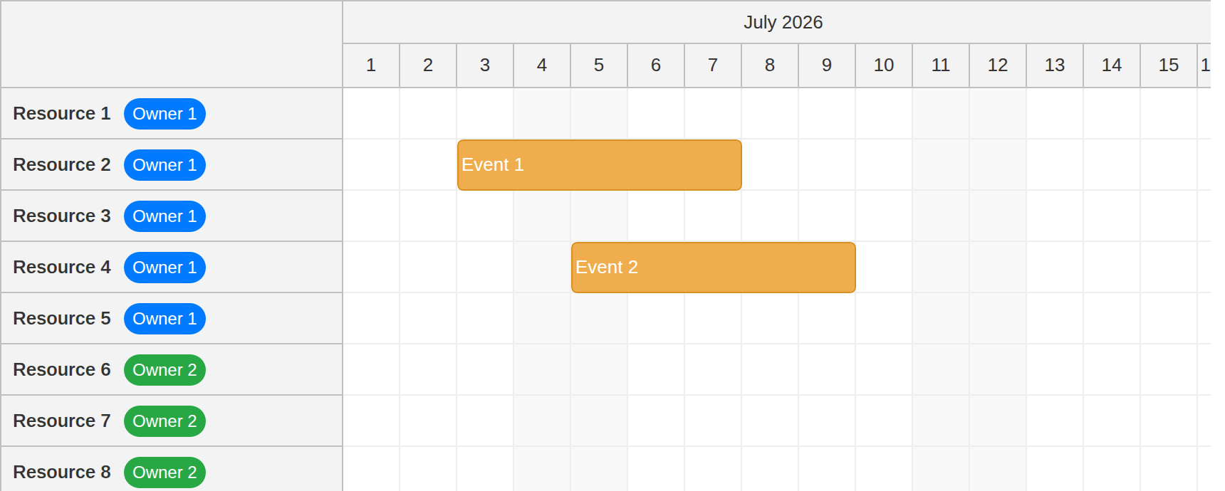
You can add more resource metadata to the same row header column. The following part of the template displays the resource name and an owner badge from row.data.owner:
<template #rowHeader="{ row }">
  <div class="scheduler-row-header">
    ...
    <span class="resource-name">{{ row.name }}</span>
    <span :class="['badge', getOwnerBadgeClass(row.data.owner)]" :title="row.data.owner">
      {{ row.data.owner }}
    </span>
    ...
  </div>
</template>
The badge keeps the owner visible without adding a separate row header column.
Adding Icons and Badges to the Scheduler Row Header
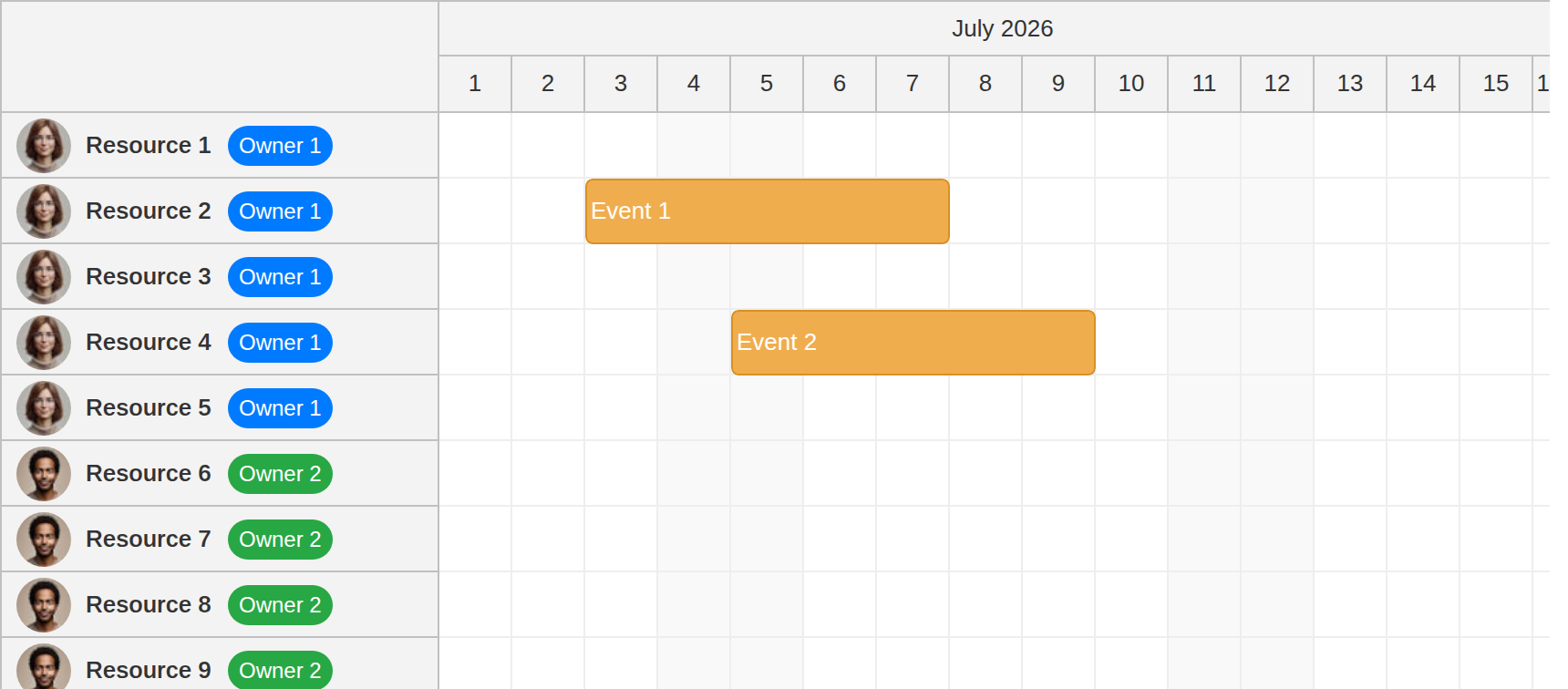
To display additional visual cues, add an avatar image and a badge to the row header:
<template #rowHeader="{ row }">
  <div class="scheduler-row-header">
    <img :src="getOwnerAvatar(row.data.owner)" class="avatar">
    <span class="resource-name">{{ row.name }}</span>
    <span :class="['badge', getOwnerBadgeClass(row.data.owner)]" :title="row.data.owner">
      {{ row.data.owner }}
    </span>
    ...
  </div>
</template>
The avatar is selected by the getOwnerAvatar() helper. The badge color comes from getOwnerBadgeClass().
const getOwnerAvatar = (owner) => owners[owner]?.avatar

const getOwnerBadgeClass = (owner) => owners[owner]?.color || 'badge-default'
Adding a Delete Button
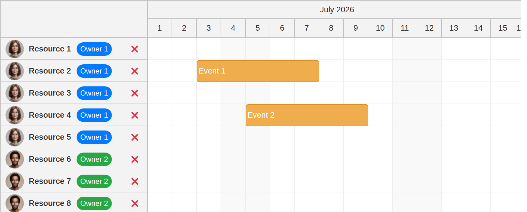
You can also add interactive elements to the row header, such as buttons or other Vue components. The following implementation adds a delete button with an SVG icon to the right side of the same row header column:
<template #rowHeader="{ row }">
  <div class="scheduler-row-header">
    ...
    <button
      type="button"
      @click.stop="deleteResource(row.data.id)"
      class="delete-button"
      aria-label="Delete resource"
    >
      <svg aria-hidden="true">
        <use href="/icons/daypilot.svg#x-4"></use>
      </svg>
    </button>
  </div>
</template>
The @click.stop modifier keeps the button click from bubbling to the Scheduler row.
Now, define the deleteResource() method. This method removes the resource from the Scheduler:
const deleteResource = (id) => {
  resources.value = resources.value.filter(resource => resource.id !== id)
}
Full Source Code
Below is the complete source code integrating all the row header customizations described above. This example includes a Vue template with avatars, badges, and a delete button in the single Lite row header column.
<template>
  <DayPilotScheduler
    :events="events"
    :resources="resources"
    scale="Day"
    :timeHeaders="timeHeaders"
    :days="DayPilot.Date.today().daysInMonth()"
    :startDate="DayPilot.Date.today().firstDayOfMonth()"
    :rowHeaderWidth="240"
    :eventHeight="36"
    :durationBarVisible="false"
    @timeRangeSelected="onTimeRangeSelected"
    @beforeEventRender="onBeforeEventRender"
  >
    <template #rowHeader="{ row }">
      <div class="scheduler-row-header">
        <img :src="getOwnerAvatar(row.data.owner)" class="avatar">
        <span class="resource-name">{{ row.name }}</span>
        <span :class="['badge', getOwnerBadgeClass(row.data.owner)]" :title="row.data.owner">
          {{ row.data.owner }}
        </span>
        <button
          type="button"
          @click.stop="deleteResource(row.data.id)"
          class="delete-button"
          aria-label="Delete resource"
        >
          <svg aria-hidden="true">
            <use href="/icons/daypilot.svg#x-4"></use>
          </svg>
        </button>
      </div>
    </template>
  </DayPilotScheduler>
</template>

<script setup>
import { DayPilot, DayPilotScheduler } from '@daypilot/daypilot-lite-vue'
import { ref, onMounted } from 'vue'

const timeHeaders = [
  { groupBy: 'Month' },
  { groupBy: 'Day', format: 'd' }
]

const events = ref([])
const resources = ref([])

const owners = {
  'Owner 1': {
    avatar: '/images/owner_1.jpg',
    color: 'badge-blue'
  },
  'Owner 2': {
    avatar: '/images/owner_2.jpg',
    color: 'badge-green'
  }
}

onMounted(() => {
  resources.value = [
    { name: 'Resource 1', id: 'R1', owner: 'Owner 1' },
    { name: 'Resource 2', id: 'R2', owner: 'Owner 1' },
    { name: 'Resource 3', id: 'R3', owner: 'Owner 1' },
    { name: 'Resource 4', id: 'R4', owner: 'Owner 1' },
    { name: 'Resource 5', id: 'R5', owner: 'Owner 1' },
    { name: 'Resource 6', id: 'R6', owner: 'Owner 2' },
    { name: 'Resource 7', id: 'R7', owner: 'Owner 2' },
    { name: 'Resource 8', id: 'R8', owner: 'Owner 2' },
    { name: 'Resource 9', id: 'R9', owner: 'Owner 2' },
    { name: 'Resource 10', id: 'R10', owner: 'Owner 2' }
  ]

  const eventStart = DayPilot.Date.today().firstDayOfMonth().addDays(2)

  events.value = [
    {
      id: 1,
      start: eventStart,
      end: eventStart.addDays(5),
      text: 'Event 1',
      resource: 'R2'
    },
    {
      id: 2,
      start: eventStart.addDays(2),
      end: eventStart.addDays(7),
      text: 'Event 2',
      resource: 'R4'
    },
  ]
})

const onBeforeEventRender = (args) => {
  args.data.backColor = '#f0ad4e'
  args.data.borderColor = '#d99023'
  args.data.fontColor = '#ffffff'
}

const onTimeRangeSelected = async (args) => {
  const modal = await DayPilot.Modal.prompt('Create a new event:', 'Event 1')
  args.control.clearSelection()
  if (modal.canceled) {
    return
  }

  events.value = [
    ...events.value,
    {
      start: args.start,
      end: args.end,
      id: DayPilot.guid(),
      resource: args.resource,
      text: modal.result
    }
  ]
}

const deleteResource = (id) => {
  resources.value = resources.value.filter(resource => resource.id !== id)
}

const getOwnerAvatar = (owner) => owners[owner]?.avatar

const getOwnerBadgeClass = (owner) => owners[owner]?.color || 'badge-default'
</script>

<style scoped>
.scheduler-row-header {
  position: absolute;
  inset: 0;

  display: flex;
  align-items: center;
  gap: 8px;

  min-width: 0;
  padding: 4px 8px;
  box-sizing: border-box;
}

.avatar {
  flex: 0 0 auto;
  width: 30px;
  height: 30px;
  border-radius: 50%;
  object-fit: cover;
}

.resource-name {
  flex: 0 0 auto;
  white-space: nowrap;
  font-weight: 600;
  width: 70px;
}

.badge {
  flex: 0 0 auto;
  padding: 2px 6px;
  border-radius: 999px;
  font-size: 12px;
  line-height: 18px;
  color: #fff;
}

.badge-blue {
  background-color: #007bff;
}

.badge-green {
  background-color: #28a745;
}

.badge-default {
  background-color: #6c757d;
}

.delete-button {
  display: inline-flex;
  align-items: center;
  justify-content: center;
  flex: 0 0 auto;
  width: 24px;
  height: 24px;
  margin-left: auto;
  border: 0;
  border-radius: 50%;
  background: transparent;
  color: #dc3545;
  cursor: pointer;
  box-sizing: border-box;
  padding: 5px;
}

.delete-button:hover {
  background-color: #fee2e2;
}

.delete-button svg {
  width: 16px;
  height: 16px;
  fill: currentColor;
  pointer-events: none;
}
</style>
You can download the full Vue project using the download link at the top of the article.