 DayPilot
")
Features
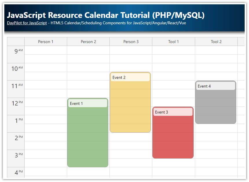
Built using the Angular Resource Calendar component from the open-source DayPilot Lite for JavaScript scheduling library.
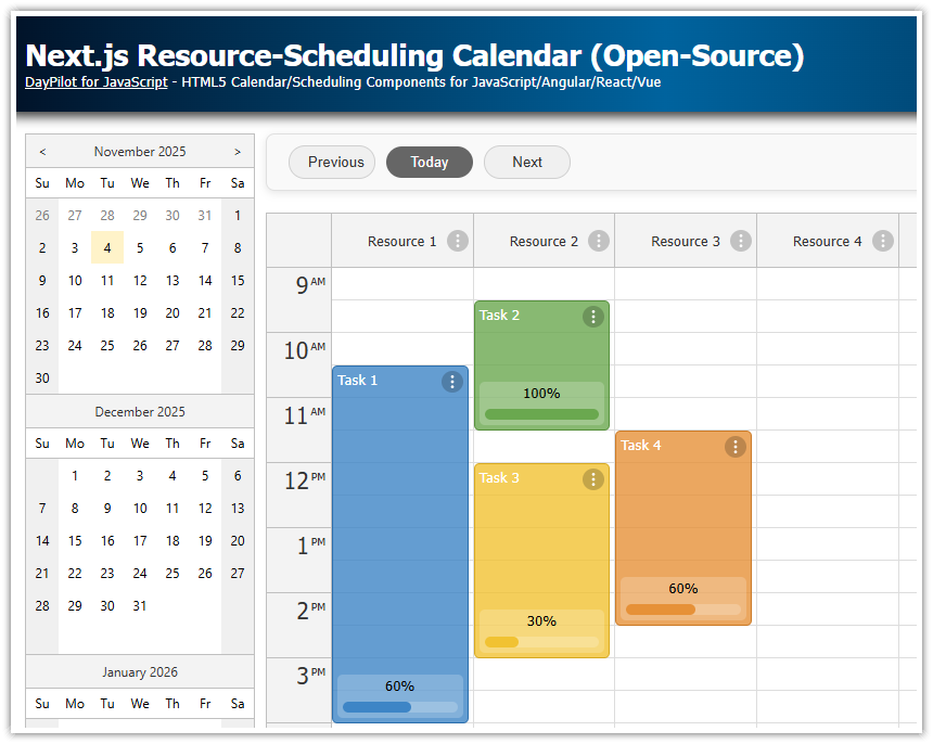
The resource calendar displays resources (such as people, rooms, or tools) on the horizontal axis as separate columns. This allows for the easy scheduling of events or tasks for multiple resources side-by-side.
The vertical axis displays time, with each resource column representing a 24-hour period.
Angular Resource Calendar Project
This project includes the minimum setup required for the Angular resource calendar/scheduler to run, including the boilerplate code and module dependencies. You can use it as a starting point for your own implementation.
It includes the Angular calendar component from @daypilot/daypilot-lite-angular NPM package.
Initialization
Before running the Angular application, it's necessary to download the dependencies specified in package.json. Simply run npm install (Node.js with npm package manager is required):
npm installWhen the dependencies are downloaded to node_modules you can run the application:
npm startThis will start a built-in web server on port 4200. You can open the application in the browser at http://localhost:4200.
Angular Project Structure
The Angular project structure is based on the default structure which is created by Angular CLI. We will minimize changes made to the generated files - all custom code can be found in src/app/calendar directory:
data.service.tscalendar.component.ts
To create a blank resource scheduling calendar project for Angular 20, you can use the online UI Builder. This app lets you configure the resource calendar, preview the configuration using a live instance and download a complete Angular project.
Resource Calendar Component (calendar.component.ts)
The resource calendar is built using DayPilot Angular event calendar component.
By default, the calendar component displays a traditional calendar with one or more days as columns (day, week, workweek views):

However, you can easily switch it to resources mode which can display custom columns:

The vertical axis displays time of day. By default, the full calendar grid displays 24 hours a day and the viewport is configured to display business hours.
Note: The Calendar component can only display resources on the horizontal axis (as columns). If you want to display resources on the vertical axis (as rows) you can use the Scheduler component from DayPilot Pro.
The calendar.component.ts file defines CalendarComponent class, which is a wrapper around the DayPilot calendar component. It adds configuration properties and custom event handlers.
calendar.component.ts
import {Component, ViewChild, AfterViewInit} from "@angular/core";
import {DayPilot, DayPilotCalendarComponent, DayPilotModule} from "@daypilot/daypilot-lite-angular";
import {DataService} from "./data.service";
import {forkJoin} from "rxjs";

@Component({
  selector: 'calendar-component',
  template: `<daypilot-calendar [config]="config" [events]="events" #calendar></daypilot-calendar>`,
  imports: [DayPilotModule],
  providers: [DataService],
  styles: [``]
})
export class CalendarComponent implements AfterViewInit {

  @ViewChild("calendar")
  calendar!: DayPilotCalendarComponent;

  events = signal<DayPilot.EventData[]>([]);

  config = signal<DayPilot.CalendarConfig>({
    viewType: "Resources",
    startDate: "2026-09-01",
    onTimeRangeSelected: async args => {
      const modal = await DayPilot.Modal.prompt("Create a new event:", "Event 1");

      const calendar = this.calendar.control;
      calendar.clearSelection();
      if (modal.canceled) {
        return;
      }

      calendar.events.add({
        start: args.start,
        end: args.end,
        id: DayPilot.guid(),
        text: modal.result,
        resource: args.resource
      });

    }
  });

  constructor(private ds: DataService) {
  }

  ngAfterViewInit(): void {

    const from = new DayPilot.Date(this.config().startDate);
    const to = from.addDays(1);

    forkJoin([
      this.ds.getResources(),
      this.ds.getEvents(from, to)
    ]).subscribe(data => {
        const events = data[1];
        this.events.set(events);

        const columns = data[0];
        this.config.update(c => ({ ...c, columns }));
    });

  }

}
You can see that the configuration object includes a viewType property. This is required to switch the calendar component to the resource calendar mode:
config = signal<DayPilot.CalendarConfig>({
  viewType: "Resources",
  // ...
});
The column data are loaded using a special DataService class (which wraps all the data-access code) - we will get to this class later. The columns can also be defined statically using the columns property:
config = signal<DayPilot.CalendarConfig>({
  // ...
  columns: [
      {name: "Resource 1", id: "R1"},
      {name: "Resource 2", id: "R2"},
      {name: "Resource 3", id: "R3"},
      {name: "Resource 4", id: "R4"},
      {name: "Resource 5", id: "R5"},
      {name: "Resource 6", id: "R6"},
      {name: "Resource 7", id: "R7"},
      {name: "Resource 8", id: "R8"}
  ];
  // ...
});
We load the initial column and event data in the ngAfterViewInit() method. The column data are provided by DataService.getResources() method and the event data are provided by DataService.getEvents() method.
Both methods return an Observable class. In order to avoid a double update of the resource calendar component, we merge the calls using forkJoin() and wait for results from both services. As soon as the column and event data are available, we update the calendar using events and config signals.
forkJoin([
  this.ds.getResources(),
  this.ds.getEvents(from, to)
]).subscribe(data => {
    const events = data[1];
    this.events.set(events);

    const columns = data[0];
    this.config.update(c => ({ ...c, columns }));
});
The header of our resource calendar now looks like this:

Each column has its own ID which will be used to display the correct events (each column will only include events with a matching resource id).
Handling User Events (Click, Drag and Drop)
The CalendarComponent class defines an onTimeRangeSelected event handler. This event is fired when a user selects a time range - we will use the event handler to create a new event at the selected location.
config = signal<DayPilot.CalendarConfig>({
  // ...
    onTimeRangeSelected: async args => {
      const modal = await DayPilot.Modal.prompt("Create a new event:", "Event 1");

      const calendar = this.calendar.control;
      calendar.clearSelection();
      if (modal.canceled) {
        return;
      }

      calendar.events.add({
        start: args.start,
        end: args.end,
        id: DayPilot.guid(),
        text: modal.result,
        resource: args.resource
      });

    }
});
This implementation opens a modal dialog for entering an event text, and adds a new event. In a real application, you'd also want to add a call to the server to save the new event in a database.
You can define more event handlers to implement custom handling of other user actions, such as drag and drop event moving and resizing.
Loading Resource Calendar Data (data.service.ts)
The ngAfterViewInit() method of our resource calendar component requests the column and event data using a special DataService class:
constructor(private ds: DataService) {}

ngAfterViewInit(): void {

  const from = new DayPilot.Date(this.config().startDate);
  const to = from.addDays(1);

  forkJoin([
    this.ds.getResources(),
    this.ds.getEvents(from, to)
  ]).subscribe(data => {
      const events = data[1];
      this.events.set(events);

      const columns = data[0];
      this.config.update(c => ({ ...c, columns }));
  });

}
The DataService class contains all data-loading code. Our implementation is static - it defines the columns and events using an array. In a real-world application, you'd want to change the getResources() and getEvents() method implementations to make an HTTP call to a server to get the data from a database.
data.service.ts
import {Injectable} from "@angular/core";
import {Observable} from "rxjs";
import {DayPilot} from "@daypilot/daypilot-lite-angular";
import {HttpClient} from "@angular/common/http";

@Injectable()
export class DataService {

  events: any[] = [
    {
      id: 1,
      start: "2026-09-01T13:00:00",
      end: "2026-09-01T15:00:00",
      text: "Event 1",
      resource: "R1",
      barColor: "#f1c232"
    },
    {
      id: 2,
      start: "2026-09-01T10:00:00",
      end: "2026-09-01T12:00:00",
      text: "Event 2",
      resource: "R1"
    }
  ];

  resources: any[] = [
      {name: "Resource 1", id: "R1"},
      {name: "Resource 2", id: "R2"},
      {name: "Resource 3", id: "R3"},
      {name: "Resource 4", id: "R4"},
      {name: "Resource 5", id: "R5"},
      {name: "Resource 6", id: "R6"},
      {name: "Resource 7", id: "R7"},
      {name: "Resource 8", id: "R8"}
  ];

  constructor(private http: HttpClient) {
  }

  getEvents(from: DayPilot.Date, to: DayPilot.Date): Observable<any[]> {

    // simulating an HTTP request
    return new Observable(observer => {
      setTimeout(() => {
        observer.next(this.events);
        observer.complete();
        }, 200);
    });

    // return this.http.get("/api/events?from=" + from.toString() + "&to=" + to.toString());
  }

  getResources(): Observable<any[]> {

    // simulating an HTTP request
    return new Observable(observer => {
      setTimeout(() => {
        observer.next(this.resources);
        observer.complete();
      }, 200);
    });

    // return this.http.get("/api/resources");
  }


}
Changing the Date Displayed by the Resource Calendar
This Angular project uses a simple configuration that doesn’t define the date for individual columns. All columns will use the same date, as defined using the startDate property:
config = signal<DayPilot.CalendarConfig>({
  // ...
  startDate: "2026-09-01",
  columns: [
      {name: "Resource 1", id: "R1"},
      {name: "Resource 2", id: "R2"},
      {name: "Resource 3", id: "R3"},
      {name: "Resource 4", id: "R4"},
      {name: "Resource 5", id: "R5"},
      {name: "Resource 6", id: "R6"},
      {name: "Resource 7", id: "R7"},
      {name: "Resource 8", id: "R8"}
  ];
  // ...
});
To learn how to integrate the resource calendar with a date picker that lets your users change the current date, please see the following tutorial:
It is also possible to define a custom date for each column of the resource calendar. You need to specify the start property for the column data:
config = signal<DayPilot.CalendarConfig>({
  // ...
  startDate: "2026-09-01",
  columns: [
      {name: "Resource 1", id: "R1"},
      {name: "Resource 1/next day", id: "R1", start: "2026-09-02},
      {name: "Resource 2", id: "R2"},
  ];
  // ...
});
Resource Icons in Column Headers
In the first step, we will assign images to the resources that are displayed as columns in the calendar. In our Angular application, the resource are defined in data.service.ts file.
We will extend the items with a custom image property that will specify the icon URL:
resources: CalendarColumnData[] = [
    {name: "Resource 1", id: "R1", tags: { image: "/avatars/pat-blue.jpg" } },
    {name: "Resource 2", id: "R2", tags: { image: "/avatars/pat-orange.jpg" } },
    {name: "Resource 3", id: "R3", tags: { image: "/avatars/pat-red.jpg" } },
    {name: "Resource 4", id: "R4", tags: { image: "/avatars/pat-yellow.jpg" } },
    {name: "Resource 5", id: "R5", tags: { image: "/avatars/pat-blue.jpg" } },
    {name: "Resource 6", id: "R6", tags: { image: "/avatars/pat-orange.jpg" } },
    {name: "Resource 7", id: "R7", tags: { image: "/avatars/pat-red.jpg" } },
    {name: "Resource 8", id: "R8", tags: { image: "/avatars/pat-yellow.jpg" } }
];
To define the exact location of the icon in the resource header and its appearance, we will use active areas.
You can define active areas for the resource headers using the onBeforeHeaderRender event handler:
config = signal<DayPilot.CalendarConfig>({
  headerHeight: 100,
  onBeforeHeaderRender: args => {
    const data = args.column.data;
    const header = args.header;
    header.verticalAlignment = "top";
    if (data.tags?.image) {
      args.header.areas = [
        {
          left: "calc(50% - 30px)",
          bottom: 10,
          height: 60,
          width: 60,
          image: data.tags.image,
          style: "border-radius: 40px; overflow: hidden; border: 3px solid #fff;"
        }
      ];
    }
  },
  // ...
});
First, we increase the height of the column headers to 100 pixels using the headerHeight property:
headerHeight: 100,The resource header content is centered (both vertically and horizontally) by default. In order to make space for the resource icon, we will move the text to the top:
args.header.verticalAlignment = "top";Now we can check the image property of the column definition and create the active area if the image is specified:
args.header.areas = [
  {
    left: "calc(50% - 30px)",
    bottom: 10,
    height: 60,
    width: 60,
    image: data.image,
    style: "border-radius: 40px; overflow: hidden; border: 3px solid #fff;"
  }
];
In addition to the position (specified using a CSS-style for the left property and using pixels for the bottom, height and width properties), we also add custom styles that will display the icon in a circle with a white border.
Context Menu for Scheduler Events

To let users perform additional actions with the events, we will define a context menu. Our example will have just two items, “Edit…” and “Delete”.
config = signal<DayPilot.CalendarConfig>({
  contextMenu: new DayPilot.Menu({
    items: [
      {
        text: "Edit...",
        onClick: async args => {
          const data = args.source.data;
          const modal = await DayPilot.Modal.prompt("Edit event text:", data.text);

          const calendar = this.calendar.control;
          if (modal.canceled) {
            return;
          }

          data.text = modal.result;
          calendar.events.update(data);
        }
      },
      {
        text: "Delete",
        onClick: args => {
          this.calendar.control.events.remove(args.source);
        }
      }
    ]
  }),
  //...

});
The context menu can be invoked using a right mouse button click. To provide a hint that a context menu is available, we will also customize the event appearance and add a special icon to the upper-left corner of the event using an active area:
config = signal<DayPilot.CalendarConfig>({
  onBeforeEventRender: args => {
    args.data.areas = [
      {
        top: 3,
        right: 3,
        width: 24,
        height: 24,
        action: "ContextMenu",
        padding: 2,
        symbol: "/icons/daypilot.svg#threedots-h",
        cssClass: "event-menu",
        toolTip: "Menu"
      }
    ];
  },
  // ...
});
This active area displays a SVG icon from the built-in icon library (daypilot.svg file - see a preview of all available icons).
It also uses an event-menu CSS class to define additional styling (see styles.css in the attached Angular application):
.event-menu {
  box-sizing: border-box;
  border-radius: 20px;
  overflow: hidden;
  border: 2px solid #ccc;
  background-color: #ffffff;
  color: #ccc;

  cursor: pointer;

}

.event-menu:hover {
  color: #999;
  border-color: #999;
}
The event-menu CSS class defines a color of the icon and a rounded border. On hover, the color of the icon and the border changes to a darker shade.
The action property of the active area is set to "ContextMenu". Now the context menu will also appear if the user clicks the context menu icon.
Full Source Code
Here is the full TypeScript source of our resource calendar implementation.
The UI that displays the calendar with resources as columns is defined calendar.component.ts:
import {Component, ViewChild, AfterViewInit, signal} from "@angular/core";
import {DayPilot, DayPilotCalendarComponent, DayPilotModule} from "@daypilot/daypilot-lite-angular";
import {DataService} from "./data.service";
import {forkJoin} from "rxjs";

@Component({
  selector: 'calendar-component',
  template: `<daypilot-calendar [config]="config" [events]="events" #calendar></daypilot-calendar>`,
  imports: [DayPilotModule],
  providers: [DataService],
  styles: [``]
})
export class CalendarComponent implements AfterViewInit {

  @ViewChild("calendar")
  calendar!: DayPilotCalendarComponent;

  events = signal<DayPilot.EventData[]>([]);

  config = signal<DayPilot.CalendarConfig>({
    viewType: "Resources",
    headerHeight: 100,
    startDate: "2026-09-01",
    contextMenu: new DayPilot.Menu({
      items: [
        {
          text: "Edit...",
          onClick: async args => {
            const data = args.source.data;
            const modal = await DayPilot.Modal.prompt("Edit event text:", data.text);

            const calendar = this.calendar.control;
            if (modal.canceled) {
              return;
            }

            data.text = modal.result;
            calendar.events.update(data);
          }
        },
        {
          text: "Delete",
          onClick: args => {
            this.calendar.control.events.remove(args.source);
          }
        }
      ]
    }),
    onTimeRangeSelected: async args => {
      const modal = await DayPilot.Modal.prompt("Create a new event:", "Event 1");

      const calendar = this.calendar.control;
      calendar.clearSelection();
      if (modal.canceled) {
        return;
      }

      calendar.events.add({
        start: args.start,
        end: args.end,
        id: DayPilot.guid(),
        text: modal.result,
        resource: args.resource
      });

    },
    onBeforeHeaderRender: args => {
      const data = args.column.data;
      const header = args.header;
      header.verticalAlignment = "top";
      if (data.tags?.image) {
        args.header.areas = [
          {
            left: "calc(50% - 30px)",
            bottom: 10,
            height: 60,
            width: 60,
            image: data.tags.image,
            style: "border-radius: 40px; overflow: hidden; border: 3px solid #fff;"
          }
        ];
      }
    },
    onBeforeEventRender: args => {
      args.data.areas = [
        {
          top: 3,
          right: 3,
          width: 24,
          height: 24,
          action: "ContextMenu",
          padding: 2,
          symbol: "/icons/daypilot.svg#threedots-h",
          cssClass: "event-menu",
          toolTip: "Menu"
        }
      ];
    }
  });

  constructor(private ds: DataService) {
  }

  ngAfterViewInit(): void {

    const from = new DayPilot.Date(this.config().startDate);
    const to = from.addDays(1);

    forkJoin([
      this.ds.getResources(),
      this.ds.getEvents(from, to)
    ]).subscribe(data => {
        const events = data[1];
        this.events.set(events);

        const columns = data[0];
        this.config.update(c => ({ ...c, columns }));
    });

  }

}
You can download the complete Angular project at the top of the article.