Overview
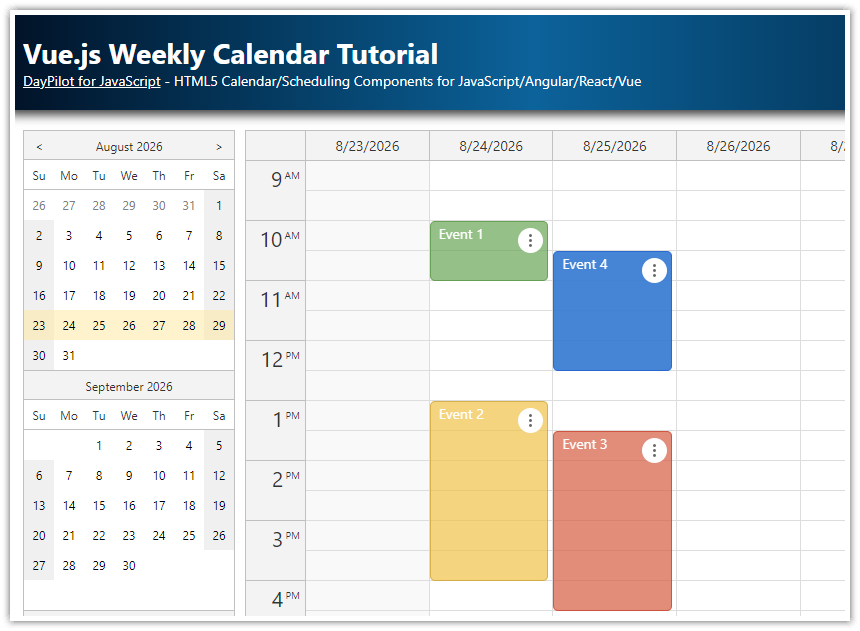
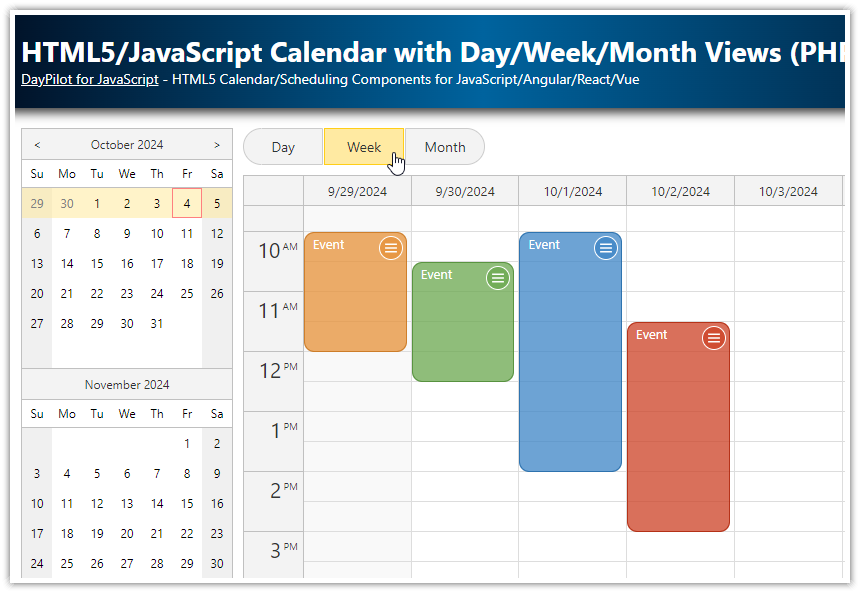
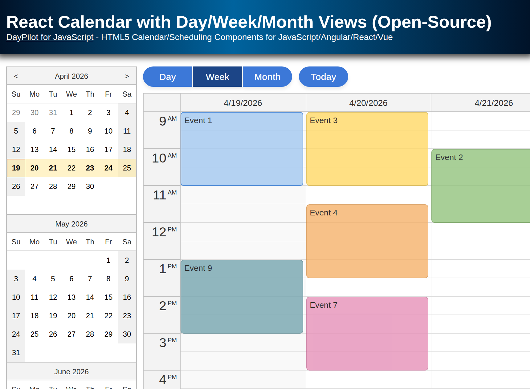
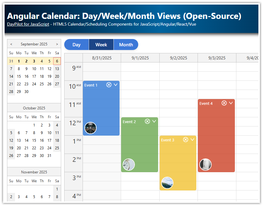
How to add a calendar UI with day, week, and month views to your Vue application.
You can add custom views (e.g., work week, two weeks) easily.
All views share the same data source and are updated automatically.
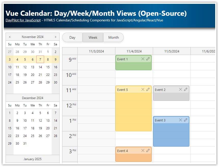
The appearance of calendar events is defined using a custom Vue component, and applied using Vue templates.
The Vue project uses the open-source DayPilot Lite for JavaScript scheduling library.
Creating Day, Week, and Month Calendar Views in Vue
To add a calendar UI to our Vue application, we will use the open-source DayPilot Lite for JavaScript library:
npm install @daypilot/daypilot-lite-vueFirst, we need to create the calendar views. Each view will be defined using a standalone calendar component, and the components will be dynamically hidden or displayed when switching between views.
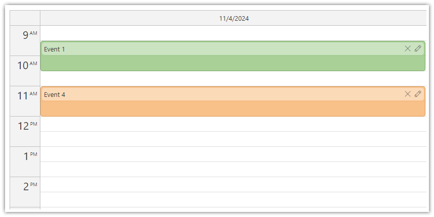
The day view is created using the Vue Calendar component from DayPilot:
<DayPilotCalendar
    :viewType="'Day'"
    :startDate="startDate"
    :visible="viewType === 'Day'"
    :events="events"
/>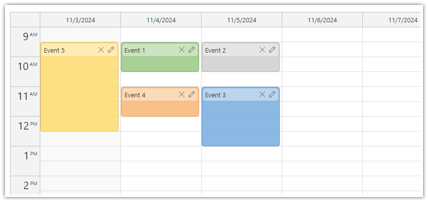
The week view is created using the Vue Calendar component as well, this time with viewType set to "Week".
<DayPilotCalendar
    :viewType="'Week'"
    :startDate="startDate"
    :visible="viewType === 'Week'"
    :events="events"
/>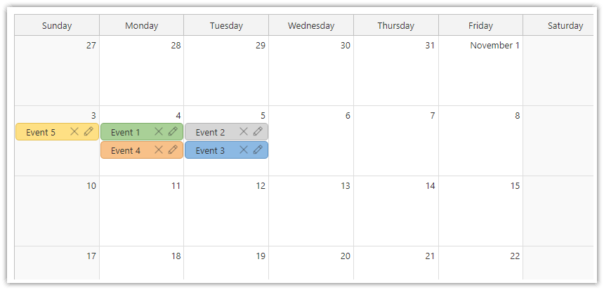
The month view is created using the Vue Monthly Calendar component:
<DayPilotMonth
    :startDate="startDate"
    :visible="viewType === 'Month'"
    :events="events"
/>
You can see that all components use the same values of :startDate and :events props. The :visible value is set depending on the currently selected view.
The :startDate prop (Calendar API docs, Month API docs) points to the startDate reactive variable which stores the currently-selected date:
const startDate = ref(DayPilot.Date.today());Changing this value will automatically change the current date for all calendar views. All calendar components will automatically calculate the correct start and end dates to ensure that they display the correct date range that includes the specified day.
The :events prop (Calendar API docs, Month API docs) points to an events variable that stores the event data. Since this is shared for all views, it is not necessary to reload events from the server when the user changes a view.
const events = ref([]);To make sure all required events are loaded, you should load the current month plus/minus one week when loading the event data for a selected date.
In our application, we don’t load the data from the server but we use a static array for simplicity:
const loadEvents = () => {
  const firstDay = DayPilot.Date.today().firstDayOfWeek().addDays(1);
  events.value = [
    { id: 1, start: firstDay.addHours(9), end: firstDay.addHours(10), text: "Event 1", color: "#93c47d"},
    { id: 2, start: firstDay.addDays(1).addHours(11), end: firstDay.addDays(1).addHours(12), text: "Event 2", color: "#cccccc"},
    { id: 3, start: firstDay.addDays(1).addHours(13), end: firstDay.addDays(1).addHours(15), text: "Event 3", color: "#6fa8dc"},
    { id: 4, start: firstDay.addHours(15), end: firstDay.addHours(16), text: "Event 4", color: "#f6b26b"},
    { id: 5, start: firstDay.addHours(11), end: firstDay.addHours(14), text: "Event 5", color: "#ffd966"},
  ];
};
The :visible prop sets the component visibility (Calendar API docs, Month API docs), depending on the current view which is stored in the viewType variable.
const viewType = ref("Week");The initial value is set to "Week" which shows the week view on the initial load.
Toolbar with Buttons for Switching the Calendar Views
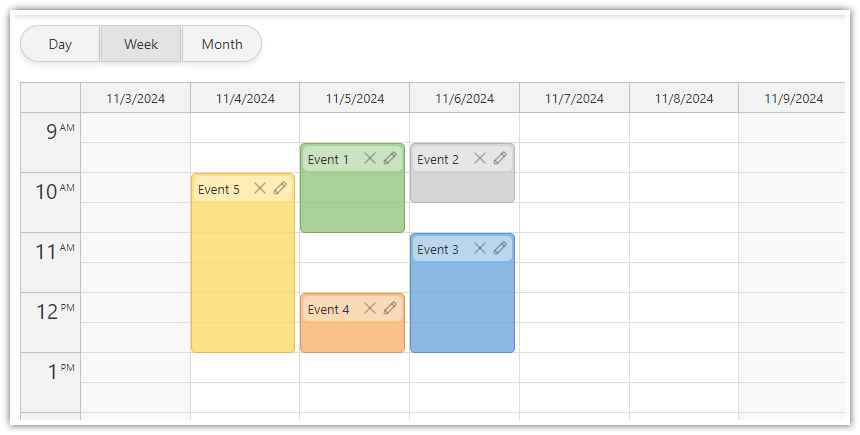
To allow switching between the calendar views, we add a toolbar with three buttons above the current calendar view:
<div class="buttons">
  <button @click="viewType='Day'" :class="{ selected: viewType === 'Day' }">Day</button>
  <button @click="viewType='Week'" :class="{ selected: viewType === 'Week' }">Week</button>
  <button @click="viewType='Month'" :class="{ selected: viewType === 'Month' }">Month</button>
</div>
The @click event simply sets the value of the viewType variable. This variable is reactive and Vue automatically updates visiblity of the calendar views whenever the value changes.
Changing the Calendar Date using a Date Picker in Vue
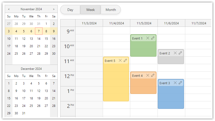
To let users change the current date, we add a date picker using DayPilot Navigator component.
<DayPilotNavigator
    :selectMode="viewType"
    :showMonths="3"
    :skipMonths="3"
    @timeRangeSelected="args => startDate = args.day">
</DayPilotNavigator>
The date picker can be configured to display one or more months (we use :showMonth="3" to display three months, see also the API docs).
The :selectMode prop sets the selection size (API docs). We will point it to the viewType variable to reflect the current view ("Day", "Week", or "Month").
Using Vue Templates to Define Calendar Event Content
The Vue calendar component supports named slots that you can use to define templates for event boxes.
This is helpful if you want to style the text or add buttons, icons and other interactive content.
To use a Calendar event slot, add a nested template marked with the #event attribute. The Vue Calendar component passes an instance of a DayPilot.Event object as event to the template.
This is a basic example that shows event text and the start time in the event box:
<DayPilotCalendar viewType="Week">
  <template #event="{event}">
    {{event.text()}} {{event.start().toString("h:mm tt")}}
  </template>
</DayPilotCalendar>
You can also use custom Vue components in the template.
We will use this approach in our Vue application as well - it will help us enapsulate the logic and reuse the template in all calendar views.
<DayPilotCalendar viewType="Week">
  <template #event="{event}">
    <CalendarEvent
        :event="event"
        @edit="onEventEdit"
        @delete="onEventDelete"
    />
  </template>
</DayPilotCalendar>
Here, we have used custom CalendarEvent Vue component that defines more complex HTML and custom icons.
Vue.js Calendar Event Component with Custom Content
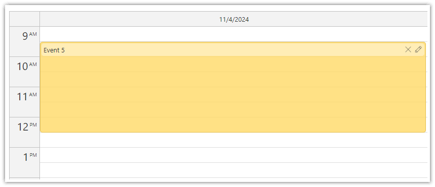
This is our CalendarEvent component that specifies the content of calendar events.
It shows a header with the event text and two icons on the right side:
“delete”
“edit”
Clicking the icons will fire onDelete and onEdit events, respectively. These events are exposed to parent components so you can handle them there.
The icons are defined as SVG symbols in the daypilot.svg file.
<template>
  <div :class="['event-header', { 'use-header': useHeader }]">
    {{ event.text() }}
    <span>
      <svg @click="handleDelete">
        <use href="/icons/daypilot.svg#x-2"></use>
      </svg>
      <svg @click="handleEdit">
        <use href="/icons/daypilot.svg#edit"></use>
      </svg>
    </span>
  </div>
</template>

<script setup>
const {event, useHeader, onEdit, onDelete} = defineProps({
  event: {type: Object, required: true},
  useHeader: {type: Boolean, required: false, default: true},
  onEdit: {type: Function, required: false},
  onDelete: {type: Function, required: false},
});

const handleEdit = () => {
  if (onEdit) {
    onEdit(event);
  }
};

const handleDelete = () => {
  if (onDelete) {
    onDelete(event);
  }
};
</script>

<style scoped>
.event-header {
  padding: 4px;
  color: #333333;
  border-radius: 5px;

}

.use-header.event-header {
  background-color: #ffffff66;
  margin-top: 2px;
  margin-left: 2px;
  margin-right: 2px;
}

.event-header span {
  float: right;
}

.event-header svg {
  width: 16px;
  height: 16px;
  margin-left: 4px;
  cursor: pointer;
  color: #33333366;
}

.event-header svg:hover {
  color: #333333;
}
</style>
The CalendarEvent component can be used in templates for <DayPilotCalendar> and <DayPilotMonth> components. Reusing the same component for all calendar views ensures that the events have the same appearance.
In case of <DayPilotMonth>, we use a slightly different styling because the event box is much smaller in the monthly calendar. This custom styling mode that doesn’t use a highlighed header can be activated using :useHeader="false":
<DayPilotMonth>
  <template #event="{event}">
    <CalendarEvent
        :event="event"
        :use-header="false"
        @edit="onEventEdit"
        @delete="onEventDelete"
    />
  </template>
</DayPilotMonth>
Full Source Code
Here is the full source code of our calendar Vue components that integrates three calendar views (daily, weekly, and monthly calendar), a date picker for changing the visible date and buttons for changing the calendar view.
<template>
  <div style="display: flex">
    <div style="margin-right: 10px">
      <DayPilotNavigator
          :selectMode="'week'"
          :showMonths="3"
          :skipMonths="3"
          @timeRangeSelected="args => startDate = args.day">
      </DayPilotNavigator>
    </div>
    <div style="flex-grow: 1;">
      <div class="buttons">
        <button @click="viewType='Day'" :class="{ selected: viewType === 'Day' }">Day</button>
        <button @click="viewType='Week'" :class="{ selected: viewType === 'Week' }">Week</button>
        <button @click="viewType='Month'" :class="{ selected: viewType === 'Month' }">Month</button>
      </div>
      <DayPilotCalendar
          :viewType="'Day'"
          :startDate="startDate"
          :visible="viewType === 'Day'"
          :events="events"
          @beforeEventRender="onBeforeEventRender"
          @timeRangeSelected="onTimeRangeSelected"
          ref="dayRef"
      >
        <template #event="{event}">
          <CalendarEvent
              :event="event"
              @edit="onEventEdit"
              @delete="onEventDelete"
          />
        </template>
      </DayPilotCalendar>
      <DayPilotCalendar
          :viewType="'Week'"
          :startDate="startDate"
          :visible="viewType === 'Week'"
          :events="events"
          :eventBorderRadius="5"
          :durationBarVisible="false"
          @beforeEventRender="onBeforeEventRender"
          @timeRangeSelected="onTimeRangeSelected"
          ref="weekRef"
      >
        <template #event="{event}">
          <CalendarEvent
              :event="event"
              @edit="onEventEdit"
              @delete="onEventDelete"
          />
        </template>
      </DayPilotCalendar>
      <DayPilotMonth
          :startDate="startDate"
          :visible="viewType === 'Month'"
          :events="events"
          @beforeEventRender="onBeforeEventRender"
          @timeRangeSelected="onTimeRangeSelected"
          ref="monthRef"
      >
        <template #event="{event}">
          <CalendarEvent
              :event="event"
              :use-header="false"
              @edit="onEventEdit"
              @delete="onEventDelete"
          />
        </template>
      </DayPilotMonth>
    </div>
  </div>

</template>

<script setup>
import {DayPilot, DayPilotCalendar, DayPilotMonth, DayPilotNavigator} from '@daypilot/daypilot-lite-vue';
import {ref, onMounted} from 'vue';
import CalendarEvent from "@/components/CalendarEvent.vue";

const events = ref([]);
const viewType = ref("Week");
const startDate = ref(DayPilot.Date.today());

const dayRef = ref(null);
const weekRef = ref(null);
const monthRef = ref(null);

const onTimeRangeSelected = async (args) => {
  const modal = await DayPilot.Modal.prompt("Create a new event:", "Event 1");
  const calendar = args.control;
  calendar.clearSelection();
  if (modal.canceled) { return; }
  calendar.events.add({
    start: args.start,
    end: args.end,
    id: DayPilot.guid(),
    text: modal.result
  });
};

const onBeforeEventRender = (args) => {
  args.data.barHidden = true;
  args.data.borderRadius = "5px";
  args.data.backColor = (args.data.color || "#cccccc") + "cc";
  args.data.borderColor = "darker";
};

const colors = [
  {name: "Green", id: "#93c47d"},
  {name: "Blue", id: "#6fa8dc"},
  {name: "Orange", id: "#f6b26b"},
  {name: "Yellow", id: "#ffd966"},
  {name: "Gray", id: "#cccccc"},
];

const onEventEdit = async  (event) => {
  const form = [
    {name: "Text", id: "text", type: "text"},
    {name: "Color", id: "color", type: "select", options: colors},
  ];
  const modal = await DayPilot.Modal.form(form, event.data);
  if (modal.canceled) {
    return;
  }
  event.data.text = modal.result.text;
  event.data.color = modal.result.color;
};

const onEventDelete = (event) => {
  const data = event.data;
  events.value = events.value.filter(e => e.id !== data.id);
}

const loadEvents = () => {
  const firstDay = DayPilot.Date.today().firstDayOfWeek().addDays(1);
  events.value = [
    { id: 1, start: firstDay.addHours(9), end: firstDay.addHours(10), text: "Event 1", color: "#93c47d"},
    { id: 2, start: firstDay.addDays(1).addHours(11), end: firstDay.addDays(1).addHours(12), text: "Event 2", color: "#cccccc"},
    { id: 3, start: firstDay.addDays(1).addHours(13), end: firstDay.addDays(1).addHours(15), text: "Event 3", color: "#6fa8dc"},
    { id: 4, start: firstDay.addHours(15), end: firstDay.addHours(16), text: "Event 4", color: "#f6b26b"},
    { id: 5, start: firstDay.addHours(11), end: firstDay.addHours(14), text: "Event 5", color: "#ffd966"},
  ];
};

onMounted(() => {
  loadEvents();
});

</script>

<style>
/* override the built-in theme, must not be scoped */
body .calendar_default_event_inner {
  padding: 0px;
}
</style>
You can download the full Vue project using the link at the top of the tutorial.
 DayPilot