Overview
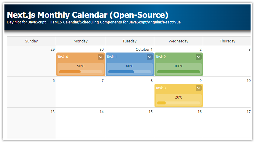
Create a monthly calendar UI in Next.js using the React monthly calendar component.
Use the React Hooks API to implement the functionality (load task data, define event handlers).
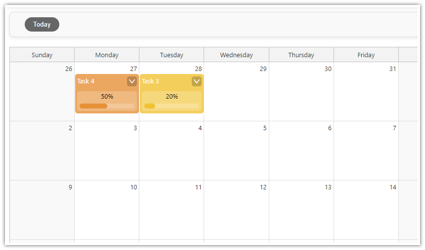
Customize the appearance of tasks and add a progress bar to the task body.
The Next.js project includes the open-source DayPilot Lite for JavaScript scheduling library.
Creating a Monthly Calendar UI in Next.js
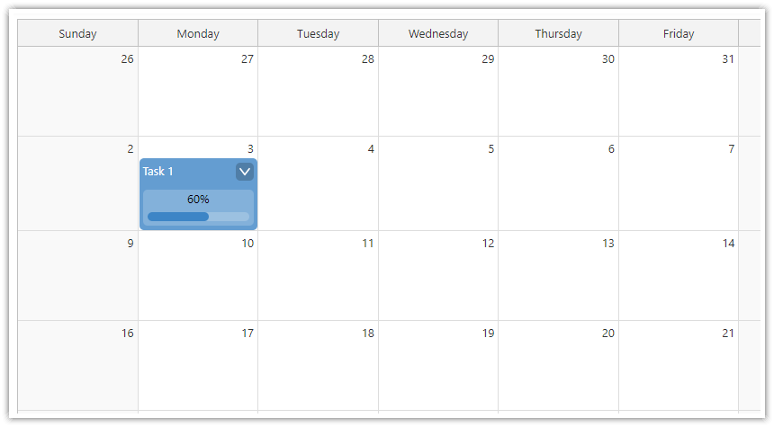
We will start with the minimum steps required to start using the React monthly calendar component in in Next.js.
1. Install DayPilot Lite for React
Begin by installing the DayPilot Lite for React library using npm:
npm install @daypilot/daypilot-lite-react2. Enable Client-Side Rendering
Since the DayPilot Month component is a client-side component, you need to enable client-side rendering in your Next.js component by adding 'use client'; at the top of your file.
3. Import the DayPilotMonth Component
Import the DayPilotMonth component from the @daypilot/daypilot-lite-react package:
import { DayPilotMonth } from "@daypilot/daypilot-lite-react";4. Add the DayPilotMonth Component to Your JSX
Insert the <DayPilotMonth /> tag into your component's JSX to render the calendar:
'use client';

import {DayPilotMonth} from "@daypilot/daypilot-lite-react";

export default function Month() {

    return (
      <DayPilotMonth />
    )
}
Setting the Visible Month in the Next.js Calendar
Now we can configure the monthly calendar component. In this step, we will set the visible month of the Next.js monthly calendar.
1.Initialize the startDate State Variable
To control the visible month, we’ll create a state variable called startDate. This state will determine which month is displayed when the calendar first renders. If you change this variable later, the calendar will update to show that month.
import { useState } from 'react';
import { DayPilot } from '@daypilot/daypilot-lite-react';

const [startDate, setStartDate] = useState<string | DayPilot.Date>("2026-11-01");
2. Pass startDate to the DayPilotMonth Component
Next, pass the startDate state variable as a prop to the DayPilotMonth component. This tells the calendar which month to display upon loading.
<DayPilotMonth startDate={startDate} />By setting the startDate prop, the calendar will display November 2025.
Adding and Managing Events in the Monthly Calendar
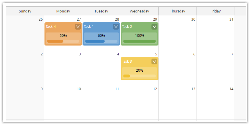
To load event data into the calendar, we'll create a new events state variable and use the setEvents() function within the useEffect() hook to load the data when the component mounts.
This example uses a simple local array of events. In your Next.js application, you can replace it with a server-side HTTP request to fetch events from a database or API.
1. Initialize the events State Variable
Begin by initializing the events state variable:
const [events, setEvents] = useState<DayPilot.EventData[]>([]);2. Load Event Data on Startup
Use the useEffect() hook to load the event data when the component mounts:
useEffect(() => {
  const data: DayPilot.EventData[] = [
    {
      id: 1,
      text: "Task 1",
      start: "2026-11-05T10:30:00",
      end: "2026-11-05T13:00:00",
      tags: { progress: 60 },
    },
    // Additional events...
  ];
  setEvents(data);
}, []);
Event properties:
id: A unique identifier for the event (required).startandend: The start and end times of the event (required).text: The text displayed on the event.tags: An object to store custom data associated with the event, such as progress indicators or custom colors.
See also DayPilot.Event.data API docs for a full list of available event properties.
3. Update the DayPilotMonth Component
Next, update the <DayPilotMonth /> component in your JSX to include the events prop:
<DayPilotMonth startDate={startDate} events={events} />By adding the events prop, the calendar will display the events you've defined in your state variable.
Displaying Progress Bars in Events
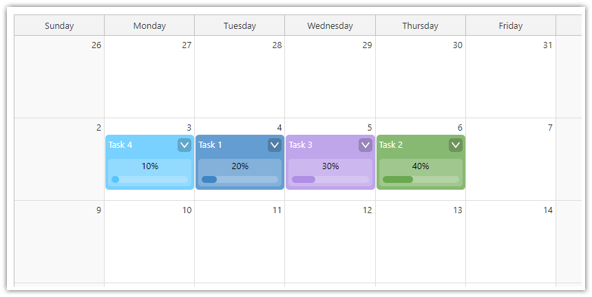
We'll use the onBeforeEventRender event handler to customize the appearance of events. By defining custom active areas within each event, we can display progress bars that visually represent the progress value stored in each event's tags.
1. Define Progress Values in Event Data
First, ensure that your event data includes a progress value within the tags property. This value should be a number between 0 and 100 representing the percentage of completion.
const data: DayPilot.EventData[] = [
  {
    id: 1,
    text: "Task 1",
    start: "2026-11-05T10:30:00",
    end: "2026-11-05T13:00:00",
    tags: { progress: 60 },
  },
  {
    id: 2,
    text: "Task 2",
    start: "2026-11-06T09:30:00",
    end: "2026-11-06T11:30:00",
    tags: { progress: 80 },
  },
  // ...
];
2. Implement the onBeforeEventRender Handler
The onBeforeEventRender event handler allows you to customize how events are rendered on the Next.js calendar. We'll use this handler to add custom areas to each event for displaying the progress bar.
<DayPilotMonth
  startDate={startDate}
  events={events}
  onBeforeEventRender={onBeforeEventRender}
  // ...
/>
3. Define the onBeforeEventRender Function
Implement the onBeforeEventRender function to customize the event rendering. We'll extract the progress value from the event's tags and define custom areas within the event to display the progress bar and other information.
const onBeforeEventRender = (args: DayPilot.MonthBeforeEventRenderArgs) => {
  // extract the color from tags or use a default
  const color = args.data.tags?.color || "#3d85c6";
  args.data.backColor = color + "cc"; // Adding transparency

  // extract the progress value or default to 0
  const progress = args.data.tags?.progress || 0;

  // clear default event HTML
  args.data.html = "";

  // define custom areas within the event
  args.data.areas = [
    // event text area
    {
      id: "text",
      top: 5,
      left: 5,
      right: 5,
      height: 20,
      text: args.data.text,
      fontColor: "#fff",
    },
    // progress percentage text
    {
      id: "progress-text",
      bottom: 5,
      left: 5,
      right: 5,
      height: 20,
      text: `${progress}%`,
      fontColor: "#000",
      backColor: "#ffffff33",
      style: "text-align: center; line-height: 20px;",
    },
    // background for progress bar
    {
      id: "progress-background",
      bottom: 10,
      left: 10,
      right: 10,
      height: 10,
      borderRadius: "5px",
      backColor: "#ffffff33",
      toolTip: `Progress: ${progress}%`,
    },
    // actual progress bar
    {
      id: "progress-bar",
      bottom: 10,
      left: 10,
      width: `calc((100% - 20px) * ${progress / 100})`,
      height: 10,
      borderRadius: "5px",
      backColor: color,
    },
    // ...
  ];
};
The actual CSS width of the "progress-bar" active area is calculated from the progress value using a CSS calc() function.
Editing Calendar Events with Modal Forms
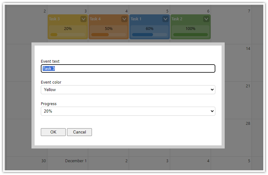
Now, we'll implement functionality to edit events in your Next.js monthly calendar using modal forms. This feature allows users to modify event details such as the title, color, and progress percentage.
1. Implement the editEvent Function
Create a function called editEvent that will be responsible for displaying the modal form and handling the event update.
const editEvent = async (e: DayPilot.Event) => {
  const form = [
    { name: "Event text", id: "text", type: "text" },
    { name: "Event color", id: "tags.color", type: "select", options: colors },
    { name: "Progress", id: "tags.progress", type: "select", options: progressValues },
  ];

  const modal = await DayPilot.Modal.form(form, e.data);
  if (modal.canceled) {
    return;
  }

  const updatedEvent = modal.result;

  calendar?.events.update(updatedEvent);
};
In the editEvent() function, we'll use the DayPilot.Modal.form() method to display a modal dialog containing a form with input fields.
There modal dialog displays three fields:
Event text field which is a standard text input field.
Event color drop-down list which lets you select a color from the
colorslist.A drop-down list that defines the progress percentage.
The colors are defined as follows:
const colors = [
    {name: "Green", id: "#6aa84f"},
    {name: "Blue", id: "#3d85c6"},
    {name: "Turquoise", id: "#00aba9"},
    // ...
];
And here is the list of predefined progress levels:
const progressValues = [
    {name: "0%", id: 0},
    {name: "10%", id: 10},
    {name: "20%", id: 20},
    // ...
];
2. Attach the editEvent Function to Event Clicks
To allow users to edit events by clicking on them, update the onEventClick handler in your DayPilotMonth component.
<DayPilotMonth
  // ...
  onEventClick={async (args) => {
    await editEvent(args.e);
  }}
/>
3. Integrate a Context Menu for Events
We'll also add a context menu to provide additional options when users right-click on an event.
const contextMenu = new DayPilot.Menu({
  items: [
    {
      text: "Delete",
      onClick: async (args) => {
        calendar?.events.remove(args.source);
      },
    },
    { text: "-" }, // Separator
    {
      text: "Edit...",
      onClick: async (args) => {
        await editEvent(args.source);
      },
    },
  ],
});
Attach the context menu to the calendar:
<DayPilotMonth
  // ...
  contextMenu={contextMenu}
/>
4. Ensure the Calendar Reference is Set
We need to make sure we have a reference to the calendar control to update events.
We will add a calendar state variable:
const [calendar, setCalendar] = useState<DayPilot.Month>();The controlRef prop allows us to store a reference to the calendar instance in the calendar state variable.
<DayPilotMonth
  // Other props...
  controlRef={setCalendar}
/>
Full Source Code
And here is the full source code of our Next.js monthly calendar component:
'use client';

import React, {useEffect, useState} from "react";
import {DayPilot, DayPilotMonth, DayPilotNavigator} from "@daypilot/daypilot-lite-react";
import "./toolbar.css";

export default function Month() {

    const [calendar, setCalendar] = useState<DayPilot.Month>();
    const [datePicker, setDatePicker] = useState<DayPilot.Navigator>();

    const [events, setEvents] = useState<DayPilot.EventData[]>([]);
    const [startDate, setStartDate] = useState<string|DayPilot.Date>("2026-11-01");

    const styles = {
        wrap: {
            display: "flex"
        },
        left: {
            marginRight: "10px"
        },
        main: {
            flexGrow: "1"
        }
    };

    const colors = [
        {name: "Green", id: "#6aa84f"},
        {name: "Blue", id: "#3d85c6"},
        {name: "Turquoise", id: "#00aba9"},
        {name: "Light Blue", id: "#56c5ff"},
        {name: "Yellow", id: "#f1c232"},
        {name: "Orange", id: "#e69138"},
        {name: "Red", id: "#cc4125"},
        {name: "Light Red", id: "#ff0000"},
        {name: "Purple", id: "#af8ee5"},
    ];

    const progressValues = [
        {name: "0%", id: 0},
        {name: "10%", id: 10},
        {name: "20%", id: 20},
        {name: "30%", id: 30},
        {name: "40%", id: 40},
        {name: "50%", id: 50},
        {name: "60%", id: 60},
        {name: "70%", id: 70},
        {name: "80%", id: 80},
        {name: "90%", id: 90},
        {name: "100%", id: 100},
    ];

    const editEvent = async (e: DayPilot.Event) => {
        const form = [
            {name: "Event text", id: "text", type: "text"},
            {name: "Event color", id: "tags.color", type: "select", options: colors},
            {name: "Progress", id: "tags.progress", type: "select", options: progressValues },
        ];

        const modal = await DayPilot.Modal.form(form, e.data);
        if (modal.canceled) { return; }

        const updatedEvent = modal.result;

        calendar?.events.update(updatedEvent);
    };

    const contextMenu = new DayPilot.Menu({
        items: [
            {
                text: "Delete",
                onClick: async args => {
                    calendar?.events.remove(args.source);
                },
            },
            {
                text: "-"
            },
            {
                text: "Edit...",
                onClick: async args => {
                    await editEvent(args.source);
                }
            }
        ]
    });

    const onBeforeEventRender = (args: DayPilot.MonthBeforeEventRenderArgs) => {
        const color = args.data.tags && args.data.tags.color || "#3d85c6";
        args.data.backColor = color + "cc";

        const progress = args.data.tags?.progress || 0;

        args.data.html = "";

        args.data.areas = [
            {
                id: "text",
                top: 5,
                left: 5,
                right: 5,
                height: 20,
                text: args.data.text,
                fontColor: "#fff",
            },
            {
                id: "progress-text",
                bottom: 5,
                left: 5,
                right: 5,
                height: 40,
                text: progress + "%",
                borderRadius: "5px",
                fontColor: "#000",
                backColor: "#ffffff33",
                style: "text-align: center; line-height: 20px;",
            },
            {
                id: "progress-background",
                bottom: 10,
                left: 10,
                right: 10,
                height: 10,
                borderRadius: "5px",
                backColor: "#ffffff33",
                toolTip: "Progress: " + progress + "%",
            },
            {
                id: "progress-bar",
                bottom: 10,
                left: 10,
                width: `calc((100% - 20px) * ${progress / 100})`,
                height: 10,
                borderRadius: "5px",
                backColor: color,
            },
            {
                id: "menu",
                top: 5,
                right: 5,
                width: 20,
                height: 20,
                symbol: "icons/daypilot.svg#minichevron-down-2",
                fontColor: "#fff",
                backColor: "#00000033",
                style: "border-radius: 25%; cursor: pointer;",
                toolTip: "Show context menu",
                action: "ContextMenu",
            },
        ];
    };

    const onTodayClick = () => {
        console.log("onTodayClick");
        datePicker?.select(DayPilot.Date.today());
    };

    useEffect(() => {

        if (!calendar || calendar.disposed()) {
            return;
        }
        const events: DayPilot.EventData[] = [
            {
                id: 1,
                text: "Task 1",
                start: "2026-11-05T10:30:00",
                end: "2026-11-05T13:00:00",
                tags: {
                    progress: 60,
                }
            },
            {
                id: 2,
                text: "Task 2",
                start: "2026-11-06T09:30:00",
                end: "2026-11-06T11:30:00",
                tags: {
                    color: "#6aa84f",
                    progress: 100,
                }
            },
            {
                id: 3,
                text: "Task 3",
                start: "2026-11-13T12:00:00",
                end: "2026-11-13T15:00:00",
                tags: {
                    color: "#f1c232",
                    progress: 20,
                }
            },
            {
                id: 4,
                text: "Task 4",
                start: "2026-11-04T11:30:00",
                end: "2026-11-04T14:30:00",
                tags: {
                    color: "#e69138",
                    progress: 50,
                }
            },
        ];

        setEvents(events);

        datePicker?.select("2026-11-01");

    }, [calendar, datePicker]);

    const onTimeRangeSelected = async (args: DayPilot.MonthTimeRangeSelectedArgs) => {
        const modal = await DayPilot.Modal.prompt("Create a new event:", "Event 1");
        calendar?.clearSelection();
        if (modal.canceled) {
            return;
        }
        // console.log("modal.result", modal.result, calendar);
        calendar?.events.add({
            start: args.start,
            end: args.end,
            id: DayPilot.guid(),
            text: modal.result,
            tags: {}
        });
    };

    return (
        <div style={styles.wrap}>
            <div style={styles.left}>
                <DayPilotNavigator
                    selectMode={"Month"}
                    showMonths={3}
                    skipMonths={3}
                    onTimeRangeSelected={args => setStartDate(args.start)}
                    controlRef={setDatePicker}
                    events={events}
                />
            </div>
            <div style={styles.main}>
                <div className={"toolbar"}>
                    <button onClick={onTodayClick}>Today</button>
                </div>
                <DayPilotMonth
                    startDate={startDate}
                    events={events}
                    eventBorderRadius={"5px"}
                    eventBarVisible={false}
                    eventHeight={80}
                    cellHeight={120}
                    onTimeRangeSelected={onTimeRangeSelected}
                    onEventClick={async args => { await editEvent(args.e); }}
                    contextMenu={contextMenu}
                    onBeforeEventRender={onBeforeEventRender}
                    controlRef={setCalendar}
                />
            </div>
        </div>
    )
}
You can download the complete Next.js project using the download link at the top of this tutorial.
 DayPilot