DayPilot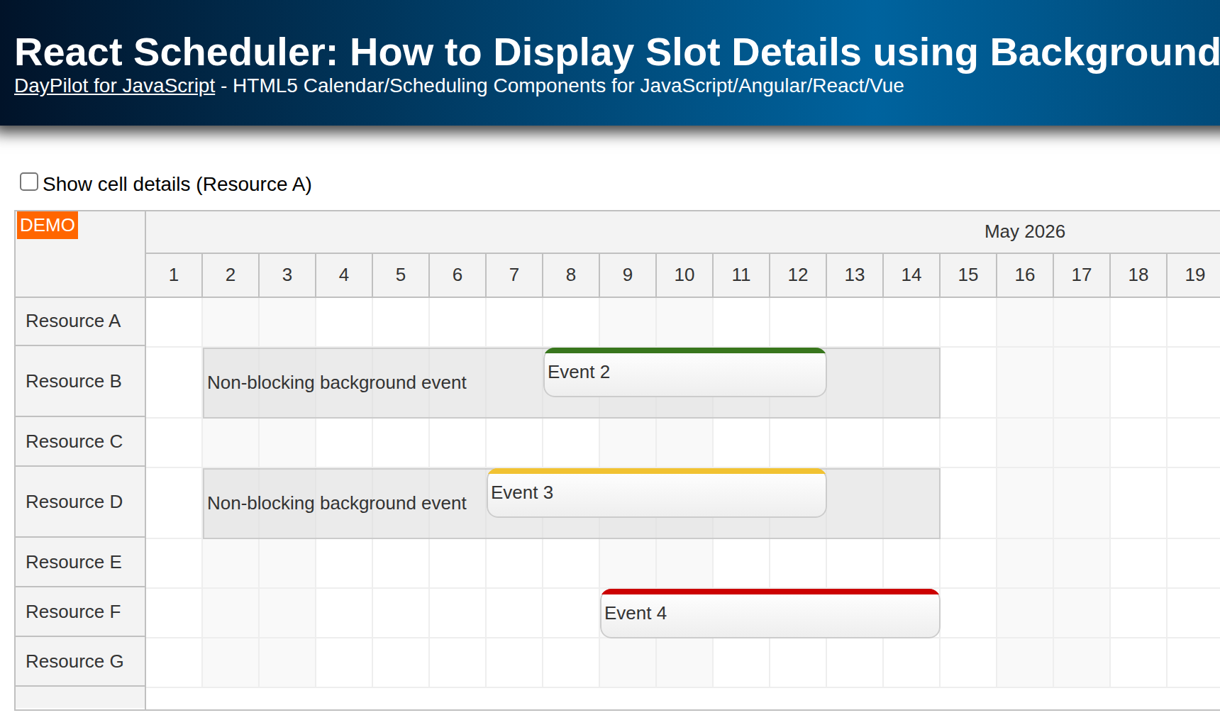
| Demo | |
|---|---|
| Downloads | |
| Languages | JavaScript |
| Technologies | React |
Overview
-
Explore the ways to show details for time slots in the React Scheduler component (DayPilot Pro for JavaScript).
License
Licensed for testing and evaluation purposes. Please see the license agreement included in the sample project. You can use the source code of the tutorial if you are a licensed user of DayPilot Pro for JavaScript.
What information can be displayed in React Scheduler slots?
When designing a scheduling or reservation application, you may want to display additional information related to the time slots.
You can display slot-specific information in the grid cells of the React Scheduler component, such as:
-
work days or work hours
-
global or resource-specific holidays
-
availability summary for a time slot or a group of resources
-
unavailable time slots
-
slot-specific price (like in the tennis court reservation tutorial)
How to display time slot details in the Scheduler?
The Scheduler component displays two layers in the main scheduling grid:
-
background layout with cells (time slots)
-
top layer with events (tasks, reservations)
The standard way is to use the background layer and display the slot details directly in the Scheduler grid cells. However, that information must be written to each cell individually.
Sometimes, you might want to add longer text that spans multiple cells. In this tutorial, you will learn how to move events to the background layer and use them to display larger blocks.
How to modify the Scheduler grid cells?
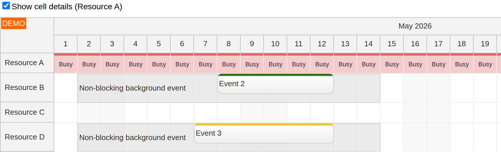
Grid cells: Resource A displays a separate “Busy” label in each daily cell.
You can use the onBeforeCellRender event handler to customize the React Scheduler cells.
In addition to setting custom content in HTML format, you can also modify the cell background color, add active areas and make the cell unavailable by marking it as blocked.
In the sample, turn on Show cell details (Resource A) to display a red strip and a short “Busy” label in each cell of that resource. The checkbox changes showCellDetails, and beforeCellRenderCaching={false} lets the cells be rendered again with the new value. These labels are visual only; this example does not mark the cells as blocked or prevent reservations.
The following handler is assigned using onBeforeCellRender={onBeforeCellRender} on DayPilotScheduler:
const Scheduler = () => {
  // ...
  const [showCellDetails, setShowCellDetails] = useState(false);
  // ...
  const onBeforeCellRender = (args) => {
    if (showCellDetails && args.cell.resource === "A") {
      args.cell.areas = [
        {
          top: 0,
          left: 0,
          right: 0,
          height: 4,
          backColor: "#e06666"
        },
        {
          top: 4,
          left: 0,
          right: 0,
          bottom: 0,
          backColor: "#f4cccc",
          fontColor: "#333333",
          text: "Busy",
          horizontalAlignment: "center",
          verticalAlignment: "center",
          style: "font-size: 8pt;"
        }
      ];
    }
  };
  // ...
};
How to display a Scheduler event in the background?
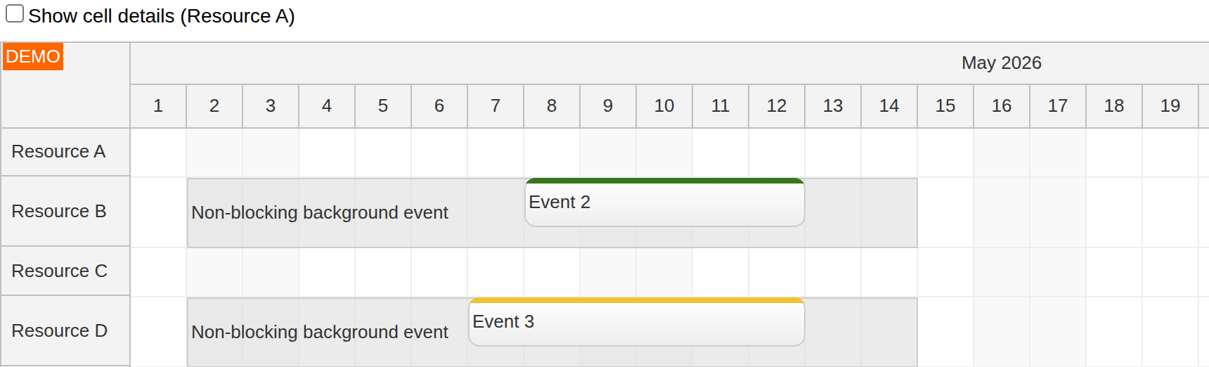
Background events: the gray blocks on resources B and D span multiple cells, with ordinary events displayed over them.
In order to display an event in the background, you need to mark it as non-blocking using the nonBlocking property of the event data item:
const [events] = useState(() => [
  {
    id: 101,
    text: "Non-blocking background event",
    start: "2026-05-02T00:00:00",
    end: "2026-05-15T00:00:00",
    resource: "B",
    barHidden: true,
    backColor: "#dddddd99",
    borderColor: "darker",
    nonBlocking: true,
    line: 0,
    height: 50,
    borderRadius: "0px"
  },
  // ...
]);
The property must be present in the data source and can’t be added later using onBeforeEventRender (unlike most other event properties).
The nonBlocking property ensures that the space occupied by the event is treated as a free space when arranging the events within a row. However, when the Scheduler looks for a free place for this event, it respects the existing events. If you want to display it at the top of the row (line 0), it’s necessary to specify the line number explicitly:
line: 0
In the sample, the background events on resources B and D span May 2–14, 2026 (the end is exclusive). The ordinary events share the same vertical space instead of being pushed to another line. barHidden removes the duration bar, while height, backColor and borderRadius give the background block a different appearance. nonBlocking controls event placement; it does not turn the interval into an unavailable reservation period.
For more information about how the Scheduler arranges events inside a row, please see the JavaScript Scheduler: Event Placement Strategies tutorial.
The nonBlocking property is available since version 2021.2.5007 of the DayPilot Pro for JavaScript package.
Full Source Code
Here is the full source code of src/scheduler/Scheduler.jsx, a React Scheduler component that displays information about multiple time slots in a single block. It opens the timeline at May 2026. Select a free time range to create an event; the dialog adds it using scheduler.events.add(). The cell-detail checkbox lets you compare the two approaches:
import { useEffect, useState } from "react";
import { DayPilot, DayPilotScheduler } from "daypilot-pro-react";

const Scheduler = () => {
  const [scheduler, setScheduler] = useState(null);
  const [showCellDetails, setShowCellDetails] = useState(false);
  const [events] = useState(() => [
    {
      id: 101,
      text: "Non-blocking background event",
      start: "2026-05-02T00:00:00",
      end: "2026-05-15T00:00:00",
      resource: "B",
      barHidden: true,
      backColor: "#dddddd99",
      borderColor: "darker",
      nonBlocking: true,
      line: 0,
      height: 50,
      borderRadius: "0px"
    },
    {
      id: 102,
      text: "Non-blocking background event",
      start: "2026-05-02T00:00:00",
      end: "2026-05-15T00:00:00",
      resource: "D",
      barHidden: true,
      backColor: "#dddddd99",
      borderColor: "darker",
      nonBlocking: true,
      line: 0,
      height: 50,
      borderRadius: "0px"
    },
    {
      id: 2,
      text: "Event 2",
      start: "2026-05-08T00:00:00",
      end: "2026-05-13T00:00:00",
      resource: "B",
      barColor: "#38761d",
      barBackColor: "#93c47d"
    },
    {
      id: 3,
      text: "Event 3",
      start: "2026-05-07T00:00:00",
      end: "2026-05-13T00:00:00",
      resource: "D",
      barColor: "#f1c232",
      barBackColor: "#f1c232"
    },
    {
      id: 4,
      text: "Event 4",
      start: "2026-05-09T00:00:00",
      end: "2026-05-15T00:00:00",
      resource: "F",
      barColor: "#cc0000",
      barBackColor: "#ea9999"
    }
  ]);
  const [resources] = useState(() => [
    {name: "Resource A", id: "A"},
    {name: "Resource B", id: "B"},
    {name: "Resource C", id: "C"},
    {name: "Resource D", id: "D"},
    {name: "Resource E", id: "E"},
    {name: "Resource F", id: "F"},
    {name: "Resource G", id: "G"}
  ]);

  useEffect(() => {
    if (scheduler) {
      scheduler.scrollTo("2026-05-01");
    }
  }, [scheduler]);

  const onTimeRangeSelected = async (args) => {
    const scheduler = args.control;
    const modal = await DayPilot.Modal.prompt("Create a new event:", "Event 1");
    scheduler.clearSelection();
    if (modal.canceled) { return; }
    scheduler.events.add({
      start: args.start,
      end: args.end,
      id: DayPilot.guid(),
      resource: args.resource,
      text: modal.result
    });
  };

  const onBeforeCellRender = (args) => {
    if (showCellDetails && args.cell.resource === "A") {
      args.cell.areas = [
        {
          top: 0,
          left: 0,
          right: 0,
          height: 4,
          backColor: "#e06666"
        },
        {
          top: 4,
          left: 0,
          right: 0,
          bottom: 0,
          backColor: "#f4cccc",
          fontColor: "#333333",
          text: "Busy",
          horizontalAlignment: "center",
          verticalAlignment: "center",
          style: "font-size: 8pt;"
        }
      ];
    }
  };

  return (
    <div>
      <div className="space">
        <label>
          <input
            type="checkbox"
            checked={showCellDetails}
            onChange={(event) => setShowCellDetails(event.target.checked)}
          />
          Show cell details (Resource A)
        </label>
      </div>
      <DayPilotScheduler
        timeHeaders={[{groupBy: "Month"}, {groupBy: "Day", format: "d"}]}
        scale={"Day"}
        days={365}
        startDate={"2026-01-01"}
        eventBorderRadius={"8px"}
        timeRangeSelectedHandling={"Enabled"}
        onTimeRangeSelected={onTimeRangeSelected}
        beforeCellRenderCaching={false}
        onBeforeCellRender={onBeforeCellRender}
        events={events}
        resources={resources}
        controlRef={setScheduler}
      />
    </div>
  );
};

export default Scheduler;
You can download the React project using the “Download” link at the top of the tutorial.