DayPilot
| Demo | |
|---|---|
| Downloads | |
| Languages | JavaScript |
Overview
The JavaScript Scheduler supports export of complex event/task objects to image (PNG, JPEG, SVG) using active areas:
-
Use active areas to insert rectangle objects at a specified position (pixel position or date/time position)
-
Active areas can display images supported by the browser (PNG, JPEG, SVG format)
-
The Scheduler can display and export font icons (e.g., Font Awesome)
-
Active areas support vertical and horizontal text alignment, custom background and font colors, borders, and rounded corners
-
Export the Scheduler view to PNG, JPEG or SVG using exportAs() method
-
Includes a trial version of DayPilot Pro for JavaScript (see also License below)
License
Licensed for testing and evaluation purposes. Please see the license agreement included in the sample project. You can use the source code of the tutorial if you are a licensed user of DayPilot Pro for JavaScript.
Scheduler Image Export
The JavaScript/HTML5 Scheduler component includes built-in support for client-side image export. It exports the Scheduler view to common formats:
-
JPEG - bitmap format with lossy compression (can be used for PDF export)
-
PNG - bitmap format with lossless compression
-
SVG - vector format (ideal for printing)
However, the export feature doesn't simply copy the screen - each element has to be rendered individually using basic elements like lines, rectangles, and text strings. That means the image export has limited support for HTML and CSS:
-
The Scheduler tries to read the styles of individual elements (e.g. event background) and use them for export.
-
The inner HTML is interpreted as text. The <br> elements are converted to line breaks.
-
The CSS detection works on element level and it doesn't read styles that you use inside the element.
To overcome these limitations the Scheduler offers two tools:
-
onBeforeEventExport event handler lets you provide plain text instead of custom HTML and override the detected styles (similar event handlers are also available for other Scheduler elements, like grid cells and row headers)
-
event active areas let you insert custom objects at specified positions inside an event
This tutorial shows how to use the active areas to build the event content and make it exportable.
Rich Content with Active Areas
The active areas can be used to create complex event layouts. Specify their content and appearance using the built-in properties so that the Scheduler can reproduce them during export. Use separate areas for a title, a secondary label, an image, or a status badge instead of putting a nested HTML layout inside the event.
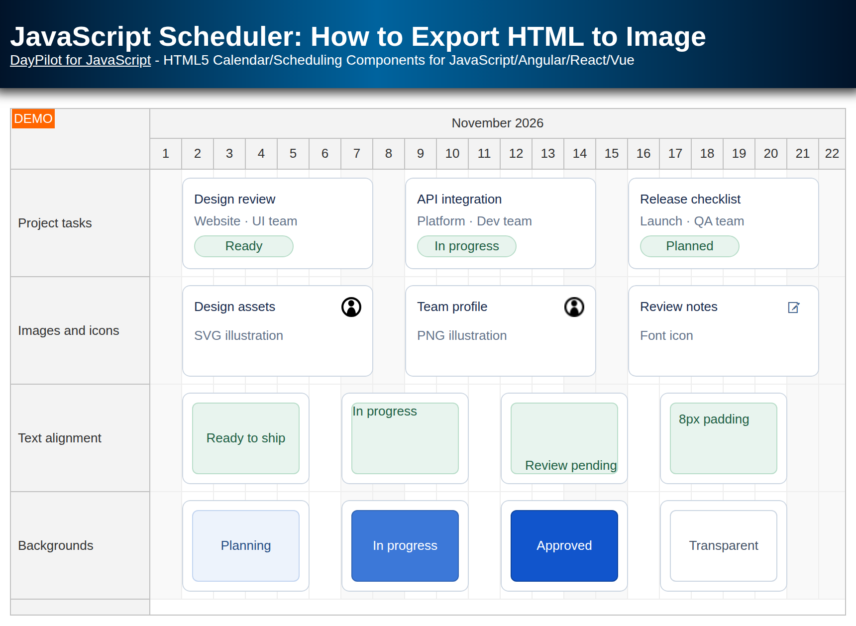
The sample keeps the default Scheduler headers and grid. White event cards use subtle borders, while color and positioning distinguish the content inside each card. The timeline starts in November 2026. The four resource rows demonstrate project tasks, images and icons, text alignment, and background colors.
Uniform numeric borderRadius values and active-area borders are supported during image export in DayPilot Pro for JavaScript 2026.4.7147 and later. Use a single pixel radius such as 6 for predictable results; arbitrary CSS shapes and nested HTML styles are not an export layout system.
Titles, Details, and Status Badges
Each project task stores its title in text and its secondary label and status in tags. This keeps the event data separate from the layout and lets newly created tasks use the same rendering logic.
const events = [
  // ...
  {
    id: "task-1", resource: "tasks", text: "Design review",
    start: "2026-11-02", end: "2026-11-08",
    tags: {type: "task", detail: "Website · UI team", status: "Ready"}
  },
  // ...
];
In onBeforeEventRender, clear the default event HTML and build three areas. The dark title and muted secondary label share the same left edge. A pale green badge sits near the bottom; its border and numeric corner radius are exported along with its text. Set the event height to 92 to leave room for all three lines.
const dp = new DayPilot.Scheduler("dp", {
  // ...
  onBeforeEventRender: (args) => {
    args.data.html = "";
    args.data.backColor = "#ffffff";
    args.data.borderColor = "#cbd5e1";
    args.data.borderRadius = 8;
    if (args.data.tags?.type === "task") {
      args.data.areas = [
        {
          left: 12, right: 12, top: 12, height: 20,
          text: args.data.text,
          fontColor: "#172b4d",
          verticalAlignment: "center"
        },
        {
          left: 12, right: 12, top: 35, height: 18,
          text: args.data.tags.detail,
          fontColor: "#64748b",
          verticalAlignment: "center"
        },
        {
          left: 12, bottom: 12, width: 100, height: 22,
          text: args.data.tags.status,
          backColor: "#e8f4ee",
          fontColor: "#206044",
          borderColor: "#b8ddc9",
          borderRadius: 11,
          horizontalAlignment: "center",
          verticalAlignment: "center"
        }
      ];
    }
  },
  onBeforeEventExport: (args) => {
    // The visible labels are supplied by active areas, not the event body.
    args.text = "";
  },
  // ...
});
The matching onBeforeEventExport handler clears args.text because the active areas already supply every visible label. The underlying event still has a useful text value; only the event body is empty in the exported image. Without this step, the default event text could overlap the area content.
SVG Image
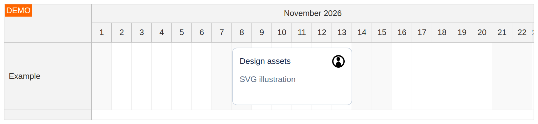
Set image to the SVG URL. The sample places a 20 × 20 pixel image at the upper-right corner and reserves space for it with the title area’s right offset. A separate area below the title provides the secondary label.
const events = [
  // ...
  {
    id: 1, resource: "icons", text: "Design assets",
    start: "2026-11-02", end: "2026-11-08",
    areas: [
      {left: 12, right: 48, top: 14, height: 20, text: "Design assets", fontColor: "#172b4d"},
      {left: 12, right: 12, top: 43, height: 20, text: "SVG illustration", fontColor: "#64748b"},
      {right: 12, top: 12, width: 20, height: 20, image: "icon.svg"}
    ]
  },
  // ...
];
PNG Image
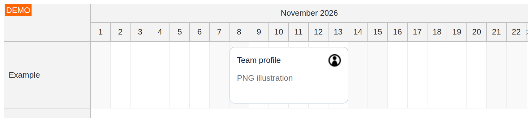
Use the same layout for a bitmap image. Change the image URL to the PNG file. The file is included with the application, so the browser and export renderer can load it from the same origin. Choose a sufficiently large source bitmap if it needs to stay sharp in high-resolution output.
const events = [
  // ...
  {
    id: 2, resource: "icons", text: "Team profile",
    start: "2026-11-09", end: "2026-11-15",
    areas: [
      {left: 12, right: 48, top: 14, height: 20, text: "Team profile", fontColor: "#172b4d"},
      {left: 12, right: 12, top: 43, height: 20, text: "PNG illustration", fontColor: "#64748b"},
      {right: 12, top: 12, width: 20, height: 20, image: "icon.png"}
    ]
  },
  // ...
];
Font Icon
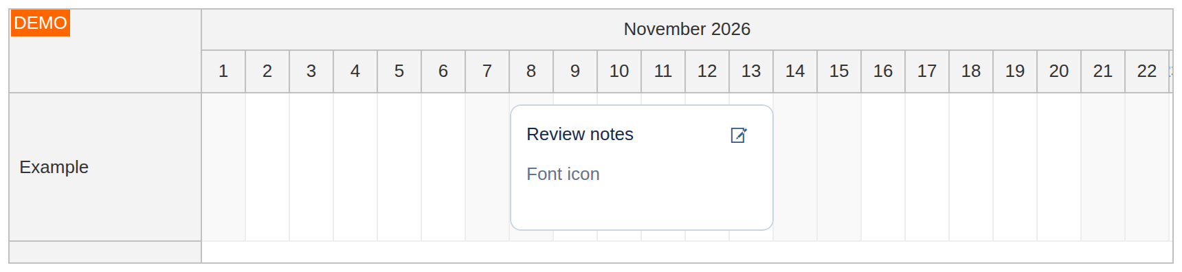
The icon property takes a CSS class that supplies a glyph from an icon font. The sample includes the icon-edit class and its font files. Load the stylesheet in the page and wait for the font before exporting; otherwise the glyph may be missing. Font Awesome can be used in the same way when its stylesheet and fonts are available.
<link rel="stylesheet" href="/icons-legacy/style.css">const events = [
// ...
{
id: 3, resource: "icons", text: "Review notes",
start: "2026-11-16", end: "2026-11-22",
areas: [
{left: 12, right: 48, top: 14, height: 20, text: "Review notes", fontColor: "#172b4d"},
{left: 12, right: 12, top: 43, height: 20, text: "Font icon", fontColor: "#64748b"},
{right: 14, top: 16, width: 18, height: 18, icon: "icon-edit", fontColor: "#375a86"}
]
},
// ...
];Centered Text
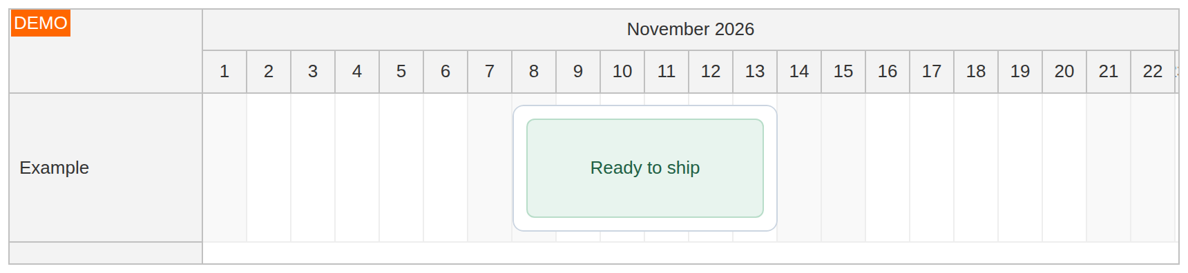
Use horizontalAlignment: "center" and verticalAlignment: "center" to center the label inside the active area. The offsets leave a ten-pixel gap between the panel and the event edges.
const events = [
  // ...
  {
    id: 21, resource: "text", text: "Centered text",
    start: "2026-11-02", end: "2026-11-06",
    areas: [{
      left: 10, right: 10, top: 10, bottom: 10,
      text: "Ready to ship", backColor: "#e8f4ee", fontColor: "#206044",
      borderColor: "#b8ddc9", borderRadius: 6,
      horizontalAlignment: "center", verticalAlignment: "center"
    }]
  },
  // ...
];
Left-Aligned Text
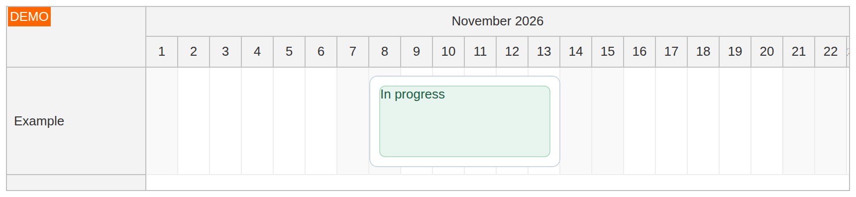
Set horizontal alignment to "left" and vertical alignment to "top". This places the label at the panel’s upper-left corner. Add padding, as shown below, when the label should have more breathing room.
const events = [
  // ...
  {
    id: 22, resource: "text", text: "Left-aligned text",
    start: "2026-11-07", end: "2026-11-11",
    areas: [{
      left: 10, right: 10, top: 10, bottom: 10,
      text: "In progress", backColor: "#e8f4ee", fontColor: "#206044",
      borderColor: "#b8ddc9", borderRadius: 6,
      horizontalAlignment: "left", verticalAlignment: "top"
    }]
  },
  // ...
];
Right-Aligned Text
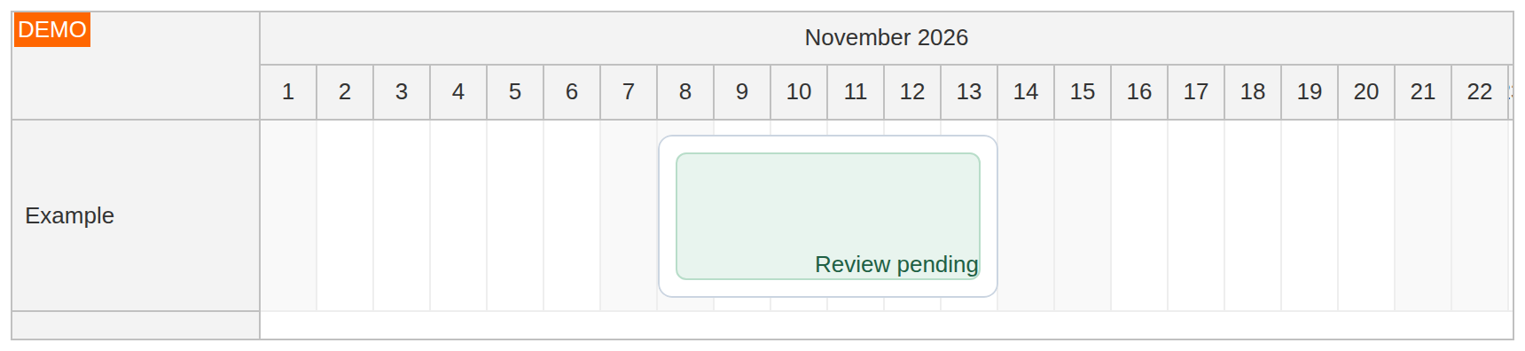
Set horizontal alignment to "right" and vertical alignment to "bottom" to anchor the label to the opposite corner. These properties position text within the area; left, right, top, and bottom position the area itself.
const events = [
  // ...
  {
    id: 23, resource: "text", text: "Right-aligned text",
    start: "2026-11-12", end: "2026-11-16",
    areas: [{
      left: 10, right: 10, top: 10, bottom: 10,
      text: "Review pending", backColor: "#e8f4ee", fontColor: "#206044",
      borderColor: "#b8ddc9", borderRadius: 6,
      horizontalAlignment: "right", verticalAlignment: "bottom"
    }]
  },
  // ...
];
Text Padding
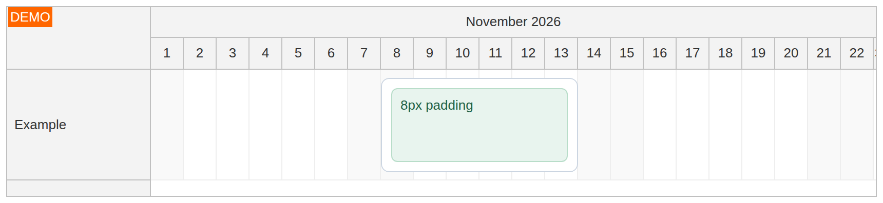
The padding property adds an inset inside the panel. Here, an eight-pixel inset keeps the top-left label away from the rounded border. Padding is also honored during export.
const events = [
  // ...
  {
    id: 24, resource: "text", text: "Text padding",
    start: "2026-11-17", end: "2026-11-21",
    areas: [{
      left: 10, right: 10, top: 10, bottom: 10,
      text: "8px padding", backColor: "#e8f4ee", fontColor: "#206044",
      borderColor: "#b8ddc9", borderRadius: 6,
      horizontalAlignment: "left", verticalAlignment: "top", padding: 8
    }]
  },
  // ...
];
Background Color
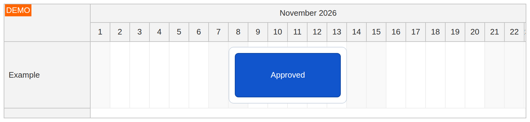
Use backColor for the panel fill and fontColor for readable text. The sample compares a pale fill, two saturated blues, and a transparent fill. A matching borderColor and a numeric borderRadius keep each panel distinct on screen and in the exported image.
const events = [
  // ...
  {
    id: 33, resource: "colors", text: "Approved",
    start: "2026-11-12", end: "2026-11-16",
    areas: [{
      left: 10, right: 10, top: 10, bottom: 10,
      text: "Approved", backColor: "#1155cc", fontColor: "#ffffff",
      borderColor: "#0d449f", borderRadius: 6,
      horizontalAlignment: "center", verticalAlignment: "center"
    }]
  },
  // ...
];
Exported Image
Scheduler with a sample event set:
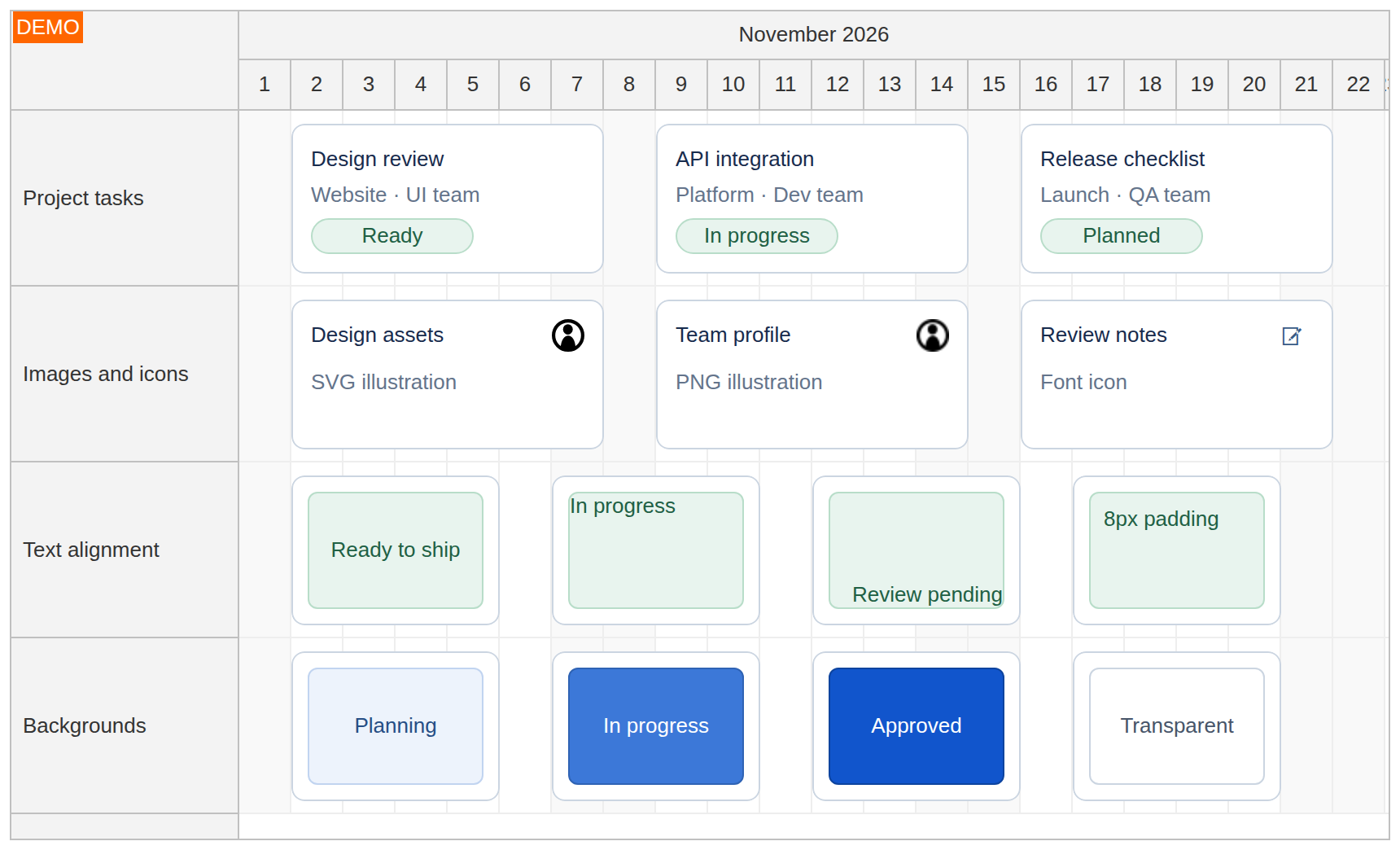
Choose PNG, JPEG, or SVG and click Export image. The button waits for the image and font assets used in the Scheduler, then calls exportAs(). The result’s toDataUri() method supplies the source of the preview image. A scale of 2 produces higher-resolution bitmap output without changing the logical schedule layout.
const app = {
  // ...
  async exportImage() {
    const {export: button, format, target, result, status} = this.elements;
    button.disabled = true;
    status.textContent = "Preparing image…";
    try {
      // Image and font assets must finish loading before synchronous export.
      await document.fonts.ready;
      await Promise.all(Array.from(document.querySelectorAll("#dp img"), image => image.decode()));
      const image = dp.exportAs(format.value, {scale: 2});
      target.src = image.toDataUri();
      await target.decode();
      result.hidden = false;
      status.textContent = `${format.value.toUpperCase()} image ready`;
    } catch (error) {
      status.textContent = "Image export failed. Please try again.";
      console.error(error);
    } finally {
      button.disabled = false;
    }
  },
  // ...
};
Exported PNG image:
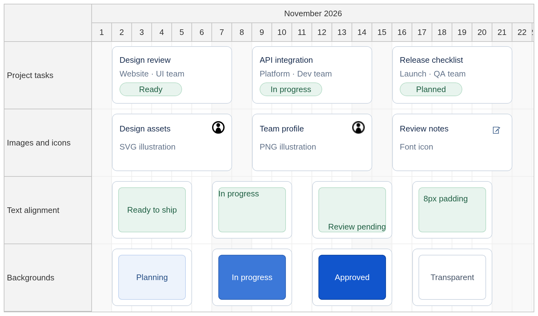
The export renders the visible schedule without browser scrollbars or the trial overlay. The labels, image areas, background panels, and rounded status badges remain. Keep external images accessible to the browser and allow them to finish loading; arbitrary cross-origin images may need CORS permission for bitmap export.
Drag across an empty time range to create a task. Its title comes from the prompt, and it receives the same title/detail/badge layout as the existing project tasks. Export uses the current in-memory schedule, including new events and drag-and-drop changes. Reloading restores the sample data; the example does not persist edits to a server.
Source Code
The downloadable project uses JavaScript modules. Run npm ci and npm run dev to start it, or npm run build to create a production build. The layout is configured in src/app.js, and index.html contains the export controls and preview image. You can also open the image export demo.
The page shell can be generated using DayPilot UI Builder. The application logic is shown below.
import {DayPilot} from "daypilot-pro-javascript";

const dp = new DayPilot.Scheduler("dp", {
  timeHeaders: [{groupBy: "Month"}, {groupBy: "Day", format: "d"}],
  scale: "Day",
  startDate: "2026-11-01",
  days: 30,
  cellWidth: 32,
  rowHeaderWidth: 140,
  eventHeight: 92,
  rowMarginTop: 8,
  rowMarginBottom: 8,
  durationBarVisible: false,
  onBeforeEventRender: (args) => {
    args.data.html = "";
    args.data.backColor = "#ffffff";
    args.data.borderColor = "#cbd5e1";
    args.data.borderRadius = 8;
    if (args.data.tags?.type === "task") {
      args.data.areas = [
        {
          left: 12, right: 12, top: 12, height: 20,
          text: args.data.text,
          fontColor: "#172b4d",
          verticalAlignment: "center"
        },
        {
          left: 12, right: 12, top: 35, height: 18,
          text: args.data.tags.detail,
          fontColor: "#64748b",
          verticalAlignment: "center"
        },
        {
          left: 12, bottom: 12, width: 100, height: 22,
          text: args.data.tags.status,
          backColor: "#e8f4ee",
          fontColor: "#206044",
          borderColor: "#b8ddc9",
          borderRadius: 11,
          horizontalAlignment: "center",
          verticalAlignment: "center"
        }
      ];
    }
  },
  onBeforeEventExport: (args) => {
    // The visible labels are supplied by active areas, not the event body.
    args.text = "";
  },
  timeRangeSelectedHandling: "Enabled",
  onTimeRangeSelected: async (args) => {
    const modal = await DayPilot.Modal.prompt("Create a new event:", "New task");
    dp.clearSelection();
    if (modal.canceled || !modal.result) {
      return;
    }
    dp.events.add({
      id: DayPilot.guid(),
      start: args.start,
      end: args.end,
      resource: args.resource,
      text: modal.result,
      tags: {type: "task", detail: "Newly scheduled", status: "Planned"}
    });
  }
});
dp.init();

const app = {
  elements: {
    export: document.getElementById("export"),
    format: document.getElementById("format"),
    target: document.getElementById("target"),
    result: document.getElementById("result"),
    status: document.getElementById("status")
  },
  async exportImage() {
    const {export: button, format, target, result, status} = this.elements;
    button.disabled = true;
    status.textContent = "Preparing image…";
    try {
      // Image and font assets must finish loading before synchronous export.
      await document.fonts.ready;
      await Promise.all(Array.from(document.querySelectorAll("#dp img"), image => image.decode()));
      const image = dp.exportAs(format.value, {scale: 2});
      target.src = image.toDataUri();
      await target.decode();
      result.hidden = false;
      status.textContent = `${format.value.toUpperCase()} image ready`;
    } catch (error) {
      status.textContent = "Image export failed. Please try again.";
      console.error(error);
    } finally {
      button.disabled = false;
    }
  },
  init() {
    const resources = [
      {name: "Project tasks", id: "tasks"},
      {name: "Images and icons", id: "icons"},
      {name: "Text alignment", id: "text"},
      {name: "Backgrounds", id: "colors"}
    ];
    const events = [
      {
        id: "task-1", resource: "tasks", text: "Design review",
        start: "2026-11-02", end: "2026-11-08",
        tags: {type: "task", detail: "Website · UI team", status: "Ready"}
      },
      {
        id: "task-2", resource: "tasks", text: "API integration",
        start: "2026-11-09", end: "2026-11-15",
        tags: {type: "task", detail: "Platform · Dev team", status: "In progress"}
      },
      {
        id: "task-3", resource: "tasks", text: "Release checklist",
        start: "2026-11-16", end: "2026-11-22",
        tags: {type: "task", detail: "Launch · QA team", status: "Planned"}
      },
      {
        id: 1, resource: "icons", text: "Design assets",
        start: "2026-11-02", end: "2026-11-08",
        areas: [
          {left: 12, right: 48, top: 14, height: 20, text: "Design assets", fontColor: "#172b4d"},
          {left: 12, right: 12, top: 43, height: 20, text: "SVG illustration", fontColor: "#64748b"},
          {right: 12, top: 12, width: 20, height: 20, image: "icon.svg"}
        ]
      },
      {
        id: 2, resource: "icons", text: "Team profile",
        start: "2026-11-09", end: "2026-11-15",
        areas: [
          {left: 12, right: 48, top: 14, height: 20, text: "Team profile", fontColor: "#172b4d"},
          {left: 12, right: 12, top: 43, height: 20, text: "PNG illustration", fontColor: "#64748b"},
          {right: 12, top: 12, width: 20, height: 20, image: "icon.png"}
        ]
      },
      {
        id: 3, resource: "icons", text: "Review notes",
        start: "2026-11-16", end: "2026-11-22",
        areas: [
          {left: 12, right: 48, top: 14, height: 20, text: "Review notes", fontColor: "#172b4d"},
          {left: 12, right: 12, top: 43, height: 20, text: "Font icon", fontColor: "#64748b"},
          {right: 14, top: 16, width: 18, height: 18, icon: "icon-edit", fontColor: "#375a86"}
        ]
      },
      {
        id: 21, resource: "text", text: "Centered text",
        start: "2026-11-02", end: "2026-11-06",
        areas: [{
          left: 10, right: 10, top: 10, bottom: 10,
          text: "Ready to ship", backColor: "#e8f4ee", fontColor: "#206044",
          borderColor: "#b8ddc9", borderRadius: 6,
          horizontalAlignment: "center", verticalAlignment: "center"
        }]
      },
      {
        id: 22, resource: "text", text: "Left-aligned text",
        start: "2026-11-07", end: "2026-11-11",
        areas: [{
          left: 10, right: 10, top: 10, bottom: 10,
          text: "In progress", backColor: "#e8f4ee", fontColor: "#206044",
          borderColor: "#b8ddc9", borderRadius: 6,
          horizontalAlignment: "left", verticalAlignment: "top"
        }]
      },
      {
        id: 23, resource: "text", text: "Right-aligned text",
        start: "2026-11-12", end: "2026-11-16",
        areas: [{
          left: 10, right: 10, top: 10, bottom: 10,
          text: "Review pending", backColor: "#e8f4ee", fontColor: "#206044",
          borderColor: "#b8ddc9", borderRadius: 6,
          horizontalAlignment: "right", verticalAlignment: "bottom"
        }]
      },
      {
        id: 24, resource: "text", text: "Text padding",
        start: "2026-11-17", end: "2026-11-21",
        areas: [{
          left: 10, right: 10, top: 10, bottom: 10,
          text: "8px padding", backColor: "#e8f4ee", fontColor: "#206044",
          borderColor: "#b8ddc9", borderRadius: 6,
          horizontalAlignment: "left", verticalAlignment: "top", padding: 8
        }]
      },
      {
        id: 31, resource: "colors", text: "Planning",
        start: "2026-11-02", end: "2026-11-06",
        areas: [{
          left: 10, right: 10, top: 10, bottom: 10,
          text: "Planning", backColor: "#edf3fc", fontColor: "#264e85",
          borderColor: "#c1d4f0", borderRadius: 6,
          horizontalAlignment: "center", verticalAlignment: "center"
        }]
      },
      {
        id: 32, resource: "colors", text: "In progress",
        start: "2026-11-07", end: "2026-11-11",
        areas: [{
          left: 10, right: 10, top: 10, bottom: 10,
          text: "In progress", backColor: "#3c78d8", fontColor: "#ffffff",
          borderColor: "#2f63b4", borderRadius: 6,
          horizontalAlignment: "center", verticalAlignment: "center"
        }]
      },
      {
        id: 33, resource: "colors", text: "Approved",
        start: "2026-11-12", end: "2026-11-16",
        areas: [{
          left: 10, right: 10, top: 10, bottom: 10,
          text: "Approved", backColor: "#1155cc", fontColor: "#ffffff",
          borderColor: "#0d449f", borderRadius: 6,
          horizontalAlignment: "center", verticalAlignment: "center"
        }]
      },
      {
        id: 34, resource: "colors", text: "Transparent",
        start: "2026-11-17", end: "2026-11-21",
        areas: [{
          left: 10, right: 10, top: 10, bottom: 10,
          text: "Transparent", backColor: "transparent", fontColor: "#475569",
          borderColor: "#cbd5e1", borderRadius: 6,
          horizontalAlignment: "center", verticalAlignment: "center"
        }]
      }
    ];
    dp.update({resources, events});
    this.elements.export.addEventListener("click", () => this.exportImage());
  }
};
app.init();