 DayPilot
")
Overview
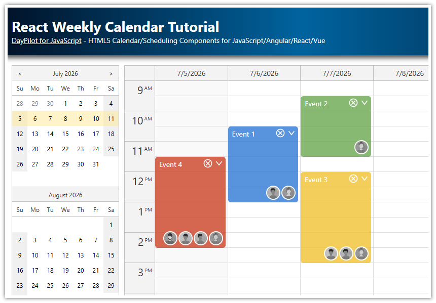
React application that shows a resource scheduling calendar (with custom resources as columns).
Learn how to load resources (columns) and events using the React state variables.
The columns displayed by the React calendar can be edited using a modal dialog that opens after clicking the column header.
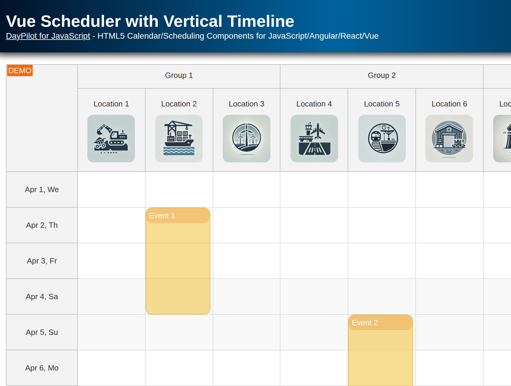
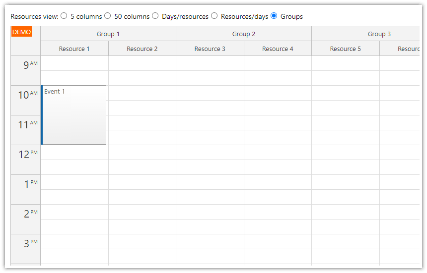
Use a drop-down list to select a group of resources that will be displayed in the calendar.
Change the date using a date picker or Next/Previous buttons (both methods work together).
Built using the free and open-source React calendar component from DayPilot Lite for JavaScript.
How to Get Started with the React Resource Calendar
 - Getting Started")
In this step, you will learn how to add the resource calendar to your React application.
Create a new React application and install the @daypilot/daypilot-lite-react package from NPM. This package includes the required calendar/scheduler components and the date picker.
npm install @daypilot/daypilot-lite-reactCreate a new Calendar component (Calendar.js file) and add a <DayPilotCalendar> tag to the JSX:
import React, { useState, useEffect } from 'react';
import { DayPilotCalendar } from "@daypilot/daypilot-lite-react";

const Calendar = () => {
  // State for viewType
  const [config, setConfig] = useState({
    viewType: "Resources",
    columns: [
      { name: "Room 1", id: "R1" },
      { name: "Room 2", id: "R2" },
      { name: "Room 3", id: "R3" },
      { name: "Room 4", id: "R4" },
      { name: "Room 5", id: "R5" },
      { name: "Room 6", id: "R6" },
      { name: "Room 7", id: "R7" },
    ]
  });

  // State for startDate
  const [startDate, setStartDate] = useState(DayPilot.Date.today());

  return (
    <DayPilotCalendar
      {...config}
      startDate={startDate}
    />
  );
}

export default Calendar;
Lets go through the important elements of this example:
1. By default, the React calendar component displays a daily calendar view. In order to switch to the resources calendar view (with resources as columns), add viewType={"Resources"} to the configuration.
<DayPilotCalendar
  viewType={"Resources"}
/>
2. In order to make the configuration easier (and changeable), move the calendar properties to the config state variable and use the spread operator (…) to inject the properties as <DayPilotCalendar> attributes.
const [config, setConfig] = useState({
  viewType: "Resources",
});

return (
  <DayPilotCalendar
    {...config}
  />
);
3. To set the initial date displayed by the calendar, create a startDate state variable.
const [startDate, setStartDate] = useState(DayPilot.Date.today());

// ...

return (
  <DayPilotCalendar
    {...config}
    startDate={startDate}
  />
);
How to Load Calendar Resources and Events
 - Loading Resources and Events")
In this step, we will move the resource data (columns) to a special state variable and load the data during the initial render.
To define the resources, create a columns state variable. Create a new useEffect() block, with [] as the dependency list, and use setColumns() to define the column array.
const [columns, setColumns] = useState([]);

useEffect(() => {
  setColumns([
    { name: "Room 1", id: "R1" },
    { name: "Room 2", id: "R2" },
    { name: "Room 3", id: "R3" },
    { name: "Room 4", id: "R4" },
    { name: "Room 5", id: "R5" },
    { name: "Room 6", id: "R6" },
    { name: "Room 7", id: "R7" },
  ]);
}, []);
To load events, use the events state variable:
const [events, setEvents] = useState([]);

useEffect(() => {
  setEvents([
    {
      id: 1,
      text: "Event 1",
      start: "2026-11-07T11:00:00",
      end: "2026-11-07T13:30:00",
      backColor: "#fcb711",
      resource: "R1"
    },
    {
      id: 2,
      text: "Event 2",
      start: "2026-11-07T10:00:00",
      end: "2026-11-07T12:00:00",
      backColor: "#f37021",
      resource: "R2"
    },
    // ...
  ]);
}, []);
The structure of the events and columns arrays is described in the API documentation.
This is how our React calendar component looks now:
import React, { useState, useEffect } from 'react';
import { DayPilotCalendar } from "@daypilot/daypilot-lite-react";

const Calendar = () => {
  // State for viewType
  const [config, setConfig] = useState({
    viewType: "Resources",
  });

  // State for startDate
  const [startDate, setStartDate] = useState(DayPilot.Date.today());

  // State for columns
  const [columns, setColumns] = useState([]);

  // State for calendar events/reservations
  const [events, setEvents] = useState([]);

  // useEffect to initialize columns
  useEffect(() => {
    setColumns([
      { name: "Room 1", id: "R1" },
      { name: "Room 2", id: "R2" },
      { name: "Room 3", id: "R3" },
      { name: "Room 4", id: "R4" },
      { name: "Room 5", id: "R5" },
      { name: "Room 6", id: "R6" },
      { name: "Room 7", id: "R7" },
    ]);

    setEvents([
      {
        id: 1,
        text: "Event 1",
        start: "2026-11-07T11:00:00",
        end: "2026-11-07T13:30:00",
        backColor: "#fcb711",
        resource: "R1"
      },
      {
        id: 2,
        text: "Event 2",
        start: "2026-11-07T10:00:00",
        end: "2026-11-07T12:00:00",
        backColor: "#f37021",
        resource: "R2"
      },
      // ...
    ]);

  }, []);

  return (
    <DayPilotCalendar
      {...config}
      startDate={startDate}
      columns={columns}
      events={events}
    />
  );
}

export default Calendar;
Now we have the basic React resource calendar working. In the next chapter, you will see how to load the resources and events from an external source and add rich UI that lets users switch the calendar views.
How to Use the Direct API to Reach Resource Calendar Features
The reactive model we used so far lets us modify the calendar by simply updating the state. This is a simple approach that works fine in most cases.
In the next step, we will see how to use the direct API instead of state variables to update the Calendar.
This approach gives you more precise control over the changes - you specify what gets updated and when.
In more complex scenarios, the direct API access makes is easier to manage state shared by multiple components.
The DayPilot.Calendar class provides additional methods that can help you perform additional actions (find an event, get the visible date range, clear the time range selection, etc.).
To access the direct API, we need a reference to the DayPilot.Calendar instance that represents the Calendar component.
import React, { useState, useRef } from 'react';
import { DayPilot, DayPilotCalendar } from "@daypilot/daypilot-lite-react";

const Calendar = () => {
  const calendarRef = useRef(null);

  // Replace '...' with your actual config initialization
  const [config, setConfig] = useState({
    // ...
  });

  // This function acts as a getter for the calendar control
  const calendar = () => {
    return calendarRef.current ? calendarRef.current.control : null;
  };

  return (
    <DayPilotCalendar
      {...config}
      ref={calendarRef}
    />
  );
}

export default Calendar;
The calendar() method returns the DayPilot.Calendar object from the calendar component reference stored in calendarRef.
Now we can use calendar() to call the calendar component methods. In the next chapter, we will use it to update events and columns.
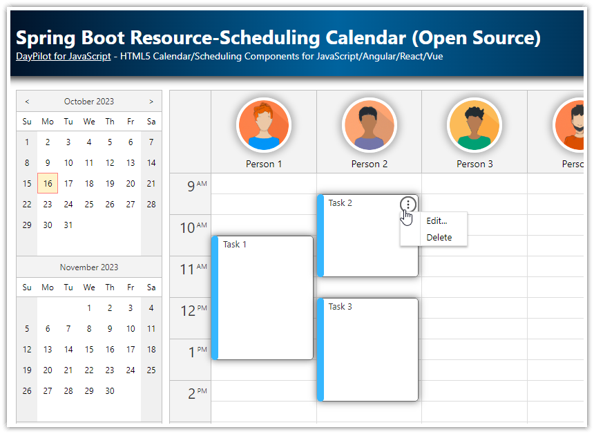
How to Edit Resource Calendar Columns
 - Edit Icon in Column Headers")
Our React application will let users edit column details on click. To implement this feature, we will add an “Edit” icon to the column header using the onBeforeHeaderRender event handler.
The onBeforeHeaderRender event handler lets you customize the resource header:
modify the text
set custom HTML
change the background color
insert icons
add action buttons
We will use it to add an icon as an active area. It will show an “Edit” icon from the built-in daypilot.svg icon bundle and use the onClick event to show a modal dialog with column details.
const onBeforeHeaderRender = args => {
  args.header.areas = [
    {
      right: "5",
      top: 5,
      width: 30,
      height: 30,
      symbol: "/daypilot.svg#edit",
      padding: 6,
      cssClass: "icon",
      toolTip: "Edit...",
      onClick: async args => {
        const column = args.source;
        const modal = await DayPilot.Modal.prompt("Resource name:", column.name);
        if (!modal.result) { return; }
        column.data.name = modal.result;
        setColumns([...columns]);
      }
    }
  ];
};


return (
  <DayPilotCalendar
    onBeforeHeaderRender={onBeforeHeaderRender}
  />
);
The icon CSS class defines the appearance and hover effect:
.icon {
    box-sizing: border-box;
    border-radius: 50%;
    overflow: hidden;
    cursor: pointer;
    color: #ffffff;
    background-color: #777777;
    transition: all 0.3s;
}

.icon:hover {
    background-color: #3c78d8;
}
The onClick event handler opens a simple modal dialog that asks for an updated resource name:

As soon as the user closes the dialog, we update the column name (the column.data object stores the original item from the columns array):
column.data.name = modal.result;Then we notify React that the events need to be reloaded:
setColumns([...columns]);How to Switch Between Different Resource Groups

To switch between different resource groups, we will create a ResourceGroups React component that displays a drop-down list with all available groups.
import React, { useState, useEffect, useRef, useCallback } from 'react';
export function ResourceGroups({ items, onChange }) {
const initialSelectedValue = items?.length > 0 ? items[0].id : '';
const [selectedValue, setSelectedValue] = useState(initialSelectedValue);
const selectRef = useRef(null);
const doOnChange = useCallback((item) => {
const args = { selected: item };
if (onChange) {
onChange(args);
}
}, [onChange]); // Dependency on onChange
useEffect(() => {
if (items?.length > 0 && selectedValue === '') {
const firstItemId = items[0].id;
setSelectedValue(firstItemId);
doOnChange(items[0]);
}
}, [items, selectedValue, doOnChange]); // Include doOnChange in the dependencies
const find = (id) => {
return items ? items.find(item => item.id === id) : null;
};
const change = (ev) => {
const value = ev.target.value;
setSelectedValue(value);
const item = find(value);
doOnChange(item);
};
return (
<span>
Group:
<select onChange={change} ref={selectRef} value={selectedValue}>
{items.map(item => (
<option key={item.id} value={item.id}>{item.name}</option>
))}
</select>
</span>
);
}
Now we can add the drop-down component to Calendar.js (just above the resource calendar):
<ResourceGroups onChange={args => setSelected(args.selected)} items={groups}></ResourceGroups>You can see that the ResourceGroups component reads the data from the items prop and fires the onChange event when the selection changes.
The groups state variable contains the list of groups and their children (resources). The selected group is stored in the selected state variable:
const [groups, setGroups] = useState([]);
const [selected, setSelected] = useState();

useEffect(() => {

  const data = [
    { name: "Locations", id: "locations", resources: [
        {name: "Room 1", id: "R1"},
        {name: "Room 2", id: "R2"},
        {name: "Room 3", id: "R3"},
        {name: "Room 4", id: "R4"},
        {name: "Room 5", id: "R5"},
        {name: "Room 6", id: "R6"},
        {name: "Room 7", id: "R7"},
      ]
    },
    { name: "People", id: "people", resources: [
        {name: "Person 1", id: "P1"},
        {name: "Person 2", id: "P2"},
        {name: "Person 3", id: "P3"},
        {name: "Person 4", id: "P4"},
        {name: "Person 5", id: "P5"},
        {name: "Person 6", id: "P6"},
        {name: "Person 7", id: "P7"},
      ]
    },
    { name: "Tools", id: "tools", resources: [
        {name: "Tool 1", id: "T1"},
        {name: "Tool 2", id: "T2"},
        {name: "Tool 3", id: "T3"},
        {name: "Tool 4", id: "T4"},
        {name: "Tool 5", id: "T5"},
        {name: "Tool 6", id: "T6"},
        {name: "Tool 7", id: "T7"},
      ]
    },
  ];

  setGroups(data);
  setSelected(data[0]);

}, []);
The column loading logic needs to be updated. Instead of loading a static set of resource during the initial render, we need to detect a change of the selected group and load the group children.
To do this, we will use a useEffect() block that uses the selected variable as a dependency:
useEffect(() => {
  setColumns(selected?.resources || []);
}, [selected, groups]);
In the next step, we will load events. The event data set depends on the selected date (startDate) and the visible resources (columns).
useEffect(() => {
  // load events for the visible date (`startDate`) and resources in the selected group (`selected`)
  setEvents([
    {
      id: 1,
      text: "Event 1",
      start: "2026-11-07T10:30:00",
      end: "2026-11-07T13:00:00",
      backColor: "#fcb711",
      resource: "R1"
    },
    // ...
  ]);
}, [startDate, columns]);
For the sake of simplicity, this function uses a static array of events (instead of loading them using an HTTP call from a server) and doesn’t filter them (it includes events for resources that are not visible at the moment).
How to Change the Resource Calendar Date

The user interface of this React application provides two ways to change the date:
A date picker displayed on the left side shows a small calendar with 3 months.
“Next” and “Previous” buttons displayed above the calendar.
To show the date picker, use the Navigator component (<DayPilotNavigator> tag):
<DayPilotNavigator
  selectMode={"Day"}
  showMonths={3}
  skipMonths={3}
  selectionDay={startDate}
  startDate={startDate}
  onTimeRangeSelected={ args => setStartDate(args.day) }
/>
The Navigator fires onTimeRangeSelected event when the selected date changes. Here, the event handler updates the startDate state variable. React detects this change and updates the resource calendar.
The selection date can be set using the selectionDay attribute:
selectionDay={startDate}The startDate attribute sets the first visible month. In this case, we will link it to the startDate state variable as well:
startDate={startDate}The “Next” and “Previous” buttons use the onClick event to change the date:
<button onClick={ev => previous()}>Previous</button>
<button onClick={ev => next()}>Next</button>
The previous() method selects a new date using the setStartDate() function. This updates both components - the date picker and the calendar.
const previous = () => {
  setStartDate(startDate.addDays(-1));
};
The next() method is very similar but it adds one day instead of subtracting it:
const next = () => {
  setStartDate(startDate.addDays(1));
};
History
January 20, 2026: Upgraded to DayPilot Lite 2026.1.790 (5.3.0).
September 6, 2025: Upgraded to React 19, DayPilot Lite 2025.3.703 (4.4.0).
November 12, 2023: Converted to the React Hooks API and functional components; the logic is now fully reactive. DayPilot Lite has been upgraded to version 2023.3.499 (3.18.0).
July 19, 2022: Initial version