 DayPilot
")
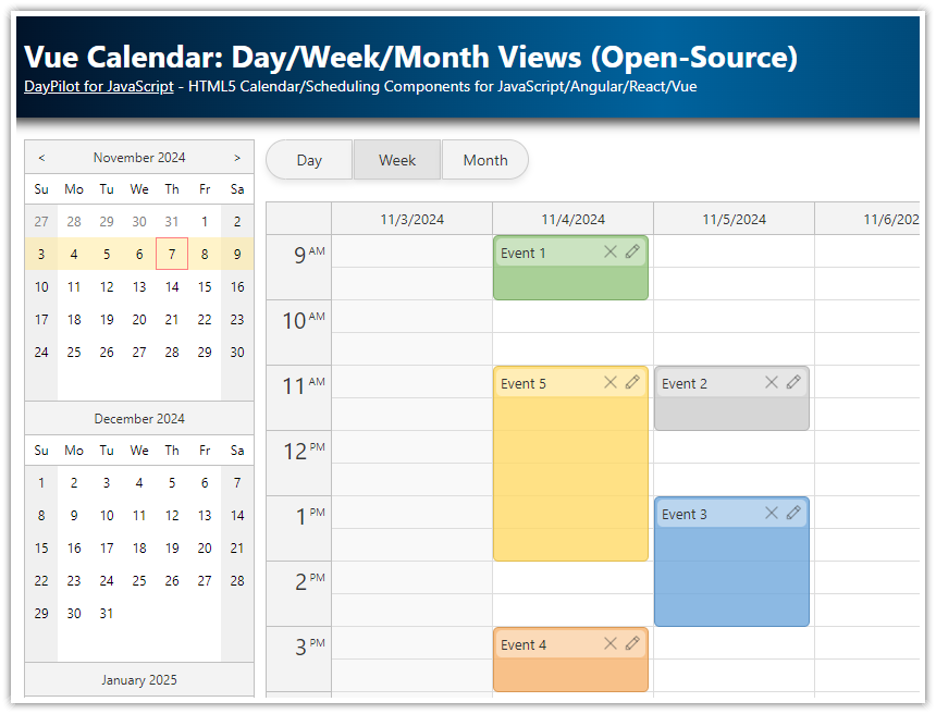
Overview
How to include integrated day, week, and month calendars in a Next.js app.
All calendar views share the same data source.
Views can be switched easily using toolbar buttons.
You can use a date picker to change the visible date. The date picker highlights busy days for a quick overview.
This Next.js calendar app is built using the open-source DayPilot Lite calendar/scheduling library.
License
Apache License 2.0
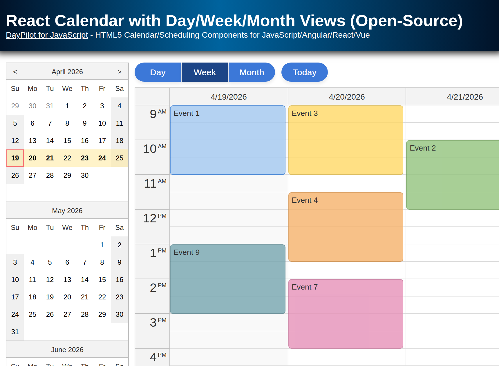
Weekly Calendar View in Next.js

The main view shows a weekly calendar, where each column represents one day and hours are displayed on the vertical axis.
The week view is built using the React Calendar component from the open-source DayPilot Lite for JavaScript library. This component is very flexible; it supports multiple display modes in which the columns can be configured to show:
One day (Day view)
Five days (Work week view)
One week (Week view)
User-defined resources (locations, people, equipment, etc.) – see the Next.js Resource-Scheduling Calendar tutorial for more details
Now we need to configure it to display one week. This can be done by setting the viewType prop to "Week":
<DayPilotCalendar
    viewType={"Week"}
    startDate={startDate}
    events={events}
    visible={view === "Week"}
    durationBarVisible={false}
    contextMenu={contextMenu}
    onEventClick={async args => editEvent(args.e)}
    onTimeRangeSelected={onTimeRangeSelected}
    onBeforeEventRender={onBeforeEventRenderDayWeek}
    controlRef={setWeekView}
/>
Learn more about configuring the daily and weekly calendar in Next.js in a separate tutorial:
Daily Calendar View in Next.js

Now we will build the day view. This view uses another instance of the same React Calendar component.
The day view displays just a single column with the selected day. This view offers a more detailed view of crowded calendars.
The configuration is very similar. In fact, the only differences are the viewType and visible properties.
<DayPilotCalendar
viewType={"Day"}
startDate={startDate}
events={events}
visible={view === "Day"}
durationBarVisible={false}
contextMenu={contextMenu}
onEventClick={async args => editEvent(args.e)}
onTimeRangeSelected={onTimeRangeSelected}
onBeforeEventRender={onBeforeEventRenderDayWeek}
controlRef={setDayView}
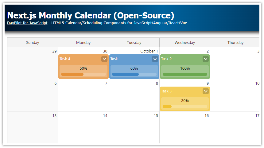
/>Month View

The month view uses the React Monthly Calendar component, which shows days of a month in a matrix.
Our monthly calendar component shares most of the configuration with the week view (the API is the same where possible):
<DayPilotMonth
    startDate={startDate}
    events={events}
    visible={view === "Month"}
    eventHeight={50}
    eventBarVisible={false}
    contextMenu={contextMenu}
    onEventClick={async args => editEvent(args.e)}
    onTimeRangeSelected={onTimeRangeSelected}
    onBeforeEventRender={onBeforeEventRenderMonth}
    controlRef={setMonthView}
/>
There is also a special tutorial on using the monthly calendar in Next.js:
Switching the Calendar Views in Next.js

We use the view state variable to store the current view ("Day", "Week", "Month").
const [view, setView] = useState<ViewType>("Week");The visibility of each calendar component is set dynamically using the visible property. This ensures the views will be switched automatically when the value changes.
<DayPilotCalendar
    visible={view === "Day"}
    ...
/>
The view-changing buttons simply modify the view state property:
<button onClick={() => setView("Day")} className={view === "Day" ? "selected" : ""}>Day</button>
<button onClick={() => setView("Week")} className={view === "Week" ? "selected" : ""}>Week</button>
<button onClick={() => setView("Month")} className={view === "Month" ? "selected" : ""}>Month</button>
Event Data Source
All events are stored in the events state variable:
const [events, setEvents] = useState<DayPilot.EventData[]>([]);The data format used by all calendar components and the date picker is the same. This means the data source can be reused for all calendar views:
<DayPilotCalendar
    viewType={"Day"}
    events={events}
    ...
/>
<DayPilotCalendar
    viewType={"Week"}
    events={events}
    ...
/>
<DayPilotMonth
    events={events}
    ...
/>
The events state variable also provides the free/busy data for the date picker:
<DayPilotNavigator
    events={events}
    ...
/>
The events are loaded in a useEffect() block that runs on the application start:
useEffect(() => {
    const first = DayPilot.Date.today().firstDayOfWeek().addDays(1);
    const data = [
        {
            id: 1,
            text: "Event 1",
            start: first.addHours(10),
            end: first.addHours(12),
            tags: {
                color: "#cd5c5c",
                assigned: "Amélie",
                location: "Conference Room A",
                team: "Marketing"
            }
        },
        {
            id: 2,
            text: "Event 2",
            start: first.addDays(1).addHours(14),
            end: first.addDays(1).addHours(16),
            tags: {
                color: "#93c47d",
                assigned: "Bernhard",
                location: "Online Meeting",
                team: "Sales"
            }
        },
        // ...
    ];
    setEvents(data);
}, []);
Content and Layout of Calendar Events
You have seen that the views share most of the configuration. However, there are difference in how the views display the event boxes (week vs. month calendar).
The events displayed by the monthly calendar have a fixed height which is relatively small (50 pixels). That’s why we use a special onBeforeEventRender event handler and create a special compact event layout for the month view.
In the daily and weekly views, the calendar defines rich event content:

The event boxes includes the following data:
Name
Assigned person
Location
Team
These details are created and positioned in the event box using active areas:
const onBeforeEventRenderDayWeek = (args: DayPilot.CalendarBeforeEventRenderArgs) => {
    const eventColor = args.data.tags?.color || "#3d85c6";
    args.data.backColor = eventColor + "dd";
    args.data.borderColor = "darker";
    const assignedTo = args.data.tags?.assigned || "Unassigned";
    const location = args.data.tags?.location || "";
    const teamName = args.data.tags?.team || "No Team";
    const teamBadgeColor = DayPilot.ColorUtil.darker(eventColor);
    args.data.html = "";
    args.data.areas = [
        {
            id: "title",
            top: 5,
            left: 5,
            right: 50,
            height: 20,
            text: args.data.text,
            fontColor: "#fff",
            style: "font-weight: bold; white-space: nowrap; overflow: hidden; text-overflow: ellipsis;"
        },
        {
            id: "assigned",
            top: 25,
            left: 5,
            right: 5,
            height: 18,
            text: `Assigned: ${assignedTo}`,
            fontColor: "#fff",
            style: "font-size: 11px; opacity: 0.9; white-space: nowrap; overflow: hidden; text-overflow: ellipsis;"
        },
        {
            id: "location",
            top: 42,
            left: 5,
            right: 5,
            height: 18,
            text: location ? `Location: ${location}` : "",
            fontColor: "#fff",
            style: "font-size: 11px; opacity: 0.9; white-space: nowrap; overflow: hidden; text-overflow: ellipsis;"
        },
        {
            id: "menu",
            top: 5,
            right: 5,
            width: 20,
            height: 20,
            padding: 2,
            symbol: "icons/daypilot.svg#threedots-v",
            fontColor: "#fff",
            backColor: "#00000033",
            borderRadius: "50%",
            style: "cursor: pointer;",
            toolTip: "Show context menu",
            action: "ContextMenu"
        },
        {
            id: "teamBadge",
            bottom: 5,
            left: 5,
            right: 5,
            height: 18,
            borderRadius: "4px",
            backColor: teamBadgeColor,
            fontColor: "#fff",
            text: `Team: ${teamName}`,
            style:
                "text-align: center; font-size: 11px; line-height: 18px; overflow: hidden; text-overflow: ellipsis; cursor: default;"
        }
    ];
};
The monthly calendar events use a simplified layout:

Here, the events only contain the event name and the assigned person:
const onBeforeEventRenderMonth = (args: DayPilot.MonthBeforeEventRenderArgs) => {
    const eventColor = args.data.tags?.color || "#3d85c6";
    args.data.backColor = eventColor + "dd";
    args.data.borderColor = DayPilot.ColorUtil.darker(eventColor);
    const assignedTo = args.data.tags?.assigned || "Unassigned";
    const location = args.data.tags?.location || "";
    const teamName = args.data.tags?.team || "No Team";
    args.data.html = "";
    args.data.areas = [
        {
            id: "title",
            top: 5,
            left: 5,
            right: 5,
            height: 16,
            text: args.data.text,
            fontColor: "#fff",
            style: "font-weight: bold; font-size: 12px; white-space: nowrap; overflow: hidden; text-overflow: ellipsis;"
        },
        {
            id: "assigned",
            bottom: 5,
            left: 5,
            right: 5,
            height: 16,
            borderRadius: "4px",
            backColor: DayPilot.ColorUtil.darker(eventColor),
            fontColor: "#fff",
            text: assignedTo,
            style:
                "font-size: 10px; text-align: center; line-height: 16px; white-space: nowrap; overflow: hidden; text-overflow: ellipsis;"
        }
    ];
    args.data.toolTip =
        "Title: " + args.data.text + "\n" +
        "Assigned: " + assignedTo + "\n" +
        "Location: " + location + "\n" +
        "Team: " + teamName;
};
Changing the Selected Date

The current date is stored in the the startDate state variable:
const [startDate, setStartDate] = useState<DayPilot.Date>(DayPilot.Date.today());The startDate variable is used by all components to determine the date range to display. Any change of this variable will automatically update all views.
The startDate value is modified at two places:
1. In the onTimeRangeSelected event handler of the date picker (which is fired when the user clicks another date in the date picker):
<DayPilotNavigator
    selectMode={view}
    showMonths={3}
    skipMonths={3}
    onTimeRangeSelected={args => setStartDate(args.day)}
    events={events}
/>
2. In onClick event of the “Today” button which jumps to today:
<button onClick={() => setStartDate(DayPilot.Date.today())} className={"standalone"}>Today</button>Full Source Code
Here is the full source of our Next.js component that displays an integrated day/week/month calendar views, together with a date picker and view-switching buttons:
"use client";

import React, { useEffect, useState } from 'react';
import { DayPilot, DayPilotCalendar, DayPilotMonth, DayPilotNavigator } from "@daypilot/daypilot-lite-react";
import "./Calendar.css";

type ViewType = "Day" | "Week" | "Month";

const colors = [
    { name: "Dark Green", id: "#228b22" },
    { name: "Green", id: "#6aa84f" },
    { name: "Yellow", id: "#f1c232" },
    { name: "Orange", id: "#e69138" },
    { name: "Indian Red", id: "#cd5c5c" },
    { name: "Fire Brick", id: "#b22222" },
    { name: "Purple", id: "#9370db" },
    { name: "Turquoise", id: "#40e0d0" },
    { name: "Light Blue", id: "#add8e6" },
    { name: "Sky Blue", id: "#87ceeb" },
    { name: "Blue", id: "#3d85c6" },
];

const people = [
    { name: "Amélie", id: "Amélie" },
    { name: "Bernhard", id: "Bernhard" },
    { name: "Carlo", id: "Carlo" },
    { name: "Diana", id: "Diana" },
    { name: "Eva", id: "Eva" },
    { name: "Francesco", id: "Francesco" },
    { name: "Lotte", id: "Lotte" },
    { name: "Erik", id: "Erik" },
];

const locations = [
    {name: "Conference Room A", id: "Conference Room A"},
    {name: "Conference Room B", id: "Conference Room B"},
    {name: "HQ - Floor 1", id: "HQ - Floor 1"},
    {name: "HQ - Floor 2", id: "HQ - Floor 2"},
    {name: "Online Meeting", id: "Online Meeting"},
    {name: "Skype Link", id: "Skype Link"},
    {name: "Zoom Link", id: "Zoom Link"},
];

const teams = [
    {name: "Development", id: "Development"},
    {name: "Finance", id: "Finance"},
    {name: "HR", id: "HR"},
    {name: "Legal", id: "Legal"},
    {name: "Marketing", id: "Marketing"},
    {name: "Product", id: "Product"},
    {name: "Sales", id: "Sales"},
];

const Calendar = () => {
    const [view, setView] = useState<ViewType>("Week");
    const [startDate, setStartDate] = useState<DayPilot.Date>(DayPilot.Date.today());
    const [events, setEvents] = useState<DayPilot.EventData[]>([]);

    type AnyCalendar = DayPilot.Calendar | DayPilot.Month;

    const [dayView, setDayView] = useState<DayPilot.Calendar>();
    const [weekView, setWeekView] = useState<DayPilot.Calendar>();
    const [monthView, setMonthView] = useState<DayPilot.Month>();

    const onTimeRangeSelected = async (args: DayPilot.CalendarTimeRangeSelectedArgs | DayPilot.MonthTimeRangeSelectedArgs) => {
        const calendar = args.control;
        const modal = await DayPilot.Modal.prompt("Create a new event:", "Event 1");
        calendar.clearSelection();
        if (modal.canceled) {
            return;
        }
        const e = {
            id: DayPilot.guid(),
            start: args.start,
            end: args.end,
            text: modal.result
        };
        setEvents(prevEvents => [...prevEvents, e]);
    };

    const onBeforeEventRenderDayWeek = (args: DayPilot.CalendarBeforeEventRenderArgs) => {
        const eventColor = args.data.tags?.color || "#3d85c6";
        args.data.backColor = eventColor + "dd";
        args.data.borderColor = "darker";
        const assignedTo = args.data.tags?.assigned || "Unassigned";
        const location = args.data.tags?.location || "";
        const teamName = args.data.tags?.team || "No Team";
        const teamBadgeColor = DayPilot.ColorUtil.darker(eventColor);
        args.data.html = "";
        args.data.areas = [
            {
                id: "title",
                top: 5,
                left: 5,
                right: 50,
                height: 20,
                text: args.data.text,
                fontColor: "#fff",
                style: "font-weight: bold; white-space: nowrap; overflow: hidden; text-overflow: ellipsis;"
            },
            {
                id: "assigned",
                top: 25,
                left: 5,
                right: 5,
                height: 18,
                text: `Assigned: ${assignedTo}`,
                fontColor: "#fff",
                style: "font-size: 11px; opacity: 0.9; white-space: nowrap; overflow: hidden; text-overflow: ellipsis;"
            },
            {
                id: "location",
                top: 42,
                left: 5,
                right: 5,
                height: 18,
                text: location ? `Location: ${location}` : "",
                fontColor: "#fff",
                style: "font-size: 11px; opacity: 0.9; white-space: nowrap; overflow: hidden; text-overflow: ellipsis;"
            },
            {
                id: "menu",
                top: 5,
                right: 5,
                width: 20,
                height: 20,
                padding: 2,
                symbol: "icons/daypilot.svg#threedots-v",
                fontColor: "#fff",
                backColor: "#00000033",
                borderRadius: "50%",
                style: "cursor: pointer;",
                toolTip: "Show context menu",
                action: "ContextMenu"
            },
            {
                id: "teamBadge",
                bottom: 5,
                left: 5,
                right: 5,
                height: 18,
                borderRadius: "4px",
                backColor: teamBadgeColor,
                fontColor: "#fff",
                text: `Team: ${teamName}`,
                style:
                    "text-align: center; font-size: 11px; line-height: 18px; overflow: hidden; text-overflow: ellipsis; cursor: default;"
            }
        ];
    };

    const onBeforeEventRenderMonth = (args: DayPilot.MonthBeforeEventRenderArgs) => {
        const eventColor = args.data.tags?.color || "#3d85c6";
        args.data.backColor = eventColor + "dd";
        args.data.borderColor = DayPilot.ColorUtil.darker(eventColor);
        const assignedTo = args.data.tags?.assigned || "Unassigned";
        const location = args.data.tags?.location || "";
        const teamName = args.data.tags?.team || "No Team";
        args.data.html = "";
        args.data.areas = [
            {
                id: "title",
                top: 5,
                left: 5,
                right: 5,
                height: 16,
                text: args.data.text,
                fontColor: "#fff",
                style: "font-weight: bold; font-size: 12px; white-space: nowrap; overflow: hidden; text-overflow: ellipsis;"
            },
            {
                id: "assigned",
                bottom: 5,
                left: 5,
                right: 5,
                height: 16,
                borderRadius: "4px",
                backColor: DayPilot.ColorUtil.darker(eventColor),
                fontColor: "#fff",
                text: assignedTo,
                style:
                    "font-size: 10px; text-align: center; line-height: 16px; white-space: nowrap; overflow: hidden; text-overflow: ellipsis;"
            }
        ];
        args.data.toolTip =
            "Title: " + args.data.text + "\n" +
            "Assigned: " + assignedTo + "\n" +
            "Location: " + location + "\n" +
            "Team: " + teamName;
    };

    const editEvent = async (e: DayPilot.Event) => {
        const form = [
            { name: "Event text", id: "text", type: "text" },
            { name: "Event color", id: "tags.color", type: "select", options: colors },
            { name: "Assigned to", id: "tags.assigned", type: "select", options: people },
            { name: "Location", id: "tags.location", type: "select", options: locations },
            { name: "Team", id: "tags.team", type: "select", options: teams }
        ];
        const modal = await DayPilot.Modal.form(form, e.data);
        if (modal.canceled) {
            return;
        }
        const updatedEvent = modal.result;
        setEvents((prevEvents) =>
            prevEvents.map((item) =>
                item.id === e.id()
                    ? updatedEvent
                    : item
            )
        );
    };

    const contextMenu = new DayPilot.Menu({
        items: [
            {
                text: "Delete",
                onClick: async args => {
                    const calendar: AnyCalendar = args.source.calendar;
                    calendar.events.remove(args.source);
                },
            },
            {
                text: "-"
            },
            {
                text: "Edit...",
                onClick: async args => {
                    await editEvent(args.source);
                }
            }
        ]
    });

    useEffect(() => {
        const first = DayPilot.Date.today().firstDayOfWeek().addDays(1);
        const data = [
            {
                id: 1,
                text: "Event 1",
                start: first.addHours(10),
                end: first.addHours(12),
                tags: {
                    color: "#cd5c5c",
                    assigned: "Amélie",
                    location: "Conference Room A",
                    team: "Marketing"
                }
            },
            {
                id: 2,
                text: "Event 2",
                start: first.addDays(1).addHours(14),
                end: first.addDays(1).addHours(16),
                tags: {
                    color: "#93c47d",
                    assigned: "Bernhard",
                    location: "Online Meeting",
                    team: "Sales"
                }
            },
            {
                id: 9,
                text: "Event 9",
                start: first.addHours(13),
                end: first.addHours(15),
                tags: {
                    color: "#76a5af",
                    assigned: "Carlo",
                    location: "HQ - Floor 2",
                    team: "Development"
                }
            },
            {
                id: 3,
                text: "Event 3",
                start: first.addDays(1).addHours(9),
                end: first.addDays(1).addHours(11),
                tags: {
                    color: "#ffd966",
                    assigned: "Diana",
                    location: "Conference Room B",
                    team: "HR"
                }
            },
            {
                id: 4,
                text: "Event 4",
                start: first.addDays(1).addHours(11).addMinutes(30),
                end: first.addDays(1).addHours(13).addMinutes(30),
                tags: {
                    color: "#f6b26b",
                    assigned: "Eva",
                    location: "Conference Room B",
                    team: "Product"
                }
            },
            {
                id: 5,
                text: "Event 5",
                start: first.addDays(4).addHours(9),
                end: first.addDays(4).addHours(11),
                tags: {
                    color: "#8e7cc3",
                    assigned: "Francesco",
                    location: "Skype Link",
                    team: "Marketing"
                }
            },
            {
                id: 6,
                text: "Event 6",
                start: first.addDays(4).addHours(13),
                end: first.addDays(4).addHours(15),
                tags: {
                    color: "#6fa8dc",
                    assigned: "Lotte",
                    location: "HQ - Floor 1",
                    team: "Finance"
                }
            },
            {
                id: 8,
                text: "Event 8",
                start: first.addDays(5).addHours(13),
                end: first.addDays(5).addHours(15),
                tags: {
                    color: "#b6d7a8",
                    assigned: "Erik",
                    location: "Zoom Link",
                    team: "Legal"
                }
            }
        ];
        setEvents(data);
    }, []);

    return (
        <div className={"container"}>
            <div className={"navigator"}>
                <DayPilotNavigator
                    selectMode={view}
                    showMonths={3}
                    skipMonths={3}
                    onTimeRangeSelected={args => setStartDate(args.day)}
                    events={events}
                />
            </div>
            <div className={"content"}>
                <div className={"toolbar"}>
                    <div className={"toolbar-group"}>
                        <button onClick={() => setView("Day")} className={view === "Day" ? "selected" : ""}>Day</button>
                        <button onClick={() => setView("Week")} className={view === "Week" ? "selected" : ""}>Week</button>
                        <button onClick={() => setView("Month")} className={view === "Month" ? "selected" : ""}>Month</button>
                    </div>
                    <button onClick={() => setStartDate(DayPilot.Date.today())} className={"standalone"}>Today</button>
                </div>
                <DayPilotCalendar
                    viewType={"Day"}
                    startDate={startDate}
                    events={events}
                    visible={view === "Day"}
                    durationBarVisible={false}
                    contextMenu={contextMenu}
                    onEventClick={async args => editEvent(args.e)}
                    onTimeRangeSelected={onTimeRangeSelected}
                    onBeforeEventRender={onBeforeEventRenderDayWeek}
                    controlRef={setDayView}
                />
                <DayPilotCalendar
                    viewType={"Week"}
                    startDate={startDate}
                    events={events}
                    visible={view === "Week"}
                    durationBarVisible={false}
                    contextMenu={contextMenu}
                    onEventClick={async args => editEvent(args.e)}
                    onTimeRangeSelected={onTimeRangeSelected}
                    onBeforeEventRender={onBeforeEventRenderDayWeek}
                    controlRef={setWeekView}
                />
                <DayPilotMonth
                    startDate={startDate}
                    events={events}
                    visible={view === "Month"}
                    eventHeight={50}
                    eventBarVisible={false}
                    contextMenu={contextMenu}
                    onEventClick={async args => editEvent(args.e)}
                    onTimeRangeSelected={onTimeRangeSelected}
                    onBeforeEventRender={onBeforeEventRenderMonth}
                    controlRef={setMonthView}
                />
            </div>
        </div>
    );
};

export default Calendar;