Overview
-
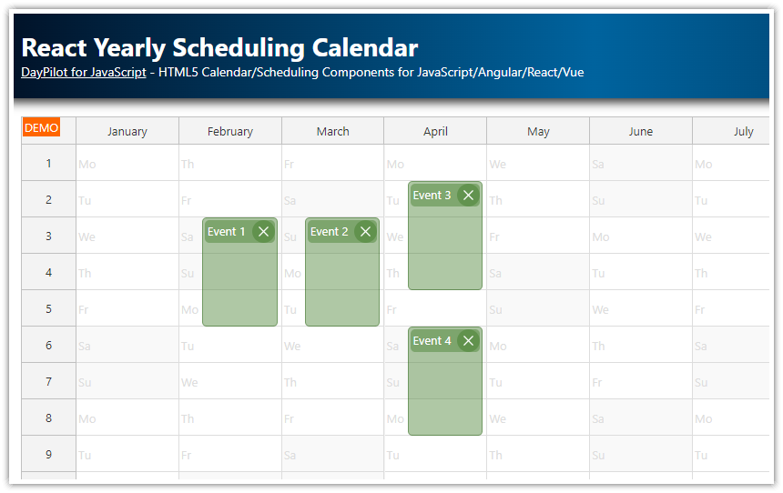
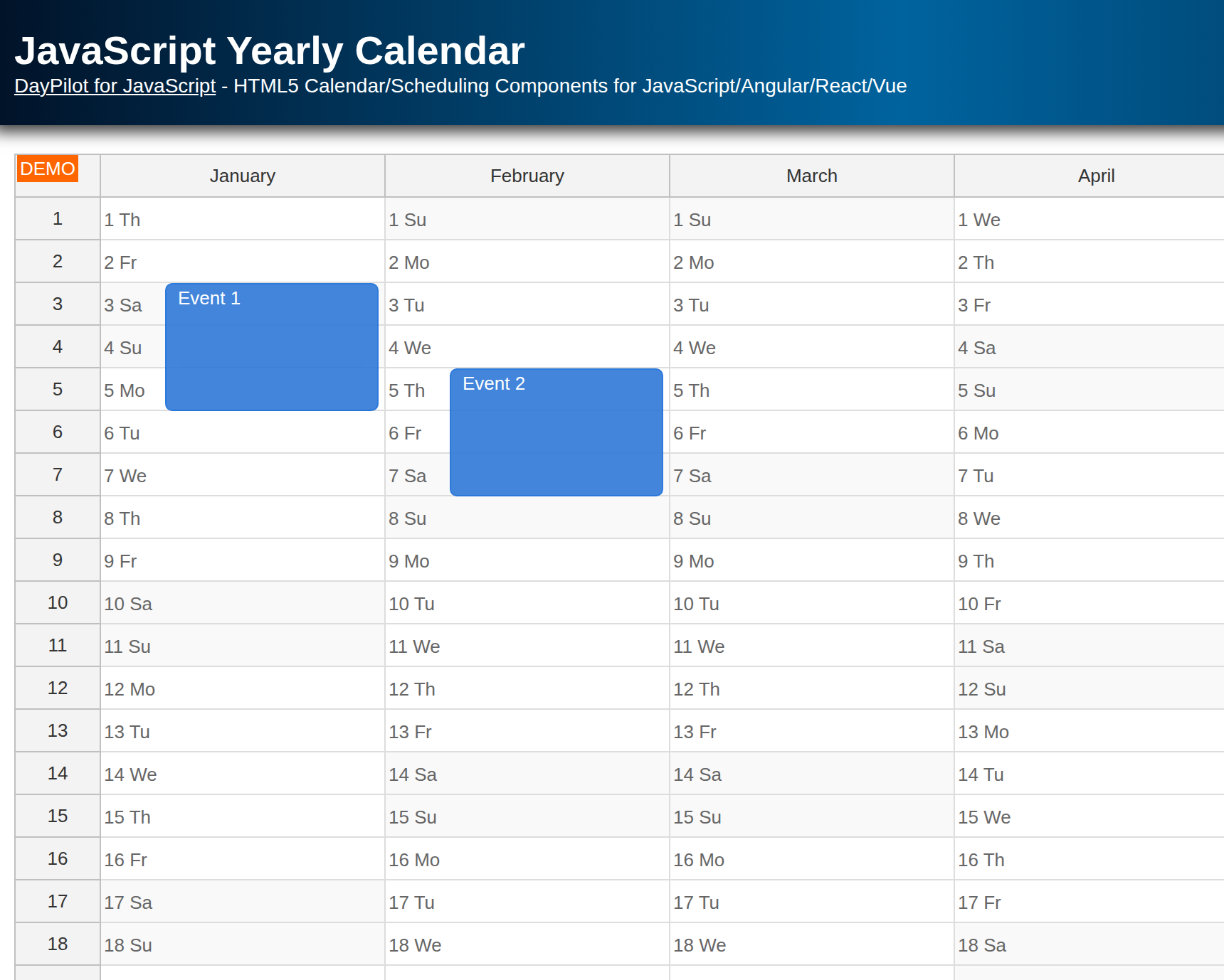
The React Calendar component can be configured to display a year view with months as columns.
-
Each calendar cell represents one day.
-
To make the calendar grid easier to read, each cell displays the day name (Mo, Tu, We…).
-
Calendar events can span multiple months (columns).
-
The React project includes a trial version of DayPilot Pro for JavaScript (see License below)
License
Licensed for testing and evaluation purposes. Please see the license agreement included in the sample project. You can use the source code of the tutorial if you are a licensed user of DayPilot Pro for JavaScript. Buy a license.
Define Yearly Calendar Columns (One for Each Month)
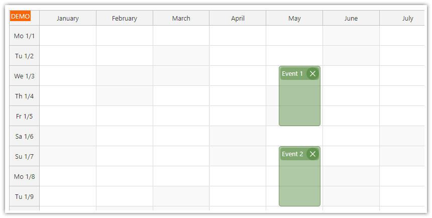
To create a yearly calendar in React, we will use the React resource calendar from DayPilot Pro.
We'll use the Calendar component in the Resources mode, which lets you define custom columns. In this case, the columns will not represent resources (people, rooms, vessels, machines, equipment, production lines…), but we will define columns with custom start dates, each representing one month of the current year.
Each column will display 31 days, regardless of the actual length of the month. We will shade the extra cells in shorter months in later steps.
Switch to "Resources" Mode
Set the viewType property to "Resources" to switch the calendar into resources mode:
<DayPilotCalendar
  viewType={"Resources"}
  // ...
/>
Set Cell Size to One Day
Set the scale property to "Day" to make each cell represent a single day:
<DayPilotCalendar
  scale={"Day"}
  // ...
/>
Define the First Day and Number of Days
Use startDate to define the first day of the calendar and days to set the number of days displayed in each column:
const [startDate, setStartDate] = useState(DayPilot.Date.today().firstDayOfYear());

// ...

<DayPilotCalendar
  startDate={startDate}
  days={31}
  // ...
/>
Generate Columns for Each Month
We'll create a columns state variable and populate it with months of the current year:
const [columns, setColumns] = useState([]);

useEffect(() => {
  const resources = [];
  // one column per month
  for (let i = 0; i < 12; i++) {
    const start = startDate.addMonths(i);
    const name = start.toString("MMMM");
    resources.push({ name, start });
  }
  setColumns(resources);
}, [startDate]);
Assing the Columns to the React Calendar Component
Include the columns prop in the DayPilotCalendar component:
<DayPilotCalendar
  columns={columns}
  // ...
/>
Show Day Numbers in the First Column
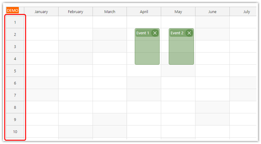
To display day numbers in the yearly calendar row headers, we'll use the onBeforeTimeHeaderRender event handler:
const onBeforeTimeHeaderRender = (args) => {
  const day = args.header.date.toString("d");
  args.header.html = day;
};
Attach this handler to the DayPilotCalendar React component tag:
<DayPilotCalendar
  onBeforeTimeHeaderRender={onBeforeTimeHeaderRender}
  // ...
/>
Gray Out Extra Days in Shorter Months
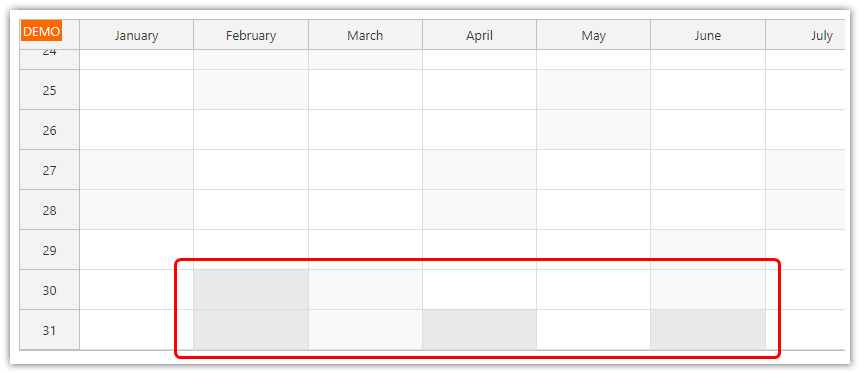
We want to make clear that the extra days at the end of columns that display shorter months (e.g., February, April, June…) are not active cells. We'll use the onBeforeCellRender event handler to set the background color to gray:
const onBeforeCellRender = (args) => {

  const belongsToCurrentMonth = args.cell.y + 1 === args.cell.start.getDay();
  if (!belongsToCurrentMonth) {
    args.cell.properties.backColor = "#e9e9e9";
  }

};
Attach this handler to the DayPilotCalendar component:
<DayPilotCalendar
  onBeforeCellRender={onBeforeCellRender}
  // ...
/>
Label Yearly Calendar Cells with Days of the Week
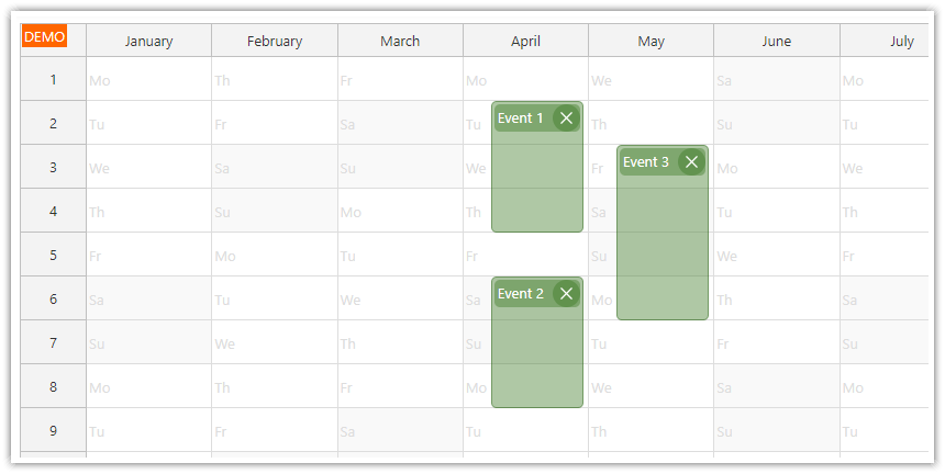
To display the day names (e.g., Mo, Tu) in the React calendar cells, we'll modify the onBeforeCellRender handler and add an active area with the day of week as text:
const onBeforeCellRender = (args) => {
  const belongsToCurrentMonth = args.cell.y + 1 === args.cell.start.getDay();

  if (belongsToCurrentMonth) {
    args.cell.properties.areas = [
      {
        top: 0,
        left: 2,
        bottom: 0,
        width: 40,
        fontColor: "#dddddd",
        text: args.cell.start.toString("ddd"),
        verticalAlignment: "center",
      },
    ];
  } else {
    args.cell.properties.backColor = "#e9e9e9";
  }
};
Full Source Code
Below is the complete source code for the React yearly scheduling calendar UI component:
import React, { useEffect, useRef, useState } from 'react';
import { DayPilot, DayPilotCalendar } from "daypilot-pro-react";

const YearlyCalendar = () => {

  const [calendar, setCalendar] = useState(null);
  const [events, setEvents] = useState([]);
  const [columns, setColumns] = useState([]);
  const [startDate, setStartDate] = useState(DayPilot.Date.today().firstDayOfYear());

  const onTimeRangeSelected = async (args) => {
    const modal = await DayPilot.Modal.prompt("Create a new event:", "Event 1");
    const calendar = args.control;
    calendar.clearSelection();
    if (modal.canceled) { return; }
    calendar.events.add({
      start: args.start,
      end: args.end,
      id: DayPilot.guid(),
      text: modal.result
    });
  };

  const onBeforeTimeHeaderRender = args => {
    const day = args.header.date.toString("d");
    args.header.html = day;
  };

  const onBeforeCellRender = args => {
    const belongsToCurrentMonth = args.cell.y + 1 === args.cell.start.getDay();

    if (belongsToCurrentMonth) {
      args.cell.properties.areas = [
        { top: 0, left: 2, bottom: 0, width: 40, fontColor: "#dddddd", text: args.cell.start.toString("ddd"), verticalAlignment: "center" }
      ];
    }
    else {
      args.cell.backColor = "#e9e9e9";
    }
  };

  const onBeforeEventRender = args => {
    args.data.barHidden = true;
    args.data.borderRadius = "5px";
    args.data.borderColor = "darker";
    args.data.fontColor = "white";
    args.data.backColor = "#38761d66";

    args.data.html = "";
    args.data.areas = [
      {
        top: 3,
        left: 3,
        right: 3,
        height: 25,
        padding: 3,
        borderRadius: 5,
        backColor: "#38761d66",
        fontColor: "#ffffff",
        text: args.data.text
      },
      {
        top: 3,
        right: 3,
        height: 25,
        width: 25,
        borderRadius: "50%",
        padding: 5,
        backColor: "#38761d66",
        fontColor: "#ffffff",
        symbol: "/icons/daypilot.svg#x-2",
        onClick: async (args) => {
          calendar.events.remove(args.source);
        }
      }
    ];
  }

  const loadEvents = (args) => {
    const data = [
      {
        id: 1,
        text: "Event 1",
        start: DayPilot.Date.today().firstDayOfYear().addMonths(1).addDays(2),
        end: DayPilot.Date.today().firstDayOfYear().addMonths(1).addDays(5),
      },
      {
        id: 2,
        text: "Event 2",
        start: DayPilot.Date.today().firstDayOfYear().addMonths(2).addDays(2),
        end: DayPilot.Date.today().firstDayOfYear().addMonths(2).addDays(5),
      },
    ];
    setEvents(data);
  };

  useEffect(() => {
    const resources = [];
    // one column per month
    for (let i = 0; i < 12; i++) {
      const start = startDate.addMonths(i);
      const name = start.toString("MMMM");
      resources.push({name, start});
    }
    setColumns(resources);
  }, [startDate]);

  useEffect(() => {
    loadEvents();
  }, []);

  return (
    <div>
      <DayPilotCalendar
        scale={"Day"}
        viewType={"Resources"}
        startDate={startDate}
        days={31}
        cellHeight={40}
        columnMarginLeft={25}
        columnWidthMin={100}
        heightSpec={"Fixed"}
        height={600}
        events={events}
        columns={columns}
        onTimeRangeSelected={onTimeRangeSelected}
        onBeforeTimeHeaderRender={onBeforeTimeHeaderRender}
        onBeforeCellRender={onBeforeCellRender}
        onBeforeEventRender={onBeforeEventRender}
        controlRef={setCalendar}
      />
    </div>
  );
}
export default YearlyCalendar;
You can download the React project using the download link at the top of the article.
History
-
March 23, 2026: Upgraded to React 19, Vite, and DayPilot Pro 2026.1.6860. Migrated from create-react-app to Vite.
-
November 21, 2024: Updated to DayPilot Pro 2024.4.6275.
-
June 25, 2024: Initial release (React 18, DayPilot Pro).
 DayPilot