 DayPilot
Overview
You can add React JSX components to Scheduler grid cells.
You an also use raw HTML and active areas to display custom content in the grid cells.
The sample project includes the open-source DayPilot Lite for JavaScript scheduling library.
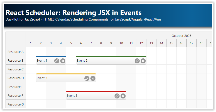
Render custom content in React Scheduler cells
The React Scheduler component lets you customize the grid cell appearance and content. You can use this feature to add useful functionality to your scheduling application.
Some examples:
You can change the background color, add custom CSS class and insert custom elements (text, HTML, icons).
How to customize React Scheduler cells using active areas

The basic option is to use custom HTML that will be used as the cell content:
const onBeforeCellRender = args => {
  args.cell.properties.html = "<div>HTML</div>;
};


return (
  <div>
    <DayPilotScheduler
      ...
      onBeforeCellRender={onBeforeCellRender}
    />
  </div>
);
In addition to specifying the raw HTML, the Scheduler component also supports active areas - rectangular objects that will be displayed at the specified position within a cell.
You can add active areas using the onBeforeCellRender event handler:
const onBeforeCellRender = args => {
  args.cell.properties.areas = [
    {
      right: 10,
      top: 10,
      left: 10,
      bottom: 10,
      fontColor: "#ddd",
      symbol: "icons/daypilot.svg#figure"
    }
  ];
};

return (
  <div>
    <DayPilotScheduler
      ...
      onBeforeCellRender={onBeforeCellRender}
    />
  </div>
);
The active areas have several advantages over raw HTML:
Built-in support for icons of different types (font icons, SVG, images).
The position can be specified in pixels or using date/time
Active areas are supported during image export
Customize the cell content using React JSX components

In some cases, it might be more convenient to define custom grid cell content using JSX. This is possible using the onBeforeCellDomAdd event handler:
const onBeforeCellDomAdd = (args) => {
  args.element = <div>jsx</div>;
};

return (
  <div>
    <DayPilotScheduler
      ...
      onBeforeCellDomAdd={onBeforeCellDomAdd}
    />
  </div>
);
Note:
The
onBeforeCellDomAddevent is extremely sensitive to performance problems. It is fired in real time, whenever the rendering takes place (unlikeonBeforeCellRenderwhich caches the result and which is only fired once by default). Try to avoid heavy calculations in the event handler.
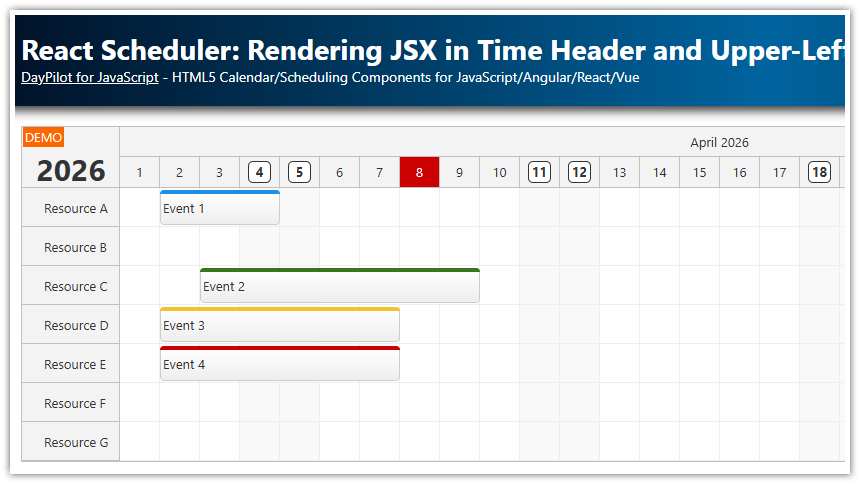
How to highlight weekends using JSX

The following example adds an “X” icons to the weekend cells using custom React JSX:
const onBeforeCellDomAdd = args => {
const dayOfWeek = args.cell.start.getDayOfWeek();
const weekend = dayOfWeek === 0 || dayOfWeek === 6;
const color = weekend ? "#cc412533" : "#93c47d33";
if (weekend) {
const barStyle = {
position: "absolute",
left: 0,
right: 0,
top: 0,
height: "6px",
backgroundColor: color
};
const xStyle = {
color: color,
fontSize: "14px",
position: "absolute",
textAlign: "center",
top: 15,
left: 0,
right: 0
};
args.element = <div>
<div style={barStyle}></div>
<div style={xStyle}>✖</div>
</div>;
}
};
return (
<div>
<DayPilotScheduler
...
onBeforeCellDomAdd={onBeforeCellDomAdd}
/>
</div>
);Cleanup when the cell component is destroyed
The React component assigned to args.element will be destroyed automatically when the cell is removed from the Scheduler.
However, if you need to perform additional cleanup you can use the the onBeforeCellDomRemove event handler. It is called before the component is destroyed:
const onBeforeCellDomRemove = args => {
  const component = args.element;
  // ... cleanup
};

return (
  <div>
    <DayPilotScheduler
      ...
      onBeforeCellDomRemove={onBeforeCellDomRemove}
    />
  </div>
);
Cell rendering performance
The React Scheduler renders and removes grid cells as needed:
To improve performance, the React Scheduler renders the grids cells progressively during scrolling. Hidden cells will be removed automatically and rendered again when needed.
The cells are also updated when the row height changes or if an event is added, removed, or updated.
Because the cells are rendered during scrolling, it is necessary to keep the rendering as fast as possible. Keep that in mind when using the onBeforeCellDomAdd event:
The
onBeforeCellDomAddis called more often thanonBeforeCellRender.Using React JSX is more expensive than raw HTML or active areas.
Avoid any costly calculations or long operations in
onBeforeCellDomAdd.By default, cells are rendered in real time. If you can’t avoid expensive operations is
onBeforeCellDomAdd, you can debounce the rendering (see more in scrolling performance). It will introduce a delay but it will make scrolling more responsive.If possible, use precalculated values and only lookup the values in the event handler.