 DayPilot
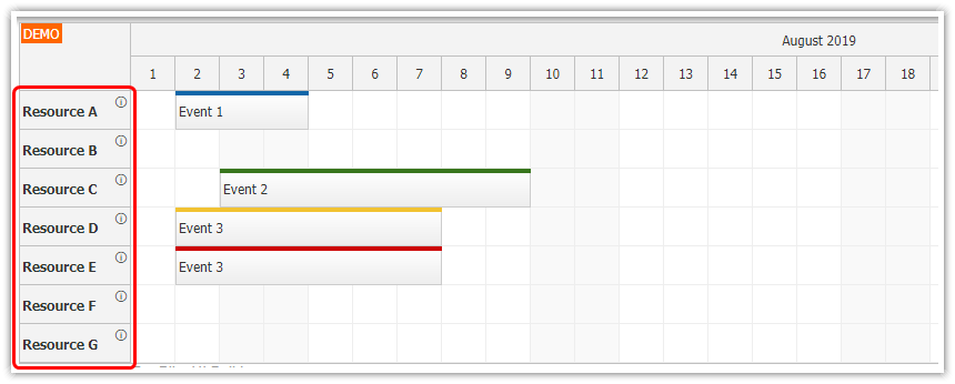
Features
Render custom JSX components in React Calendar events.
You can also use active areas to insert rich content and icons.
This tutorial uses the React package from the open-source DayPilot Lite for JavaScript scheduling library.
How to Add an Icon using Active Areas
This example adds an icon to the calendar event box using active areas. Active areas are a built-in mechanism for adding custom elements at specified locations in Calendar events, grid cells, time headers, and other places. You can define visibility, CSS classes, special actions such as drag handles or hover bubbles, and your own click handler. The same active area definitions are used by DayPilot client-side image export features (in the Pro version).
const onBeforeEventRender = (args) => {
  args.data.backColor = "#93c47d";
  args.data.barHidden = true;
  args.data.fontColor = "#ffffff";
  args.data.borderColor = "darker";

  args.data.areas = [
    {
      right: 6,
      top: 6,
      width: 17,
      height: 17,
      image: activeAreaIcon,
      onClick: (args) => showDetails(args.source),
    },
  ];
};
How to Add an Icon using JSX
You can define custom event content using JSX in the onBeforeEventDomAdd event handler. The handler receives the DayPilot event as args.e and the React element is assigned to args.element.
const onBeforeEventDomAdd = (args) => {
  args.element = (
    <div>
      {args.e.data.text}
      <div
        style={{
          position: "absolute",
          right: "25px",
          top: "5px",
          height: "17px",
          width: "17px",
        }}
        onClick={() => showDetails(args.e)}
      >
        <img src={infoIcon} />
      </div>
    </div>
  );
};
Full Source Code
Calendar.jsx
import { useState } from "react";
import { DayPilot, DayPilotCalendar } from "@daypilot/daypilot-lite-react";

const infoIcon = "/icons/info-17-semi.svg";
const activeAreaIcon = "/icons/info-17-inverted-rounded-semi.svg";

const Calendar = () => {
  const [events] = useState(() => {
    const today = DayPilot.Date.today();

    return [
      {
        id: 1,
        text: "Event 1",
        start: today.addHours(9),
        end: today.addHours(14),
      },
      {
        id: 2,
        text: "Event 2",
        start: today.addDays(1).addHours(10),
        end: today.addDays(1).addHours(15),
      },
    ];
  });

  const showDetails = (event) => {
    DayPilot.Modal.alert(event.data.text);
  };

  const onTimeRangeSelected = async (args) => {
    const modal = await DayPilot.Modal.prompt("Create a new event:", "Event 1");
    const calendar = args.control;

    calendar.clearSelection();
    if (modal.canceled) {
      return;
    }

    calendar.events.add({
      start: args.start,
      end: args.end,
      id: DayPilot.guid(),
      text: modal.result,
    });
  };

  const onBeforeEventRender = (args) => {
    args.data.backColor = "#93c47d";
    args.data.barHidden = true;
    args.data.fontColor = "#ffffff";
    args.data.borderColor = "darker";

    args.data.areas = [
      {
        right: 6,
        top: 6,
        width: 17,
        height: 17,
        image: activeAreaIcon,
        onClick: (args) => showDetails(args.source),
      },
    ];
  };

  const onBeforeEventDomAdd = (args) => {
    args.element = (
      <div>
        {args.e.data.text}
        <div
          style={{
            position: "absolute",
            right: "25px",
            top: "5px",
            height: "17px",
            width: "17px",
          }}
          onClick={() => showDetails(args.e)}
        >
          <img src={infoIcon} />
        </div>
      </div>
    );
  };

  return (
    <div>
      <DayPilotCalendar
        viewType="Week"
        startDate={DayPilot.Date.today()}
        cellHeight={30}
        eventClickHandling="Disabled"
        eventMoveHandling="Update"
        eventResizeHandling="Update"
        timeRangeSelectedHandling="Enabled"
        onTimeRangeSelected={onTimeRangeSelected}
        onBeforeEventRender={onBeforeEventRender}
        onBeforeEventDomAdd={onBeforeEventDomAdd}
        events={events}
      />
    </div>
  );
};

export default Calendar;