DayPilot
| Demo | |
|---|---|
| Downloads | |
| Repository | |
| Languages | JavaScript |
| Technologies | ReactJSX |
| Code License | Apache License 2.0 (Open-Source) |
Overview
-
Add custom DOM elements to the Scheduler row headers in a React application.
-
React JSX elements and custom components can be inserted directly into the row header DOM.
-
Other Scheduler row header customization options include raw HTML strings and active areas.
-
Uses DayPilot Lite for JavaScript with a React/Vite project.
License
This tutorial uses DayPilot Lite for JavaScript, available under the Apache License 2.0. The sample project includes the applicable licensing information.
Rendering JSX Component in React Scheduler Header
Custom HTML
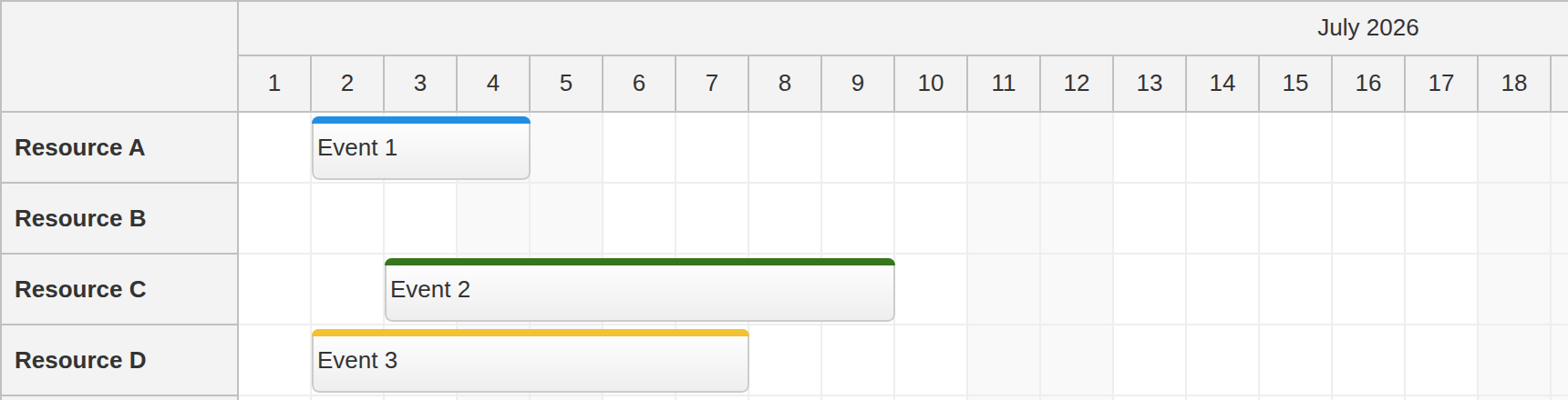
The standard way of customizing the React Scheduler row headers is to use the onBeforeRowHeaderRender event handler.
This event handler lets you change row properties and set the row header HTML. The HTML value is a string, so it is useful for simple formatting:
const onBeforeRowHeaderRender = (args) => {
  args.row.html = `<span style="font-weight: bold">${args.row.name}</span>`;
};
Active Areas
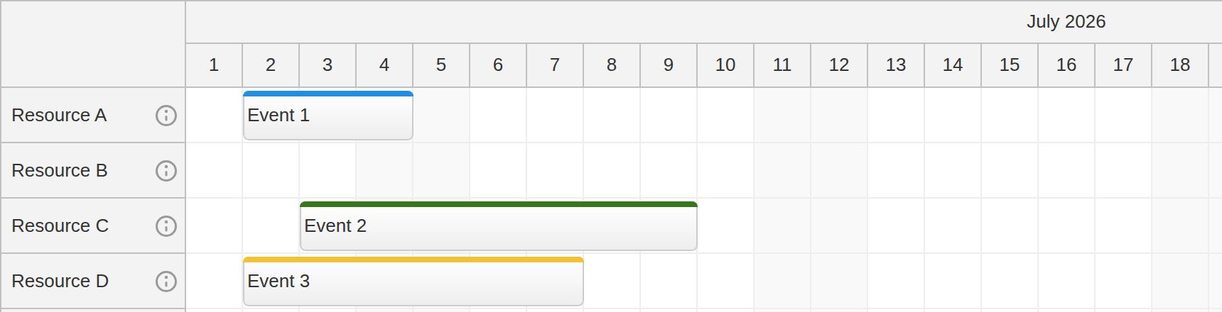
If you want to avoid raw HTML, you can use active areas. Active areas insert positioned elements into the row header and can attach behavior such as opening a modal dialog or running custom JavaScript.
The sample adds a small icon to the right side of each row header. Clicking the icon opens an alert with the row name:
const onBeforeRowHeaderRender = (args) => {
  args.row.areas = [
    {
      right: 5,
      top: "calc(50% - 9px)",
      height: 18,
      width: 18,
      symbol: "icons/daypilot.svg#i-circle",
      cursor: "pointer",
      fontColor: "#999999",
      onClick: (args) => {
        const row = args.source;
        DayPilot.Modal.alert(row.name);
      }
    }
  ];
};
React JSX Component
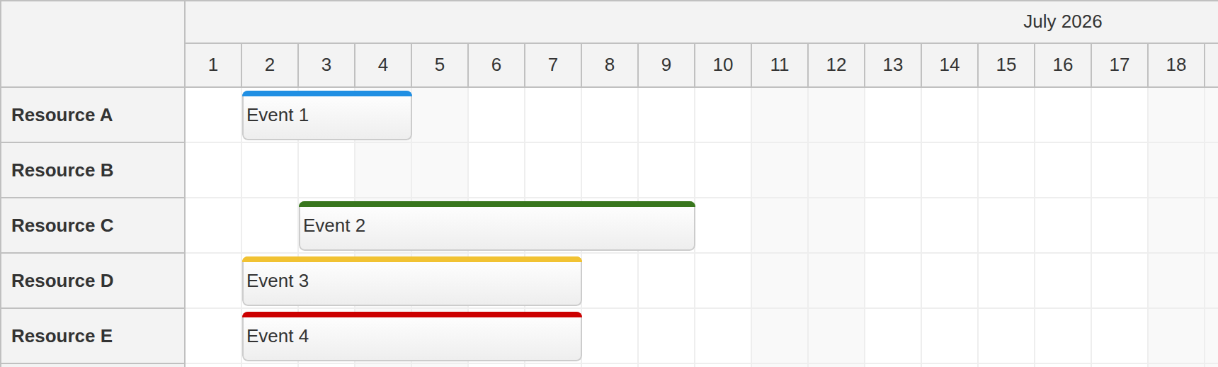
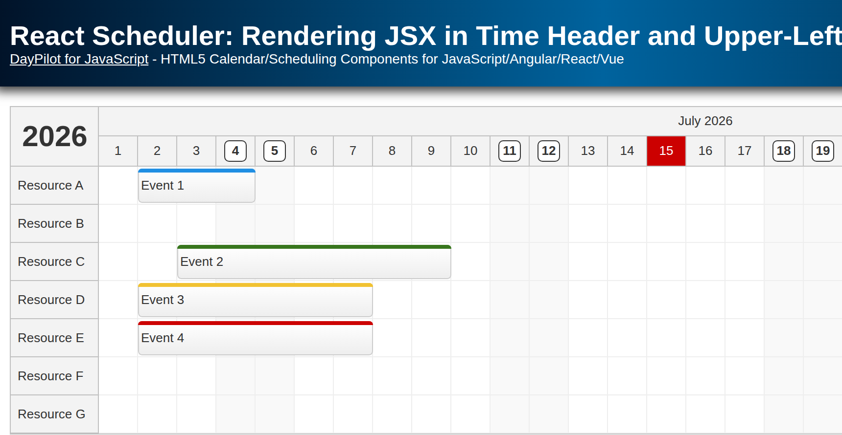
To render React content in a row header, use the onBeforeRowHeaderDomAdd event handler. It is called when the row header element is created and added to the DOM.
You can use it to define a custom DOM element that will be inserted into the row header DOM:
const onBeforeRowHeaderDomAdd = (args) => {
  const element = document.createElement("span");
  element.innerText = args.row.name;
  element.style.fontWeight = "bold";

  args.element = element;
};
You can also assign JSX directly to args.element:
const onBeforeRowHeaderDomAdd = (args) => {
  args.element = <span style={{fontWeight: "bold"}}>{args.row.name}</span>;
};
The same hook works with a custom React component:
const onBeforeRowHeaderDomAdd = (args) => {
  args.element = <SchedulerRow row={args.row} />;
};
SchedulerRow.jsx:
const SchedulerRow = ({ row }) => {
  return <span style={{ fontWeight: "bold" }}>{row.name}</span>;
};

export default SchedulerRow;
Full Source Code
Scheduler.jsx (Scheduler component)
import { useState } from "react";
import { DayPilot, DayPilotScheduler } from "@daypilot/daypilot-lite-react";
import SchedulerRow from "./SchedulerRow.jsx";

const Scheduler = () => {
  const [startDate] = useState(() => DayPilot.Date.today().firstDayOfMonth());
  const [events] = useState(() => {
    const monthStart = DayPilot.Date.today().firstDayOfMonth();

    return [
      {
        id: 1,
        text: "Event 1",
        start: monthStart.addDays(1),
        end: monthStart.addDays(4),
        resource: "A"
      },
      {
        id: 2,
        text: "Event 2",
        start: monthStart.addDays(2),
        end: monthStart.addDays(9),
        resource: "C",
        barColor: "#38761d",
        barBackColor: "#93c47d"
      },
      {
        id: 3,
        text: "Event 3",
        start: monthStart.addDays(1),
        end: monthStart.addDays(7),
        resource: "D",
        barColor: "#f1c232",
        barBackColor: "#f1c232"
      },
      {
        id: 4,
        text: "Event 4",
        start: monthStart.addDays(1),
        end: monthStart.addDays(7),
        resource: "E",
        barColor: "#cc0000",
        barBackColor: "#ea9999"
      }
    ];
  });
  const [resources] = useState([
    {name: "Resource A", id: "A"},
    {name: "Resource B", id: "B"},
    {name: "Resource C", id: "C"},
    {name: "Resource D", id: "D"},
    {name: "Resource E", id: "E"},
    {name: "Resource F", id: "F"},
    {name: "Resource G", id: "G"}
  ]);
  const days = startDate.daysInMonth();

  const onTimeRangeSelected = async (args) => {
    const scheduler = args.control;
    const modal = await DayPilot.Modal.prompt("Create a new event:", "Event 1");
    scheduler.clearSelection();

    if (modal.canceled) {
      return;
    }

    scheduler.events.add({
      start: args.start,
      end: args.end,
      id: DayPilot.guid(),
      resource: args.resource,
      text: modal.result
    });
  };

  const onBeforeRowHeaderRender = (args) => {
    args.row.areas = [
      {
        right: 5,
        top: "calc(50% - 9px)",
        height: 18,
        width: 18,
        symbol: "icons/daypilot.svg#i-circle",
        cursor: "pointer",
        fontColor: "#999999",
        onClick: (args) => {
          const row = args.source;
          DayPilot.Modal.alert(row.name);
        }
      }
    ];
  };

  const onBeforeRowHeaderDomAdd = (args) => {
    args.element = <SchedulerRow row={args.row} />;
  };

  return (
    <div>
      <DayPilotScheduler
        timeHeaders={[{"groupBy": "Month"}, {"groupBy": "Day", "format": "d"}]}
        scale="Day"
        days={days}
        startDate={startDate}
        rowMarginTop={2}
        rowMarginBottom={2}
        rowHeaderWidth={130}
        onTimeRangeSelected={onTimeRangeSelected}
        onBeforeRowHeaderRender={onBeforeRowHeaderRender}
        onBeforeRowHeaderDomAdd={onBeforeRowHeaderDomAdd}
        events={events}
        resources={resources}
      />
    </div>
  );
};
export default Scheduler;
SchedulerRow.jsx (custom row header component)
const SchedulerRow = ({ row }) => {
  return <span style={{ fontWeight: "bold" }}>{row.name}</span>;
};

export default SchedulerRow;
History
July 15, 2026: Updated the sample project to React 19, Vite, and DayPilot Lite.