Features
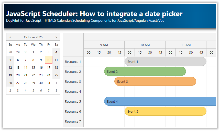
Angular 14 project that displays a timeline for multiple resources using Angular Scheduler component from DayPilot Pro for JavaScript package
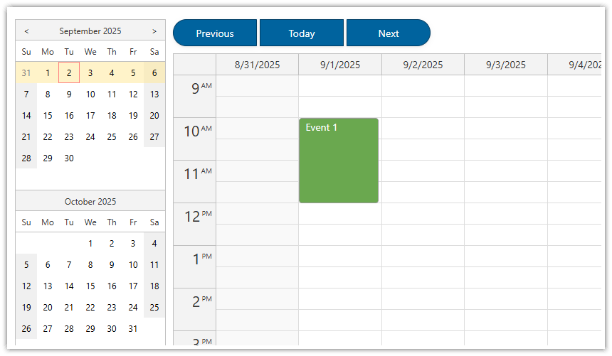
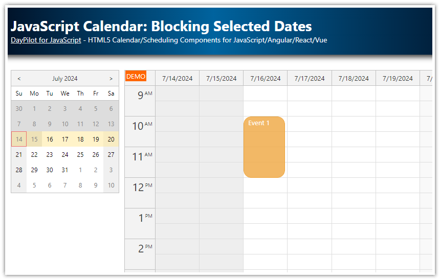
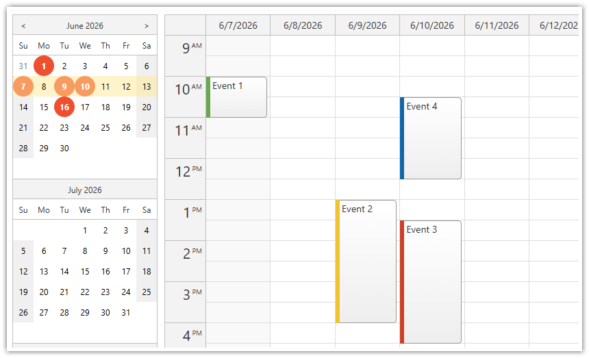
Navigator component is used as a date picker
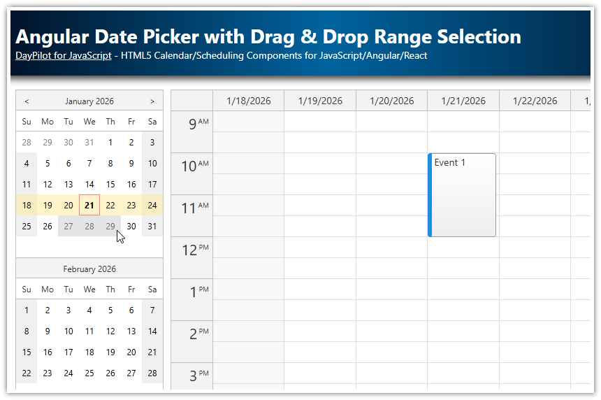
Free-hand date selection is enabled (for selecting custom date range)
Collapsible sidebar with the date picker and other settings
Includes a trial version of DayPilot Pro for JavaScript (see License below)
For a basic tutorial on using the Angular Scheduler, please see:
License
Licensed for testing and evaluation purposes. Please see the license agreement included in the sample project. You can use the source code of the tutorial if you are a licensed user of DayPilot Pro for JavaScript.
Angular Date Picker Component

We will use the Navigator component as a date picker which will let users select the date range for the Scheduler component.
<daypilot-navigator [config]="navigatorConfig" (dateChange)="changeDate()" #navigator></daypilot-navigator>By default the Navigator displays one months and selects a single day on click. We will switch the select mode to "Month" (selectMode property) and display three months at once (showMonths). Clicking previous/next icons in the Navigator header will change the date by three months (skipMonths).
navigatorConfig: DayPilot.NavigatorConfig = {
  showMonths: 3,
  skipMonths: 3,
  selectMode: "Month"
};
Whenever the user changes the selected date the dateChange event is fired. We will use this event to change the date range visible in the Scheduler control.
dateChange() {
  this.config.startDate = this.navigator.control.selectionStart;
  this.config.days = new DayPilot.Duration(<DayPilot.Date>this.navigator.control.selectionStart, <DayPilot.Date>this.navigator.control.selectionEnd).totalDays() + 1;
}
Loading Angular Scheduler Events for the New Date Range

Now the Scheduler displays the month selected using the Navigator control. We need to load a new set of events when the view changes - this can be done using viewChange event:
<daypilot-scheduler [config]="config" [events]="events" (viewChange)="viewChange()" #scheduler></daypilot-scheduler>The viewChange() method checks the current date range using visibleStart() and visibleEnd() methods and requests the relevant events.
viewChange() {
  const from = this.scheduler.control.visibleStart();
  const to = this.scheduler.control.visibleEnd();
  this.ds.getEvents(from, to).subscribe(result => {
    this.events = result;
  });
}
Free-Hand Date Range Selection

The Navigator supports a couple of preconfigured select modes ("Day", "Week", "Month") and a free-hand selection (drag a mouse to select a custom date range). Only one selectMode can be active at a time (we are using "Month") but it can be combined with a free-hand selection. We will add this option using a checkbox that updates freeHandSelectionEnabled property of the Navigator:
<label class="row"><input type="checkbox" [(ngModel)]="navigatorConfig.freeHandSelectionEnabled"> Free-hand range</label>Auto Cell Width

By default, the Angular Scheduler uses a fixed cell width. When the displayed date range is long a horizontal scrollbar is added automatically. Shorter date ranges make the grid shorter than the Scheduler width (that makes a free space appear after the end of the grid).
For reasonably-sized date ranges (such as one month, with a scale set to one day per cell) it's possible to let the Scheduler adjust the cell width automatically in order to fill the available space. That will eliminate the horizonal scrollbar.
We will let users switch the modes using a simple checkbox.
<label class="row"><input type="checkbox" (change)="changeAutoCellWidth($event)"> Auto cell width</label>When the checkbox value changes the Scheduler properties are updated accordingly. The auto cell width mode updates the cellWidth property with the calculated value - that means we have to reset the cellWidth when switching back to fixed cell width mode.
changeAutoCellWidth(event: Event) {
  const target = <HTMLInputElement>event.target;
  if (target.checked) {
    this.config.cellWidthSpec = "Auto";
  }
  else {
    this.config.cellWidthSpec = "Fixed";
    this.config.cellWidth = 40;
  }
}
History
October 10, 2022: Upgraded to Angular 14, DayPilot Pro 2022.4.5442
November 22, 2020: Upgraded to Angular 11, DayPilot Pro 2020.4.4772
June 24, 2018: Upgraded to Angular 6, date syncing fixed
February 5, 2017: Initial release (Angular 2)
 DayPilot
