 DayPilot
")
Overview
The Angular date picker component supports a free-hand range selection.
Use drag and drop to select a custom set of days to be displayed by the Calendar.
The free-hand range selection can be combined with the standard selection modes: day, week, month
Angular Date Picker Component

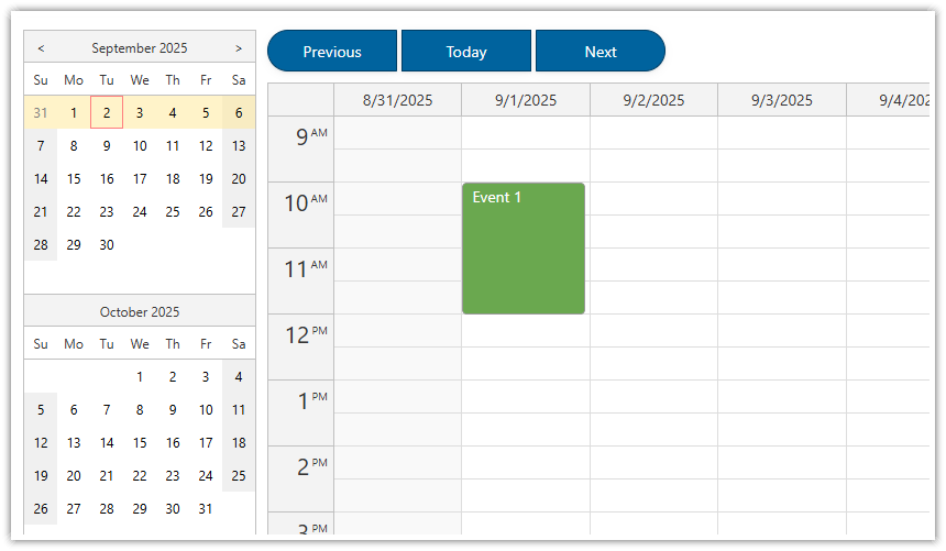
The open-source DayPilot Lite includes an Angular date picker component (DayPilot Navigator) which lets you select a specified date that will be displayed by the main calendar component.
Features:
configurable number of months
horizontal or vertical orientation
highlighting busy days
cell customization (custom styling of date cells)
built-in selection modes: day, week, month
CSS styling (create your own theme using the online Theme Designer application)
Date Picker Selection Modes
The date picker component supports the following modes:
Day
Week
Month
Day Mode

Week Mode

Month Mode

By default, it uses the “Day” mode which selects the day that was clicked.
Free-Hand Mode with Drag and Drop Range Selection

The Navigator date picker component lets you select a custom date range.
In order to activate this option, use freeHandSelectionEnabled property:
configNavigator = signal<DayPilot.NavigatorConfig>({
  // ...
  freeHandSelectionEnabled: true,
});
This mode can be combined with any standard selection mode (Day, Week, Month). Clicking a day will select the range specified by the selection mode. In addition to clicks, the date picker also supports selecting a date range using drag and drop.
configNavigator = signal<DayPilot.NavigatorConfig>({
  // ...
  selectMode: "Week",
  freeHandSelectionEnabled: true,
});
How to Handle the Selection Change
You can use onTimeRangeSelected event handler to detect a change of the date range selection.
configNavigator = signal<DayPilot.NavigatorConfig>({

  // ...

  onTimeRangeSelected: args => {
    console.log("args", args);
  }

  // ...

});
The args object holds information about the updated date selection:
args.start- start date/timeargs.end- end date/time (end of the last selected day)args.days- number of selected days
How to Update the Calendar View
The Angular Calendar component can display a custom number of days using the viewType: "Days" mode.
We will use this mode to display the date range selected using the free-hand date picker mode:
configNavigator = signal<DayPilot.NavigatorConfig>({

  // ...

  onTimeRangeSelected: (args) => {
    this.configCalendar.update((c) => ({
      ...c,
      viewType: "Days",
      startDate: args.start,
      days: args.days,
    }));
  },

  // ...

});