 DayPilot
Features
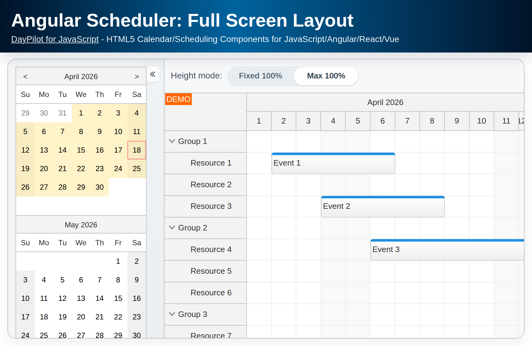
The Angular calendar component from DayPilot Pro for JavaScript can be configured to fill the available space.
We will use it in combination with a simple sidebar component to build a full-screen calendar user interface.
This Angular project was generated using Scheduler UI Builder.
License
Licensed for testing and evaluation purposes. Please see the license agreement included in the sample project. You can use the source code of the tutorial if you are a licensed user of DayPilot Pro for JavaScript.
Angular Calendar Introduction
For introduction to using the Angular calendar component (package installation, calendar component configuration, reading data from a PHP/MySQL backend) please see the following tutorial:
Angular Calendar: Full Screen Mode

The Angular calendar component can adjust its height automatically to fill the parent element:
config: DayPilot.CalendarConfig = {
  heightSpec: "Parent100Pct",
  // ...
}
This option sets the height of the calendar to 100% of its parent. It's necessary to set the parent element height explicitly (it's the parent element which defines the content size). We will use left/right/top/bottom CSS properties in combination with position: absolute style:
calendar.component.html
<div class="main-body">
  <daypilot-calendar [config]="config" [events]="events" #calendar (viewChange)="viewChange()"></daypilot-calendar>
</div>
calendar.component.css
.main-body {
  position: absolute;
  left: 0px;
  right: 0px;
  top: 0px;
  bottom: 0px;
  overflow: hidden;
}
calendar.component.ts
import {Component, ViewChild, AfterViewInit} from "@angular/core";
import {DayPilot, DayPilotCalendarComponent} from "daypilot-pro-angular";

@Component({
  selector: 'calendar-component',
  templateUrl: './calendar.component.html',
  styleUrls: ['./calendar.component.css']
})
export class CalendarComponent {

  config: any = {
    heightSpec: "Parent100Pct",
    // ...
  };

  // ...
}
Angular Calendar: Sidebar with Date Picker

This Angular project includes a simple collapsible sidebar component in SidebarModule (src/app/sidebar directory). We will use the sidebar to integrate a date picker into our full-screen view.
The sidebar can be integrated using the following components:
<sidebar-container> wraps the whole content (sidebar and the main area)
<sidebar-expanded> defines the content of the sidebar in expanded state - we will use it to display the date picker
<sidebar-collapsed> defines the content of the sidebar in collapsed state (in our example it's empty)
<sidebar-main> holds the main page content (the calendar component in our case)
Our Angular application will display the date picker (implemented using DayPilot Navigator component) in the sidebar on the left side of the screen. Users can click the selected date to change the current week in the Calendar component. They can also collapse the sidebar if more space is needed for the calendar.
See also Angular Calendar: Date Switching tutorial to see how to change the date displayed using the calendar component.
calendar.component.html
<div class="fullscreen">
  <sidebar-container #sidebar [(expanded)]="expanded">
    <sidebar-expanded>
      <daypilot-navigator [config]="navigatorConfig" [(date)]="date" #navigator></daypilot-navigator>
    </sidebar-expanded>
    <sidebar-collapsed></sidebar-collapsed>
    <sidebar-main>
      <div class="main-body">
        <daypilot-calendar [config]="config" [events]="events" #calendar (viewChange)="viewChange()"></daypilot-calendar>
      </div>
    </sidebar-main>
  </sidebar-container>
</div>
calendar.component.css
.fullscreen {
  position: absolute; top:90px; left: 0px; right: 0px; bottom: 0px;
}
h2 {
  padding-left: 5px;
  margin: 0;
}

input[type=checkbox] {
  vertical-align: middle;
  position: relative;
  bottom: 1px;
}

.main-body {
  position:absolute;
  left: 0px;
  right: 0px;
  top: 0px;
  bottom: 0px;
  overflow:hidden;
}
.main-bottom {
  border-top: 1px solid #ccc;
}
.row {
  margin-top: 2px;
  white-space: nowrap;
  display: block;
}

:host ::ng-deep .calendar_default_colheader_inner {
  padding: 5px;
}

:host ::ng-deep .calendar_default_rowheader_inner {
  padding: 5px;
}

:host ::ng-deep .navigator_default_main,
:host ::ng-deep .navigator_default_title,
:host ::ng-deep .navigator_default_titleleft,
:host ::ng-deep .navigator_default_titleright,
:host ::ng-deep .navigator_default_line
{
  border: 0px;
  background: #ffffff;
}
calendar.component.ts
import {Component, ViewChild, AfterViewInit} from "@angular/core";
import {DayPilot, DayPilotCalendarComponent, DayPilotNavigatorComponent} from "daypilot-pro-angular";
import {DataService} from "./data.service";

@Component({
  selector: 'calendar-component',
  templateUrl: './calendar.component.html',
  styleUrls: ['./calendar.component.css']
})
export class CalendarComponent implements AfterViewInit {

  @ViewChild("navigator") navigator!: DayPilotNavigatorComponent;
  @ViewChild("calendar") calendar!: DayPilotCalendarComponent;

  expanded: boolean = true;

  navigatorConfig: any = {
    showMonths: 3,
    skipMonths: 3,
    selectMode: "week",
    cellWidth: 30,
    cellHeight: 30,
    dayHeaderHeight: 30,
    titleHeight: 30
  };

  events: DayPilot.EventData[] = [];

  config: DayPilot.CalendarConfig = {
    // startDate: DayPilot.Date.today(),
    viewType: "Week",
    heightSpec: "Parent100Pct",
    cellHeight: 30,
    headerHeight: 30,
    hourWidth: 60,
    onTimeRangeSelected: async (args) => {
      const modal = await DayPilot.Modal.prompt("Create a new event:", "Event 1");

      const dp = args.control;
      dp.clearSelection();
      if (!modal.result) { return; }
      dp.events.add({
        start: args.start,
        end: args.end,
        id: DayPilot.guid(),
        text: modal.result
      });
    }
  };


  get date(): DayPilot.Date {
    return <DayPilot.Date>this.config.startDate;
  }

  set date(val: DayPilot.Date) {
    this.config.startDate = val;
  }

  constructor(private ds: DataService) {
  }

  ngAfterViewInit(): void {
  }

  viewChange(): void {

    var from = this.calendar.control.visibleStart();
    var to = this.calendar.control.visibleEnd();

    this.ds.getEvents(from, to).subscribe(result => {
      this.events = result;
    });
  }

}