 DayPilot
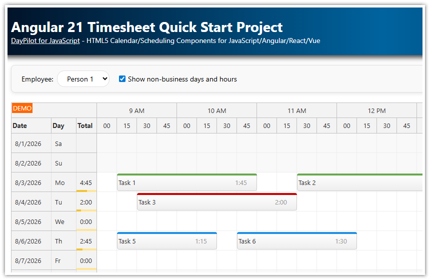
Overview
A quick-start Angular 22 project that includes a pre-configured Scheduler component.
The Angular Scheduler component displays a timeline for multiple resources.
You can use it as a starting point for your own Angular application (project management, reservations, work order scheduling, production planning and other calendar applications).
You can also configure the Angular Scheduler component online using the UI Builder application and generate a new Angular project with your own configuration.
You will learn how to add more Scheduler features to provide a richer user interface.
The project includes a trial version of DayPilot Pro for JavaScript (see License below).
License
Licensed for testing and evaluation purposes. Please see the license agreement included in the sample project. You can use the source code of the tutorial if you are a licensed user of DayPilot Pro for JavaScript. Buy a license.
Angular 22 Scheduler Component

Here you can find the minimum configuration required to display the Angular Scheduler component.
The Scheduler component is defined using a <daypilot-scheduler> tag in the HTML template. The [config] attribute points to a signal with configuration options, while the [resources] and [events] attributes receive the row and event data. In the initial step, the event list is empty so the Scheduler shows just the timeline and resource rows.
The config signal specifies the Scheduler behavior and appearance. In this minimum configuration, startDate, days, timeHeaders, and scale define the timeline. The resources are loaded in ngAfterViewInit(); when they arrive, the sample updates the resources signal bound to the Scheduler.
You can find the component in the src/app/scheduler/scheduler.component.ts file:
import {Component, ViewChild, AfterViewInit, signal} from '@angular/core';
import {DayPilot, DayPilotModule, DayPilotSchedulerComponent} from 'daypilot-pro-angular';
import {DataService} from './data.service';

@Component({
  selector: 'scheduler-component',
  standalone: true,
  imports: [DayPilotModule],
  providers: [DataService],
  template: `<daypilot-scheduler [config]="config" [events]="events" [resources]="resources" #scheduler></daypilot-scheduler>`,
  styles: [``]
})
export class SchedulerComponent implements AfterViewInit {

  @ViewChild('scheduler')
  scheduler!: DayPilotSchedulerComponent;

  events = signal<DayPilot.EventData[]>([]);
  resources = signal<DayPilot.ResourceData[]>([]);

  config = signal<DayPilot.SchedulerConfig>({
    timeHeaders: [
      {groupBy: "Month"},
      {groupBy: "Day", format: "d"}
    ],
    scale: "Day",
    days: 31,
    startDate: "2026-10-01",
    treeEnabled: true
  });

  constructor(private ds: DataService) {
  }

  ngAfterViewInit(): void {

    this.ds.getResources().subscribe(result => {
      this.resources.set(result);
    });

  }

}
The Angular 22 Scheduler component displays custom resources as rows. You can bind the rows directly using the Scheduler [resources] attribute, in the same way the sample binds event data using [events]. In this example, we use a special service (DataService class) to provide the resource data.
In a standard Angular application, you would load the resource data from an HTTP endpoint but we define it statically for simplicity.
import {Injectable} from '@angular/core';
import {DayPilot} from 'daypilot-pro-angular';
import {HttpClient} from '@angular/common/http';
import {Observable} from 'rxjs';
@Injectable()
export class DataService {
resources: DayPilot.ResourceData[] = [
{
name: 'Group A', id: 'GA', expanded: true, children: [
{name: 'Resource 1', id: 'R1', capacity: 10},
{name: 'Resource 2', id: 'R2', capacity: 30},
{name: 'Resource 3', id: 'R3', capacity: 20},
{name: 'Resource 4', id: 'R4', capacity: 40}
]
},
{
name: 'Group B', id: 'GB', expanded: true, children: [
{name: 'Resource 5', id: 'R5', capacity: 20},
{name: 'Resource 6', id: 'R6', capacity: 40},
{name: 'Resource 7', id: 'R7', capacity: 20},
{name: 'Resource 8', id: 'R8', capacity: 40}
]
}
];
constructor(private http: HttpClient) {
}
getResources(): Observable<any[]> {
// simulating an HTTP request
return new Observable(observer => {
setTimeout(() => {
observer.next(this.resources);
}, 200);
});
// return this.http.get("/api/resources");
}
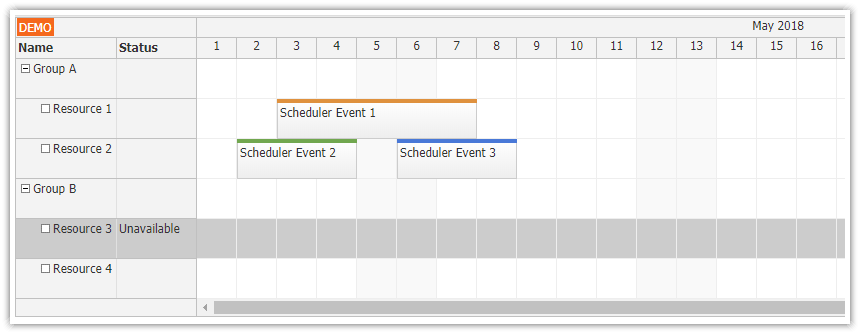
}Row Header Columns with Resource Details

Now we can start adding more properties to the Scheduler config to enable additional features.
In the first step, we will define row header columns which can display detailed information for resources.
Our example defines two columns:
“Name” - this column displays the default resource name (as defined using
nameproperty)“Capacity” - this is a custom column that uses data from a
capacityproperty
Note that if you add a sort property the Scheduler component will enable row sorting and users will be able to change the row order using sort icons in the column header. The sort value points to a field of the data source (resource object) that will be used to determine the order. It can be the same value that is displayed in the column (like in this example) or it can be a different field. That is helpful when you display a formatted value (such as a number or currency).
config = signal<DayPilot.SchedulerConfig>({
  rowHeaderColumns: [
    {text: "Name", display: "name", sort: "name"},
    {text: "Capacity", display: "capacity", sort: "capacity"}
  ],
  // ...
});
Context Menu for Scheduler Events

The Scheduler can display a context menu for events where you can define common actions, such as “Edit”, “Delete”, and “Assign”.
The contextMenu property defines the menu items. The onBeforeEventRender handler adds a hover icon that opens the same menu using action: "ContextMenu".
We will also add a hover icon as a hint that the context menu is available. Users will be able to open the context menu by right-clicking the event or by clicking the menu icon.
config = signal<DayPilot.SchedulerConfig>({
  contextMenu: new DayPilot.Menu({
    items: [
      { text: "Edit...",
        onClick: async args => {
          const e = args.source;
          this.editEvent(e);
        }
      },
      { text: "Delete",
        onClick: args => {
          const e = args.source;
          this.scheduler.control.events.remove(e);
        }
      }
    ]
  }),
  onBeforeEventRender: args => {
    args.data.areas = [
      {
        right: 5,
        top: 10,
        width: 16,
        height: 16,
        symbol: "/icons/daypilot.svg#minichevron-down-2",
        fontColor: "#aaa",
        backColor: "#fff",
        action: "ContextMenu",
        style: "border: 1px solid #aaa; border-radius: 50%;",
        visibility: "Hover"
      }
    ];
  },
  // ...
});
Modal Dialog with Scheduler Event Details

To edit the event details, you can use a customizable modal form provided by the DayPilot.Modal.form() method. It lets you define custom fields and their mappings to the Angular Scheduler event object.
The onEventClick handler opens the same editEvent() method that is used by the context menu. The form contains a Name field mapped to text and a Description field mapped to description. When the modal is submitted, events.update() applies the changed event data.
config = signal<DayPilot.SchedulerConfig>({
  onEventClick: args => {
    this.editEvent(args.e);
  },
  // ...
});

async editEvent(e: DayPilot.Event): Promise<void> {
  const form = [
    { name: "Name", id: "text", type: "text"},
    { name: "Description", id: "description", type: "textarea"}
  ];
  const modal = await DayPilot.Modal.form(form, e.data);
  if (modal.canceled) {
    return;
  }
  const updated = modal.result;
  this.scheduler.control.events.update(updated);
}
Callout with Event Description

The Angular 22 Scheduler component also provides a way to show more event details. The event bubble can display custom HTML on hover.
The easiest way to define the tooltip content is to add a bubbleHtml property directly to the event data object (you can generate it on the server side or using the onBeforeEventRender event handler).
The callout HTML can also be generated dynamically right before the bubble is displayed using the onLoad method.
This example simply displays the value of the description property but you can use the onLoad method to load the data from the server using an HTTP call.
config = signal<DayPilot.SchedulerConfig>({
  eventHoverHandling: "Bubble",
  bubble: new DayPilot.Bubble({
    onLoad: args => {
      args.html = DayPilot.Util.escapeHtml(args.source.data.description || "");
    }
  }),
  // ...
});
Angular Data Service
The DataService class defines the data access methods:
getEvents()- returns anObservablethat provides an array with Scheduler event datagetResources()- returns anObservablethat provides an array with Scheduler resource data
As we mentioned above, this example defines the data statically. In your Angular application, you will need to update the methods to make an HTTP call to a service that loads the data from a database.
import {Injectable} from '@angular/core';
import {DayPilot} from 'daypilot-pro-angular';
import {HttpClient} from '@angular/common/http';
import {Observable} from 'rxjs';

@Injectable()
export class DataService {

  resources: DayPilot.ResourceData[] = [
    {
      name: 'Group A', id: 'GA', expanded: true, children: [
        {name: 'Resource 1', id: 'R1', capacity: 10},
        {name: 'Resource 2', id: 'R2', capacity: 30},
        {name: 'Resource 3', id: 'R3', capacity: 20},
        {name: 'Resource 4', id: 'R4', capacity: 40}
      ]
    },
    {
      name: 'Group B', id: 'GB', expanded: true, children: [
        {name: 'Resource 5', id: 'R5', capacity: 20},
        {name: 'Resource 6', id: 'R6', capacity: 40},
        {name: 'Resource 7', id: 'R7', capacity: 20},
        {name: 'Resource 8', id: 'R8', capacity: 40}
      ]
    }
  ];

  events: DayPilot.EventData[] = [
    {
      id: '1',
      resource: 'R1',
      start: '2026-10-03',
      end: '2026-10-08',
      text: 'Scheduler Event 1',
      barColor: '#e69138',
      description: 'Resource 1 scheduled maintenance.'
    },
    {
      id: '2',
      resource: 'R3',
      start: '2026-10-02',
      end: '2026-10-05',
      text: 'Scheduler Event 2',
      barColor: '#6aa84f',
      description: 'Resource 3 availability review.'
    },
    {
      id: '3',
      resource: 'R3',
      start: '2026-10-06',
      end: '2026-10-09',
      text: 'Scheduler Event 3',
      barColor: '#3c78d8',
      description: 'Resource 3 follow-up task.'
    }
  ];

  constructor(private http: HttpClient) {
  }

  getEvents(from: DayPilot.Date, to: DayPilot.Date): Observable<any[]> {

    // simulating an HTTP request
    return new Observable(observer => {
      setTimeout(() => {
        observer.next(this.events);
      }, 200);
    });

    // return this.http.get("/api/events?from=" + from.toString() + "&to=" + to.toString());
  }

  getResources(): Observable<any[]> {

    // simulating an HTTP request
    return new Observable(observer => {
      setTimeout(() => {
        observer.next(this.resources);
      }, 200);
    });

    // return this.http.get("/api/resources");
  }

}
Package.json
The package.json file includes the standard dependencies as it was generated by Angular 22 CLI and also the daypilot-pro-angular package that is hosted at npm.daypilot.org.
{
  "name": "angular-scheduler-quick-start-project",
  "version": "0.0.0",
  "license": "SEE LICENSE IN LICENSE.md",
  "scripts": {
    "ng": "ng",
    "start": "ng serve",
    "build": "ng build",
    "watch": "ng build --watch --configuration development",
    "test": "ng test"
  },
  "private": true,
  "packageManager": "npm@11.6.4",
  "dependencies": {
    "@angular/common": "^22.0.0",
    "@angular/compiler": "^22.0.0",
    "@angular/core": "^22.0.0",
    "@angular/forms": "^22.0.0",
    "@angular/platform-browser": "^22.0.0",
    "@angular/router": "^22.0.0",
    "daypilot-pro-angular": "https://npm.daypilot.org/daypilot-pro-angular/trial/2026.2.6955.tar.gz",
    "rxjs": "~7.8.0",
    "tslib": "^2.3.0"
  },
  "devDependencies": {
    "@angular/build": "^22.0.1",
    "@angular/cli": "^22.0.1",
    "@angular/compiler-cli": "^22.0.0",
    "jsdom": "^28.0.0",
    "prettier": "^3.8.1",
    "typescript": "~6.0.2",
    "vitest": "^4.0.8"
  }
}