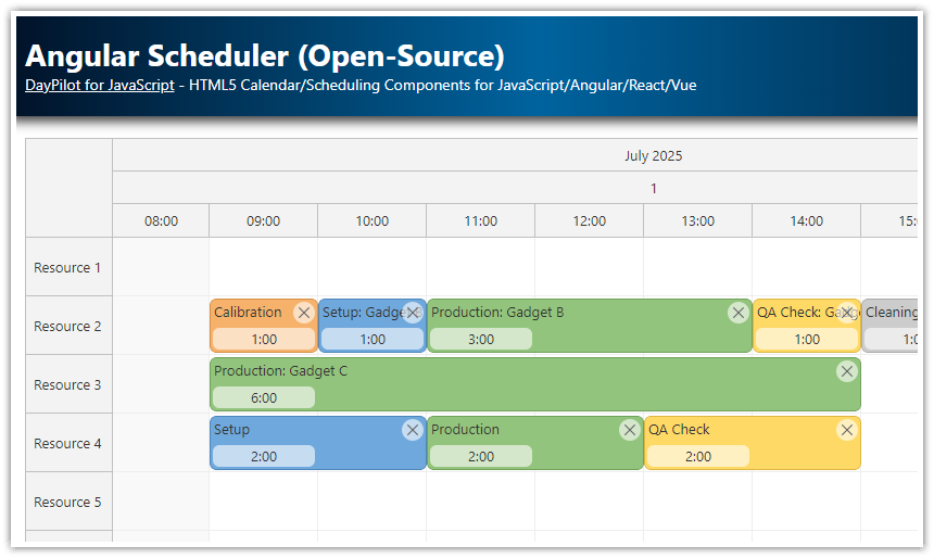
 DayPilot
")
Features
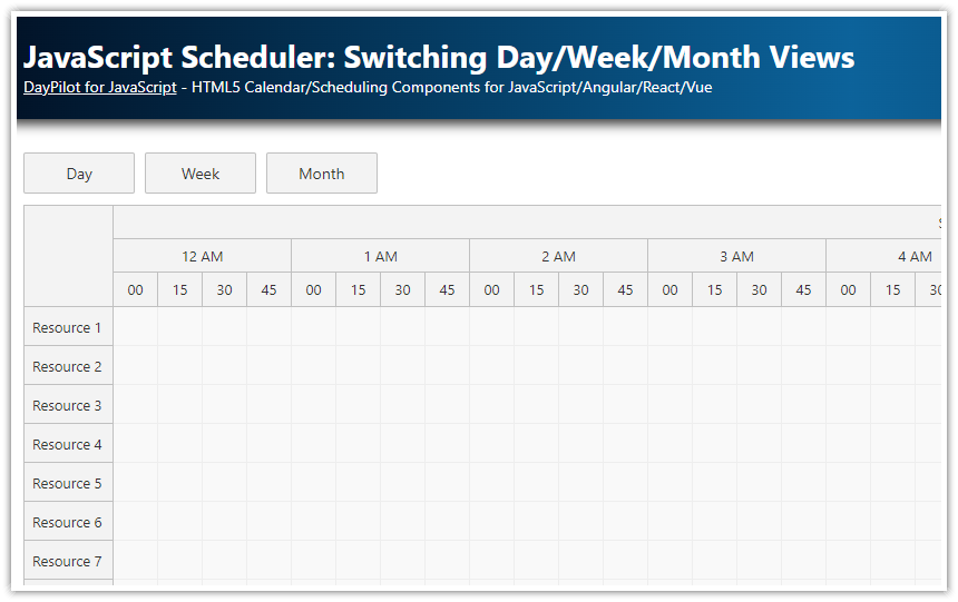
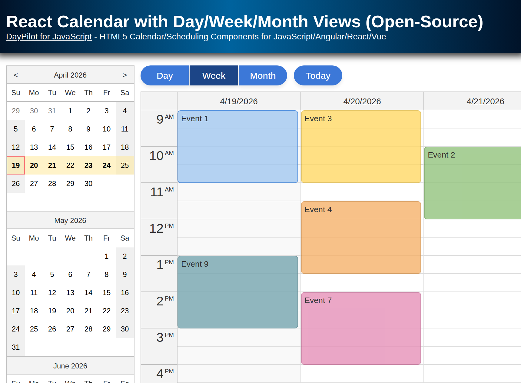
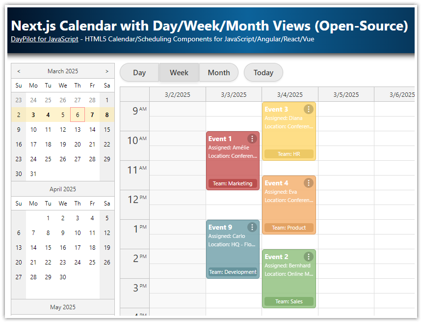
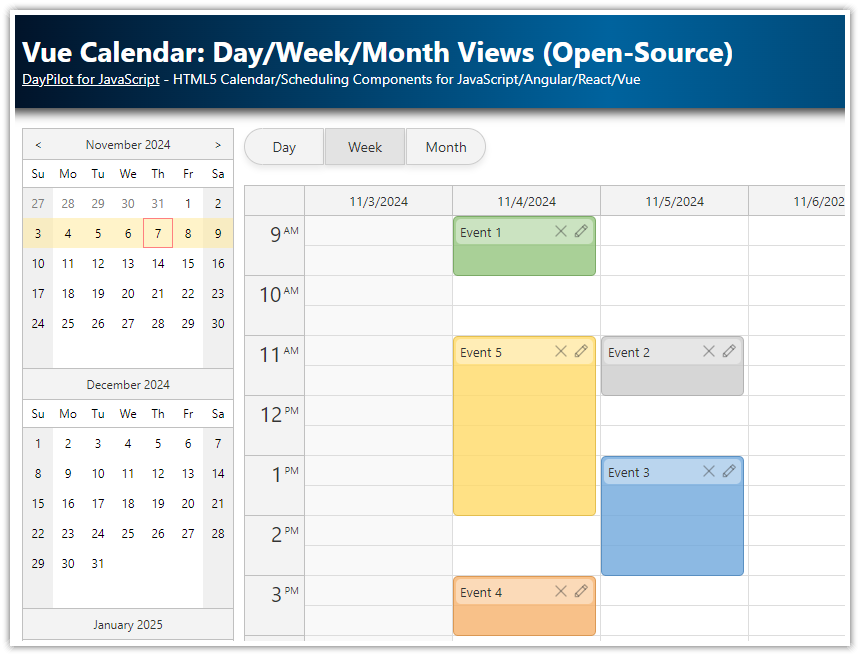
Create day, week and month calendar views.
Users can switch the view using buttons at the top of the page.
Each view is implemented using a special component - the components are displayed/hidden as needed.
A date picker displayed on the left side lets users change the visible date.
The selected date range is highlighted in the date picker.
The date picker highlights busy days using bold font.
All calendar components and the date picker share the same data source.
Built using Angular Calendar components from the free and open-source DayPilot Lite for JavaScript package.
New: Angular Calendar Component Configurator

You can configure the Angular calendar component using the visual UI Builder application. Use this WYSIWYG tool to customize the calendar properties and download a ready-to-run Angular project.
Angular calendar with multiple views and a date picker
We are going to create an Angular application that displays a calendar/scheduler with multiple views of the same data (daily, weekly, and monthly calendar). It follows the standard UI layout that you know from Google Calendar or Outlook.
Each calendar view will be represented by a standalone calendar component instance. When switching the view, the application displays the selected component hides the others. Each calendar component has its own configuration which lets you customize the behavior and appearance independently.
Our application will also display a date picker next to the main calendar view. It will let users switch the date. The date picker shows three months and once and highlights the current date selection (day, week, or month). It remembers the day that was clicked the last time - it will display the correct date when switching from the month view to the day view.
You can also extend your calendar application with additional features, such as undo/redo.
How to create a daily calendar in Angular?

To create a day-view calendar in our Angular application, we will use the Angular Calendar component from the open-source DayPilot package. This component can display a calendar with one or more days as columns.
The following example includes the basic configuration needed to display a daily calendar.
The template contains <daypilot-calendar> tag that displays the calendar component.
The day view loads the configuration from configDay object which is specified using the
configattribute.The calendar events are loaded from the events array (specified using the
[events]attribute).
The configDay object specifies the viewType ("Day" in this case). You can use this object to specify additional calendar properties and event handlers.
calendar.component.ts
import {Component, ViewChild, AfterViewInit} from "@angular/core";
import {
  DayPilot,
  DayPilotCalendarComponent
} from "@daypilot/daypilot-lite-angular";
import {DataService} from "./data.service";

@Component({
  selector: 'calendar-component',
  template: `
    <daypilot-calendar [config]="configDay" [events]="events" #day></daypilot-calendar>
  `
})
export class CalendarComponent implements AfterViewInit {

  @ViewChild("day") day!: DayPilotCalendarComponent;

  events = signal<DayPilot.EventData[]>([]);

  configDay = signal<DayPilot.CalendarConfig>({
    viewType: "Day"
  });

  constructor(private ds: DataService) {
  }

  ngAfterViewInit(): void {
    this.loadEvents();
  }

  loadEvents(): void {
    const from = this.day.control.visibleStart();
    const to = this.day.control.visibleEnd();
    this.ds.getEvents(from, to).subscribe(result => {
      this.events.set(result);
    });
  }

  // ...

}
How to create a weekly calendar in Angular?

The week-view calendar is very similar. We will use the same component that we used for the day view. This time we have switched it to display a weekly calendar.
The template contains <daypilot-calendar> tag that displays the Angular Calendar component.
The week view loads the configuration from configWeek object which is specified using "config" attribute.
The events are loaded from events array (specified using "events" attribute).
The configWeek object is also very simple - it only specifies the viewType property ("Week").
Note that we have used the same events object. This means the data for both calendar views will be updated automatically when you load the new data set from the server.
calendar.component.ts
import {Component, ViewChild, AfterViewInit} from "@angular/core";
import {
  DayPilot,
  DayPilotCalendarComponent
} from "@daypilot/daypilot-lite-angular";
import {DataService} from "./data.service";

@Component({
  selector: 'calendar-component',
  template: `
    <daypilot-calendar [config]="configWeek" [events]="events" #week></daypilot-calendar>
  `
})
export class CalendarComponent implements AfterViewInit {

  @ViewChild("week") week!: DayPilotCalendarComponent;

  events = signal<DayPilot.EventData[]>([]);

  configWeek = signal<DayPilot.CalendarConfig>({
    viewType: "Week"
  });

  constructor(private ds: DataService) {
  }

  ngAfterViewInit(): void {
    this.loadEvents();
  }

  loadEvents(): void {
    const from = this.week.control.visibleStart();
    const to = this.week.control.visibleEnd();
    this.ds.getEvents(from, to).subscribe(result => {
      this.events.set(result);
    });
  }

  // ...

}
How to create a monthly calendar in Angular?

The month view is displayed using <daypilot-month> tag which adds the Angular monthly calendar component.
The config attribute specifies the config object (configMonth). The events attribute points to the same events object that we used for the day and week calendar components. Again, we are sharing the data and there is no need to load the events for the monthly calendar view separately.
calendar.component.ts
import {Component, ViewChild, AfterViewInit} from "@angular/core";
import {
  DayPilot,
  DayPilotMonthComponent
} from "@daypilot/daypilot-lite-angular";
import {DataService} from "./data.service";

@Component({
  selector: 'calendar-component',
  template: `
    <daypilot-month [config]="configMonth" [events]="events" #month></daypilot-month>
  `
})
export class CalendarComponent implements AfterViewInit {

  @ViewChild("month") month!: DayPilotMonthComponent;

  events = signal<DayPilot.EventData[]>([]);

  configMonth= signal<DayPilot.MonthConfig>({
  });

  constructor(private ds: DataService) {
  }

  ngAfterViewInit(): void {
    this.loadEvents();
  }

  loadEvents(): void {
    const from = this.month.control.visibleStart();
    const to = this.month.control.visibleEnd();
    this.ds.getEvents(from, to).subscribe(result => {
      this.events.set(result);
    });
  }

}
How to switch the calendar views?

In this step, we add buttons that will let users switch the current view. The calendar components can be hidden or displayed by setting the visible property of the config object.
In the next step, we will also highlight the selected button by applying selected CSS class.
calendar.component.ts
import {Component, ViewChild, AfterViewInit} from "@angular/core";
import {
  DayPilot,
  DayPilotCalendarComponent,
  DayPilotMonthComponent,
  DayPilotNavigatorComponent
} from "@daypilot/daypilot-lite-angular";
import {DataService} from "./data.service";

@Component({
  selector: 'calendar-component',
  template: `
    <div class="buttons">
        <button (click)="viewDay()">Day</button>
        <button (click)="viewWeek()">Week</button>
        <button (click)="viewMonth()">Month</button>
    </div>

    <daypilot-calendar [config]="configDay" [events]="events" #day></daypilot-calendar>
    <daypilot-calendar [config]="configWeek" [events]="events" #week></daypilot-calendar>
    <daypilot-month [config]="configMonth" [events]="events" #month></daypilot-month>
  `,
  styles: [`
  `]
})
export class CalendarComponent implements AfterViewInit {

  @ViewChild("day") day!: DayPilotCalendarComponent;
  @ViewChild("week") week!: DayPilotCalendarComponent;
  @ViewChild("month") month!: DayPilotMonthComponent;

  events: DayPilot.EventData[] = [];

  configDay = signal<DayPilot.CalendarConfig>({
  });

  configWeek = signal<DayPilot.CalendarConfig>({
    viewType: "Week"
  });

  configMonth = signal<DayPilot.MonthConfig>({
  });

  constructor(private ds: DataService) {
    this.viewWeek();
  }

  ngAfterViewInit(): void {
    // ...
  }

  viewDay():void {
    this.configDay.update(c => ({ ...c, visible: true }));
    this.configWeek.update(c => ({ ...c, visible: false }));
    this.configMonth.update(c => ({ ...c, visible: false }));
  }

  viewWeek():void {
    this.configDay.update(c => ({ ...c, visible: false }));
    this.configWeek.update(c => ({ ...c, visible: true }));
    this.configMonth.update(c => ({ ...c, visible: false }));
  }

  viewMonth():void {
    this.configDay.update(c => ({ ...c, visible: false }));
    this.configWeek.update(c => ({ ...c, visible: false }));
    this.configMonth.update(c => ({ ...c, visible: true }));
  }
}
How to add a date picker for switching the date?

The previous examples didn't specify any date to be displayed - by default all calendar components use today.
We want to let users choose a date to be displayed and so we will add a date picker using DayPilot Navigator component.
The navigator is added using <daypilot-navigator> tag:
<daypilot-navigator [config]="configNavigator" [events]="events" [(date)]="date" (dateChange)="changeDate($event)" #navigator></daypilot-navigator>The first two attributes ([config] and [events]) work the same way - they specify the config object and event data source, respectively.
The date picker exposes a date property and dateChange event that will let us specify the selected date and watch the changes.
The selected date will be always available as date property of our CalendarComponent class:
date = DayPilot.Date.today();This property lets us set the selected date (during the initial load or anytime later).
The changeDate() method updates the startDate property of all linked calendar components which changes the visible date:
changeDate(date: DayPilot.Date): void {
    this.configDay.update(cfg => ({...cfg,  startDate: date}));
    this.configWeek.update(cfg => ({...cfg, startDate: date}));
    this.configMonth.update(cfg => ({...cfg, startDate: date}));
}
Source Code
Here is the source code of our Angular application that displays a full calendar view with daily, weekly and monthly calendar.
You can download the Angular project using the link at the top of the article.
import {Component, ViewChild, AfterViewInit, signal} from "@angular/core";
import {
  DayPilot,
  DayPilotModule,
  DayPilotCalendarComponent,
  DayPilotMonthComponent,
  DayPilotNavigatorComponent
} from "@daypilot/daypilot-lite-angular";
import {DataService} from "./data.service";

@Component({
  selector: 'calendar-component',
  standalone: true,
  imports: [DayPilotModule],
  providers: [DataService],
  template: `
    <div class="container">
      <div class="navigator">
        <daypilot-navigator [config]="configNavigator" [events]="events" [(date)]="date"
                            (dateChange)="changeDate($event)" #navigator></daypilot-navigator>
      </div>
      <div class="content">
        <div class="buttons">
          <button (click)="viewDay()" [class.selected]="configNavigator().selectMode === 'Day'">Day</button>
          <button (click)="viewWeek()" [class.selected]="configNavigator().selectMode === 'Week'">Week</button>
          <button (click)="viewMonth()" [class.selected]="configNavigator().selectMode === 'Month'">Month</button>
        </div>

        <daypilot-calendar [config]="configDay" [events]="events" #day></daypilot-calendar>
        <daypilot-calendar [config]="configWeek" [events]="events" #week></daypilot-calendar>
        <daypilot-month [config]="configMonth" [events]="events" #month></daypilot-month>
      </div>
    </div>
  `,
  styles: [`
    .container {
      display: flex;
      flex-direction: row;
    }

    .navigator {
      margin-right: 10px;
    }

    .content {
      flex-grow: 1;
    }

    .buttons {
      margin-bottom: 10px;
      display: inline-flex;
    }

    button {
      background-color: #3c78d8;
      color: white;
      border: 0;
      padding: .5rem 1rem;
      width: 80px;
      font-size: 15px;
      font-weight: 500;
      cursor: pointer;
      margin-right: 1px;
      transition: all 0.2s;
      box-shadow: 0 4px 6px rgba(0, 0, 0, 0.08);
      box-sizing: border-box;
    }

    button:last-child {
      margin-right: 0;
    }

    button.selected {
      background-color: #1c4587;
      box-shadow: 0 3px 5px rgba(0, 0, 0, 0.1);
    }

    button:first-child {
      border-top-left-radius: 30px;
      border-bottom-left-radius: 30px;
    }

    button:last-child {
      border-top-right-radius: 30px;
      border-bottom-right-radius: 30px;
    }

    button:hover {
      background-color: #2f66c4;
      box-shadow: 0 5px 7px rgba(0, 0, 0, 0.1);
    }

    button:active {
      box-shadow: 0 2px 4px rgba(0, 0, 0, 0.1);
    }

  `]
})
export class CalendarComponent implements AfterViewInit {

  @ViewChild("day") day!: DayPilotCalendarComponent;
  @ViewChild("week") week!: DayPilotCalendarComponent;
  @ViewChild("month") month!: DayPilotMonthComponent;
  @ViewChild("navigator") nav!: DayPilotNavigatorComponent;

  date = DayPilot.Date.today();

  events = signal<DayPilot.EventData[]>([]);

  contextMenu = new DayPilot.Menu({
    items: [
      {
        text: "Delete",
        onClick: args => {
          const event = args.source;
          const dp = event.calendar;
          dp.events.remove(event);
        }
      },
      {
        text: "Edit...",
        onClick: async args => {
          const event = args.source;
          const dp = event.calendar;

          const modal = await DayPilot.Modal.prompt("Edit event text:", event.data.text);
          dp.clearSelection();
          if (!modal.result) {
            return;
          }
          event.data.text = modal.result;
          dp.events.update(event);
        }
      },
      {
        text: "-"
      },
      {
        text: "Red",
        onClick: args => {
          const event = args.source;
          const dp = event.calendar;
          event.data.backColor = DataService.colors.red;
          dp.events.update(event);
        }
      },
      {
        text: "Green",
        onClick: args => {
          const event = args.source;
          const dp = event.calendar;
          event.data.backColor = DataService.colors.green;

          dp.events.update(event);
        }
      },
      {
        text: "Blue",
        onClick: args => {
          const event = args.source;
          const dp = event.calendar;
          event.data.backColor = DataService.colors.blue;

          dp.events.update(event);
        }
      },
      {
        text: "Yellow",
        onClick: args => {
          const event = args.source;
          const dp = event.calendar;
          event.data.backColor = DataService.colors.yellow;

          dp.events.update(event);
        }
      },

      {
        text: "Gray",
        onClick: args => {
          const event = args.source;
          const dp = event.calendar;
          event.data.backColor = DataService.colors.gray;

          dp.events.update(event);
        }
      }
    ]
  });

  configNavigator = signal<DayPilot.NavigatorConfig>({
    showMonths: 3,
    cellWidth: 25,
    cellHeight: 25,
    onVisibleRangeChanged: args => {
      this.loadEvents();
    }
  });

  changeDate(date: DayPilot.Date): void {
    this.configDay.update(cfg => ({...cfg, startDate: date}));
    this.configWeek.update(cfg => ({...cfg, startDate: date}));
    this.configMonth.update(cfg => ({...cfg, startDate: date}));
  }

  configDay = signal<DayPilot.CalendarConfig>({
    durationBarVisible: false,
    contextMenu: this.contextMenu,
    onTimeRangeSelected: this.onTimeRangeSelected.bind(this),
    onBeforeEventRender: this.onBeforeEventRender.bind(this),
    onEventClick: this.onEventClick.bind(this),
  });

  configWeek = signal<DayPilot.CalendarConfig>({
    viewType: "Week",
    durationBarVisible: false,
    contextMenu: this.contextMenu,
    onTimeRangeSelected: this.onTimeRangeSelected.bind(this),
    onBeforeEventRender: this.onBeforeEventRender.bind(this),
    onEventClick: this.onEventClick.bind(this),
  });

  configMonth = signal<DayPilot.MonthConfig>({
    contextMenu: this.contextMenu,
    eventBarVisible: false,
    onTimeRangeSelected: this.onTimeRangeSelected.bind(this),
    onEventClick: this.onEventClick.bind(this),
  });

  constructor(private ds: DataService) {
    this.viewWeek();
  }

  ngAfterViewInit(): void {
    this.loadEvents();
  }

  loadEvents(): void {
    const from = this.nav.control.visibleStart();
    const to = this.nav.control.visibleEnd();
    this.ds.getEvents(from, to).subscribe(result => {
      this.events.set(result);
    });
  }

  viewDay(): void {
    this.configNavigator.update(c => ({...c, selectMode: "Day"}));
    this.configDay.update(c => ({...c, visible: true}));
    this.configWeek.update(c => ({...c, visible: false}));
    this.configMonth.update(c => ({...c, visible: false}));
  }

  viewWeek(): void {
    this.configNavigator.update(c => ({...c, selectMode: "Week"}));
    this.configDay.update(c => ({...c, visible: false}));
    this.configWeek.update(c => ({...c, visible: true}));
    this.configMonth.update(c => ({...c, visible: false}));

  }

  viewMonth(): void {
    this.configNavigator.update(c => ({...c, selectMode: "Month"}));
    this.configDay.update(c => ({...c, visible: false}));
    this.configWeek.update(c => ({...c, visible: false}));
    this.configMonth.update(c => ({...c, visible: true}));
  }

  onBeforeEventRender(args: any) {
    const dp = args.control;
    args.data.areas = [
      {
        top: 3,
        right: 3,
        width: 20,
        height: 20,
        symbol: "/icons/daypilot.svg#minichevron-down-2",
        fontColor: "#fff",
        toolTip: "Show context menu",
        action: "ContextMenu",
      },
      {
        top: 3,
        right: 25,
        width: 20,
        height: 20,
        symbol: "/icons/daypilot.svg#x-circle",
        fontColor: "#fff",
        action: "None",
        toolTip: "Delete event",
        onClick: async (args: any) => {
          dp.events.remove(args.source);
        }
      }
    ];

    args.data.areas.push({
      bottom: 5,
      left: 5,
      width: 36,
      height: 36,
      action: "None",
      image: `https://picsum.photos/36/36?random=${args.data.id}`,
      style: "border-radius: 50%; border: 2px solid #fff; overflow: hidden;",
    });
  }

  async onTimeRangeSelected(args: any) {
    const modal = await DayPilot.Modal.prompt("Create a new event:", "Event 1");
    const dp = args.control;
    dp.clearSelection();
    if (!modal.result) {
      return;
    }
    dp.events.add(new DayPilot.Event({
      start: args.start,
      end: args.end,
      id: DayPilot.guid(),
      text: modal.result
    }));
  }

  async onEventClick(args: any) {
    const form = [
      {name: "Text", id: "text"},
      {name: "Start", id: "start", dateFormat: "MM/dd/yyyy", type: "datetime"},
      {name: "End", id: "end", dateFormat: "MM/dd/yyyy", type: "datetime"},
      {name: "Color", id: "backColor", type: "select", options: this.ds.getColors()},
    ];

    const data = args.e.data;

    const modal = await DayPilot.Modal.form(form, data);

    if (modal.canceled) {
      return;
    }

    const dp = args.control;

    dp.events.update(modal.result);
  }

}
Here is the project package.json configuration:
{
  "name": "angular-calendar-day-week-month",
  "version": "0.0.0",
  "license": "Apache-2.0",
  "scripts": {
    "ng": "ng",
    "start": "ng serve",
    "build": "ng build",
    "watch": "ng build --watch --configuration development",
    "test": "ng test"
  },
  "prettier": {
    "printWidth": 100,
    "singleQuote": true,
    "overrides": [
      {
        "files": "*.html",
        "options": {
          "parser": "angular"
        }
      }
    ]
  },
  "private": true,
  "packageManager": "npm@11.6.4",
  "dependencies": {
    "@angular/common": "^21.0.0",
    "@angular/compiler": "^21.0.0",
    "@angular/core": "^21.0.0",
    "@angular/forms": "^21.0.0",
    "@angular/platform-browser": "^21.0.0",
    "@angular/router": "^21.0.0",
    "@daypilot/daypilot-lite-angular": "^5.0.0",
    "rxjs": "~7.8.0",
    "tslib": "^2.3.0"
  },
  "devDependencies": {
    "@angular/build": "^21.0.1",
    "@angular/cli": "^21.0.1",
    "@angular/compiler-cli": "^21.0.0",
    "jsdom": "^27.1.0",
    "typescript": "~5.9.2",
    "vitest": "^4.0.8"
  }
}