 DayPilot
Overview
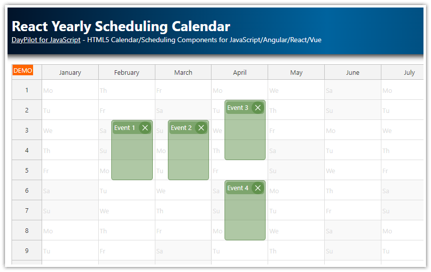
See how the React calendar component handles data for multiple resources.
The attached project lets you switch between several views: 5 columns, 50 columns, days/resources hierarchy, resources/days hierarchy, and groups/resources view.
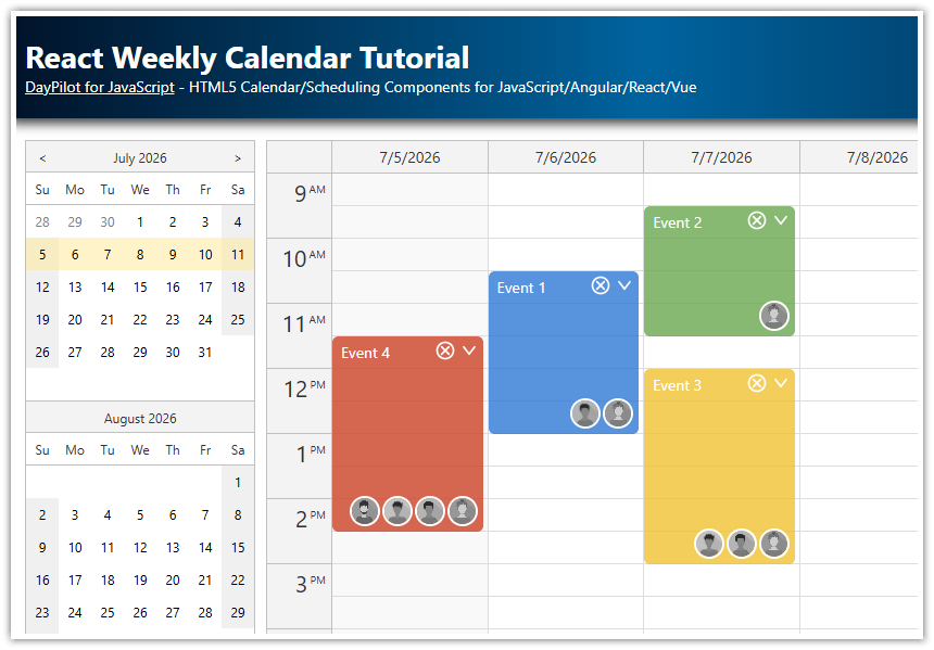
This tutorial explores the advanced configuration options - to see an introduction to using the event calendar in React, please see the React Weekly Calendar Tutorial.
The resource calendar is now also supported in the open-source version of DayPilot.
License
Licensed for testing and evaluation purposes. Please see the license agreement included in the sample project. You can use the source code of the tutorial if you are a licensed user of DayPilot Pro for JavaScript.
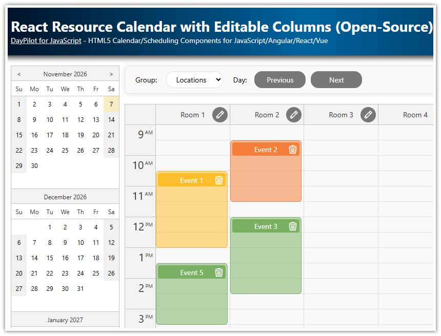
How to display resources as columns in the React calendar?

The React event calendar component can be switched to a resources view which displays custom resources instead of days as columns. The vertical axis displays up to 24 hours (the start and end time is customizable).
You can switch to the resources mode using viewType property (set the value to "Resources").
The column data can be specified using columns attribute. It holds an array of column objects:
Each column specifies the resource
id(string or number) andname(string). The name will be HTML-encoded automatically to prevent XSS attacks.Optionally, you can specify
startproperty (DayPilot.Date object or a string convertible toDayPilot.Date) which sets the day to be displayed in the column. If the start property is not specified, the column will display the day set using startDate property.
import React, {Component} from 'react';
import {DayPilot, DayPilotCalendar} from "daypilot-pro-react";

class Calendar extends Component {

  constructor(props) {
    super(props);
    this.state = {
      viewType: "Resources",
      columns = [
        { name: "Resource 1", id: "R1"},
        { name: "Resource 2", id: "R2"},
        { name: "Resource 3", id: "R3"},
        { name: "Resource 4", id: "R4"},
        { name: "Resource 5", id: "R5"}
      ]
    };
  }

  render() {
    const {...config} = this.state;
    return (
      <div>
        <DayPilotCalendar
          {...config}
          ref={component => {
            this.calendar = component && component.control;
          }}
        />
      </div>
    );
  }
}

export default Calendar;
The events to be displayed in the React resource calendar have to specify resource property in order to be displayed in the correct column.
this.setState({
  events: [
    {
      id: 1,
      text: "Event 1",
      start: "2021-07-02T10:00:00",
      end: "2021-07-02T12:00:00",
      resource: "R1"
    },
    // ...
  ]
});
How to display many resources in the React calendar?

By default, the column width is determined automatically and the React resource calendar fills the available horizontal space. This means the column width will decrease with the growing number of columns and the event data may become hard to read.
If you want to display a large number of columns in the React resource calendar, you can switch to the fixed-width column mode using columnWidthSpec property. That way, the resource calendar will use the width specified using columnWidth property. A horizontal scrollbar will be added if needed.
import React, {Component} from 'react';
import {DayPilot, DayPilotCalendar} from "daypilot-pro-react";

class Calendar extends Component {

  constructor(props) {
    super(props);
    this.state = {
      viewType: "Resources",
      // ..
    };
  }

  componentDidMount() {
    this.resources50();
  }

  resources50() {

    const columns = [];
    for (let i = 1 ; i <= 50; i++) {
      columns.push({
        id: i,
        name: `Resource ${i}`
      });
    }

    this.setState({
      columnWidthSpec: "Fixed",
      columnWidth: 100,
      columns,
      headerLevels: 1
    });
  }

  render() {
    const {...config} = this.state;
    return (
      <div>
        <DayPilotCalendar
          {...config}
          ref={component => {
            this.calendar = component && component.control;
          }}
        />
      </div>
    );
  }
}

export default Calendar;
Since version 2020.4.4807, the cells and events are rendered progressively during scrolling - the resource calendar will only draw cells and events that are in the current viewport. This means the calendar is able to display hundreds of events.
You can also use the React Scheduler component which uses switched axes. Resources are displayed on the vertical/y axis and timeline is displayed on the horizontal/x axis.
How to display multiple resources for each day?

The React resource calendar can display a hierarchy of columns. You can use this feature to display multiple resource columns for each day. This way your users will see the available of all resources side by side.
To show multiple resources for each day, it is necessary to specify the top-level columns (days) using columns property. The individual resources (child columns) can be specified using children property of each top-level column. The id and start properties are not required for the parent columns.
const columns = [
  { name: "July 11, 2021",
    children: [
      { name: "R 1", id: "R1", start: "2021-07-11"},
      { name: "R 2", id: "R2", start: "2021-07-11"},
      { name: "R 3", id: "R3", start: "2021-07-11"},
      { name: "R 4", id: "R4", start: "2021-07-11"}
    ]
  }
];
In addition to the column children, it’s also necessary to specify the header levels to be displayed using headerLevels property. To display two levels of the column hierarchy, set the value to 2.
import React, {Component} from 'react';
import {DayPilot, DayPilotCalendar} from "daypilot-pro-react";

class Calendar extends Component {

  constructor(props) {
    super(props);
    this.state = {
      viewType: "Resources",
      // ..
    };
  }

  componentDidMount() {
    this.daysResources();
  }

  daysResources() {

    const columns = [];

    for (let i = 0 ; i < 7; i++) {
      const start = DayPilot.Date.today().addDays(i);

      const day = {
        id: i,
        start,
        name: `${start.toString("MMMM d, yyyy")}`
      };

      day.children = [
        { name: "R 1", id: "R1", start},
        { name: "R 2", id: "R2", start},
        { name: "R 3", id: "R3", start},
        { name: "R 4", id: "R4", start}
      ];

      columns.push(day);

    }

    this.setState({
      columnWidthSpec: "Auto",
      columns,
      headerLevels: 2
    });
  }

  render() {
    const {...config} = this.state;
    return (
      <div>
        <DayPilotCalendar
          {...config}
          ref={component => {
            this.calendar = component && component.control;
          }}
        />
      </div>
    );
  }
}

export default Calendar;
How to display multiple days for each resource?

The column hierarchy feature of the React resource calendar is very flexible and it also lets you use an inverted hierarchy, with resources as parent columns and individual days as children.
const columns = [
  { name: "Resource 1",
    children: [
      { name: "July 11, 2021", id: "R1", start: "2021-07-11"},
      { name: "July 12, 2021", id: "R1", start: "2021-07-12"},
      { name: "July 13, 2021", id: "R1", start: "2021-07-13"},
      { name: "July 14, 2021", id: "R1", start: "2021-07-14"}
    ]
  }
];
Full example:
import React, {Component} from 'react';
import {DayPilot, DayPilotCalendar} from "daypilot-pro-react";
class Calendar extends Component {
constructor(props) {
super(props);
this.state = {
viewType: "Resources",
// ..
};
}
componentDidMount() {
this.resourcesDays();
}
resourcesDays() {
const columns = [
{ name: "Resource 1", id: "R1"},
{ name: "Resource 2", id: "R2"},
{ name: "Resource 3", id: "R3"},
{ name: "Resource 4", id: "R4"}
];
columns.forEach(col => {
col.children = [];
for (let i = 0 ; i < 7; i++) {
const start = DayPilot.Date.today().addDays(i);
const day = {
id: col.id,
start,
name: `${start.toString("ddd")}`
};
col.children.push(day);
}
});
this.setState({
columnWidthSpec: "Auto",
columns,
headerLevels: 2
});
}
render() {
const {...config} = this.state;
return (
<div>
<DayPilotCalendar
{...config}
ref={component => {
this.calendar = component && component.control;
}}
/>
</div>
);
}
}
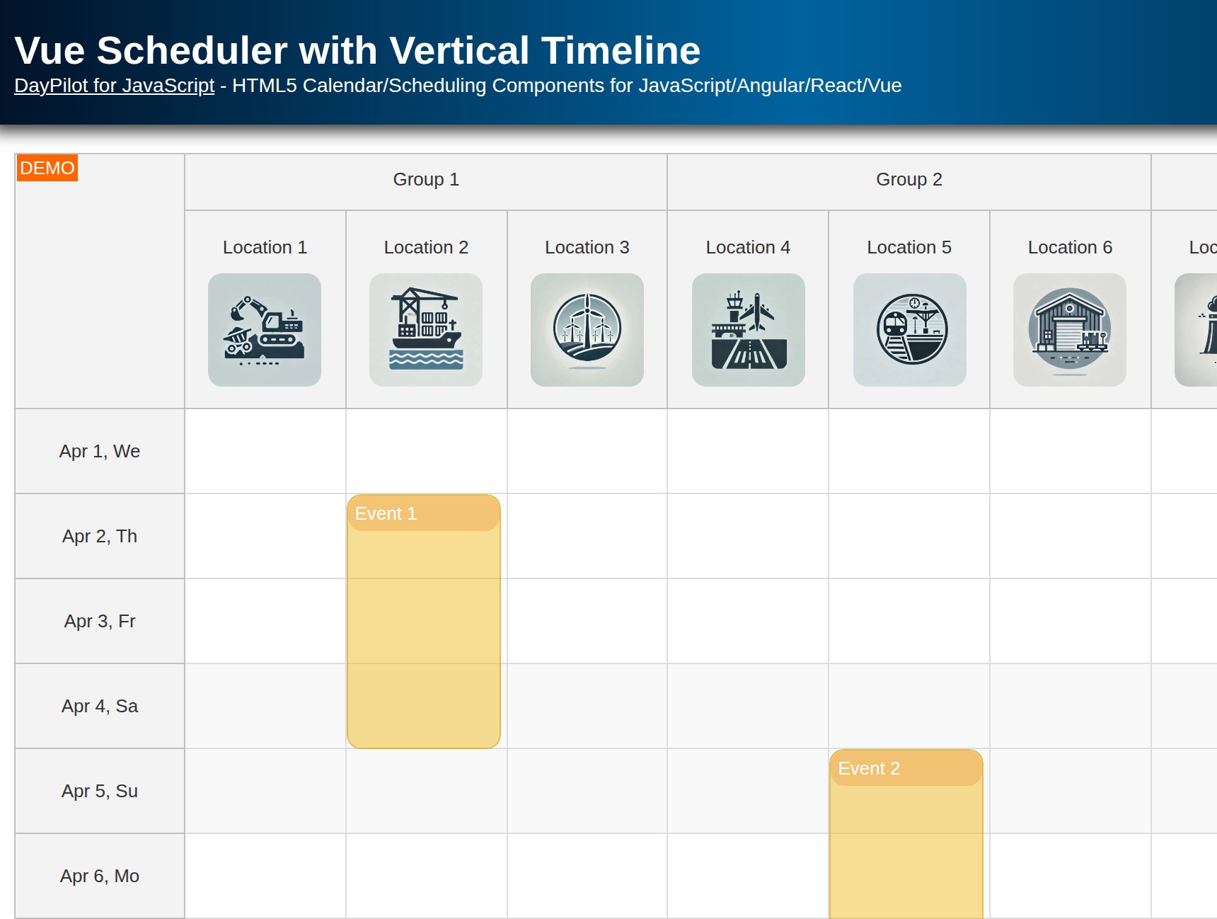
export default Calendar;How to group columns in the React resource calendar?

If you need to display many resources that are organized in groups, you can display resources groups as the top-level columns and the actual resources as children. In this view, the React resource calendar will display one day (set using startDate property) and you don’t need to specify the date for the columns:
import React, {Component} from 'react';
import {DayPilot, DayPilotCalendar} from "daypilot-pro-react";

class Calendar extends Component {

  constructor(props) {
    super(props);
    this.state = {
      viewType: "Resources",
      // ..
    };
  }

  componentDidMount() {
    this.resourcesGroups();
  }

  resourceGroups() {
    const columns = [
      { name: "Group 1", id: "G1", children: [
          { name: "Resource 1", id: "R1"},
          { name: "Resource 2", id: "R2"},
        ]},
      { name: "Group 2", id: "G2", children: [
          { name: "Resource 3", id: "R3"},
          { name: "Resource 4", id: "R4"}
        ]},
      { name: "Group 3", id: "G3", children: [
          { name: "Resource 5", id: "R5"},
          { name: "Resource 6", id: "R6"}
        ]},
      { name: "Group 4", id: "G4", children: [
          { name: "Resource 7", id: "R7"},
          { name: "Resource 8", id: "R8"}
        ]}
    ];

    this.setState({
      columnWidthSpec: "Auto",
      columns,
      headerLevels: 2
    });
  }

  render() {
    const {...config} = this.state;
    return (
      <div>
        <DayPilotCalendar
          {...config}
          ref={component => {
            this.calendar = component && component.control;
          }}
        />
      </div>
    );
  }
}

export default Calendar;