 DayPilot
Features
Vue 3 + Vite sample that integrates the DayPilot Vue Gantt Chart component from DayPilot Pro for JavaScript.
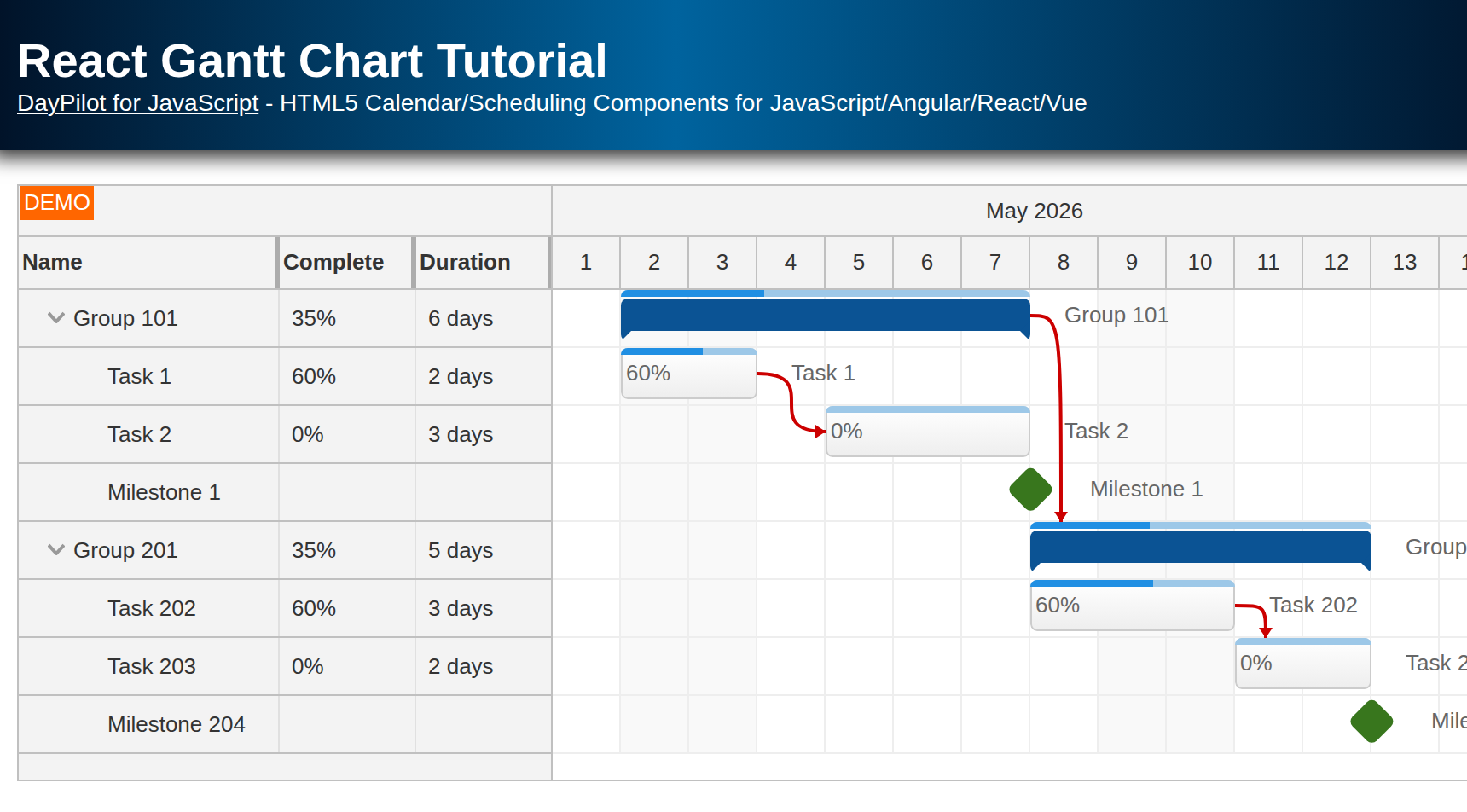
Current-month project plan with summary tasks, milestones, and Finish-to-Start dependency links.
Multi-column task list using row header columns for task name, lead, and status.
Demonstrates built-in row moving, task moving, link creating, and new-row creation with lightweight Vue handlers.
Shows both reactive Vue bindings and direct access to the underlying DayPilot.Gantt object.
License
Licensed for testing and evaluation purposes. See LICENSE.md in the sample project. You can use the source code from this tutorial if you are a licensed user of DayPilot Pro for JavaScript. Buy a license.
JavaScript Dependencies
Install the daypilot-pro-vue package from npm.daypilot.org. The current Vue integration options are also summarized in the Vue Gantt Chart documentation:
npm install https://npm.daypilot.org/daypilot-pro-vue/trial/2026.2.6903.tar.gzThe package contains both the DayPilot JavaScript library and the Vue wrapper components. In the downloadable sample, the dependency is already listed in package.json, so after cloning the project you only need a normal npm install.
This refreshed sample uses Vue 3.5 and Vite 7. The generated Vite shell is intentionally minimal, so the tutorial can focus on the Gantt-specific code in src/components/Gantt.vue instead of boilerplate startup files.
Running the Vue Project
Once the dependencies are installed, start the local development server:
npm install
npm run dev
The first working version should show the current month on the timeline, a task list on the left, summary bars for the three main phases, milestone diamonds, and dependency links connecting the sample schedule. Right after the initial load, the sample also displays a small startup message using the DayPilot API.

Vue Gantt Chart Component
The main tutorial code lives in src/components/Gantt.vue. The surrounding Vue shell is simple: App.vue just renders the Gantt component, and the generated Vite bootstrap mounts the app. That means almost all of the interesting frontend logic can stay in one place.
The wrapper component has four jobs:
render the
<DayPilotGantt>componentdefine the visible timeline and row-header structure
store the task and link arrays in reactive Vue refs
handle a few built-in editing events and expose the underlying DayPilot control when needed
The initial component shell looks like this:
<template>
  <DayPilotGantt
    ref="ganttRef"
    :columns="columns"
    cellWidthSpec="Fixed"
    :cellWidth="40"
    :timeHeaders="timeHeaders"
    scale="Day"
    :days="days"
    :startDate="startDate"
    :rowHeaderHideIconEnabled="false"
    rowMoveHandling="Update"
    @rowMoved="onRowMoved"
    :taskHeight="30"
    taskMoveHandling="Update"
    @taskMoved="onTaskMoved"
    linkCreateHandling="Update"
    @linkCreated="onLinkCreated"
    rowCreateHandling="Enabled"
    @rowCreate="onRowCreate"
    :tasks="tasks"
    :links="links"
  />
</template>

<script setup>
import { DayPilot, DayPilotGantt } from 'daypilot-pro-vue'
import { computed, nextTick, onMounted, ref } from 'vue'

const startDate = DayPilot.Date.today().firstDayOfMonth()
const days = DayPilot.Date.today().daysInMonth()
const ganttRef = ref(null)
const gantt = computed(() => ganttRef.value?.control ?? null)
const tasks = ref([])
const links = ref([])
const day = offset => startDate.addDays(offset)
</script>
This version uses inline Vue props on <DayPilotGantt> instead of keeping everything inside a single config object. That style fits Vue 3 well: the component template shows the Gantt configuration directly, while the reactive state stays in normal <script setup> variables.
The small day() helper is worth keeping. It lets the sample define readable relative dates such as day(5) or day(14) instead of repeating manual date construction throughout the task list.
Gantt Chart Configuration
Before loading any data, we need to define what part of the schedule will be visible and how dense the grid should be:

const startDate = DayPilot.Date.today().firstDayOfMonth()
const days = DayPilot.Date.today().daysInMonth()

const timeHeaders = [
  { groupBy: 'Month' },
  { groupBy: 'Day', format: 'd' }
]
<DayPilotGantt
cellWidthSpec="Fixed"
:cellWidth="40"
:timeHeaders="timeHeaders"
scale="Day"
:days="days"
:startDate="startDate"
:rowHeaderHideIconEnabled="false"
:taskHeight="30"
...
/>These settings define the overall shape of the chart:
startDateanddayslimit the visible range to the current month. That keeps the tutorial self-explanatory because the sample always opens on real, current dates.scale="Day"means one grid cell represents one day. For a project plan, that is a good default because the schedule stays readable without becoming too coarse.timeHeaderscreates a two-level header: month above, individual days below. This is a typical Gantt layout because it gives quick calendar context without wasting vertical space.cellWidthSpec="Fixed"together with:cellWidth="40"keeps the day columns consistent. That makes screenshots and visual comparisons easier and avoids the grid stretching differently with each viewport width.:taskHeight="30"gives the bars enough height for the sample labels and progress indicators without making the chart feel oversized.:rowHeaderHideIconEnabled="false"keeps the expand/collapse icons visible in the task list so the hierarchy is obvious.
The editing flags in the template, such as rowMoveHandling="Update" and taskMoveHandling="Update", turn on DayPilot's built-in interactions. We will come back to those after looking at the task and link data.
Row Header Columns
By default, the task list on the left only shows the task name. This sample adds two extra columns so the row header behaves more like a lightweight project table:
const columns = [
  { title: 'Task', width: 132, property: 'text' },
  { title: 'Lead', width: 76, property: 'owner' },
  { title: 'State', width: 74, property: 'status' }
]
The first column uses the built-in text field. The other two columns map to custom task properties, owner and status. This is a useful pattern for real project plans because the chart can show who owns a task and what stage it is in without opening a dialog or switching to another grid view.
The important detail is the property field. It tells the Gantt which value to read from each task object. As soon as the task data includes matching fields, the row header columns render them automatically.
Gantt Chart Configurator
If you want a running starter project before writing code manually, the Gantt Chart UI Builder can generate the initial Vue project structure for you.

That builder-generated structure is exactly what this refresh uses as its base. It gives you the correct package setup, the sample page shell, and the Vue component wrapper so you can focus on the article-specific logic instead of scaffolding.
Loading Gantt Chart Data
This tutorial keeps the data local, but it still uses the same reactive pattern that you would use with a REST API: store the data in Vue refs, then fill those refs after the component mounts.
onMounted(async () => {
  loadTasks()
  loadLinks()
  await nextTick()
  gantt.value?.message('Welcome!')
})
There are three things happening here:
loadTasks()fillstasks.valuewith the task hierarchy.loadLinks()fillslinks.valuewith the dependency definitions.await nextTick()waits until Vue has rendered the updated component tree, so the DayPilot control is ready before we call the imperativemessage()method.
In a real application, the same structure works with HTTP calls. Instead of assigning static arrays, you would fetch the data and then assign the server response to tasks.value and links.value.
If you prefer imperative control updates, the wrapped component still exposes the update() method through the template ref. For this sample, the reactive Vue approach is simpler and more idiomatic, so the article uses prop-driven updates as the primary pattern.
How to load Vue Gantt Chart tasks
The task list is stored in the format described by DayPilot.Task.data. The current sample uses three top-level phases, each with child rows that define the actual scheduled work:

const loadTasks = () => {
  tasks.value = [
    {
      id: 'planning',
      text: 'Planning',
      owner: 'Elena',
      status: 'Active',
      expanded: true,
      children: [
        {
          id: 'kickoff',
          start: day(0),
          end: day(2),
          text: 'Kickoff',
          owner: 'Elena',
          status: 'Done',
          complete: 100
        },
        {
          id: 'requirements',
          start: day(2),
          end: day(5),
          text: 'Requirements',
          owner: 'Marcus',
          status: 'Review',
          complete: 80
        },
        {
          id: 'approval',
          start: day(5),
          type: 'Milestone',
          text: 'Scope sign-off',
          owner: 'Sponsor',
          status: 'Next'
        }
      ]
    },
    // Design group omitted for brevity
    {
      id: 'launch-prep',
      text: 'Launch prep',
      owner: 'Priya',
      status: 'Next',
      expanded: true,
      children: [
        {
          id: 'qa',
          start: day(10),
          end: day(12),
          text: 'QA pass',
          owner: 'QA',
          status: 'Plan',
          complete: 20
        },
        // ...
        {
          id: 'launch-day',
          start: day(14),
          type: 'Milestone',
          text: 'Launch',
          owner: 'Ops',
          status: 'Next'
        }
      ]
    }
  ]
}
This structure illustrates several important Gantt concepts:
Parent rows such as
planning,design, andlaunch-prepdefine the hierarchy. They do not need explicitstartandendvalues because the Gantt calculates the summary bar from their children.The
childrenarrays hold the scheduled rows that actually define the phase duration.expanded: trueis a view-state choice. It tells the control to open the phase initially so readers can see the task breakdown immediately.Rows with
type: 'Milestone'use the milestone task type, which renders the diamond marker instead of a duration bar.completecontrols the progress indicator inside a normal task bar.The custom
ownerandstatusfields are not just extra JSON data. They are displayed directly in the row header columns described earlier.
The // ... marker simply shortens the article excerpt. The downloadable sample continues with the full Design group and the remaining Launch prep rows using the same task shape.
How to load task links
Task links are stored separately in the links array. Each item names the predecessor row, the successor row, and the dependency type:

const loadLinks = () => {
  links.value = [
    { from: 'kickoff', to: 'requirements', type: 'FinishToStart' },
    { from: 'planning', to: 'design', type: 'FinishToStart' },
    { from: 'wireframes', to: 'prototype', type: 'FinishToStart' },
    { from: 'design', to: 'launch-prep', type: 'FinishToStart' },
    { from: 'qa', to: 'content-freeze', type: 'FinishToStart' },
    { from: 'content-freeze', to: 'launch-day', type: 'FinishToStart' }
  ]
}
All links in this sample use the Finish-to-Start relationship, but they intentionally operate at more than one level:
kickoff -> requirementsandwireframes -> prototypeshow detailed task-to-task sequencing inside a phase.planning -> designanddesign -> launch-prepshow phase handoffs using the summary rows themselves. That is useful when the dependency is really between whole groups of work, not just one specific child task.content-freeze -> launch-daylinks a normal task to a milestone. That is a common scheduling pattern for approval, freeze, or release gates.
The important rule is that the values in from and to must match task IDs from the task array. Once the IDs line up, the Gantt draws the dependency arrows automatically through the bound :links prop.
Built-in Gantt interactions
The sample does not persist edits to a backend, but it still enables several built-in Gantt interactions so you can see how the Vue wrapper exposes them:
<DayPilotGantt
  rowMoveHandling="Update"
  @rowMoved="onRowMoved"
  taskMoveHandling="Update"
  @taskMoved="onTaskMoved"
  linkCreateHandling="Update"
  @linkCreated="onLinkCreated"
  rowCreateHandling="Enabled"
  @rowCreate="onRowCreate"
  ...
/>
const onRowMoved = args => {
args.control.message('Row moved: ' + args.source.text())
}
const onTaskMoved = args => {
args.control.message('Task moved to: ' + args.newStart)
}
const onLinkCreated = args => {
args.control.message('Link created, type: ' + args.type)
}
const onRowCreate = args => {
const start = args.control.startDate
tasks.value = [
...tasks.value,
{
id: DayPilot.guid(),
text: args.text,
start,
end: start.addDays(1),
owner: 'TBD',
status: 'New'
}
]
}This is intentionally lightweight. The sample uses messages to confirm the action instead of sending it to a server. That keeps the tutorial focused on the Vue integration points:
row moving changes the hierarchy or order and reports the moved row text
task moving reports the new start date
link creating reports the selected dependency type
row creating appends a new local task with default
ownerandstatusvalues so it fits the same row-header structure as the rest of the sample
The new-row handler also shows a practical detail: it uses args.control.startDate to seed a valid default range immediately, so the inserted task appears in a predictable place on the current timeline.
How to access the DayPilot.Gantt object
Most of the sample uses normal Vue bindings, but the wrapper also exposes the underlying DayPilot control through a template ref:
const ganttRef = ref(null)
const gantt = computed(() => ganttRef.value?.control ?? null)That gives you a simple rule of thumb:
use Vue refs and props for normal application state, such as
tasks,links, or configuration valuesuse the
DayPilot.Ganttinstance for imperative actions that are naturally command-like
The startup message is a small but realistic example:

gantt.value?.message('Welcome!')Because the same component also exposes the update() method and the rest of the DayPilot API through the same control reference, this pattern scales naturally if you later need imperative refreshes, scrolling, selection changes, or custom UI reactions.
Full Source Code
Here is the full current source of src/components/Gantt.vue:
<template>
<DayPilotGantt
ref="ganttRef"
:columns="columns"
cellWidthSpec="Fixed"
:cellWidth="40"
:timeHeaders="timeHeaders"
scale="Day"
:days="days"
:startDate="startDate"
:rowHeaderHideIconEnabled="false"
rowMoveHandling="Update"
@rowMoved="onRowMoved"
:taskHeight="30"
taskMoveHandling="Update"
@taskMoved="onTaskMoved"
linkCreateHandling="Update"
@linkCreated="onLinkCreated"
rowCreateHandling="Enabled"
@rowCreate="onRowCreate"
:tasks="tasks"
:links="links"
/>
</template>
<script setup>
import { DayPilot, DayPilotGantt } from 'daypilot-pro-vue'
import { computed, nextTick, onMounted, ref } from 'vue'
const startDate = DayPilot.Date.today().firstDayOfMonth()
const days = DayPilot.Date.today().daysInMonth()
const ganttRef = ref(null)
const gantt = computed(() => ganttRef.value?.control ?? null)
const tasks = ref([])
const links = ref([])
const day = offset => startDate.addDays(offset)
const columns = [
{ title: 'Task', width: 132, property: 'text' },
{ title: 'Lead', width: 76, property: 'owner' },
{ title: 'State', width: 74, property: 'status' }
]
const timeHeaders = [
{ groupBy: 'Month' },
{ groupBy: 'Day', format: 'd' }
]
const onRowMoved = args => {
  args.control.message('Row moved: ' + args.source.text())
}

const onTaskMoved = args => {
  args.control.message('Task moved to: ' + args.newStart)
}

const onLinkCreated = args => {
  args.control.message('Link created, type: ' + args.type)
}

const onRowCreate = args => {
  const start = args.control.startDate

  tasks.value = [
    ...tasks.value,
    {
      id: DayPilot.guid(),
      text: args.text,
      start,
      end: start.addDays(1),
      owner: 'TBD',
      status: 'New'
    }
  ]
}
const loadTasks = () => {
tasks.value = [
{
id: 'planning',
text: 'Planning',
owner: 'Elena',
status: 'Active',
expanded: true,
children: [
{
id: 'kickoff',
start: day(0),
end: day(2),
text: 'Kickoff',
owner: 'Elena',
status: 'Done',
complete: 100
},
{
id: 'requirements',
start: day(2),
end: day(5),
text: 'Requirements',
owner: 'Marcus',
status: 'Review',
complete: 80
},
{
id: 'approval',
start: day(5),
type: 'Milestone',
text: 'Scope sign-off',
owner: 'Sponsor',
status: 'Next'
}
]
},
{
id: 'design',
text: 'Design',
owner: 'Nina',
status: 'Next',
expanded: true,
children: [
{
id: 'wireframes',
start: day(5),
end: day(8),
text: 'Wireframes',
owner: 'Nina',
status: 'Ready',
complete: 65
},
{
id: 'prototype',
start: day(8),
end: day(10),
text: 'Prototype',
owner: 'Leo',
status: 'Queued',
complete: 35
},
{
id: 'design-review',
start: day(10),
type: 'Milestone',
text: 'Review',
owner: 'Review',
status: 'Next'
}
]
},
{
id: 'launch-prep',
text: 'Launch prep',
owner: 'Priya',
status: 'Next',
expanded: true,
children: [
{
id: 'qa',
start: day(10),
end: day(12),
text: 'QA pass',
owner: 'QA',
status: 'Plan',
complete: 20
},
{
id: 'content-freeze',
start: day(12),
end: day(14),
text: 'Freeze',
owner: 'Content',
status: 'Plan',
complete: 10
},
{
id: 'launch-day',
start: day(14),
type: 'Milestone',
text: 'Launch',
owner: 'Ops',
status: 'Next'
}
]
}
]
}
const loadLinks = () => {
links.value = [
{ from: 'kickoff', to: 'requirements', type: 'FinishToStart' },
{ from: 'planning', to: 'design', type: 'FinishToStart' },
{ from: 'wireframes', to: 'prototype', type: 'FinishToStart' },
{ from: 'design', to: 'launch-prep', type: 'FinishToStart' },
{ from: 'qa', to: 'content-freeze', type: 'FinishToStart' },
{ from: 'content-freeze', to: 'launch-day', type: 'FinishToStart' }
]
}
onMounted(async () => {
loadTasks()
loadLinks()
await nextTick()
gantt.value?.message('Welcome!')
})
</script>See Also
History
April 13, 2026: Updated the sample to Vue 3 + Vite, DayPilot Pro 2026.2.6903, prop-driven bindings, multi-column row headers, and an expanded tutorial structure.
August 9, 2021: Upgraded to DayPilot Pro 2021.3.5046
December 21, 2020: Upgraded to package-based project, Vue 2, DayPilot Pro 2020.4.4807
April 27, 2018: Initial release