 DayPilot
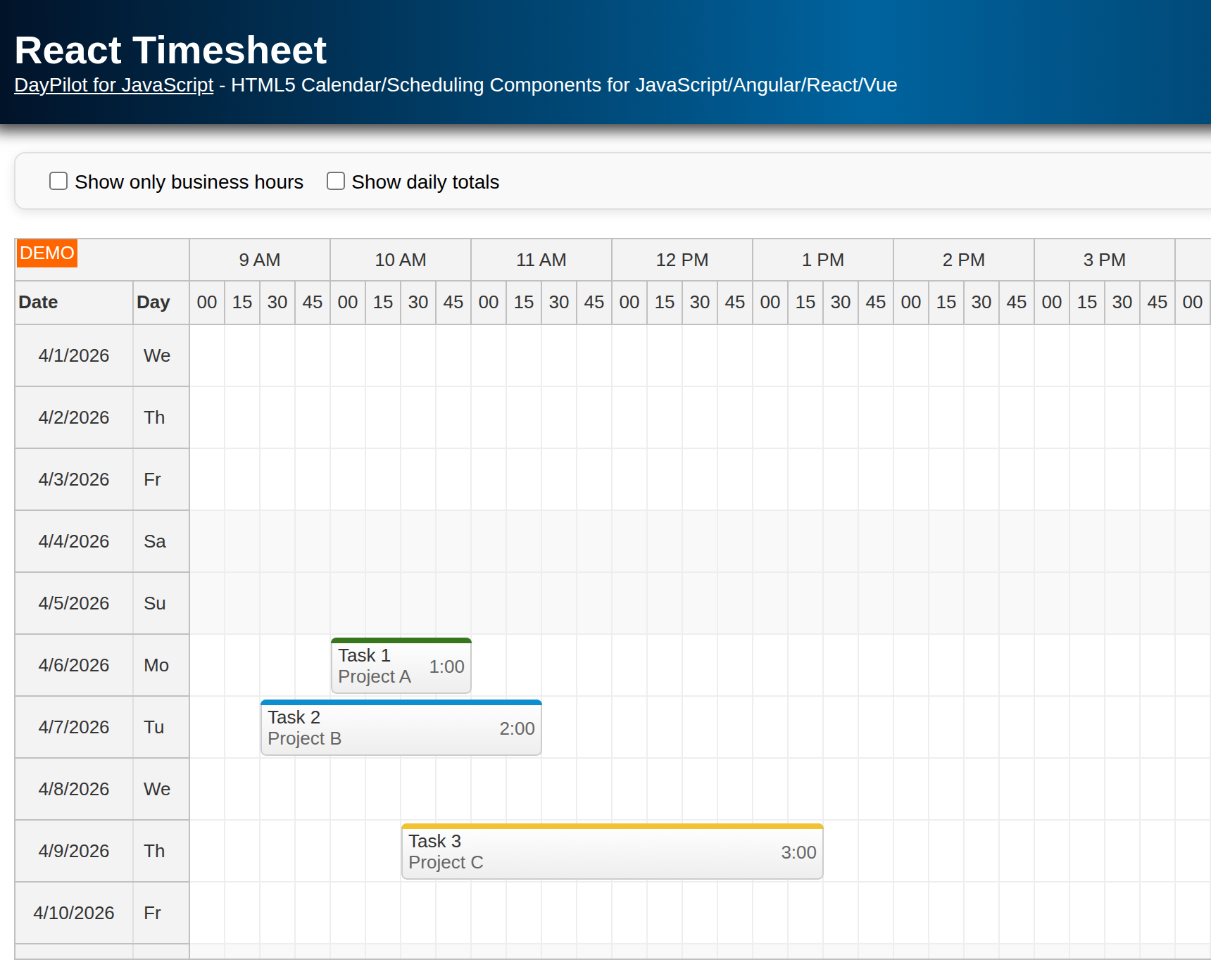
Overview
This is a simple React project that will let you explore features of the React Gantt Chart component from DayPilot Pro for JavaScript.
The project was generated using DayPilot UI Builder - an online application that lets you configure the Gantt Chart component and generate a new React project.
The Gantt Chart supports tasks, task groups, milestones, task dependencies, and percent-complete indicators.
The tasks can be moved using drag and drop, and new rows can be created directly in the Gantt chart.
License
Licensed for testing and evaluation purposes. Please see the license agreement included in the sample project. You can use the source code of the tutorial if you are a licensed user of DayPilot Pro for JavaScript.
React Gantt Chart Component

We will create a Gantt component that wraps the DayPilotGantt component and configures its appearance and behavior.
Before we can use the DayPilotGantt component, we need to install the daypilot-pro-react package from npm.daypilot.org:
npm install https://npm.daypilot.org/daypilot-pro-react/trial/2026.2.6907.tar.gz --saveThe first version of our component is very simple (src/gantt/Gantt.jsx):
import { DayPilotGantt } from "daypilot-pro-react";

const Gantt = () => {
  return (
    <div>
      <DayPilotGantt />
    </div>
  );
};

export default Gantt;
This code displays an empty Gantt chart without any configuration. Let's display a task in the current month:
import { DayPilot, DayPilotGantt } from "daypilot-pro-react";

const Gantt = () => {
  const today = DayPilot.Date.today();
  const startDate = today.firstDayOfMonth();

  return (
    <div>
      <DayPilotGantt
        startDate={startDate}
        days={today.daysInMonth()}
        tasks={[
          {
            id: 1,
            text: "Task 1",
            start: startDate.addDays(3),
            end: startDate.addDays(10)
          }
        ]}
      />
    </div>
  );
};

export default Gantt;
Our application now displays a minimal Gantt chart with a single task:

The tasks are defined using the tasks={} attribute of the <DayPilotGantt> tag.
The structure of the data object is defined in the API docs (see DayPilot.Task.data).
We define four basic properties:
id- task IDtext- task name to be displayed in the Gantt chartstart- task start (DayPilot.Date object or ISO 8601 date/time string)end- task end (DayPilot.Date object or ISO 8601 date/time string)
These properties define the task identity and position - they are required to display the task in the Gantt chart.
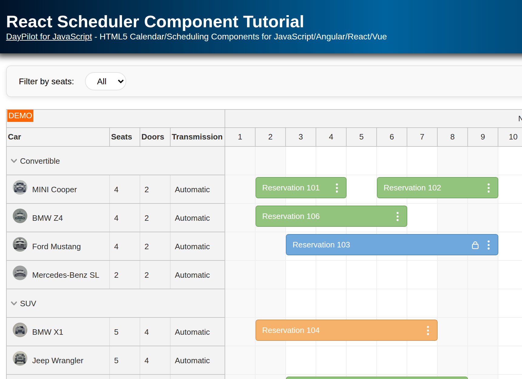
Each task will be displayed in a separate row. The task names (and possibly additional properties) are displayed in the row headers on the left side. The task date/time position is displayed in the time grid as well. If you need to display multiple tasks in the same row, you can check the React Scheduler component, which allows greater flexibility in the task display.
The startDate and days properties define the grid start and end. In our example, we display the current month, starting on the first day of the month.
Let's add another task now and a link that highlights the dependency between them:
import { DayPilot, DayPilotGantt } from "daypilot-pro-react";

const Gantt = () => {
  const today = DayPilot.Date.today();
  const startDate = today.firstDayOfMonth();

  return (
    <div>
      <DayPilotGantt
        startDate={startDate}
        days={today.daysInMonth()}
        tasks={[
          {
            id: 1,
            text: "Task 1",
            start: startDate.addDays(3),
            end: startDate.addDays(9)
          },
          {
            id: 2,
            text: "Task 2",
            start: startDate.addDays(9),
            end: startDate.addDays(15)
          }
        ]}
        links={[
          { from: 1, to: 2, type: "FinishToStart" }
        ]}
      />
    </div>
  );
};

export default Gantt;
And the result:
Gantt Chart Configuration
In the previous examples, we have defined the Gantt chart properties directly using the component attributes.
In the full component, we will move the dynamic timeline and data to React state variables (timeline, tasks, and links) and keep the Gantt chart options as inline props on DayPilotGantt.
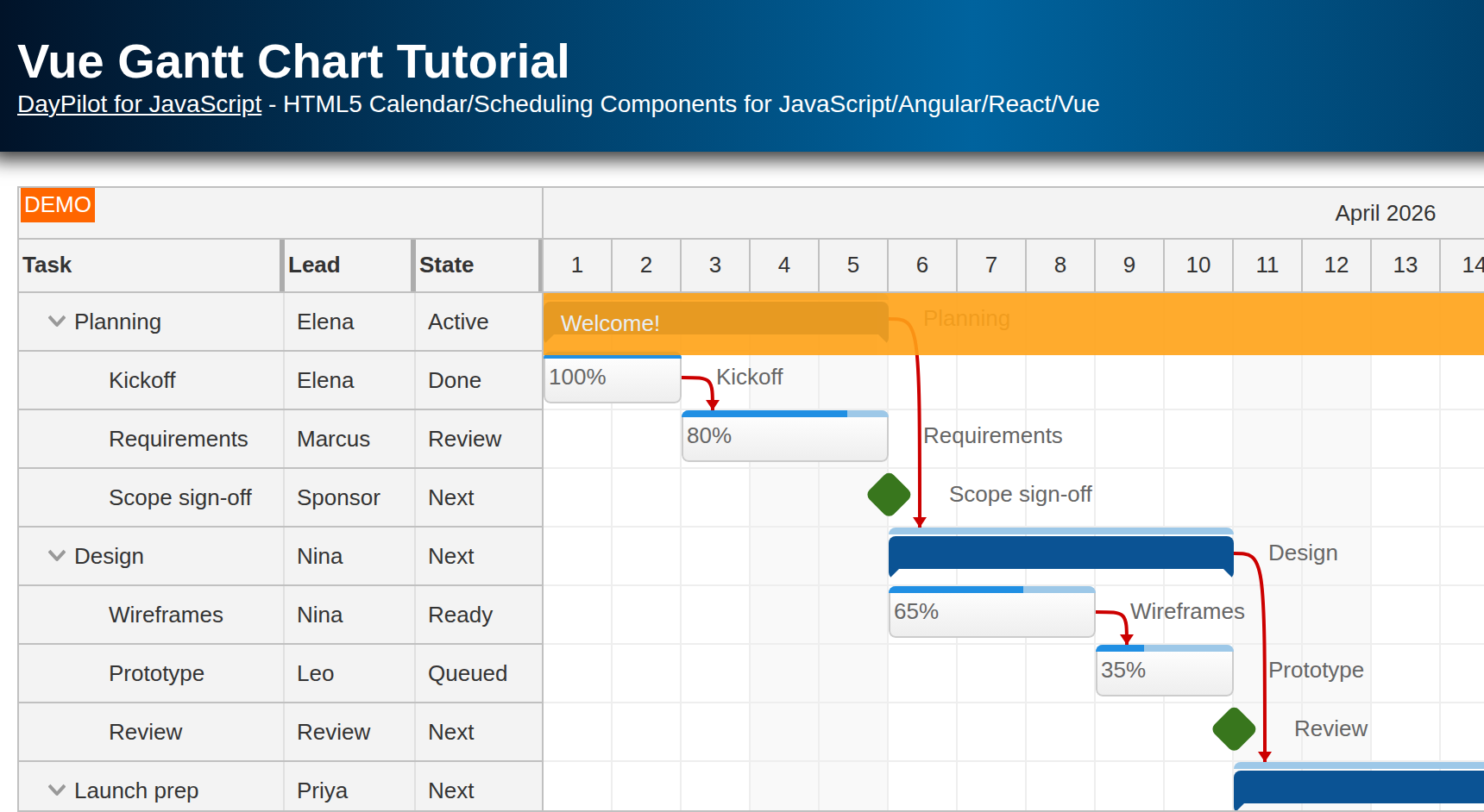
We will also add a complete property to our task records (it sets the task progress bar value), group related tasks under parent rows, and add milestone records (type: "Milestone").
const [timeline] = useState(() => {
  const today = DayPilot.Date.today();
  return {
    startDate: today.firstDayOfMonth(),
    days: today.daysInMonth()
  };
});

const [tasks] = useState(() => [
  {
    id: 101,
    text: "Group 101",
    complete: 35,
    children: [
      {
        id: 102,
        text: "Task 1",
        start: timeline.startDate.addDays(1),
        end: timeline.startDate.addDays(3),
        complete: 60
      },
      // ...
      {
        id: 104,
        text: "Milestone 1",
        type: "Milestone",
        start: timeline.startDate.addDays(7)
      }
    ]
  }
]);

const [links] = useState([
  { from: 102, to: 103, type: "FinishToStart" },
  { from: 202, to: 203, type: "FinishToStart" },
  { from: 101, to: 201, type: "FinishToStart" }
]);
The date values are calculated from DayPilot.Date.today(), so the sample opens on the current month instead of relying on a fixed demo year.
Our updated Gantt chart displays task groups, progress bars, dependency links, and milestones:

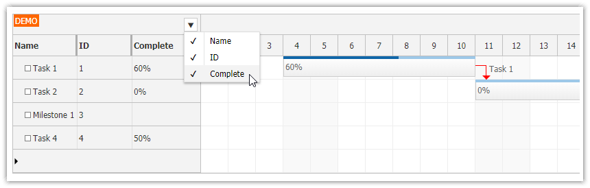
Row Header Columns with Additional Task Data

In this step, we will customize the row headers of the Gantt chart component to display some more columns in addition to the task name:
Progress
Duration
The row header columns can be defined using the columns property:
const columns = [
  { name: "Name", property: "text" },
  { name: "Complete" },
  { name: "Duration" }
];
The name property specifies the column name that will be displayed in the title. The property value specifies the property of the task that will be used for cell content in each row.
The "Complete" and "Duration" columns will require additional formatting, so we don't specify the property for them. Instead, we will use onBeforeRowHeaderRender to define the cell content:
const onBeforeRowHeaderRender = (args) => {
  if (args.task.type() !== "Milestone") {
    args.row.columns[1].html = args.task.data.complete + "%";
    args.row.columns[2].html = args.task.duration().totalDays() + " days";
  }
};
You can use this feature to display additional task details in the Gantt chart, such as ID, task owner, priority, and so on.
Full Source Code
Here is the full source code of our React Gantt Chart component:
import React, { useState } from "react";
import { DayPilot, DayPilotGantt } from "daypilot-pro-react";

const Gantt = () => {
  const [timeline] = useState(() => {
    const today = DayPilot.Date.today();
    return {
      startDate: today.firstDayOfMonth(),
      days: today.daysInMonth()
    };
  });

  const [tasks] = useState(() => [
    {
      id: 101,
      text: "Group 101",
      complete: 35,
      children: [
        {
          id: 102,
          text: "Task 1",
          start: timeline.startDate.addDays(1),
          end: timeline.startDate.addDays(3),
          complete: 60
        },
        {
          id: 103,
          text: "Task 2",
          start: timeline.startDate.addDays(4),
          end: timeline.startDate.addDays(7),
          complete: 0
        },
        {
          id: 104,
          text: "Milestone 1",
          type: "Milestone",
          start: timeline.startDate.addDays(7)
        }
      ]
    },
    {
      id: 201,
      text: "Group 201",
      complete: 35,
      children: [
        {
          id: 202,
          text: "Task 202",
          start: timeline.startDate.addDays(7),
          end: timeline.startDate.addDays(10),
          complete: 60
        },
        {
          id: 203,
          text: "Task 203",
          start: timeline.startDate.addDays(10),
          end: timeline.startDate.addDays(12),
          complete: 0
        },
        {
          id: 204,
          text: "Milestone 204",
          type: "Milestone",
          start: timeline.startDate.addDays(12)
        }
      ]
    }
  ]);

  const [links] = useState([
    { from: 102, to: 103, type: "FinishToStart" },
    { from: 202, to: 203, type: "FinishToStart" },
    { from: 101, to: 201, type: "FinishToStart" }
  ]);

  const columns = [
    { name: "Name", property: "text" },
    { name: "Complete" },
    { name: "Duration" }
  ];

  const onBeforeRowHeaderRender = (args) => {
    if (args.task.type() !== "Milestone") {
      args.row.columns[1].html = args.task.data.complete + "%";
      args.row.columns[2].html = args.task.duration().totalDays() + " days";
    }
  };

  const onRowMoved = (args) => {
    args.control.message("Row moved: " + args.source.text());
  };

  const onRowCreate = (args) => {
    const gantt = args.control;
    gantt.tasks.add({
      id: DayPilot.guid(),
      text: args.text,
      complete: 0,
      start: gantt.startDate,
      end: gantt.startDate.addDays(1)
    });
  };

  const onTaskMoved = (args) => {
    args.control.message("Task moved to: " + args.newStart);
  };

  const onLinkCreated = (args) => {
    args.control.message("Link created, type: " + args.type);
  };

  return (
    <div>
      <DayPilotGantt
        cellWidthSpec="Fixed"
        cellWidth={40}
        columns={columns}
        days={timeline.days}
        height={600}
        heightSpec="Max"
        linkCreateHandling="Update"
        links={links}
        onBeforeRowHeaderRender={onBeforeRowHeaderRender}
        onLinkCreated={onLinkCreated}
        onRowCreate={onRowCreate}
        onRowMoved={onRowMoved}
        onTaskMoved={onTaskMoved}
        rowCreateHandling="Enabled"
        rowHeaderHideIconEnabled={false}
        rowMoveHandling="Update"
        scale="Day"
        startDate={timeline.startDate}
        taskHeight={30}
        taskMoveHandling="Update"
        tasks={tasks}
        timeHeaders={[
          { groupBy: "Month" },
          { groupBy: "Day", format: "d" }
        ]}
      />
    </div>
  );
};

export default Gantt;
History
May 4, 2026: Upgraded to React 19, Vite, and DayPilot Pro 2026.2.6907; updated the sample to use current-month dates and inline React props.
July 23, 2024: Upgraded to React 18, DayPilot Pro 2024.3.5972, row header columns added.
December 5, 2020: Upgraded to DayPilot Pro for JavaScript 2020.4.4788, React 17.
October 3, 2019: Initial release, React 16.