 DayPilot
")
Overview
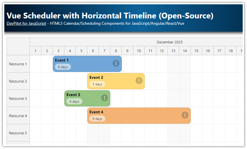
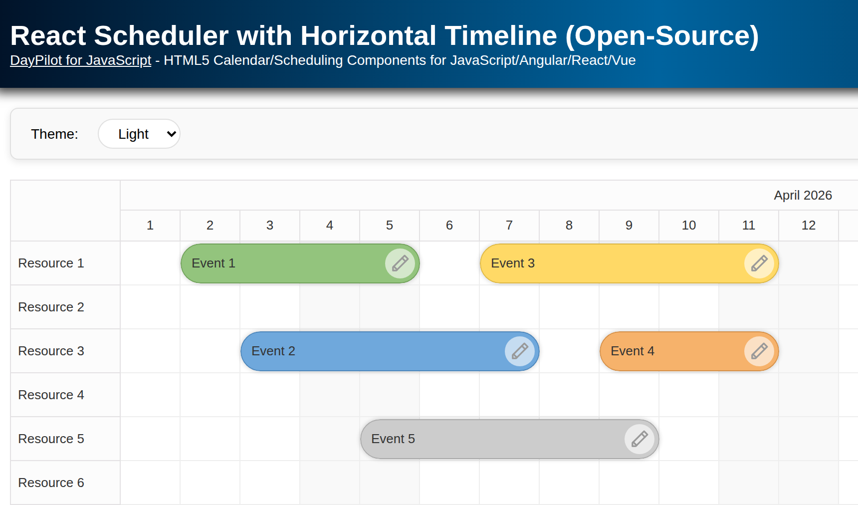
Horizontal timeline (hour/day/week/month/year) with multi-row time headers.
Rows representing resources (people, tools, locations, machines, trucks).
Built-in UI for create/move/resize/edit/delete.
A minimal toolbar for month switching that uses programmatic date chaning and scrolling.
Inline buttons/icons (3-dots menu, badges) implementd using event active areas.
Context menu with custom event actions.
Scheduler component optimized for big data (progressive row/event rendering).
Themeable via CSS.
This app uses the JavaScript Scheduler component from the open-source DayPilot Lite for JavaScript scheduling library.
Quick Start
To add the Scheduler component to your application, include the DayPilot library and add a container <div> element:
<script src="js/daypilot/daypilot-all.min.js"></script>

<div id="scheduler"></div>

<script>

  const scheduler = new DayPilot.Scheduler("scheduler");
  scheduler.init();

</script>
Tip: To create a quick proof of concept, you can use the UI Builder app and configure the Scheduler visually (timeline, headers, behavior). You can immediately see a live preview, and download a ready-to-run project (JavaScript/TypeScript/Angular/React/Vue).
Scheduler Timeline Configuration

We’ll configure the Scheduler to show a timeline for the current month in daily scale. The timeline can be configured using a combination of the following settings:
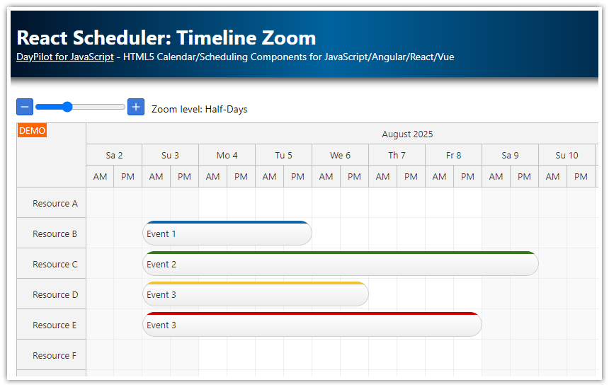
Scale
The time unit of each cell. Common values:"Hour","Day","Week","CellDuration"(custom number of minutes).Time headers
Stack multiple header rows (e.g., Month → Day) to keep the grid readable.Start date
The first visible column. Update it as users navigate.Length
How many days to render on the timeline.Cell width
Affects density and scrolling comfort; 60–100 px works well for daily views.
Let’s start with the following configuration:
<script>

  const scheduler = new DayPilot.Scheduler("scheduler", {
    timeHeaders: [{ groupBy: "Month" }, { groupBy: "Day", format: "d" }],
    scale: "Day",
    startDate: DayPilot.Date.today().firstDayOfMonth(),
    days: DayPilot.Date.today().daysInMonth(),
    cellWidth: 100,
  });
  scheduler.init();

</script>
Event Styling with Active Areas (Inline Icons & Actions)

The best way to style the events is to create a custom CSS theme (use the online Theme Designer to generate one).
In this project, we will stick to the default theme and only modify selected styles (such as event padding and event border radius) using special Scheduler properties.
const scheduler = new DayPilot.Scheduler("scheduler", {
  eventHeight: 40,
  eventBorderRadius: 20,
  eventPadding: 10,
  rowMarginTop: 2,
  rowMarginBottom: 2,
  durationBarVisible: false
});
scheduler.init();
To add elements to events and to modify the content depending on the event data, use the onBeforeEventRender event handler.
The Scheduler lets you add active areas to events - absolutely positioned elements with a defined appearance and actions. Active areas let you add custom actions, such as:
3-dots menu button in the top-right corner that opens the context menu (
action: "ContextMenu").Badges (e.g., duration or status) in corners.
Inline actions like delete or “open details”.
Active areas can display images in various formats (JPEG, PNG, SVG). DayPilot includes a bundled SVG icon set that you can browse and download.
Here we add a 3-dots icon that opens the context menu:
onBeforeEventRender: (args) => {
  const color = args.data.color || "#999999";
  args.data.backColor = color;
  args.data.fontColor = "white";
  args.data.borderColor = "darker";   // auto-derives a darker border

  args.data.areas = [{
    right: 6, top: 6, width: 28, height: 28, padding: 6,
    symbol: "icons/daypilot.svg#threedots-v", // SVG symbol from an icon sprite
    backColor: "#00000033",
    fontColor: "white",
    borderRadius: "50%",
    action: "ContextMenu"
  }];
}
The symbol property lets you pull an SVG icon from a sprite (e.g., daypilot.svg#threedots-v).
Context Menu (Edit / Duplicate / Delete)

Attach a DayPilot.Menu with items that use symbol, image, or icon. In this sample:
Edit… opens the built-in modal form.
Duplicate clones the event one day forward using
e.start().addDays(1).Delete removes it from the data set immediately.
contextMenu: new DayPilot.Menu({
  items: [
    { text: "Edit...",   symbol: "/icons/daypilot.svg#edit",  onClick: a => app.editEvent(a.source) },
    { text: "Duplicate", symbol: "/icons/daypilot.svg#copy",  onClick: a => {
        const e = a.source;
        scheduler.events.add({
          id: DayPilot.guid(),
          start: e.start().addDays(1),
          end: e.end().addDays(1),
          resource: e.resource(),
          text: e.text(),
          color: e.data.color
        });
      }
    },
    { text: "-" },
    { text: "Delete",    symbol: "/icons/daypilot.svg#trash", onClick: a => scheduler.events.remove(a.source) }
  ]
})
Tip: You can also tweak items dynamically with onShow (e.g., enable/disable per event).
Built-In Modal Form for Event Editing

DayPilot includes a modal form that lets you create modal dialogs programmatically. This is good for prototyping, and you can easily replace the built-in modal dialog with a different implementation. To create a modal form quickly, you can use the modal dialog builder.
Our app uses the following modal dialog that shows the event text, start, end, resource and color:
const app = {
  colors: [
    { name: "(default)", id: null },
    { name: "Blue",    id: "#6fa8dc" },
    { name: "Green",   id: "#93c47d" },
    { name: "Yellow",  id: "#ffd966" },
    { name: "Red",     id: "#f6b26b" }
  ],
  async editEvent(e) {
    const form = [
      { name: "Text", id: "text" },
      { name: "Start", id: "start", type: "datetime" },
      { name: "End", id: "end", type: "datetime" },
      { name: "Resource", id: "resource", type: "select", options: scheduler.resources },
      { name: "Color", id: "color", type: "select", options: app.colors }
    ];
    const modal = await DayPilot.Modal.form(form, e.data);
    if (!modal.canceled) scheduler.events.update(modal.result);
  }
};
Month Navigation (Prev / Today / Next)

The navigation toolbar displayed above the Scheduler displays three buttons for easy switching of the visible date:
Previous
Today
Next
We’ll add event handlers that compute a new month and call scheduler.update():
const ui = {
  prev: document.getElementById("prev"),
  today: document.getElementById("today"),
  next: document.getElementById("next")
};

ui.prev.onclick = () => {
  const d = scheduler.startDate.addMonths(-1);
  scheduler.update({ startDate: d, days: d.daysInMonth() });
};
ui.today.onclick = () => {
  const d = DayPilot.Date.today().firstDayOfMonth();
  scheduler.update({ startDate: d, days: d.daysInMonth() });
};
ui.next.onclick = () => {
  const d = scheduler.startDate.addMonths(1);
  scheduler.update({ startDate: d, days: d.daysInMonth() });
};
You can also use the Navigator component as a date picker for switching the date displayed by the Scheduler.
Load Resources & Events, then Scroll to a Date

To load row data, update the resources property of the JavaScript Scheduler. It’s an array of object that specify the row id and name:
const resources = [
  { name: "Resource 1", id: "R1" },
  { name: "Resource 2", id: "R2" },
  // ...
  { name: "Resource 9", id: "R9" }
];
Event objects need to define an id, start, end, text and resource properties:
const events = [
  { id: 1, start: first.addDays(2), end: first.addDays(4), text: "Event 1", resource: "R1" },
  { id: 2, start: first.addDays(2), end: first.addDays(6), text: "Event 2", resource: "R2", color: "#93c47d" },
  // ...
];
Here is our loadData() function that defines rows and events using simple static arrays. Both resources and events are loaded using a single update() call for improved performance:
function loadData() {
  const first = DayPilot.Date.today().firstDayOfMonth();

  const resources = [
    { name: "Resource 1", id: "R1" },
    { name: "Resource 2", id: "R2" },
    // ...
    { name: "Resource 9", id: "R9" }
  ];

  const events = [
    { id: 1, start: first.addDays(2), end: first.addDays(4), text: "Event 1", resource: "R1" },
    { id: 2, start: first.addDays(2), end: first.addDays(6), text: "Event 2", resource: "R2", color: "#93c47d" },
    // ...
  ];

  scheduler.update({ resources, events });
  scheduler.scrollTo(first.addDays(1));   // jump the viewport where you want
}
loadData();
The Scheduler uses progressive event rendering and progressive row rendering so only on-screen items are painted. You can tune debounce delays or switch to synchronous rendering if you’re dealing with smaller data.
Minimal Create/Move/Resize Handlers

To handle user actions, we definen the following event handlers:
onTimeRangeSelected: async (args) => {
  const modal = await DayPilot.Modal.prompt("Create a new event:", "Event 1");
  scheduler.clearSelection();
  if (modal.canceled) return;
  scheduler.events.add({
    id: DayPilot.guid(),
    start: args.start, end: args.end, resource: args.resource,
    text: modal.result
  });
},

onEventMoved:   (args) => console.log("Event moved:",   args.e.data),
onEventResized: (args) => console.log("Event resized:", args.e.data),
The default action for selecting a time range is not defined, and we need to implement the event creation logic in onTimeRangeSelected.
Our handlers opens a modal dialog and creates a new event with the defined text.
In our sample project, the drag-and-drop event moving and resizing handlers simply log the event to the JavaScript console.
Theming & Branding
You can apply a custom CSS theme to style the whole Scheduler component:
scheduler.update({ theme: "scheduler_rounded" }) // for exampleApply any CSS theme via the
themeproperty (several samples are included).For fastest results, generate a custom theme using the Theme Designer (live preview + download).
You can also theme companion components like the Navigator to match.