 DayPilot
Overview
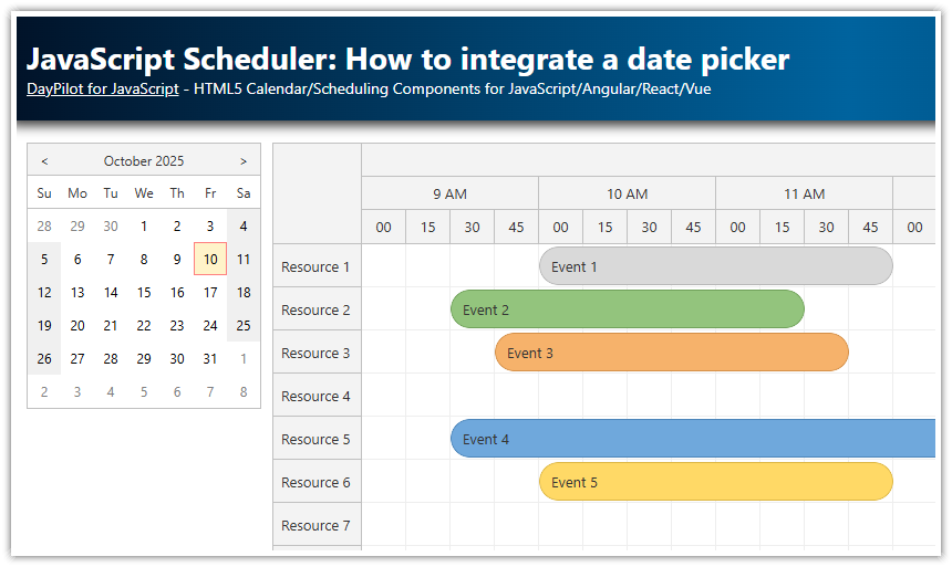
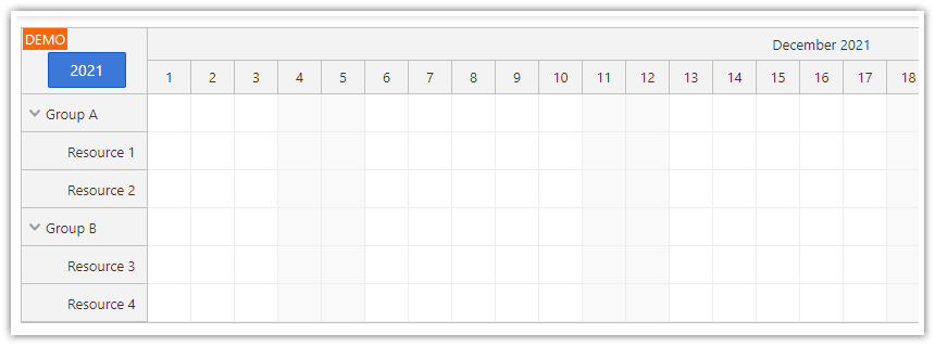
Add a calendar icon to the upper-left corner of the JavaScript Scheduler component.
Add an event handler that opens a popup date picker on click.
Update the timeline of the Scheduler when a new date is selected.
Built using the open-source DayPilot Lite for JavaScript scheduling library.
Adding a Calendar Icon to the Upper-Left Corner
We create an active area inside the scheduler’s upper-left corner header in onBeforeCornerRender.
Dimensions:
20 px × 20 px.Centering:
calc(50% - 10px)positions the icon in the middle of the 40 px‑high corner cell.Icon: an SVG symbol (
#calendar) from the DayPilot icon set (daypilot.svg) inherits the current text color, so it looks natural in both light and dark themes.Pointer cursor: so users know it is clickable.
const scheduler = new DayPilot.Scheduler("dp", {
  onBeforeCornerRender: args => {
    args.areas = [
      {
        top: "calc(50% - 10px)",
        left: "calc(50% - 10px)",
        width: 20,
        height: 20,
        style: "cursor: pointer",
        symbol: "icons/daypilot.svg#calendar",
        onClick: args => {}                     // we will open the date picker here
      }
    ];
  },
  // ...other configuration
});
scheduler.init();
Opening the Date Picker on Click
To handle the click event, we attach an onClick handler to the active area:
The date picker is anchored to the area by passing
target: args.originalEvent.currentTarget.We disable automatic reading/writing of the value with
resetTarget: falseso the icon itself is not overwritten by the selected date.The current scheduler
startDateis used as the initial selection.When the user clicks a day, we close the picker and call
scheduler.update({ startDate: args.start }), which updates the Scheduler range to start with the newly chosen date.
onClick: args => {
  const picker = new DayPilot.DatePicker({
    target: args.originalEvent.currentTarget,
    resetTarget: false,
    date: scheduler.startDate,
    onTimeRangeSelect: args => {
      args.preventDefault(); // keep the icon intact
      picker.close();
      scheduler.update({ startDate: args.start });
    }
  });
  picker.show();
}
Giving the Picker a Subtle Shadow
The default navigator component is flat. A little depth makes it stand out:
.navigator_default_main {
  box-shadow: 0px 0px 10px 2px rgba(0,0,0,0.2);
}
Full Source Code
Below is the complete example, including a minimal resource/event dataset so you can copy‑paste and run it immediately:
import {DayPilot} from "@daypilot/daypilot-lite-javascript";

const scheduler = new DayPilot.Scheduler("dp", {
  timeHeaders: [
    {groupBy: "Day", format:"MMMM d, yyyy"},
    {groupBy: "Hour", format: "h tt"}
  ],
  scale: "Hour",
  days: 7,
  startDate: DayPilot.Date.today(),
  cellWidth: 60,
  onTimeRangeSelected: async (args) => {
    const scheduler = args.control;
    const modal = await DayPilot.Modal.prompt("Create a new event:", "Event 1");
    scheduler.clearSelection();
    if (modal.canceled) { return; }
    scheduler.events.add({
      start: args.start,
      end: args.end,
      id: DayPilot.guid(),
      resource: args.resource,
      text: modal.result
    });
  },
  treeEnabled: true,
  onBeforeCornerRender: args => {
    args.areas = [
      {
        top: "calc(50% - 10px)",
        left: "calc(50% - 10px)",
        width: 20,
        height: 20,
        style: "cursor: pointer",
        symbol: "icons/daypilot.svg#calendar",
        onClick: args => {
          const picker = new DayPilot.DatePicker({
            target: args.originalEvent.currentTarget,
            resetTarget: false,
            date: scheduler.getViewport().start,
            onTimeRangeSelect: args => {
              // don't write the value to the `target` element
              args.preventDefault();
              picker.close();

              scheduler.update({startDate: args.start});
            }
          });
          picker.show();
        }
      }
    ]
  }
});
scheduler.init();

const app = {
  init() {
    const resources = [
      {name: "Resource 1", id: "R1"},
      {name: "Resource 2", id: "R2"},
      {name: "Resource 3", id: "R3"},
      {name: "Resource 4", id: "R4"},
      {name: "Resource 5", id: "R5"},
      {name: "Resource 6", id: "R6"},
      {name: "Resource 7", id: "R7"},
      {name: "Resource 8", id: "R8"},
      {name: "Resource 9", id: "R9"},
    ];
    const events = [];
    scheduler.update({resources, events});
  }
};
app.init();
You can also download the complete project that includes the dependencies using the “Download” link at the top of the tutorial.