 DayPilot
")
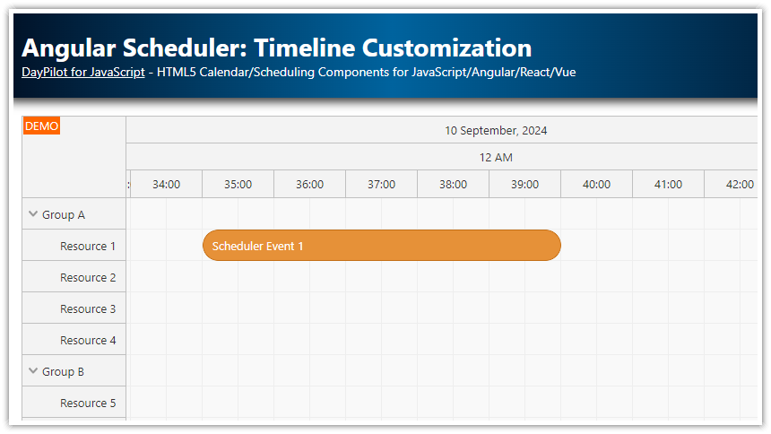
Overview
This tutorial shows how to build a Vue Scheduler using the open-source DayPilot Lite scheduling library.
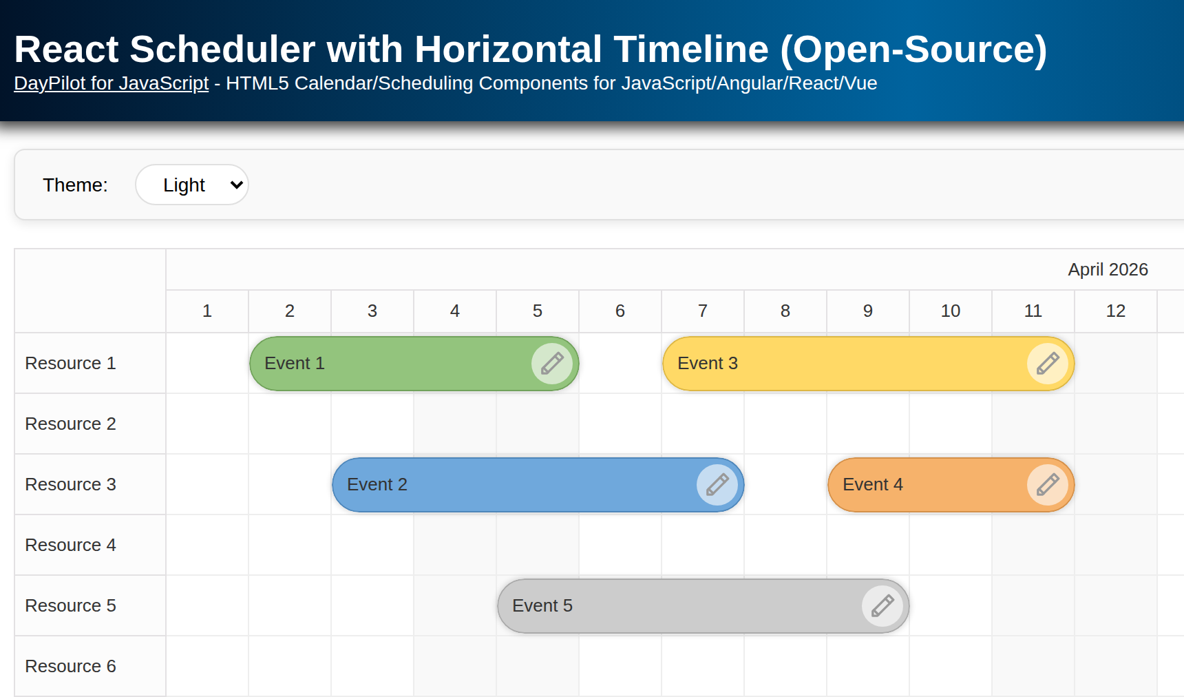
Horizontal timeline grouped by month and day
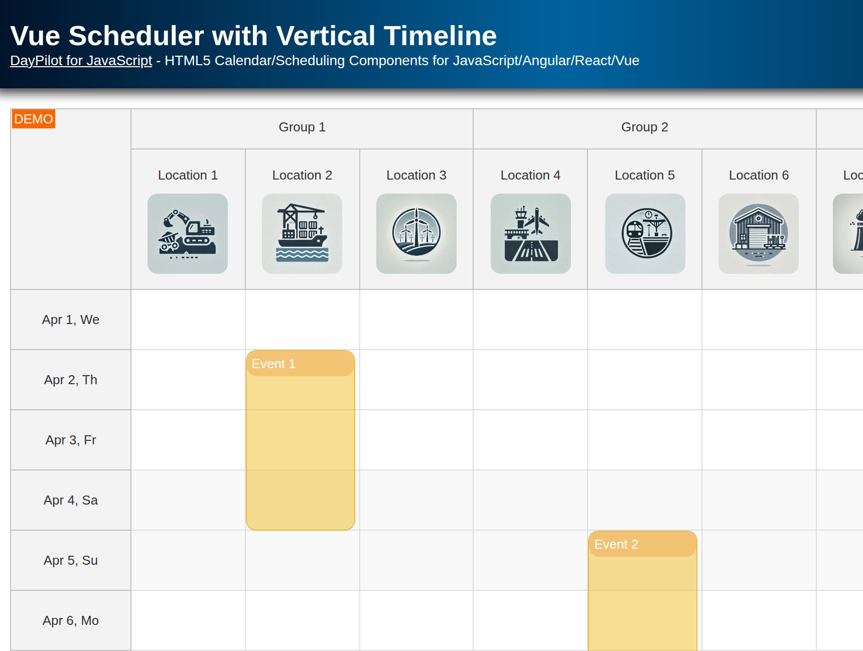
Resources on the vertical axis
Custom event template with title and duration
Lightweight color tagging (stored in
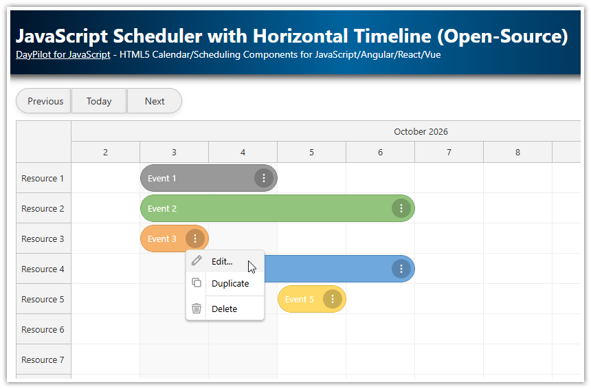
tags.color)Context menu for edit/delete
Modal form for event creation and editing
The project uses the Composition API and <script setup> syntax.
Installing DayPilot Lite for Vue
Install the Vue package (@daypilot/daypilot-lite-vue) using npm:
npm install @daypilot/daypilot-lite-vue
Then import the Scheduler component:
import { DayPilot, DayPilotScheduler } from "@daypilot/daypilot-lite-vue"
Configuring the Horizontal Timeline

The timeline can be configured using the scale, startDate and days props.
The time header can display multiple rows, grouped by different time units. Here, we define two rows using the timeHeaders property (grouped by month and day):
<DayPilotScheduler
  :timeHeaders="[{ groupBy: 'Month' }, { groupBy: 'Day', format: 'd' }]"
  scale="Day"
  :startDate="startDate"
  :days="days"
/>
The timeline automatically adjusts to the selected month:
const startDate = ref(DayPilot.Date.today().firstDayOfMonth())
const days = computed(() => startDate.value.daysInMonth())
To change the visible month, simply set a new startDate value:
startDate.value = new DayPilot.Date("2026-11-01");Loading Resources and Events
The Scheduler loads event and row data using the events and resources props:
<DayPilotScheduler
  ...
  :events="events"
  :resources="resources"
/>
These props point to special ref variables. To load the data, simply update the values:
const resources = ref([])
const events = ref([])

onMounted(() => {

  resources.value = [
    {name: "Resource 1", id: "R1"},
    {name: "Resource 2", id: "R2"},
    {name: "Resource 3", id: "R3"},
    // ...
  ]

  events.value = [
    {
      id: 1,
      start: "2026-11-02T00:00:00",
      end: "2026-11-06T00:00:00",
      text: "Event 1",
      resource: "R1",
      tags: {
        color: "#6fa8dc"
      }
    },
    // ...
  ]

})
The structure of the events data objects is defined in the DayPilot.Event.data object API docs.
The resources need to follow the structure described in the DayPilot.Scheduler.resources property docs.
Rendering Custom Event Content using Vue Templates

By default, the events display the value of the text property.
You can define custom event content using a Vue template - use the #event slot:
<DayPilotScheduler
  ... >

<template #event="{ event }">
  <div class="ev">
    <div class="ev-title">
      {{ event.text() }}
    </div>

    <div class="ev-meta">
      {{ event.duration().totalDays() }} day<span v-if="event.duration().totalDays() > 1">s</span>
    </div>
  </div>
</template>

</DayPilotScheduler>
In this example, we display the event text in bold on the first line (ev-title) and the duration in days in a badge on the second line (ev-meta).
Setting Per-Event Background Color

To set custom event properties, you can use the onBeforeEventRender event handler.
There, you have access to the source data object (args.data). This is a shallow copy of the data object that you pass to the events prop.
You can use it to read custom properties (e.g. a custom color) and modify the event properties based on your rules.
We use this approach to set a custom color (if defined) and an automatic border color:
const onBeforeEventRender = (args) => {
  const color = args.data.tags?.color || "#aaaaaa"
  args.data.backColor = color
  args.data.borderColor = "darker"
}
You can see that we read the event color from the tags object.
The tags object lets you define custom properties without risking a conflict with the reserved property names.
{
  id: 1,
  start: DayPilot.Date.today().addDays(2),
  end: DayPilot.Date.today().addDays(8),
  text: "Event 1",
  resource: "R1",
  tags: {
    color: "#6fa8dc"
  }
},
Event Context Menu Icon

The onBeforeEventRender handler lets you set additional event properties (for example, disable drag-and-drop moving for specific events) and add active areas - visual elements with a specified position and action.
In our Vue app, we use an active area to add a context menu icon:
const onBeforeEventRender = (args) => {

  // ...

  args.data.areas = [
    {
      top: 14,
      right: 8,
      width: 24,
      height: 24,
      padding: 4,
      symbol: "/icons/daypilot.svg#threedots-v",
      fontColor: "#ffffff",
      backColor: "#00000033",
      borderRadius: "50%",
      action: "ContextMenu"
    }
  ]
}
This active area displays the three dots icon from the DayPilot icon bundle using the symbol property. It opens the default context menu on click (action: "ContextMenu").
You can define the context menu using the contextMenu prop of the Scheduler component:
<DayPilotScheduler
    :contextMenu="menu"
    ... />
The context menu is a DayPilot.Menu object. Our context menu defines two items (“Edit…” and “Delete”):
const menu = new DayPilot.Menu({
  items: [
    {
      text: "Edit...",
      onClick: async (args) => {
        const e = args.source
        const modal = await DayPilot.Modal.form(form, e.data)
        if (!modal.canceled) {
          schedulerRef.value.control.events.update(modal.result)
        }
      }
    },
    { text: "-" },
    {
      text: "Delete",
      onClick: (args) => {
        schedulerRef.value.control.events.remove(args.source)
      }
    }
  ]
})
Creating and Editing Events Using Modal Forms

DayPilot includes a built-in modal form implementation that can be used for both new events and editing existing ones.
If needed, you can replace it with a modal form implementation that you already use in your application.
Form definition
The form array defines the form items. Here, it is the event text and color.
const colors = [
  { name: "(default)", id: null },
  { name: "Blue",    id: "#6fa8dc" },
  { name: "Green",   id: "#93c47d" },
  { name: "Yellow",  id: "#ffd966" },
  { name: "Red",     id: "#f6b26b" },
  {name: "Purple", id: "#8e7cc3"}
]

const form = [
  { name: "Text", id: "text", type: "text" },
  { name: "Color", id: "tags.color", type: "select", options: colors }
]
Creating events by selecting a time range
Now you can use the modal form definition for entering details of a new event in onTimeRangeSelected.
const onTimeRangeSelected = async (args) => {
  const scheduler = args.control

  const data = {
    start: args.start,
    end: args.end,
    id: DayPilot.guid(),
    resource: args.resource,
    text: "Event",
    tags: { color: null }
  }

  const modal = await DayPilot.Modal.form(form, data)
  scheduler.clearSelection()

  if (!modal.canceled) {
    scheduler.events.add(modal.result)
  }
}
Full Source Code
Here is the full source code of our Vue component that defines and displays a horizontal timeline for multiple resources:
<template>
  <DayPilotScheduler
      :timeHeaders="[{groupBy: 'Month'}, {groupBy: 'Day', format: 'd'}]"
      scale="Day"
      :startDate="startDate"
      :days="days"
      :events="events"
      :resources="resources"
      :eventBorderRadius="10"
      :durationBarVisible="false"
      :eventHeight="56"
      :rowMarginTop="2"
      :rowMarginBottom="2"
      :contextMenu="menu"
      @timeRangeSelected="onTimeRangeSelected"
      @beforeEventRender="onBeforeEventRender"
      ref="schedulerRef"
  >
    <template #event="{ event }">
      <div class="ev">
        <div class="ev-title">
          {{ event.text() }}
        </div>

        <div class="ev-meta">
          {{ event.duration().totalDays() }} day<span v-if="event.duration().totalDays() > 1">s</span>
        </div>
      </div>
    </template>

  </DayPilotScheduler>
</template>

<script setup>
import {DayPilot, DayPilotScheduler} from '@daypilot/daypilot-lite-vue'
import {ref, onMounted, computed} from 'vue'

const schedulerRef = ref(null)

const resources = ref([])
const events = ref([])
const startDate = ref(DayPilot.Date.today().firstDayOfMonth())
const days = computed(() => startDate.value.daysInMonth())

const colors = [
  { name: "(default)", id: null },
  { name: "Blue",    id: "#6fa8dc" },
  { name: "Green",   id: "#93c47d" },
  { name: "Yellow",  id: "#ffd966" },
  { name: "Red",     id: "#f6b26b" },
  {name: "Purple", id: "#8e7cc3"}
]

const form = [
  {name: "Text", id: "text", type: "text"},
  {name: "Color", id: "tags.color", type: "select", options: colors}
]

const menu = new DayPilot.Menu({
  items: [
    {
      text: "Edit...",
      onClick: async (args) => {
        const e = args.source
        const modal = await DayPilot.Modal.form(form, e.data)
        if (modal.canceled) {
          return
        }
        const scheduler = schedulerRef.value.control
        scheduler.events.update(modal.result)
      }
    },
    {
      text: "-"
    },
    {
      text: "Delete",
      onClick: (args) => {
        const scheduler = schedulerRef.value.control
        const e = args.source
        scheduler.events.remove(e)
      }
    }
  ]
})

const onTimeRangeSelected = async (args) => {
  const scheduler = args.control

  const data = {
    start: args.start,
    end: args.end,
    id: DayPilot.guid(),
    resource: args.resource,
    text: "Event",
    tags: {
      color: null
    }
  }

  const modal = await DayPilot.Modal.form(form, data)
  scheduler.clearSelection()
  if (modal.canceled) {
    return
  }

  scheduler.events.add(modal.result)
}

const onBeforeEventRender = (args) => {
  const color = args.data.tags?.color || "#aaaaaa"
  args.data.backColor = color
  args.data.borderColor = "darker"
  args.data.areas = [
    {
      top: 14,
      right: 8,
      width: 24,
      height: 24,
      padding: 4,
      symbol: "/icons/daypilot.svg#threedots-v",
      fontColor: "#ffffff",
      backColor: "#00000033",
      borderRadius: "50%",
      action: "ContextMenu"
    }
  ]
}

const loadEvents = () => {
  const first = startDate.value;
  events.value = [
    {
      id: 1,
      start: first.addDays(2),
      end: first.addDays(8),
      text: "Event 1",
      resource: "R1",
      tags: {
        color: "#6fa8dc"
      }
    },
    {
      id: 2,
      start: first.addDays(5),
      end: first.addDays(10),
      text: "Event 2",
      resource: "R2",
      tags: {
        color: "#ffd966"
      }
    }
  ]
}

const loadResources = () => {
  resources.value = [
    {name: "Resource 1", id: "R1"},
    {name: "Resource 2", id: "R2"},
    {name: "Resource 3", id: "R3"},
    {name: "Resource 4", id: "R4"},
    {name: "Resource 5", id: "R5"},
    {name: "Resource 6", id: "R6"},
    {name: "Resource 7", id: "R7"},
    {name: "Resource 8", id: "R8"}
  ]
}


onMounted(() => {
  loadEvents()
  loadResources()
})
</script>


<style scoped>
.ev {
  position: absolute;
  inset: 6px;
  display: flex;
  flex-direction: column;
  justify-content: space-between;
  gap: 6px;
  overflow: hidden;
}

.ev-title {
  color: #111111;
  font-weight: 700;
  font-size: 14px;
  line-height: 1.15;

  display: -webkit-box;
  -webkit-box-orient: vertical;
  -webkit-line-clamp: 2;
  overflow: hidden;
}

.ev-meta {
  align-self: flex-start;
  color: #3f3f3f;
  font-size: 12px;
  line-height: 1;

  padding: 4px 10px;
  border-radius: 999px;

  background: rgba(255, 255, 255, 0.55);
  border: 1px solid rgba(0, 0, 0, 0.08);
  backdrop-filter: blur(6px);
  -webkit-backdrop-filter: blur(6px);

  box-shadow: 0 1px 0 rgba(255, 255, 255, 0.25);
}
</style>