 DayPilot
")
Overview
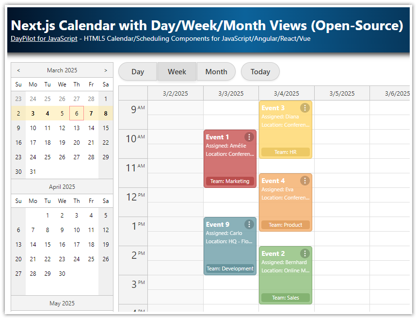
The day, week, and month calendar views are created using separate React calendar components. The app uses the DayPilot Lite open-source scheduling library.
-
The views are switched by hiding and showing the individual components.
-
All views share the same visible date and the same event data.
-
The date picker highlights busy days and stays synchronized with the currently selected view.
-
Separate components let you customize each view individually.
This tutorial assumes that you are already familiar with using the React Calendar from DayPilot in your application. For an introduction, please see the React Weekly Calendar (Open-Source) tutorial.
License
Apache License 2.0
Daily Calendar View in React

The daily calendar is created using the React Calendar component from the open-source DayPilot Lite for JavaScript library. This calendar component displays days as columns and time slots as rows.
We switch the calendar component to a day view using the viewType property.
<DayPilotCalendar
  viewType="Day"
  startDate={startDate}
  events={events}
  visible={view === "Day"}
  durationBarVisible={false}
  timeRangeSelectedHandling="Enabled"
  onTimeRangeSelected={onTimeRangeSelected}
/>
Weekly Calendar View in React

The weekly calendar uses the same component. We just need to change the value of viewType to "Week".
<DayPilotCalendar
  viewType="Week"
  startDate={startDate}
  events={events}
  visible={view === "Week"}
  durationBarVisible={false}
  timeRangeSelectedHandling="Enabled"
  onTimeRangeSelected={onTimeRangeSelected}
/>
Monthly Calendar View in React

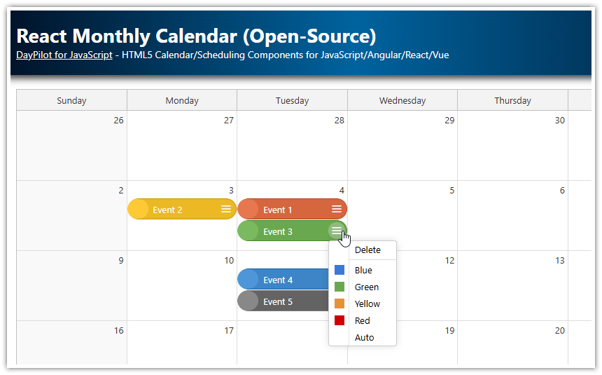
The monthly calendar view requires the React monthly calendar component. This component displays one week per row and one day per cell.
<DayPilotMonth
  startDate={startDate}
  events={events}
  visible={view === "Month"}
  eventBarVisible={false}
  timeRangeSelectedHandling="Enabled"
  onTimeRangeSelected={onTimeRangeSelected}
/>
Loading Calendar Events
You might have noticed that all the calendar components specify an events attribute that points to the shared events state variable:
const [events, setEvents] = useState(createInitialEvents);The demo data is stored in a small helper function and used as the initial state value. This keeps the sample compatible with the current React 19 builder template while still keeping the event data in one place.
function createInitialEvents() {
  const today = DayPilot.Date.today();

  return [
    {
      id: 1,
      text: "Event 1",
      start: today.addHours(9),
      end: today.addHours(11),
    },
    {
      id: 2,
      text: "Event 2",
      start: today.addDays(2).addHours(10),
      end: today.addDays(2).addHours(12),
      backColor: "#93c47d",
      borderColor: "darker",
    },
Updating the events state variable is the easiest way to update the calendar data for all components at once.
Switching the Day, Week, and Month Calendar Views in React

Now it’s time to add the logic that lets users of your React scheduling application switch the calendar views.
The first step is to create a view state variable that stores the current view ("Day", "Week", or "Month"). The default value is "Week", so the weekly calendar is displayed on startup.
const [view, setView] = useState("Week");
Now we can add the corresponding buttons to the JSX that change the value of view on click.
Note that we also add a selected CSS class to the currently selected button.
<div className="toolbar">
  <div className="toolbar-group">
    <button type="button" onClick={() => setView("Day")} className={view === "Day" ? "selected" : ""}>
      Day
    </button>
    <button type="button" onClick={() => setView("Week")} className={view === "Week" ? "selected" : ""}>
      Week
    </button>
    <button type="button" onClick={() => setView("Month")} className={view === "Month" ? "selected" : ""}>
      Month
    </button>
  </div>
  <button type="button" onClick={() => setStartDate(DayPilot.Date.today())} className="standalone">
    Today
  </button>
</div>
The calendar components representing the day, week, and month views are hidden or displayed depending on the value of view. The visible property of each component is only set to true for the active view.
<DayPilotCalendar
  viewType="Day"
  startDate={startDate}
  events={events}
  visible={view === "Day"}
  durationBarVisible={false}
  timeRangeSelectedHandling="Enabled"
  onTimeRangeSelected={onTimeRangeSelected}
/>
<DayPilotCalendar
  viewType="Week"
  startDate={startDate}
  events={events}
  visible={view === "Week"}
  durationBarVisible={false}
  timeRangeSelectedHandling="Enabled"
  onTimeRangeSelected={onTimeRangeSelected}
/>
<DayPilotMonth
  startDate={startDate}
  events={events}
  visible={view === "Month"}
  eventBarVisible={false}
  timeRangeSelectedHandling="Enabled"
  onTimeRangeSelected={onTimeRangeSelected}
/>
Changing the Selected Date using a Date Picker

In this step, we will add an option to change the visible date using a React date picker component. The date picker (<DayPilotNavigator>) displays a small calendar on the left side of the page and highlights the currently selected date.
The date picker supports several selection types ("Day", "Week", and "Month") that correspond to our calendar views. It always remembers the clicked date but automatically extends the selection to the specified date range. The selectMode property is bound to view, so the selection changes together with the active calendar view.
The onTimeRangeSelected event handler is fired when the user selects a different date. We store the new date in the startDate state variable, which updates all calendar components.
The Navigator also receives the shared events state variable (linked internally to events.list) so it can highlight busy days automatically.
<div className="container">
  <div className="navigator">
    <DayPilotNavigator
      selectMode={view}
      showMonths={3}
      skipMonths={3}
      onTimeRangeSelected={(args) => setStartDate(args.day)}
      selectionDay={startDate}
      events={events}
    />
Using a Button to Change the Selected Date in the Calendar

In this section, we will take a look at how to change the visible date manually. The Today button simply resets startDate to the current day.
<button type="button" onClick={() => setStartDate(DayPilot.Date.today())} className="standalone">
  Today
</button>
As you can see, the onClick handler updates the startDate state variable using setStartDate().
The startDate value is used by all calendar components for the visible date. React detects the change and all calendar views are updated automatically.
Creating Events in the Day, Week, and Month Views of the React Calendar

The React calendar has built-in support for drag-and-drop time range selection. This feature can be used easily to create new calendar events.
The calendar component fires the onTimeRangeSelected handler whenever the user completes a time-range selection in the calendar grid.
The syntax of onTimeRangeSelected is compatible across all three components, so we can point them to the same handler.
<DayPilotCalendar
  viewType="Day"
  startDate={startDate}
  events={events}
  visible={view === "Day"}
  durationBarVisible={false}
  timeRangeSelectedHandling="Enabled"
  onTimeRangeSelected={onTimeRangeSelected}
/>
<DayPilotCalendar
  viewType="Week"
  startDate={startDate}
  events={events}
  visible={view === "Week"}
  durationBarVisible={false}
  timeRangeSelectedHandling="Enabled"
  onTimeRangeSelected={onTimeRangeSelected}
/>
<DayPilotMonth
  startDate={startDate}
  events={events}
  visible={view === "Month"}
  eventBarVisible={false}
  timeRangeSelectedHandling="Enabled"
  onTimeRangeSelected={onTimeRangeSelected}
/>
Our handler clears the current selection, displays a modal dialog, and then adds the new event to the shared events state variable. Because all views use the same state, the new event appears in the day, week, and month calendars immediately.
  const onTimeRangeSelected = async (args) => {
    const modal = await DayPilot.Modal.prompt("Create a new event:", "Event 1");
    args.control.clearSelection();

    if (modal.canceled) {
      return;
    }

    const event = {
      id: DayPilot.guid(),
      start: args.start,
      end: args.end,
      text: modal.result,
    };

    setEvents((currentEvents) => [...currentEvents, event]);
  };
Full Source Code
And here is the full source code of the Calendar.jsx React component that shows day, week, and month calendar views.
import { useState } from "react";
import {
  DayPilot,
  DayPilotCalendar,
  DayPilotMonth,
  DayPilotNavigator,
} from "@daypilot/daypilot-lite-react";
import "./Calendar.css";

function createInitialEvents() {
  const today = DayPilot.Date.today();

  return [
    {
      id: 1,
      text: "Event 1",
      start: today.addHours(9),
      end: today.addHours(11),
    },
    {
      id: 2,
      text: "Event 2",
      start: today.addDays(2).addHours(10),
      end: today.addDays(2).addHours(12),
      backColor: "#93c47d",
      borderColor: "darker",
    },
    {
      id: 9,
      text: "Event 9",
      start: today.addHours(13),
      end: today.addHours(15),
      backColor: "#76a5af",
      borderColor: "darker",
    },
    {
      id: 3,
      text: "Event 3",
      start: today.addDays(1).addHours(9),
      end: today.addDays(1).addHours(11),
      backColor: "#ffd966",
      borderColor: "darker",
    },
    {
      id: 4,
      text: "Event 4",
      start: today.addDays(1).addHours(11).addMinutes(30),
      end: today.addDays(1).addHours(13).addMinutes(30),
      backColor: "#f6b26b",
      borderColor: "darker",
    },
    {
      id: 7,
      text: "Event 7",
      start: today.addDays(1).addHours(14),
      end: today.addDays(1).addHours(16),
      backColor: "#e691b8",
      borderColor: "darker",
    },
    {
      id: 5,
      text: "Event 5",
      start: today.addDays(4).addHours(9),
      end: today.addDays(4).addHours(11),
      backColor: "#8e7cc3",
      borderColor: "darker",
    },
    {
      id: 6,
      text: "Event 6",
      start: today.addDays(4).addHours(13),
      end: today.addDays(4).addHours(15),
      backColor: "#6fa8dc",
      borderColor: "darker",
    },
    {
      id: 8,
      text: "Event 8",
      start: today.addDays(5).addHours(13),
      end: today.addDays(5).addHours(15),
      backColor: "#b6d7a8",
      borderColor: "darker",
    },
  ];
}

function Calendar() {
  const [view, setView] = useState("Week");
  const [startDate, setStartDate] = useState(() => DayPilot.Date.today());
  const [events, setEvents] = useState(createInitialEvents);

  const onTimeRangeSelected = async (args) => {
    const modal = await DayPilot.Modal.prompt("Create a new event:", "Event 1");
    args.control.clearSelection();

    if (modal.canceled) {
      return;
    }

    const event = {
      id: DayPilot.guid(),
      start: args.start,
      end: args.end,
      text: modal.result,
    };

    setEvents((currentEvents) => [...currentEvents, event]);
  };

  return (
    <div className="container">
      <div className="navigator">
        <DayPilotNavigator
          selectMode={view}
          showMonths={3}
          skipMonths={3}
          onTimeRangeSelected={(args) => setStartDate(args.day)}
          selectionDay={startDate}
          events={events}
        />
      </div>
      <div className="content">
        <div className="toolbar">
          <div className="toolbar-group">
            <button type="button" onClick={() => setView("Day")} className={view === "Day" ? "selected" : ""}>
              Day
            </button>
            <button type="button" onClick={() => setView("Week")} className={view === "Week" ? "selected" : ""}>
              Week
            </button>
            <button type="button" onClick={() => setView("Month")} className={view === "Month" ? "selected" : ""}>
              Month
            </button>
          </div>
          <button type="button" onClick={() => setStartDate(DayPilot.Date.today())} className="standalone">
            Today
          </button>
        </div>

        <DayPilotCalendar
          viewType="Day"
          startDate={startDate}
          events={events}
          visible={view === "Day"}
          durationBarVisible={false}
          timeRangeSelectedHandling="Enabled"
          onTimeRangeSelected={onTimeRangeSelected}
        />
        <DayPilotCalendar
          viewType="Week"
          startDate={startDate}
          events={events}
          visible={view === "Week"}
          durationBarVisible={false}
          timeRangeSelectedHandling="Enabled"
          onTimeRangeSelected={onTimeRangeSelected}
        />
        <DayPilotMonth
          startDate={startDate}
          events={events}
          visible={view === "Month"}
          eventBarVisible={false}
          timeRangeSelectedHandling="Enabled"
          onTimeRangeSelected={onTimeRangeSelected}
        />
      </div>
    </div>
  );
}

export default Calendar;
Download
You can download the full React 19 project at the top of the tutorial.
History
-
April 19, 2026: Refreshed the sample on the current React 19 builder template, upgraded
@daypilot/daypilot-lite-reactto5.6.0, updated the screenshots, and cleaned up the article text and code snippets. -
December 12, 2025: Upgraded to React 19, DayPilot Lite for JavaScript 2025.4.766 (5.0.0). Fixed Navigator selection synchronization with “Today” button.
-
August 30, 2025: Upgraded to DayPilot Lite for JavaScript 2025.3.703 (4.4.0), published to GitHub
-
June 16, 2024: Initial version.