 DayPilot
")
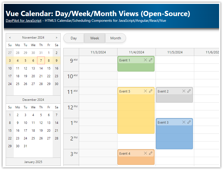
Features
The application uses the React monthly calendar component from DayPilot Lite for JavaScript.
Calendar events are loaded using React automatic change detection.
The calendar component appearance is customized using CSS.
The calendar events use a context menu to provide additional options (delete an event, change color).
The React project download includes the open-source DayPilot Lite calendar/scheduling library.
React Calendar UI Configurator
You can configure the calendar/scheduler components using the visual UI Builder application. Preview the configuration using a live calendar instance and download a ready-to-run React project.
Basic React Monthly Calendar Configuration

You can add the monthly calendar component to your application using <DayPilotMonth> component which is included in the @daypilot/daypilot-lite-react package.
The @daypilot/daypilot-lite-react package is hosted at npmjs.org - you can get add it to your React application using npm install command:
npm install @daypilot/daypilot-lite-reactWe will create a new React component class (MonthlyCalendar) that will wrap the DayPilot calendar component and specify its properties. Our MonthlyCalendar component defines the calendar appearance and behavior using configuration properties and event handlers.
import React, { useState, useRef } from 'react';
import { DayPilot, DayPilotMonth } from "@daypilot/daypilot-lite-react";

const MonthlyCalendar = () => {
  const [startDate] = useState(DayPilot.Date.today());
  const [calendar, setCalendar] = useState(null);

  return (
    <div>
      <DayPilotMonth
        startDate={startDate}
        controlRef={setCalendar}
      />
    </div>
  );
};

export default MonthlyCalendar;
How to Load Calendar Events in React

You can load events in a useEffect() block using the setEvents() function:
import React, { useState, useEffect, useRef } from 'react';
import { DayPilot, DayPilotMonth } from "daypilot-pro-react";

const Month = () => {
  const [startDate] = useState("2026-08-01");
  const [events, setEvents] = useState([]);
  const [calendar, setCalendar] = useState(null);

  useEffect(() => {

    const events =  [
      {
        id: 1,
        text: "Event 1",
        start: "2026-08-04",
        end: "2026-08-05",
      },
      {
        id: 2,
        text: "Event 2",
        start: "2026-08-03",
        end: "2026-08-04",
      },
      {
        id: 3,
        text: "Event 3",
        start: "2026-08-04",
        end: "2026-08-04",
      },
      {
        id: 4,
        text: "Event 4",
        start: "2026-08-11",
        end: "2026-08-12",
      },
      {
        id: 5,
        text: "Event 5",
        start: "2026-08-11",
        end: "2026-08-12"
      },
    ];

    setEvents(events);
  }, []);


  return (
    <div>
      <DayPilotMonth
        startDate={startDate}
        events={events}
        controlRef={setCalendar}
      />
    </div>
  );
};

export default Month;
The structure of event data items is described in DayPilot.Event.data documentation.
How to Style the Monthly Calendar Component

The calendar element dimensions can be modified using DayPilot.Month object properties. We will use the properties (eventHeight, headerHeight, and cellHeaderHeight) to increase the size of selected calendar elements.
import React, { useState, useEffect, useRef } from 'react';
import { DayPilot, DayPilotMonth } from "daypilot-pro-react";

const Month = () => {
  const [startDate] = useState("2026-08-01");
  const [events, setEvents] = useState([]);
  const [calendar, setCalendar] = useState(null);

  const config = {
    eventHeight: 30,
    headerHeight: 30,
    cellHeaderHeight: 20,
  };

  useEffect(() => {

    const events =  [
      {
        id: 1,
        text: "Event 1",
        start: "2026-08-04",
        end: "2026-08-05",
      },
      {
        id: 2,
        text: "Event 2",
        start: "2026-08-03",
        end: "2026-08-04",
      },
      {
        id: 3,
        text: "Event 3",
        start: "2026-08-04",
        end: "2026-08-04",
      },
      {
        id: 4,
        text: "Event 4",
        start: "2026-08-11",
        end: "2026-08-12",
      },
      {
        id: 5,
        text: "Event 5",
        start: "2026-08-11",
        end: "2026-08-12"
      },
    ];

    setEvents(events);
  }, []);

  return (
    <div>
      <DayPilotMonth
        {...config}
        startDate={startDate}
        events={events}
        controlRef={setCalendar}
      />
    </div>
  );
};

export default Month;
The monthly calendar appearance is controlled by CSS. By default, the component uses a built-in theme (month_default). You can create your own CSS theme using the online theme designer or you can simply override selected styles of the built-in theme:
MonthlyCalendar.css
.month_default_main:not(.default) {
    --dp-month-event-border-radius: 15px;
    --dp-month-event-color: #ffffff;
    --dp-month-event-border-color: #777777;
    --dp-month-event-background: #636363;
    --dp-month-event-background-hover: #636363;
    --dp-month-event-bar-width: 30px;
}

.month_default_main:not(.default) .month_default_event_inner {
    padding-left: 35px;
}

.month_default_main:not(.default) .month_default_event_bar {
    left: 0px;
    width: 30px;
}

.month_default_main:not(.default) .month_default_event_bar_inner {
    background: #888888;
    border-radius: 15px;
}
React Monthly Calendar: How to Change the Event Appearance

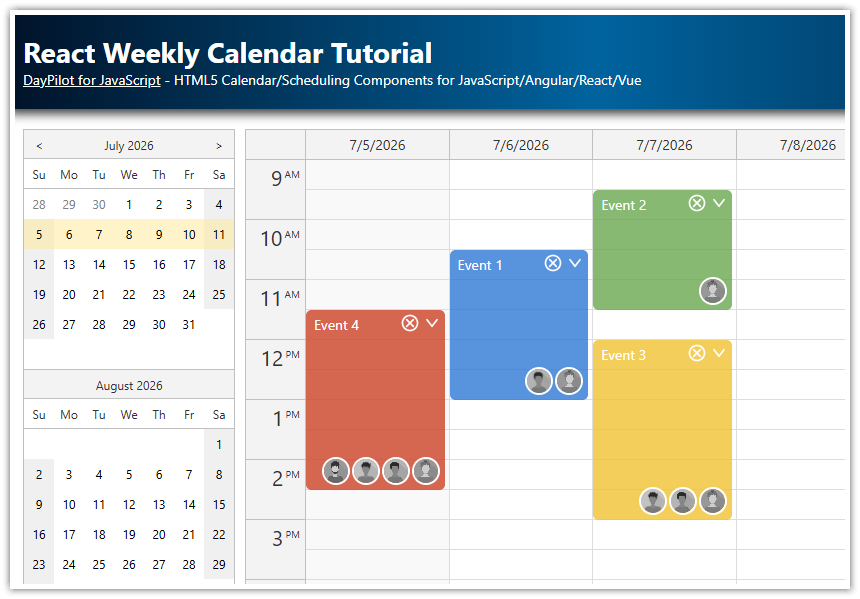
You can customize the event appearance using data object properties. You can set the properties on the server side (add them to the JSON object after loading the data from a database). You can also customize the events on the client side using onBeforeEventRender to save bandwidth.
We will set event background color using backColor property of the event data object:
useEffect(() => {

  const events =  [
    {
      id: 1,
      text: "Event 1",
      start: "2026-08-04",
      end: "2026-08-05",
      backColor: "#d5663e",
    },
    {
      id: 2,
      text: "Event 2",
      start: "2026-08-03",
      end: "2026-08-04",
      backColor: "#ecb823",
    },
    {
      id: 3,
      text: "Event 3",
      start: "2026-08-04",
      end: "2026-08-04",
      backColor: "#6aa84f",
    },
    {
      id: 4,
      text: "Event 4",
      start: "2026-08-11",
      end: "2026-08-12",
      backColor: "#3d85c6",
    },
    {
      id: 5,
      text: "Event 5",
      start: "2026-08-11",
      end: "2026-08-12"
    },
  ];

  setEvents(events);
}, []);
The backColor property defines the basic event color. We will use the onBeforeEventRender event handler to set a corresponding event bar color (the event bar appearance is changed to a circle using CSS set in the previous step).
import React, { useEffect, useRef, useState } from 'react';
import {DayPilot, DayPilotMonth} from "@daypilot/daypilot-lite-react";
import "./MonthlyCalendar.css";

const MonthlyCalendar = () => {
  const [calendar, setCalendar] = useState(null);

  const [events, setEvents] = useState([]);
  const [startDate, setStartDate] = useState("2026-08-01");

  const config = {
    onBeforeEventRender: args => {
      args.data.borderColor = "darker";
      if (args.data.backColor) {
        args.data.barColor = DayPilot.ColorUtil.lighter(args.data.backColor, 1);
      }
    },
    // ...
  };

  // ...

  return (
    <div>
      <DayPilotMonth
        {...config}
        events={events}
        startDate={startDate}
        controlRef={setCalendar}
      />
    </div>
  );
}
export default MonthlyCalendar;
Monthly Calendar Context Menu

We will define a context menu using the contextMenu property of the scheduler component. The context menu can be activated by right-clicking the events.
import React, { useEffect, useRef, useState } from 'react';
import {DayPilot, DayPilotMonth} from "@daypilot/daypilot-lite-react";
import "./MonthlyCalendar.css";

const MonthlyCalendar = () => {
  const [calendar, setCalendar] = useState(null);

  const [events, setEvents] = useState([]);
  const [startDate, setStartDate] = useState("2026-11-01");

  const config = {
    contextMenu: new DayPilot.Menu({
      items: [
        {
          text: "Delete",
          onClick: args => {
            const e = args.source;
            calendar.events.remove(e);
          }
        },
        {
          text: "-"
        },
        {
          text: "Blue",
          icon: "icon icon-blue",
          color: "#3d85c6",
          onClick: args => updateColor(args.source, args.item.color)
        },
        {
          text: "Green",
          icon: "icon icon-green",
          color: "#6aa84f",
          onClick: args => updateColor(args.source, args.item.color)
        },
        {
          text: "Yellow",
          icon: "icon icon-yellow",
          color: "#ecb823",
          onClick: args => updateColor(args.source, args.item.color)
        },
        {
          text: "Red",
          icon: "icon icon-red",
          color: "#d5663e",
          onClick: args => updateColor(args.source, args.item.color)
        },
        {
          text: "Auto",
          color: null,
          onClick: args => updateColor(args.source, args.item.color)
        },

      ]
    }),
    // ...
  };

  // ...

  return (
    <div>
      <DayPilotMonth
        {...config}
        events={events}
        startDate={startDate}
        controlRef={setCalendar}
      />
    </div>
  );
}
export default MonthlyCalendar;
The first context menu item (“Delete”) removes the selected event from the calendar/scheduler using the events.remove() method. The event reference is accessible in the onClick handler as args.e so we can simply pass it to the events.remove() method.
The context menu also allows changing the event color. The menu items (“Blue”, “Green”, “Yellow”, “Red”, “Auto”) display a preview of the color using icon property and update the event object using updateColor() method on click:
const updateColor = (e, color) =>{
  e.data.backColor = color;
  calendar.events.update(e);
};
Full Source Code
Here is the full source of our React monthly calendar app with all the customizations described above.
The React component is defined in MonthlyCalendar.jsx:
import React, { useEffect, useRef, useState } from 'react';
import {DayPilot, DayPilotMonth} from "@daypilot/daypilot-lite-react";
import "./MonthlyCalendar.css";

const MonthlyCalendar = () => {
  const [calendar, setCalendar] = useState(null);

  const [events, setEvents] = useState([]);
  const [startDate, setStartDate] = useState("2026-08-01");

  const config = {
    eventHeight: 30,
    headerHeight: 30,
    cellHeaderHeight: 25,
    onBeforeEventRender: args => {
      args.data.borderColor = "darker";
      if (args.data.backColor) {
        args.data.barColor = DayPilot.ColorUtil.lighter(args.data.backColor, 1);
      }
      args.data.areas = [
        {
          top: "calc(50% - 12px)",
          right: 4,
          width: 24,
          height: 24,
          padding: 2,
          symbol: "/icons/daypilot.svg#hamburger-menu",
          action: "ContextMenu",
          cssClass: "event_menu_icon"
        }
      ];
    },
    contextMenu: new DayPilot.Menu({
      items: [
        {
          text: "Delete",
          onClick: args => {
            const e = args.source;
            calendar.events.remove(e);
          }
        },
        {
          text: "-"
        },
        {
          text: "Blue",
          icon: "icon icon-blue",
          color: "#3d85c6",
          onClick: args => updateColor(args.source, args.item.color)
        },
        {
          text: "Green",
          icon: "icon icon-green",
          color: "#6aa84f",
          onClick: args => updateColor(args.source, args.item.color)
        },
        {
          text: "Yellow",
          icon: "icon icon-yellow",
          color: "#ecb823",
          onClick: args => updateColor(args.source, args.item.color)
        },
        {
          text: "Red",
          icon: "icon icon-red",
          color: "#d5663e",
          onClick: args => updateColor(args.source, args.item.color)
        },
        {
          text: "Auto",
          color: null,
          onClick: args => updateColor(args.source, args.item.color)
        },

      ]
    }),
    onTimeRangeSelected: async args => {
      const modal = await DayPilot.Modal.prompt("Create a new event:", "Event 1");

      if (!modal.result) {
        return;
      }

      calendar.clearSelection();

      calendar.events.add({
        start: args.start,
        end: args.end,
        id: DayPilot.guid(),
        text: modal.result
      });
    },
  };

  const updateColor = (e, color) =>{
    e.data.backColor = color;
    calendar.events.update(e);
  };

  useEffect(() => {

    const events =  [
      {
        id: 1,
        text: "Event 1",
        start: "2026-08-04",
        end: "2026-08-05",
        backColor: "#d5663e",
      },
      {
        id: 2,
        text: "Event 2",
        start: "2026-08-03",
        end: "2026-08-04",
        backColor: "#ecb823",
      },
      {
        id: 3,
        text: "Event 3",
        start: "2026-08-04",
        end: "2026-08-04",
        backColor: "#6aa84f",
      },
      {
        id: 4,
        text: "Event 4",
        start: "2026-08-11",
        end: "2026-08-12",
        backColor: "#3d85c6",
      },
      {
        id: 5,
        text: "Event 5",
        start: "2026-08-11",
        end: "2026-08-12"
      },
    ];

    setEvents(events);
  }, []);

  return (
    <div>
      <DayPilotMonth
        {...config}
        events={events}
        startDate={startDate}
        controlRef={setCalendar}
      />
    </div>
  );
}
export default MonthlyCalendar;
The CSS styles are defined in MonthlyCalendar.css:
/* calendar event */

.month_default_main:not(.default) {
    --dp-month-event-border-radius: 15px;
    --dp-month-event-color: #ffffff;
    --dp-month-event-border-color: #777777;
    --dp-month-event-background: #636363;
    --dp-month-event-background-hover: #636363;
    --dp-month-event-bar-width: 30px;
}

.month_default_main:not(.default) .month_default_event_inner {
    padding-left: 35px;
}

.month_default_main:not(.default) .month_default_event_bar {
    left: 0px;
    width: 30px;
}

.month_default_main:not(.default) .month_default_event_bar_inner {
    background: #888888;
    border-radius: 15px;
}

.event_menu_icon:hover {
    background-color: #dddddd55;
    border-radius: 50%;
}

/* context menu icons */
.icon:before {
    position: absolute;
    left: 0px;
    margin-left: 8px;
    margin-top: 3px;
    width: 14px;
    height: 14px;
    content: '';
}

.icon-blue:before { background-color: #3c78d8; }
.icon-green:before { background-color: #6aa84f; }
.icon-yellow:before { background-color: #e69138; }
.icon-red:before { background-color: #cc0000; }
History
January 10, 2026: Upgraded to Daypilot Lite for JavaScript 2026.1.790 (5.3.0). Context menu icon added.
September 11, 2025: Upgraded to React 19. Upgraded to Daypilot Lite for JavaScript 2025.3.703 (4.4.0).
July 30, 2024: Upgraded to DayPilot Lite for JavaScript 2024.3.539 (available as 3.24.0 in the NPM registry). Converted to a functional component with hooks API.
August 17, 2022: Switched to the open-source DayPilot Lite for JavaScript 2022.3.432 (available as 3.10.1 in the NPM registry). Upgraded to React 18. Updated event styles and colors.
December 14, 2020: Upgraded to DayPilot Pro for JavaScript 2020.4.4788, React 17.
September 23, 2019: Upgraded to DayPilot Pro for JavaScript 2019.3.4039, styling updates.
June 15, 2018: Initial release