 DayPilot
")
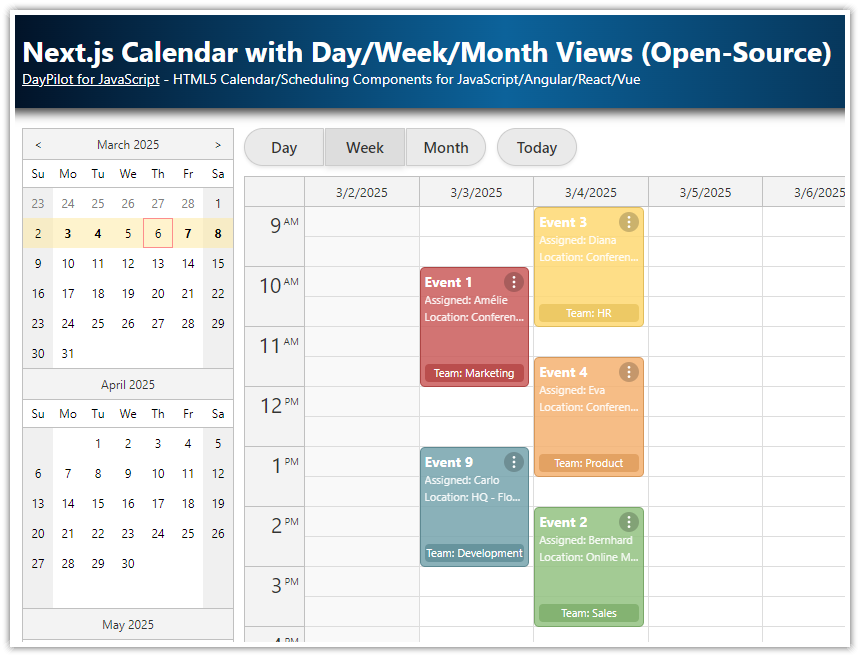
Overview
How to add an interactive open-source calendar component to your Next.js application.
The calendar component supports drag and drop, CSS themes, event content customization and other features.
Built using Next.js 16 and the React package of the open-source DayPilot Lite for JavaScript library.
Create a New Next.js Application
First, create a new Next.js application using create-next-app:
npx create-next-appInstall the React Calendar Component
Use npm to install the DayPilot Lite for React package (@daypilot/daypilot-lite-react):
npm install @daypilot/daypilot-lite-reactDayPilot Lite is an open-source calendar and scheduling library, which includes a React Calendar component. We will use this component to create a drag-and-drop scheduling calendar in our Next.js application.
Main component
The main component of the Next.js application (Home) is a very simple React component that displays the Calendar, which we define in the next step.
page.tsx
import Calendar from "@/app/Calendar";

export default function Home() {
  return (
      <div>
        <Calendar/>
      </div>
  )
}
React Calendar Component in Next.js

Our Next.js Calendar component will display a weekly calendar using the open-source React calendar component from the DayPilot Lite library.
DayPilot Calendar is an interactive client-side component but you can use it in server-side rendered (SSR) Next.js React applications as well. To make this work, it’s necessary to mark the component using 'use client' at the top of the source file.
The component includes standard configuration that you know from the React Weekly Calendar tutorial:
1. It defines the Calendar configuration using a special state variable (config):
The calendar is switched to a week view (
viewType: "Week").It will display a week that includes the
startDate.To resolve the first day of week, it uses the specified
locale.
2. It stores the DayPilot.Calendar object reference in a calendar state variable.
By default, the
calendarstate variable value isundefined.The value will be set using the
controlRefattribute of the<DayPilotCalendar>JSX tag when the component is mounted.The
calendarvariable lets you access the direct API. As an example, we will use the direct API to load the calendar event data.
3. Our Next.js app loads the calendar events in a useEffect() block.
The
useEffect()callback uses thecalendarvariable as a dependency. It ensures that it will be executed when thecalendarvalue is set.The event data are defined as a static array. Normally you will use an HTTP request to a JSON endpoint instead.
calendar.tsx
'use client';

import React, {useEffect, useState} from "react";
import {DayPilot, DayPilotCalendar} from "@daypilot/daypilot-lite-react";

export default function Calendar() {

    const [calendar, setCalendar] = useState<DayPilot.Calendar>();

    const initialConfig: DayPilot.CalendarConfig = {
        viewType: "Week",
        startDate" "2026-10-01",
        locale: "en-us"
    };

    const [config, setConfig] = useState(initialConfig);

    useEffect(() => {

        if (!calendar || calendar?.disposed()) {
            return;
        }
        const events: DayPilot.EventData[] = [
            {
                id: 1,
                text: "Event 1",
                start: "2026-10-02T10:30:00",
                end: "2026-10-02T13:00:00",
                tags: {
                    participants: 2,
                }
            },

            // ...

        ];

        calendar.update({events});
    }, [calendar]);


    return (
        <div>
            <DayPilotCalendar
                {...config}
                controlRef={setCalendar}
            />
        </div>
    )
}
Show Number of Participants as an Icon in Next.js Calendar Events

As an example of the customization capabilities of the Calendar component, we will change the appearance of the calendar events using the onBeforeEventRender event handler.
First, add the onBeforeEventRender attribute to the <DayPilotCalendar> tag. It will point to an onBeforeEventRender function that we define below.
JSX:
<DayPilotCalendar
    {...config}
    onBeforeEventRender={onBeforeEventRender}
    controlRef={setCalendar}
/>
The event handler will be fired once for every visible event.
It lets you modify the appearance and behavior of the calendar events. Our example adds an icon with a number of participants to the lower-left corner of each event.
1. The number of participants is defined using a participants property of the tags field of the event data object:
{
  id: 1,
  text: "Event 1",
  start: "2026-10-02T10:30:00",
  end: "2026-10-02T13:00:00",
  tags: {
      participants: 2,
  }
},
2. In the event handler, we will read the value and add the icons if there the participants are defined:
const participants = args.data.tags?.participants || 0;Full event handler code:
const onBeforeEventRender = (args: DayPilot.CalendarBeforeEventRenderArgs) => {

    // ...

    const participants = args.data.tags?.participants || 0;
    if (participants > 0) {
        args.data.areas.push({
            bottom: 5,
            left: 5,
            width: 24,
            height: 24,
            action: "None",
            backColor: "#00000033",
            fontColor: "#fff",
            text: participants,
            style: "border-radius: 50%; border: 2px solid #fff; font-size: 18px; text-align: center;",
        });
    }
};
Full Source Code
Here is the full source code of our Calendar component:
'use client';

import React, {useEffect, useState} from "react";
import {DayPilot, DayPilotCalendar} from "@daypilot/daypilot-lite-react";

export default function Calendar() {

    const colors = [
        {name: "Green", id: "#6aa84f"},
        {name: "Blue", id: "#3d85c6"},
        {name: "Turquoise", id: "#00aba9"},
        {name: "Light Blue", id: "#56c5ff"},
        {name: "Yellow", id: "#f1c232"},
        {name: "Orange", id: "#e69138"},
        {name: "Red", id: "#cc4125"},
        {name: "Light Red", id: "#ff0000"},
        {name: "Purple", id: "#af8ee5"},
    ];

    const participants = [
        {name: "1", id: 1},
        {name: "2", id: 2},
        {name: "3", id: 3},
        {name: "4", id: 4},
    ];

    const [calendar, setCalendar] = useState<DayPilot.Calendar>();

    const editEvent = async (e: DayPilot.Event) => {
        const form = [
            {name: "Event text", id: "text", type: "text"},
            {name: "Event color", id: "tags.color", type: "select", options: colors},
            {name: "Number of participants", id: "tags.participants", type: "select", options: participants},
        ];

        const modal = await DayPilot.Modal.form(form, e.data);
        if (modal.canceled) { return; }
        calendar?.events.update(modal.result);
    };

    const contextMenu = new DayPilot.Menu({
        items: [
            {
                text: "Delete",
                onClick: async args => {
                    calendar?.events.remove(args.source);
                },
            },
            {
                text: "-"
            },
            {
                text: "Edit...",
                onClick: async args => {
                    await editEvent(args.source);
                }
            }
        ]
    });

    const onBeforeEventRender = (args: DayPilot.CalendarBeforeEventRenderArgs) => {

        args.data.backColor = args.data.tags?.color || "#888888";
        args.data.backColor += "bb"; // add transparency

        args.data.areas = [
            {
                top: 5,
                right: 5,
                width: 20,
                height: 20,
                symbol: "icons/daypilot.svg#minichevron-down-2",
                fontColor: "#fff",
                backColor: "#00000033",
                style: "border-radius: 25%; cursor: pointer;",
                toolTip: "Show context menu",
                action: "ContextMenu",
            },
        ];


        const participants = args.data.tags?.participants || 0;
        if (participants > 0) {
            args.data.areas.push({
                bottom: 5,
                left: 5,
                width: 24,
                height: 24,
                action: "None",
                backColor: "#00000033",
                fontColor: "#fff",
                text: participants,
                style: "border-radius: 50%; border: 2px solid #fff; font-size: 18px; text-align: center;",
            });
        }
    };

    const initialConfig: DayPilot.CalendarConfig = {
        viewType: "Week",
        durationBarVisible: false,
    };

    const [config, setConfig] = useState(initialConfig);

    useEffect(() => {

        if (!calendar || calendar?.disposed()) {
            return;
        }
        const events: DayPilot.EventData[] = [
            {
                id: 1,
                text: "Event 1",
                start: "2026-10-02T10:30:00",
                end: "2026-10-02T13:00:00",
                tags: {
                    color: "#2e78d6",
                    participants: 2,
                }
            },
            {
                id: 2,
                text: "Event 2",
                start: "2026-10-03T09:30:00",
                end: "2026-10-03T11:30:00",
                tags: {
                    participants: 1,
                    color: "#6aa84f",
                }
            },
            {
                id: 3,
                text: "Event 3",
                start: "2026-10-03T12:00:00",
                end: "2026-10-03T15:00:00",
                tags: {
                    participants: 3,
                    color: "#f1c232",
                }
            },
            {
                id: 4,
                text: "Event 4",
                start: "2026-10-01T11:30:00",
                end: "2026-10-01T14:30:00",
                tags: {
                    color: "#cc4125",
                    participants: 2,
                }
            },
        ];

        const startDate = "2026-10-01";

        calendar.update({startDate, events});
    }, [calendar]);

    const onTimeRangeSelected = async (args: DayPilot.CalendarTimeRangeSelectedArgs) => {
        const modal = await DayPilot.Modal.prompt("Create a new event:", "Event 1");
        calendar?.clearSelection();
        if (modal.canceled) {
            return;
        }
        // console.log("modal.result", modal.result, calendar);
        calendar?.events.add({
            start: args.start,
            end: args.end,
            id: DayPilot.guid(),
            text: modal.result,
            tags: {
                participants: 1,
            }
        });
    };

    return (
        <div>
            <DayPilotCalendar
                {...config}
                onTimeRangeSelected={onTimeRangeSelected}
                onEventClick={async args => { await editEvent(args.e); }}
                contextMenu={contextMenu}
                onBeforeEventRender={onBeforeEventRender}
                controlRef={setCalendar}
            />
        </div>
    )
}
package.json
This is the package.json file used in the attached project. It includes dependencies required for a Next.js 16 application and the open-source version of DayPilot.
{
  "name": "nextjs-calendar-open-source",
  "version": "0.1.0",
  "private": true,
  "license": "Apache-2.0",
  "scripts": {
    "dev": "next dev",
    "build": "next build",
    "start": "next start",
    "lint": "eslint"
  },
  "dependencies": {
    "@daypilot/daypilot-lite-react": "^5.2.0",
    "next": "16.1.1",
    "react": "19.2.3",
    "react-dom": "19.2.3"
  },
  "devDependencies": {
    "@types/node": "^20",
    "@types/react": "^19",
    "@types/react-dom": "^19",
    "eslint": "^9",
    "eslint-config-next": "16.1.1",
    "typescript": "^5"
  }
}