 DayPilot
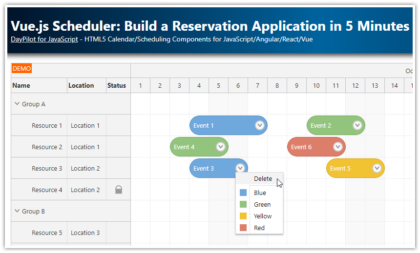
Overview
Learn how to display Vue components in Scheduler event boxes.
You can use custom Vue component to adjust the event appearance or add action buttons or icons.
Includes a trial version of DayPilot Pro for JavaScript (see License below).
This tutorial assumes you already know how to install and configure the Vue Scheduler component. For an introduction, please see the basic Vue Scheduler tutorial.
This feature requires DayPilot Pro for JavaScript, version 2024.1.5867 or higher.
Note: Since version 2024.4.6243, the Vue Scheduler supports native Vue templates for named slots:
License
Licensed for testing and evaluation purposes. Please see the license agreement included in the sample project. You can use the source code of the tutorial if you are a licensed user of DayPilot Pro for JavaScript. Buy a license.
Vue Component for Scheduler Event Content
First, let’s create a new Vue component (EventContent) that will specify the Scheduler event content:
The component uses the
<template>section to define two rows of text: the event text and duration in days. In the upper-right corner, there will be an SVG icon.It defines an
eventprop that will be used to pass a DayPilot.Event object to our component.We also add scoped CSS that will stretch the component to fill its parent element using
position: absoluteandinset: 0styles and define a custom background and text color.
In the next step, we are going to insert this component into Scheduler events.
EventContent.vue
<script setup>
import { DayPilot } from 'daypilot-pro-vue';

const props = defineProps({
  event: DayPilot.Event,
});

</script>

<template>
<div class="scheduler-event">
  <div>{{ event.text() }}</div>
  <div>{{ event.duration().totalDays() }} days</div>
  <div style="position: absolute; top: 5px; right: 5px;">
    <svg width='17' height='17' xmlns='http://www.w3.org/2000/svg'><path d='m 5,8 3,3 5,-5' style='fill:none;stroke:#ffffff;stroke-width:2;stroke-linejoin:round;stroke-linecap:butt' /></svg>
  </div>
</div>
</template>

<style scoped>
.scheduler-event {
  position: absolute;
  inset: 0;
  padding: 5px;
  background-color: #4CAF50;
  color: white;
}
</style>
How to Insert a Vue Component into a Scheduler Event
The Vue Scheduler component lets you customize the event content using the onBeforeEventRender event handler. Using this event handler, you can modify the default appearance and behavior (e.g., add icons, set background color, etc).
In Vue 3, you can also use a custom Vue component to add custom dynamic content.
To insert your own Vue component into Scheduler events, use the onBeforeEventDomAdd event handler.
In the event handler, use
args.elementto specify the Vue component.You can set the component props using
args.props.
The Vue component will replace the default event content.
<template>
  <DayPilotScheduler :config="config" />
</template>

<script setup>
import { DayPilot, DayPilotScheduler } from 'daypilot-pro-vue';
import { ref, reactive, onMounted } from 'vue';
import EventContent from "@/components/EventContent.vue";

const config = reactive({
  // ...
  onBeforeEventDomAdd: args => {
    args.element = EventContent;
    args.props = {
      event: args.e
    };
  }
});

</script>