Overview
In addition to the concurrent event groups that are created automatically by the JavaScript Scheduler component, you can also implement custom grouping logic
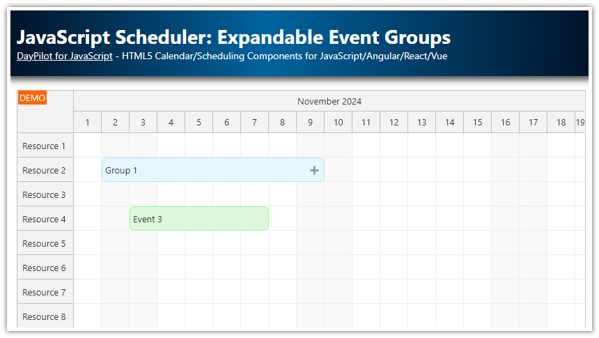
Add an active area to event groups that allows expanding the group using a [+] icon
Add an active area to expanded event members that allows collapsing the group using a [-] icon
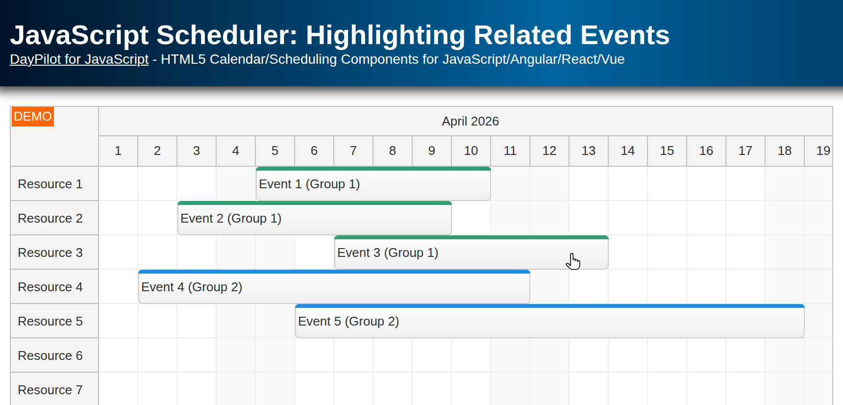
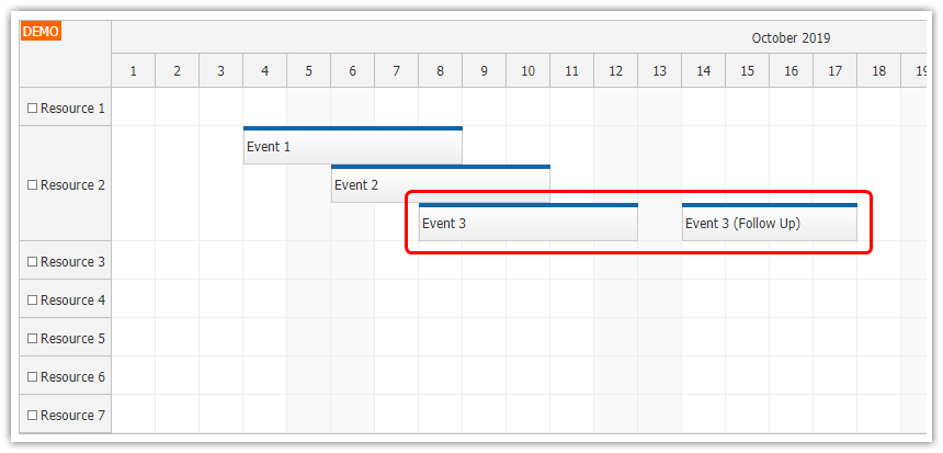
See also how to highlight related Scheduler events on hover and force a specific position of related events
License
Licensed for testing and evaluation purposes. Please see the license agreement included in the sample project. You can use the source code of the tutorial if you are a licensed user of DayPilot Pro for JavaScript.
Automatic Grouping of Scheduler Events
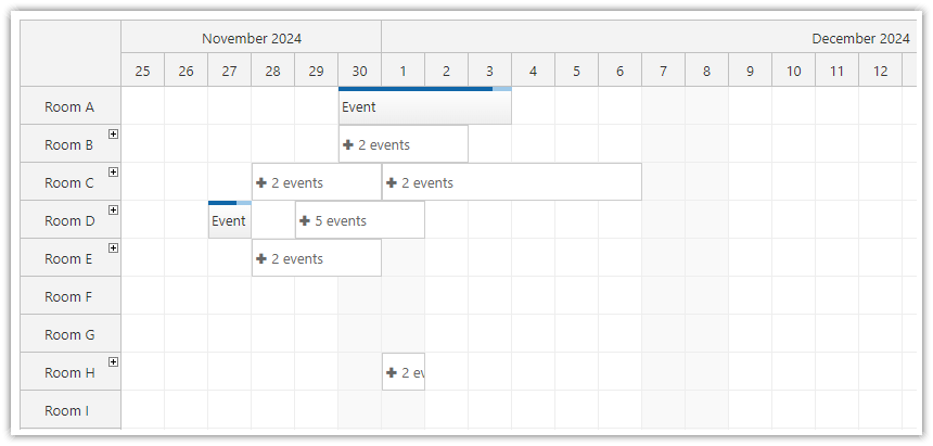
The JavaScript Scheduler supports automatic grouping of concurrent events. This feature helps with compacting the view if there are many events. The groups can be expanded on click.
The grouping is fully automatic and all events that are part of an overlapping block of events will be included.
If you want to create custom groups you can use the approach described in this tutorial.
Defining a Group of Related Events
Let's say we have two events that we want to display as a single group:
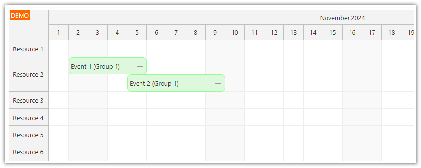
const events = [
  {
    id: 1,
    start: "2024-11-02T00:00:00",
    end: "2024-11-06T00:00:00",
    text: "Event 1 (Group 1)",
    resource: "R2"
  },
  {
    id: 2,
    start: "2024-11-05T00:00:00",
    end: "2024-11-10T00:00:00",
    text: "Event 2 (Group 1)",
    resource: "R2"
  }
];
In order to display them as one event, we need to replace these two records with a single one that defines the group. We'll also add properties that define the boundaries (start, end), name (text) and custom duration bar color to indicate a group (barColor).
The group members will be stored in a members property. This is a custom property name and you can change it as you wish (just make sure it doesn't conflict with the predefined properties).
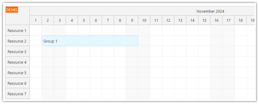
const events = [
  {
    id: 101,
    start: "2024-11-02T00:00:00",
    end: "2024-11-10T00:00:00",
    text: "Group 1",
    resource: "R2",
    cssClass: "event-group",
    members: [
      {
        id: 1,
        start: "2024-11-02T00:00:00",
        end: "2024-11-06T00:00:00",
        text: "Event 1 (Group 1)",
        group: 101,
        resource: "R2"
      },
      {
        id: 2,
        start: "2024-11-05T00:00:00",
        end: "2024-11-10T00:00:00",
        text: "Event 2 (Group 1)",
        group: 101,
        resource: "R2"
      }
    ]
  },
];
Adding Expand Icon [+] to Groups
![]()
In order to add an expand icon to the groups, we will use onBeforeEventRender event to add an active area to the event.
First, we need to check if the event is a group (it has args.data.members property). Then we add an active area (positioned using right, top, width and height properties) with an SVG icon (symbol property).
The onClick event handler defines the click action, which is to hide the group and show the members.
onBeforeEventRender: (args) => {
  const areas = args.data.areas || [];

  // this is a group event, add an expand icon
  if (args.data.members) {
    areas.push({
      right: 6,
      top: 10,
      height: 17,
      width: 17,
      fontColor: "#999",
      symbol: "icons/daypilot.svg#plus-4",
      onClick: (args) => {
        const e = args.source;
        const members = e.data.members;

        // hide the group event
        e.data.hidden = true;
        e.data.expanded = true;
        dp.events.update(e);

        // show members
        members.forEach(function(data) {
          dp.events.add(new DayPilot.Event(data));
        });
      }
    });
  }
  args.data.areas = areas;
};
Adding Collapse Icon [-] to Event Group Members
![]()
We will use the same logic to add the collapse icon to the group members.
First, we detect a group member by checking args.data.group property. We add an active area at the same position but this time we use a different SVG icon (maypilot.svg#minus-4).
The onClick event handler hides the members and shows the group event.
Note that we also store the collapsed/expanded status using a custom group.data.expanded property. The value is not used in this example but you can use in your application to get the group display status.
onBeforeEventRender: (args) => {
  const areas = args.data.areas || [];

  // ...

  // this is a member event, add a collapse icon
  if (args.data.group) {
    areas.push({
      right: 6,
      top: 10,
      height: 17,
      width: 17,
      fontColor: "#999",
      symbol: "icons/daypilot.svg#minus-4",
      onClick: (args) => {
        const e = args.source;

        // hide members
        const members = dp.events.list.filter(data => data.group === e.data.group );
        members.forEach(function(data) {
          dp.events.remove(new DayPilot.Event(data));
        });

        // show the group event
        var group = dp.events.find(e.data.group);
        if (group) {
          group.data.hidden = false;
          group.data.expanded = true;
          dp.events.update(group);
        }
      }
    });
  }
  args.data.areas = areas;
};
Full Source Code
This is the full source code of the JavaScript Scheduler event grouping implementation:
<!DOCTYPE html>
<html>
<head>
  <meta charset="utf-8"/>
  <meta name="viewport" content="width=device-width, initial-scale=1">
  <title>JavaScript Scheduler: Expandable Event Groups</title>

  <!-- DayPilot library -->
  <script src="js/daypilot/daypilot-all.min.js"></script>
</head>
<body>
<div class="header">
  <h1><a href='https://code.daypilot.org/22806/javascript-scheduler-expandable-event-groups'>JavaScript Scheduler: Expandable Event Groups</a></h1>
  <div><a href="https://javascript.daypilot.org/">DayPilot for JavaScript</a> - HTML5 Calendar/Scheduling Components for JavaScript/Angular/React/Vue</div>
</div>

<div class="main">
  <div id="dp"></div>
  <div class="generated">Generated using <a href="https://builder.daypilot.org/">DayPilot UI Builder</a>.</div>
</div>

<script>
  const dp = new DayPilot.Scheduler("dp", {
    timeHeaders: [{"groupBy": "Month"}, {"groupBy": "Day", "format": "d"}],
    scale: "Day",
    days: 30,
    startDate: "2024-11-01",
    timeRangeSelectedHandling: "Enabled",
    durationBarVisible: false,
    onTimeRangeSelected: async (args) => {
      const modal = await DayPilot.Modal.prompt("Create a new event:", "Event 1");
      dp.clearSelection();
      if (modal.canceled) {
        return;
      }
      dp.events.add({
        start: args.start,
        end: args.end,
        id: DayPilot.guid(),
        resource: args.resource,
        text: modal.result
      });
    },
    onBeforeEventRender: (args) => {

      const areas = args.data.areas || [];

      // this is a group event, add an expand icon
      if (args.data.members) {
        areas.push({
          right: 6,
          top: 10,
          height: 17,
          width: 17,
          fontColor: "#999",
          symbol: "icons/daypilot.svg#plus-4",
          onClick: (args) => {
            const e = args.source;
            const members = e.data.members;

            // hide the group event
            e.data.hidden = true;
            e.data.expanded = true;
            dp.events.update(e);

            // show members
            members.forEach(function(data) {
              dp.events.add(new DayPilot.Event(data));
            });
          }
        });
      }
      // this is a member event, add a collapse icon
      else if (args.data.group) {
        areas.push({
          right: 6,
          top: 10,
          height: 17,
          width: 17,
          fontColor: "#999",
          symbol: "icons/daypilot.svg#minus-4",
          onClick: (args) => {
            const e = args.source;

            // hide members
            const members = dp.events.list.filter(data => data.group === e.data.group);
            members.forEach(function(data) {
              dp.events.remove(new DayPilot.Event(data));
            });

            // show the group event
            const group = dp.events.find(e.data.group);
            if (group) {
              group.data.hidden = false;
              group.data.expanded = true;
              dp.events.update(group);
            }
          }
        });
      }
      args.data.areas = areas;
    }
  });
  dp.init();

  const app = {
    loadData() {
      const resources = [
        {name: "Resource 1", id: "R1"},
        {name: "Resource 2", id: "R2"},
        {name: "Resource 3", id: "R3"},
        {name: "Resource 4", id: "R4"},
        {name: "Resource 5", id: "R5"},
        {name: "Resource 6", id: "R6"},
        {name: "Resource 7", id: "R7"},
        {name: "Resource 8", id: "R8"},
      ];
      const events = [
        {
          id: 101,
          start: "2024-11-02T00:00:00",
          end: "2024-11-10T00:00:00",
          text: "Group 1",
          resource: "R2",
          cssClass: "event-group",
          members: [
            {
              id: 1,
              start: "2024-11-02T00:00:00",
              end: "2024-11-06T00:00:00",
              text: "Event 1 (Group 1)",
              group: 101,
              resource: "R2"
            },
            {
              id: 2,
              start: "2024-11-05T00:00:00",
              end: "2024-11-10T00:00:00",
              text: "Event 2 (Group 1)",
              group: 101,
              resource: "R2"
            }

          ]
        },
        {
          id: 3,
          start: "2024-11-03T00:00:00",
          end: "2024-11-08T00:00:00",
          text: "Event 3",
          resource: "R4"
        }

      ];
      dp.update({resources, events});
    },
    init() {
      this.loadData();
    }
  };
  app.init();
</script>

<style>
  .scheduler_default_event_inner {
    background: #ddf8dd;
    border: 1px solid #93fd93;
    border-radius: 8px;
    padding: 4px;
  }

  .event-group .scheduler_default_event_inner {
    background: #e6f7ff;
    border: 1px solid #b3e0ff;
  }

</style>

</body>
</html> DayPilot