 DayPilot
Overview
Learn how to work with CSS themes and use them to customize the appearance of the React Scheduler component.
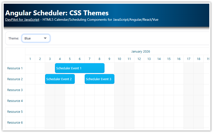
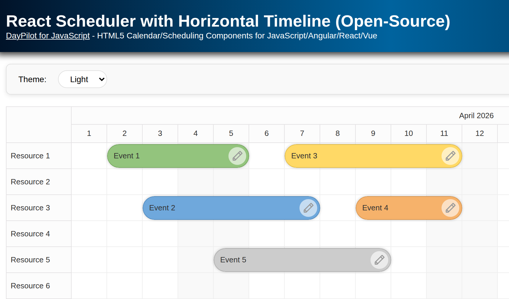
Default React Scheduler CSS theme

The appearance of most React Scheduler elements is defined by a CSS theme. Inline styles are used for setting dimensions of the Scheduler elements or for important styles that shouldn’t be overridden.
The default CSS theme is included in the DayPilot React package and it is loaded automatically. There is no need to include a special stylesheet file in your React project.
For an introduction to using the React Scheduler please see the React Scheduler Component Tutorial.
What React Scheduler themes are available?
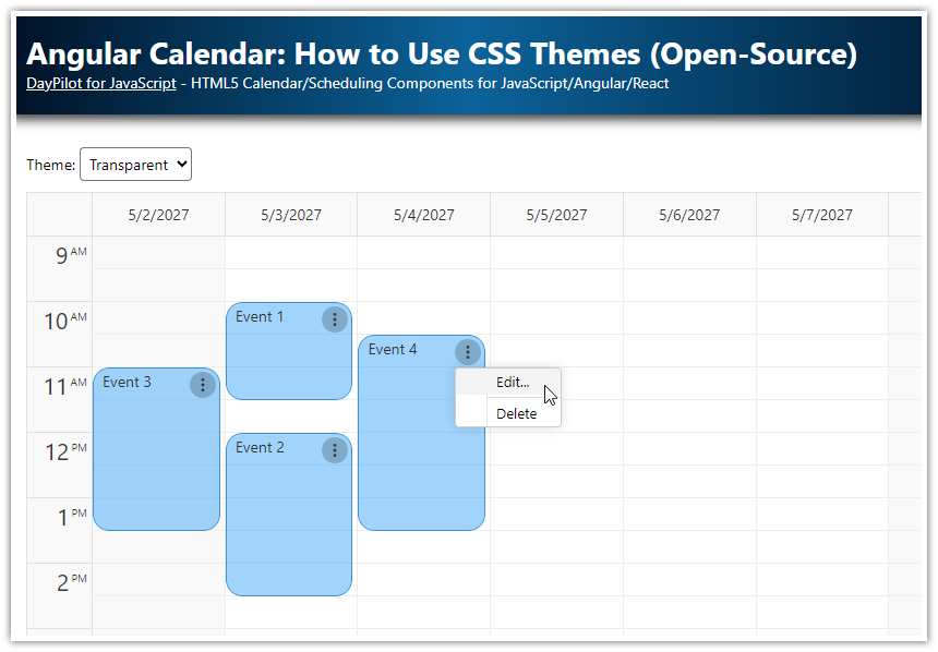
The attached React project includes the following themes:
White (
scheduler_white.css)Transparent (
scheduler_transparent.css)Green (
scheduler_green.css)Blue (
scheduler_blue.css)
You can find them in the src/themes directory.
White CSS Theme

index.css:
@import url('themes/scheduler_white.css');React JSX:
<DayPilotScheduler
  theme={"scheduler_white"}
/>
Transparent CSS Theme

index.css:
@import url('themes/scheduler_transparent.css');React JSX
<DayPilotScheduler
  theme={"scheduler_transparent"}
/>
Green CSS Theme

index.css:
@import url('themes/scheduler_green.css');React JSX:
<DayPilotScheduler
  theme={"scheduler_green"}
/>
Blue Theme

index.css:
@import url('themes/scheduler_blue.css');React JSX:
<DayPilotScheduler
  theme={"scheduler_blue"}
/>
How to create your own CSS theme for the React Scheduler?

The best way to start with a custom CSS theme is to use the Theme Designer. This online application lets you configure the basic appearance properties of the React Scheduler (font family and size, background color, borders…). It will generate a new CSS file with the custom CSS theme for you.
If you are happy with the generated theme, you can start using it:
Include the CSS file in your React project.
Set the
themeproperty of DayPilot React component to use the id (prefix) of your theme.
You can also open the CSS file and make manual changes.
How to find the React Scheduler CSS class that you need to change?
You can find a description of all CSS classes in the documentation:
The best way is to use the browser developer tools to discover the exact DOM structure and the classes used to style the selected element.
You can activate the element inspection mode using the following shortcuts:
Ctrl+Shift+C(Windows/Linux)Command+Shift+CorCommand+Option+C(Mac)
These shortcuts work in all major desktop browsers (Chrome, Safari, Firefox, Edge).

How to make partial changes to the default CSS theme?
If you are happy with the default Scheduler theme but need to make some minor changes, there are two options:
Use the default CSS theme and override the classes you need
Create a custom theme using the Theme Designer and modify the selected classes
If you use the default theme it will be updated automatically when you upgrade to a new version.
If you use a custom theme, you’ll need to update it manually. The theme generated by the theme designer can be converted to a new version in the designer:
Open the theme URL (you can find it in the CSS file header).
Click Edit
Click Download
This way it will use the custom properties you used the last time to generate a current version of the CSS theme.
How to override the CSS theme styles?
When you locate the CSS class that you want to customize you add a new selector to your global CSS styles to override the theme.
Note that in order to override the CSS theme it is necessary to use a more specific CSS selector.
The following example shows how to change the padding of the row header cells. This is how the React Scheduler looks by default:

The row header cell appearance is defined using .scheduler_default_rowheader_inner class. It specifies a padding of 7 pixels (via --dp-scheduler-rowheader-padding CSS variable):
.scheduler_default_row_header_inner {
  padding: var(--dp-scheduler-rowheader-padding);
}
To increase the left padding it is necessary to use a more specific selector in your CSS. This example adds body element to the selector:
body .scheduler_default_rowheader_inner {
    padding-left: 20px;
}
This way you can increase the left padding: