 DayPilot
Overview
How to add a Vue timesheet to your application
How to display daily totals
How to add project and client information to the timesheet records
How to customize the appearance using CSS themes
License
Licensed for testing and evaluation purposes. Please see the license agreement included in the sample project. You can use the source code of the tutorial if you are a licensed user of DayPilot Pro for JavaScript.
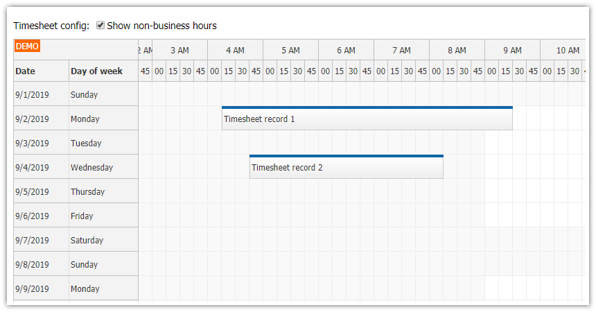
How to Create a Vue Timesheet Project
As the first step, we will create a new Vue project and add the required dependencies.
1. Create a new Vue project using create-vue:
npm create vue@latest2. To display the timesheet, we’ll use the Vue Scheduler component from DayPilot Pro for JavaScript. The Vue Scheduler component displays resources as rows by default but you can switch it to a special mode where it displays days on the vertical axis and hours of day on the horizontal axis.
First, it is necessary to install the DayPilot Pro Vue package (daypilot-pro-vue) from npm.daypilot.org:
npm install https://npm.daypilot.org/daypilot-pro-vue/trial/2026.2.6907.tar.gz3. You can also generate a new Vue project using the DayPilot UI Builder online application. The UI Builder lets you customize the timesheet appearance and create a new Vue project including the preconfigured Vue timesheet component.
How to Add a Vue Timesheet Component

Create a new component (Timesheet.vue) and add DayPilot Scheduler using the <DayPilotScheduler> tag:
<template>
  <DayPilotScheduler
    :timeHeaders="timeHeaders"
    scale="CellDuration"
    :cellDuration="15"
    :days="31"
    viewType="Days"
    :startDate="startDate"
    :events="events"
  />
</template>

<script setup>
import { DayPilotScheduler } from 'daypilot-pro-vue'
import { ref } from 'vue'

const startDate = "2026-10-01"
const events = ref([])
</script>
The Scheduler properties are supplied as Vue component props. Scheduler event handlers can be attached using Vue event listeners.
First, it’s necessary to switch the Vue Scheduler component to the timesheet mode:
<DayPilotScheduler
  viewType="Days"
  ...
/>
To display October 2026, use the startDate and days properties:
const startDate = "2026-10-01"

<DayPilotScheduler
  :startDate="startDate"
  :days="31"
  ...
/>
The time headers (the horizontal axis) will display hours of day and 15-minute intervals:
const timeHeaders = [
{groupBy: "Hour"},
{groupBy: "Cell", format: "mm"}
]
<DayPilotScheduler
:timeHeaders="timeHeaders"
scale="CellDuration"
:cellDuration="15"
...
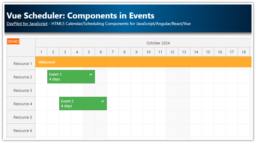
/>This is how the initial component looks now. In the onMounted() hook, we also load sample timesheet records using the loadEvents() method and scroll the grid to the beginning of the working day.
<template>
<DayPilotScheduler
ref="timesheetRef"
:timeHeaders="timeHeaders"
scale="CellDuration"
:cellDuration="15"
:days="31"
viewType="Days"
:startDate="startDate"
:showNonBusiness="true"
:businessWeekends="false"
:events="events"
/>
</template>
<script setup>
import { DayPilotScheduler } from 'daypilot-pro-vue'
import { ref, onMounted } from 'vue'
const startDate = "2026-10-01"
const timeHeaders = [
{groupBy: "Hour"},
{groupBy: "Cell", format: "mm"}
]
const events = ref([])
const timesheetRef = ref(null)
const loadEvents = () => {
events.value = [
{
id: 1,
start: "2026-10-02T09:30:00",
end: "2026-10-02T11:30:00",
text: "Task 1",
project: 1,
client: 1
},
{
id: 2,
start: "2026-10-04T10:00:00",
end: "2026-10-04T12:30:00",
text: "Task 2",
project: 2,
client: 1
}
]
}
onMounted(() => {
loadEvents()
timesheetRef.value?.control.scrollTo("2026-10-01T09:00:00")
timesheetRef.value?.control.message("Welcome!")
})
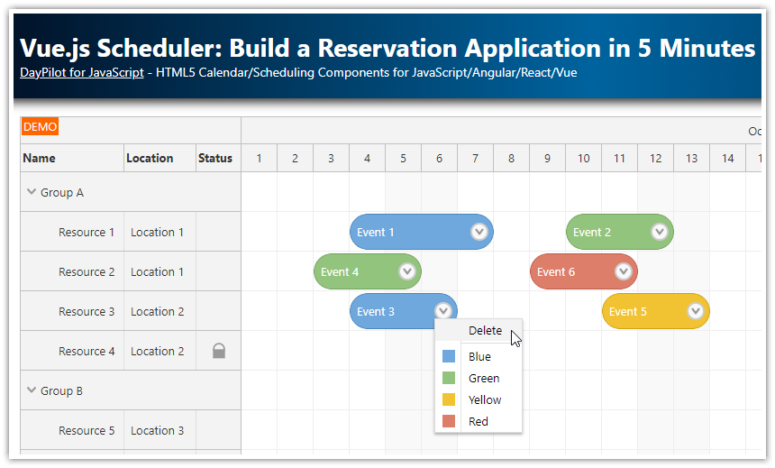
</script>To learn more on using the Vue Scheduler component, please see the Vue Scheduler: Build a Reservation Application in 5 Minutes tutorial.
How to Style the Vue Timesheet using CSS

The Vue timesheet component can be styled using CSS. The Scheduler includes a default CSS theme which is enabled by default. You can customize the appearance using one of the following methods:
You can create a custom CSS theme using the online Theme Designer. The Theme Designer will generate a CSS file which you can download and include in your project. You can switch to the custom theme using the
themeproperty.You can also directly override selected styles of the default theme.
As we only want to change the event appearance, we will use method #2 and override the event CSS classes:
<style>
body .scheduler_default_event_inner,
body .scheduler_default_event:hover .scheduler_default_event_inner {
border-radius: 10px;
padding-left: 10px;
background: #505050;
color: #ffffff;
}
body .scheduler_default_event_bar {
display: none;
}
body .scheduler_default_event_float_inner {
color: #ffffff;
}
body .scheduler_default_event_float_inner::after {
border-color: transparent #ffffff transparent transparent;
}
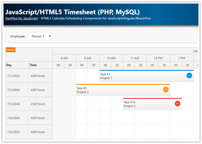
</style>How to Display Project and Client Information on Timesheet Records

In this step, we will add project and client information to the timesheet records.
By default, the Timesheet event displays the default text (defined using the text property), aligned to the left. In this tutorial, we hide the default text and replace it with rich content.
First, we need to add the project and client IDs to the task source data object. In this example, we will use project and client properties defined at the top level:
const events = [
  {
    id: 1,
    start: "2026-10-02T09:30:00",
    end: "2026-10-02T11:30:00",
    text: "Task 1",
    project: 1,
    client: 1
  },
  {
    id: 2,
    start: "2026-10-04T10:00:00",
    end: "2026-10-04T12:30:00",
    text: "Task 2",
    project: 2,
    client: 1
  }
]
The event height needs to be increased to 80 pixels to make room for the project and client details:
<DayPilotScheduler
  :eventHeight="80"
  ...
/>
To customize the event content, we will use the onBeforeEventRender event handler.
Our handler uses active areas to display text and icons at specified locations. To enhance the readability of the timesheet record content, we will add icons in different colors: a yellow icon before the task name, a red icon before the project name, and a green icon before the client name.
The code for this implementation is as follows:
<DayPilotScheduler
  @beforeEventRender="onBeforeEventRender"
  ...
/>

const onBeforeEventRender = args => {
  args.data.html = ""

  const projectName = projects.value.find(p => p.id === args.data.project)?.name || "(not specified)"
  const clientName = clients.value.find(c => c.id === args.data.client)?.name || "(not specified)"

  args.data.areas = [
    {left: 6, top: 8, width: 14, height: 14, backColor: "#f1ce46", borderRadius: 2},
    {left: 26, top: 8, text: args.data.text, fontColor: "#fff"},

    {left: 6, top: 32, width: 14, height: 14, backColor: "#d5663e", borderRadius: 2},
    {left: 26, top: 32, text: projectName, fontColor: "#fff"},

    {left: 6, top: 56, width: 14, height: 14, backColor: "#6aa84f", borderRadius: 2},
    {left: 26, top: 56, text: clientName, fontColor: "#fff"}
  ]
}
The list of projects and clients is defined statically in this example:
const projects = ref([
{id: 1, name: "Project 1"},
{id: 2, name: "Project 2"},
{id: 3, name: "Project 3"},
])
const clients = ref([
{id: 1, name: "Client 1"},
{id: 2, name: "Client 2"},
{id: 3, name: "Client 3"},
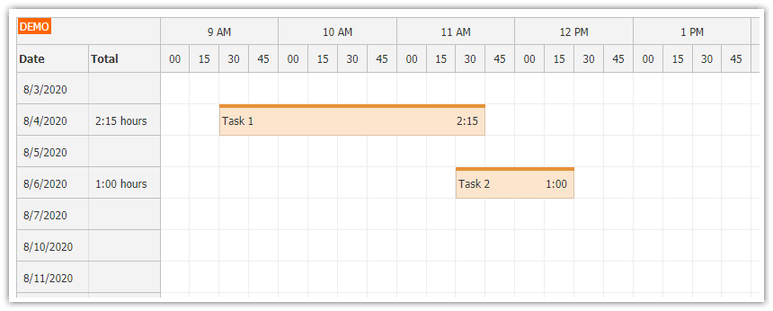
])How to Display Duration of Timesheet Events

To show the task duration at the right side of events, we will add another event active area.
The duration can be calculated from the start and end properties using the DayPilot.Duration class. This class can perform some basic calculations and format the duration as a string:
const onBeforeEventRender = args => {
  const duration = new DayPilot.Duration(args.data.start, args.data.end)

  args.data.areas = [
    // ...
    {right: 6, top: 0, bottom: 0, width: 34, text: duration.toString("h:mm"), verticalAlignment: "center", fontColor: "#fff"}
  ]
}
How to Calculate Daily Totals

First, define custom row header columns using the rowHeaderColumns property:
const rowHeaderColumns = [
  {name: "Date"},
  {name: "Day"},
  {name: "Total"},
]

<DayPilotScheduler
  :rowHeaderColumns="rowHeaderColumns"
  ...
/>
Now you can define the column content using the onBeforeRowHeaderRender event. You can also use this event to customize the appearance of the header cells (background color, font color, text alignment) and add icons with additional functionality using active areas.
<DayPilotScheduler
  @beforeRowHeaderRender="onBeforeRowHeaderRender"
  ...
/>

const onBeforeRowHeaderRender = args => {
  const day = args.row.start.toString("dddd")
  args.row.columns[1].text = `${day}`

  const duration = args.row.events.totalDuration()
  if (duration.totalSeconds() === 0) {
    return
  }

  let hours = duration.toString("H:mm")
  if (duration.totalDays() >= 1) {
    hours = Math.floor(duration.totalHours()) + ":" + duration.toString("mm")
  }
  args.row.columns[2].text = `${hours} hours`
}
The first column (“Date”) will display the default content (the date). It uses the datePattern property of the current locale to format the date. If you don’t like the default text, you can override it using the args.row.columns[0].text property.
The second column (“Day”) displays the day of week:
const day = args.row.start.toString("dddd")
args.row.columns[1].text = `${day}`
The third column (“Total”) displays the daily total. You can get the total duration of all events in a row using the args.row.events.totalDuration() method.
const duration = args.row.events.totalDuration()This method returns a DayPilot.Duration object. Now you can format the duration using the toString() method.
let hours = duration.toString("H:mm")
args.row.columns[2].text = `${hours} hours`
History
May 11, 2026: Updated the sample to the current Vue 3/Vite project template and DayPilot Pro Vue package. The tutorial now uses direct Scheduler props and Vue event listeners.
December 14, 2023: Upgraded to Vue 3.3, Vite, Composition API. Updated styling. Supports project and client details.
October 18, 2021: Initial release (Vue 3.0)