 DayPilot
")
Features
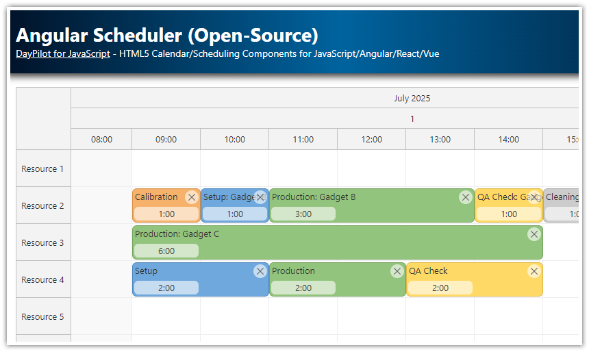
This project uses Angular Calendar component from the open-source DayPilot Lite calendar/scheduling library
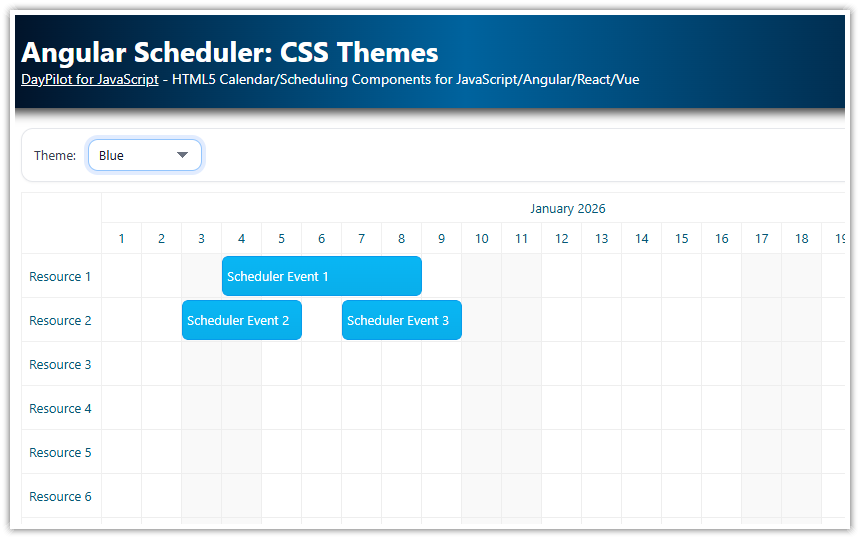
Four sample CSS themes included: Default, Blue, Green, Transparent, White
Live switching of the CSS theme using a drop-down list
License
Apache License 2.0
Default Calendar CSS Theme
This is the default look of the Angular Calendar that uses the built-in theme. The built-in theme doesn’t require any external stylesheets to be included in the application.

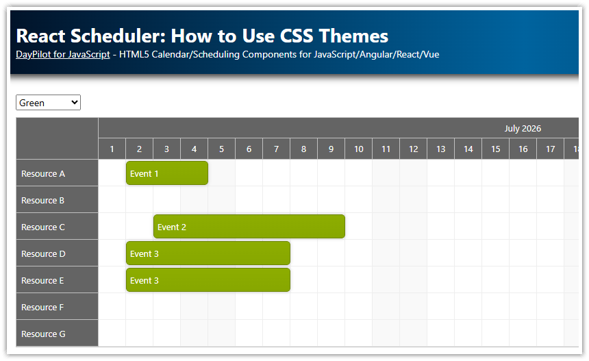
Green Calendar CSS Theme
The green CSS theme is defined in the calendar_green.css file (you can find it in the themes directory). The green theme uses dark gray background for the calendar headers (both vertical and horizontal), white background for the calendar cells and green background for scheduler events.

White Calendar CSS Theme
The white calendar theme uses white background for both headers and calendar grid cells. The non-business cells use a light gray color. You can find this theme in the calendar_white.css file.

Transparent Calendar CSS Theme
The transparent theme uses a semi-transparent blue background for calendar/scheduler events. The semi-transparent background can be useful if there are overlapping events (it lets you see the event in the background). The transparent theme is defined in calendar_transparent.css.

How to Style the Angular Calendar with a Custom CSS Theme
To use a custom CSS theme in the Angular Calendar component, the following steps are required:
Include the theme CSS file
Specify the theme name using the
themeproperty of the calendar config.
How to Include the Theme CSS File
The default CSS theme ("calendar_default") is built in - it doesn't require any external CSS file.
In our Angular application, we are going to use multiple themes (which can be switch on the fly) so we will include all of them in styles.css.
src/styles.css
@import 'themes/calendar_blue.css';
@import 'themes/calendar_green.css';
@import 'themes/calendar_transparent.css';
@import 'themes/calendar_white.css';
It's necessary to copy the theme files to your project (themes directory) and import them in styles.css. These global CSS files will get included in the compiled CSS when you build the Angular application.
It's necessary to include the themes in the global CSS file. If you include it in the component-specific CSS files (using styleUrls property of the @Component annotation) the class names will get prefixed with a local identifier. However, the internal Angular Calendar DOM elements are not marked with the identifier and the CSS theme wouldn't be applied.
How to Change the Calendar CSS Theme
The CSS theme can be activated using the theme property of the Angular Calendar component config object:
import {Component, ViewChild, AfterViewInit, signal} from "@angular/core";
import {DayPilot, DayPilotCalendarComponent} from "daypilot-pro-angular";
import {DataService} from "./data.service";

@Component({
  selector: 'calendar-component',
  template: `
  <daypilot-calendar [config]="config"></daypilot-calendar>
  `,
  styles: [``]
})
export class CalendarComponent implements AfterViewInit {

  config = signal<DayPilot.CalendarConfig>({
    // ...
    theme: "calendar_green"
  });

  // ...

}
The attached Angular application lets you change the theme on the fly using a drop-down list (<select> element):
import { Component, ViewChild, AfterViewInit, signal } from "@angular/core";
import { FormsModule } from "@angular/forms";
import {
  DayPilot,
  DayPilotModule,
  DayPilotCalendarComponent,
} from "@daypilot/daypilot-lite-angular";
import { DataService } from "./data.service";

@Component({
  selector: "calendar-component",
  standalone: true,
  imports: [DayPilotModule, FormsModule],
  providers: [DataService],
  template: `
    <div class="space">
      Theme:
      <select [ngModel]="config().theme" (ngModelChange)="setTheme($event)">
        @for (item of themes; track item.value) {
          <option [ngValue]="item.value">{{ item.name }}</option>
        }
      </select>
    </div>

    <daypilot-calendar [config]="config" [events]="events" #calendar></daypilot-calendar>
  `,
  styles: [``],
})
export class CalendarComponent implements AfterViewInit {
  @ViewChild("calendar") calendar!: DayPilotCalendarComponent;

  events = signal<DayPilot.EventData[]>([]);

  config = signal<DayPilot.CalendarConfig>({
    viewType: "Week",
    startDate: "2027-05-02",
    theme: "calendar_green",
    headerHeight: 40,
    // ...
  });

  themes: Array<{ name: string; value: string }> = [
    { name: "Default", value: "calendar_default" },
    { name: "Blue", value: "calendar_blue" },
    { name: "Green", value: "calendar_green" },
    { name: "Transparent", value: "calendar_transparent" },
    { name: "White", value: "calendar_white" },
  ];

  constructor(private ds: DataService) {}

  setTheme(theme: string): void {
    this.config.update((c) => ({ ...c, theme }));
  }

  ngAfterViewInit(): void {
    const from = this.calendar.control.visibleStart();
    const to = this.calendar.control.visibleEnd();

    this.ds.getEvents(from, to).subscribe((result) => {
      this.events.set(result);
    });
  }
}
How to Create a Custom Calendar CSS Theme

You can create your own CSS theme using the online theme designer. It lets you design a theme in a WYSIWYG mode and download a generated CSS file.
You can customize the generated CSS file manually if needed.